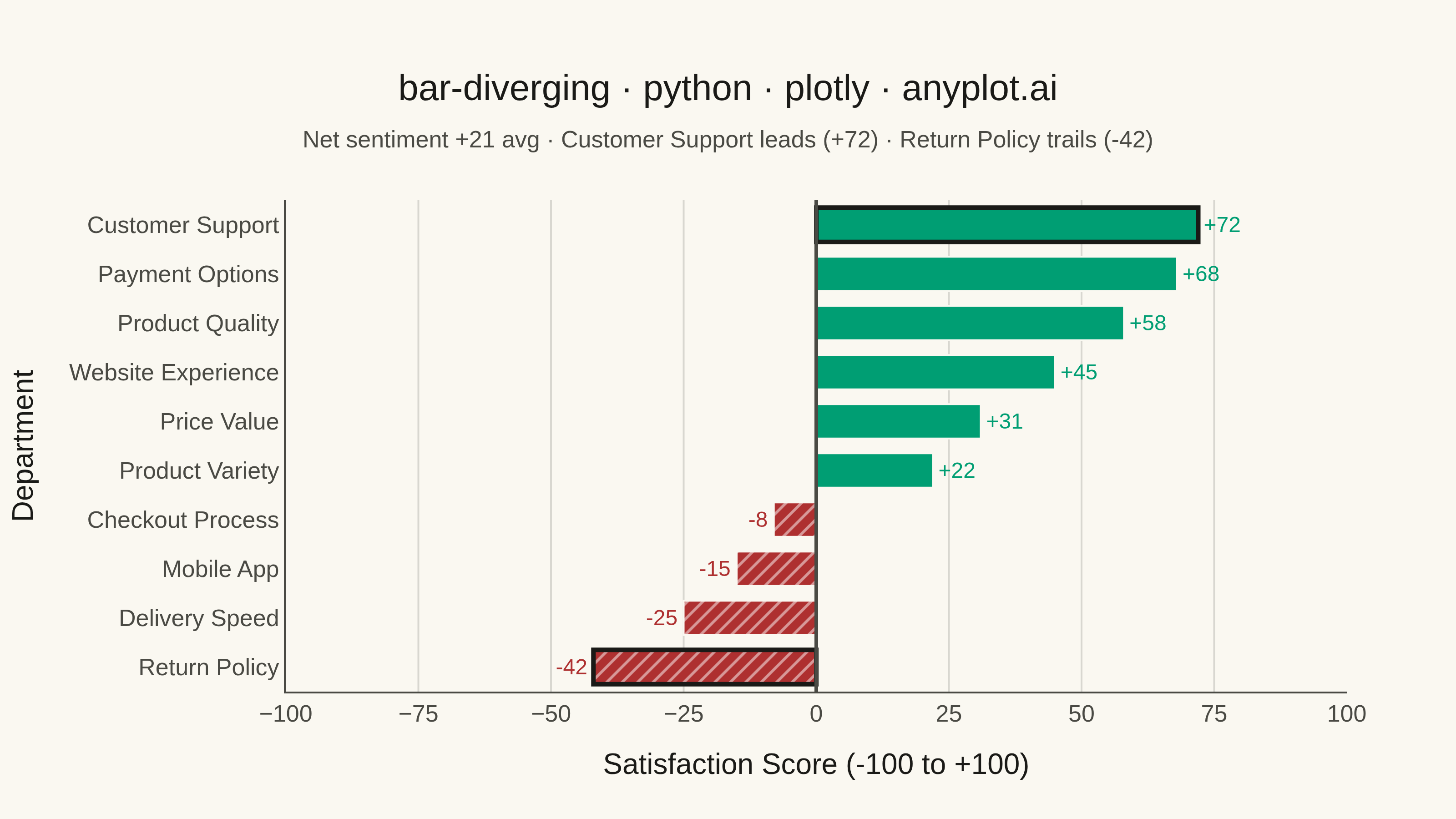
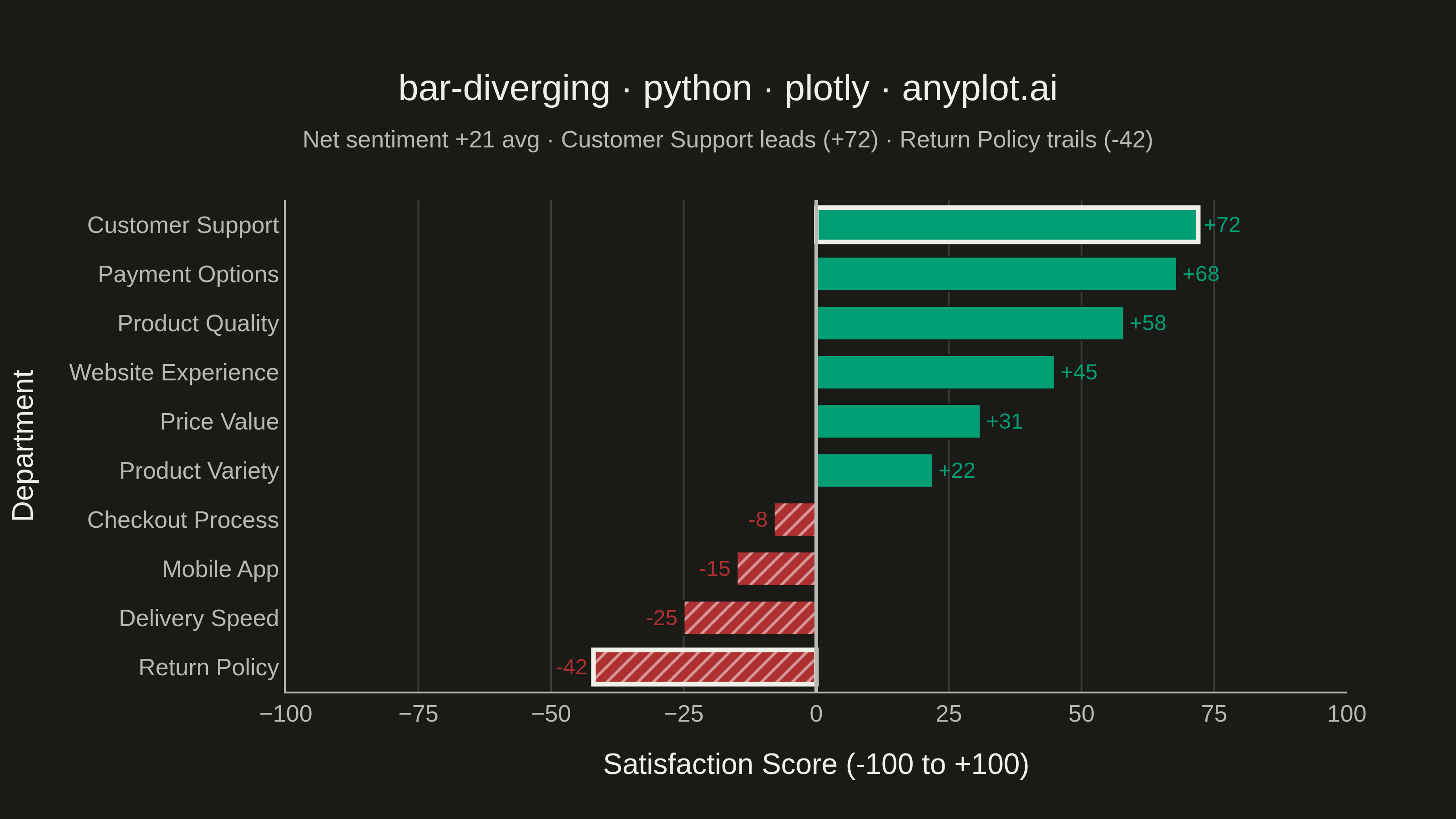
A diverging bar chart displays bars extending in opposite directions from a central baseline, typically at zero. This visualization is ideal for comparing positive and negative values, showing responses above and below a neutral point, or contrasting opposing categories. Different colors distinguish positive from negative values, making it easy to identify magnitude and direction at a glance.
""" anyplot.ai
bar-diverging: Diverging Bar Chart
Library: plotly 6.9.0 | Python 3.13.15
Quality: 94/100 | Updated: 2026-08-18
"""

import os

import plotly.graph_objects as go


# Theme tokens
THEME = os.getenv("ANYPLOT_THEME", "light")
PAGE_BG = "#FAF8F1" if THEME == "light" else "#1A1A17"
ELEVATED_BG = "#FFFDF6" if THEME == "light" else "#242420"
INK = "#1A1A17" if THEME == "light" else "#F0EFE8"
INK_SOFT = "#4A4A44" if THEME == "light" else "#B8B7B0"
GRID = "rgba(26,26,23,0.15)" if THEME == "light" else "rgba(240,239,232,0.15)"

# Imprint palette: position 1 (brand green) for positive, position 5 (matte
# red) for negative — sentiment/polarity semantic exception
POSITIVE_COLOR = "#009E73"
NEGATIVE_COLOR = "#AE3030"

# Data: Customer satisfaction survey results by department
# Scores range from -100 (very dissatisfied) to +100 (very satisfied)
categories = [
    "Customer Support",
    "Product Quality",
    "Delivery Speed",
    "Website Experience",
    "Return Policy",
    "Price Value",
    "Mobile App",
    "Payment Options",
    "Product Variety",
    "Checkout Process",
]
values = [72, 58, -25, 45, -42, 31, -15, 68, 22, -8]

# Sort by value for better pattern recognition
sorted_data = sorted(zip(categories, values, strict=True), key=lambda x: x[1])
categories_sorted = [item[0] for item in sorted_data]
values_sorted = [item[1] for item in sorted_data]

# Assign colors: Imprint brand green for positive, matte red for negative
colors = [POSITIVE_COLOR if v >= 0 else NEGATIVE_COLOR for v in values_sorted]

# Redundant non-color encoding beyond bar direction + sign: a diagonal hatch
# flags negative bars, distinctive Plotly marker.pattern usage
patterns = ["" if v >= 0 else "/" for v in values_sorted]

# The two extreme bars (sorted ascending, so index 0 and -1) get a bolder
# outline to draw the eye to the highest/lowest departments
extreme_indices = {0, len(values_sorted) - 1}
line_widths = [2.5 if i in extreme_indices else 1 for i in range(len(values_sorted))]
line_colors = [INK if i in extreme_indices else PAGE_BG for i in range(len(values_sorted))]

# Net sentiment context for the subtitle and richer hover cards
net_avg = sum(values_sorted) / len(values_sorted)
bottom_cat, bottom_val = sorted_data[0]
top_cat, top_val = sorted_data[-1]
sentiment_labels = ["Positive" if v >= 0 else "Negative" for v in values_sorted]
customdata = list(zip(sentiment_labels, [abs(v) for v in values_sorted], strict=True))

# Create horizontal diverging bar chart
fig = go.Figure()

fig.add_trace(
    go.Bar(
        y=categories_sorted,
        x=values_sorted,
        orientation="h",
        marker={
            "color": colors,
            "line": {"color": line_colors, "width": line_widths},
            "pattern": {"shape": patterns, "fgcolor": PAGE_BG, "size": 6, "solidity": 0.25},
        },
        text=[f"{v:+d}" for v in values_sorted],
        textposition="outside",
        textfont={"size": 12, "color": colors},
        customdata=customdata,
        hovertemplate=(
            "<b>%{y}</b><br>Score: %{x:+d}<br>Sentiment: %{customdata[0]}<br>"
            "Magnitude: %{customdata[1]} of 100<extra></extra>"
        ),
    )
)

# Add zero baseline
fig.add_vline(x=0, line={"color": INK_SOFT, "width": 2})

# Layout styling for 3200x1800
fig.update_layout(
    autosize=False,
    title={
        "text": (
            "bar-diverging · python · plotly · anyplot.ai<br>"
            f"<span style='font-size:13px;font-weight:normal;color:{INK_SOFT}'>"
            f"Net sentiment {net_avg:+.0f} avg · {top_cat} leads ({top_val:+d}) · "
            f"{bottom_cat} trails ({bottom_val:+d})</span>"
        ),
        "font": {"size": 20, "color": INK},
        "x": 0.5,
        "xanchor": "center",
    },
    xaxis={
        "title": {"text": "Satisfaction Score (-100 to +100)", "font": {"size": 16, "color": INK}},
        "tickfont": {"size": 13, "color": INK_SOFT},
        "range": [-100, 100],
        "dtick": 25,
        "gridcolor": GRID,
        "linecolor": INK_SOFT,
        "zeroline": False,
    },
    yaxis={
        "title": {"text": "Department", "font": {"size": 16, "color": INK}},
        "tickfont": {"size": 13, "color": INK_SOFT},
        "automargin": True,
        "linecolor": INK_SOFT,
    },
    paper_bgcolor=PAGE_BG,
    plot_bgcolor=PAGE_BG,
    showlegend=False,
    margin={"l": 20, "r": 60, "t": 110, "b": 70},
    bargap=0.3,
)

# Save outputs
fig.write_image(f"plot-{THEME}.png", width=800, height=450, scale=4)
fig.write_html(f"plot-{THEME}.html", include_plotlyjs="cdn")
Runnable source as JSON, for any HTTP client: https://api.anyplot.ai/specs/bar-diverging/plotly/code. Any spec id and library id listed in llms-full.txt fit the same URL shape; every URL below is complete and callable.
{
  "spec_id": "bar-diverging",
  "language": "python",
  "library": "plotly",
  "page": "https://anyplot.ai/bar-diverging/python/plotly",
  "hub": "https://anyplot.ai/bar-diverging",
  "code_json": "https://api.anyplot.ai/specs/bar-diverging/plotly/code",
  "spec_json": "https://api.anyplot.ai/specs/bar-diverging",
  "render_light_png": "https://storage.googleapis.com/anyplot-images/plots/bar-diverging/python/plotly/plot-light.png",
  "render_dark_png": "https://storage.googleapis.com/anyplot-images/plots/bar-diverging/python/plotly/plot-dark.png",
  "interactive_light_html": "https://storage.googleapis.com/anyplot-images/plots/bar-diverging/python/plotly/plot-light.html",
  "interactive_dark_html": "https://storage.googleapis.com/anyplot-images/plots/bar-diverging/python/plotly/plot-dark.html",
  "quality_score": 94.0,
  "license": "MIT",
  "guide": "https://anyplot.ai/llms.txt"
}
Part of Diverging Bar Chart on anyplot.ai.