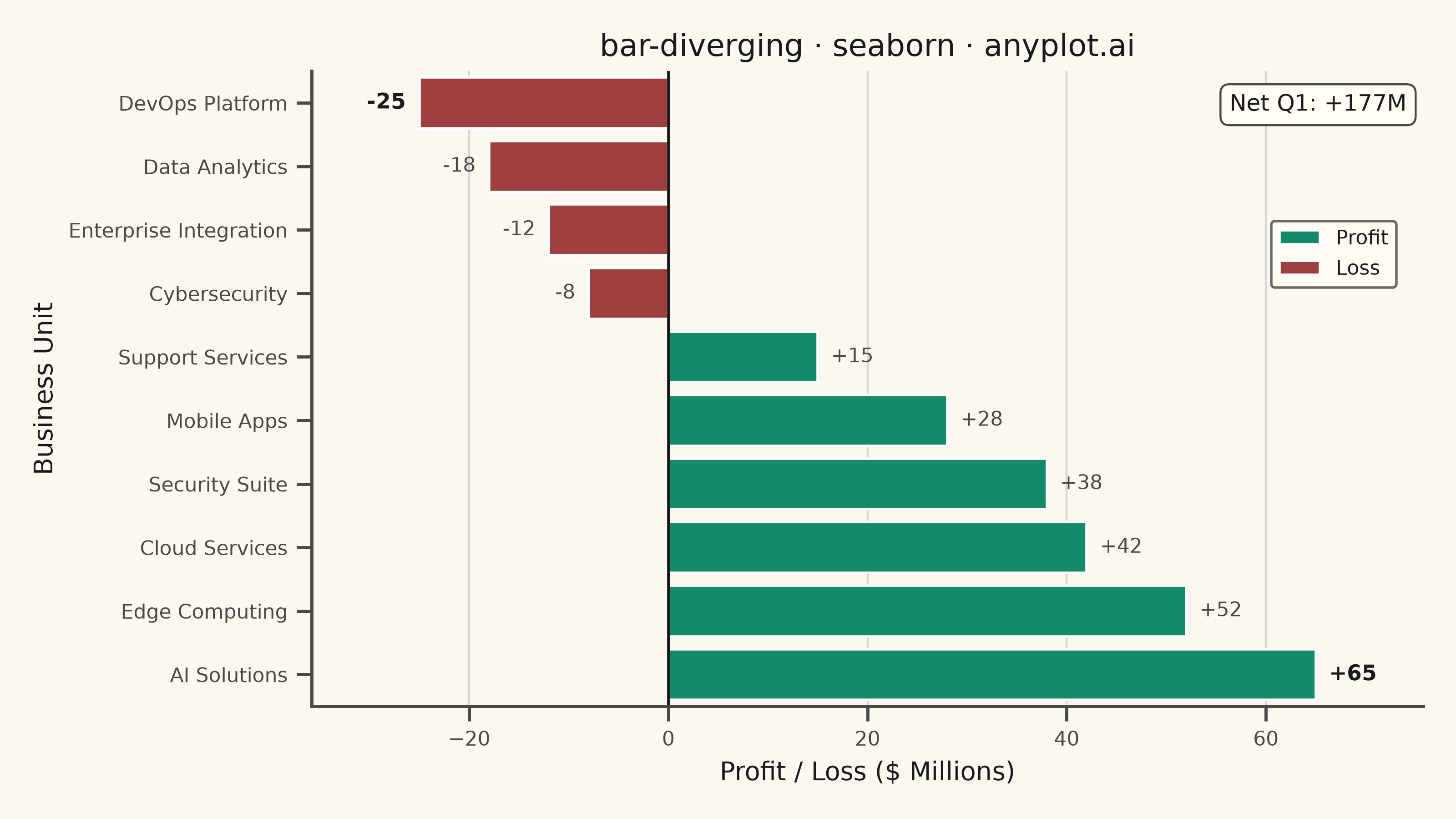
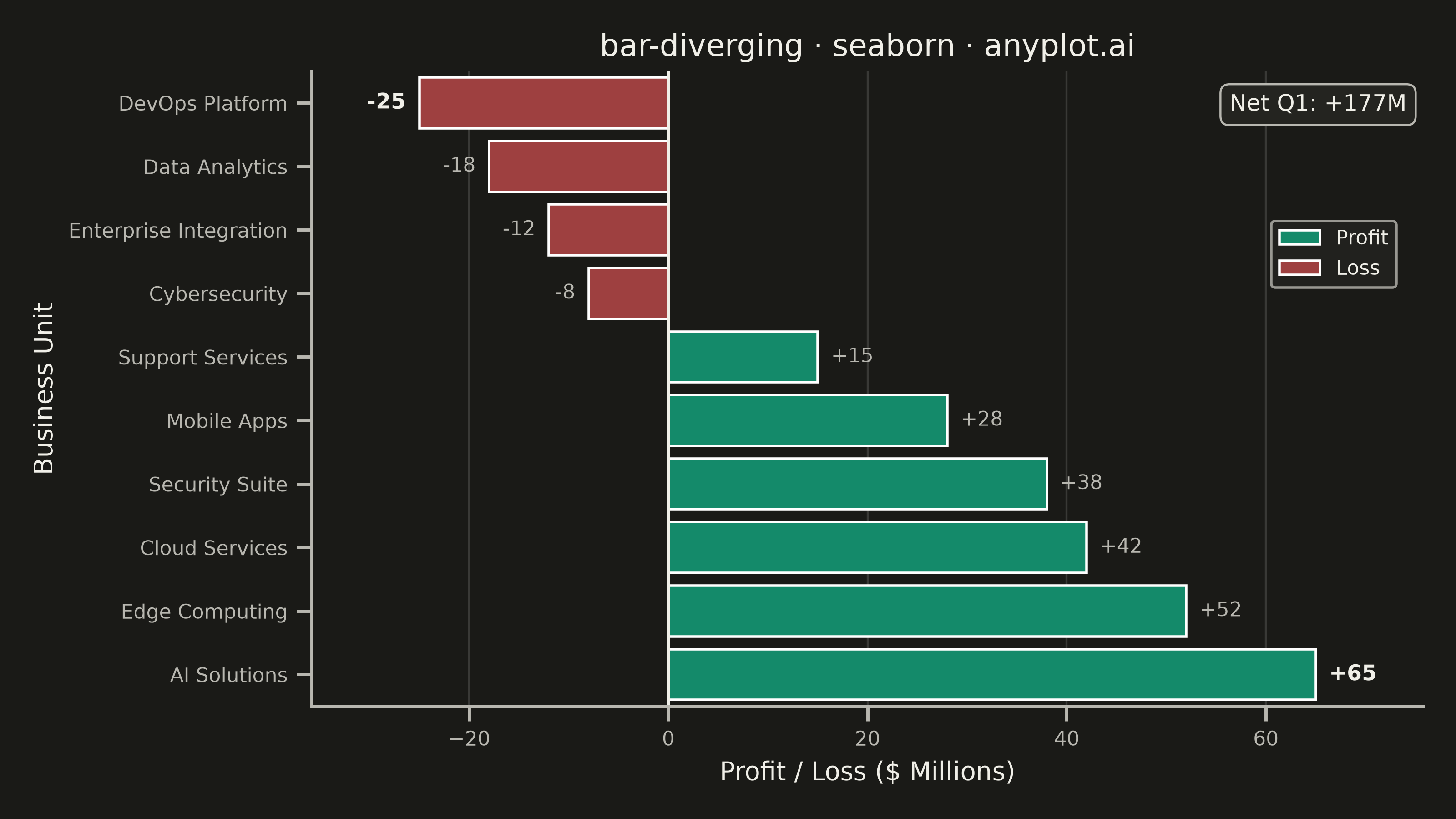
A diverging bar chart displays bars extending in opposite directions from a central baseline, typically at zero. This visualization is ideal for comparing positive and negative values, showing responses above and below a neutral point, or contrasting opposing categories. Different colors distinguish positive from negative values, making it easy to identify magnitude and direction at a glance.
""" anyplot.ai
bar-diverging: Diverging Bar Chart
Library: seaborn 0.13.2 | Python 3.13.15
Quality: 91/100 | Updated: 2026-08-18
"""

import os
import sys


sys.path = [p for p in sys.path if "implementations" not in p]

import matplotlib.pyplot as plt
import numpy as np
import pandas as pd
import seaborn as sns


# Theme tokens
THEME = os.getenv("ANYPLOT_THEME", "light")
PAGE_BG = "#FAF8F1" if THEME == "light" else "#1A1A17"
ELEVATED_BG = "#FFFDF6" if THEME == "light" else "#242420"
INK = "#1A1A17" if THEME == "light" else "#F0EFE8"
INK_SOFT = "#4A4A44" if THEME == "light" else "#B8B7B0"

# Imprint semantic anchors — profit/loss is a labeled sentiment pair, so we
# break canonical ordinal order (see default-style-guide.md "Semantic exception")
PROFIT_COLOR = "#009E73"  # Imprint position 1 — brand green, profit
LOSS_COLOR = "#AE3030"  # Imprint position 5 — matte red, loss

# Data - Quarterly profit/loss by business unit (in millions)
units = [
    "Cloud Services",
    "Data Analytics",
    "AI Solutions",
    "DevOps Platform",
    "Security Suite",
    "Enterprise Integration",
    "Mobile Apps",
    "Edge Computing",
    "Cybersecurity",
    "Support Services",
]
values = np.array([42, -18, 65, -25, 38, -12, 28, 52, -8, 15])

df = pd.DataFrame({"Unit": units, "Value": values})
df["Sign"] = np.where(df["Value"] >= 0, "Profit", "Loss")
df = df.sort_values("Value", ascending=True).reset_index(drop=True)

# Configure seaborn theme
sns.set_theme(
    style="ticks",
    rc={
        "figure.facecolor": PAGE_BG,
        "axes.facecolor": PAGE_BG,
        "axes.edgecolor": INK_SOFT,
        "axes.labelcolor": INK,
        "text.color": INK,
        "xtick.color": INK_SOFT,
        "ytick.color": INK_SOFT,
        "grid.color": INK,
        "grid.alpha": 0.15,
        "legend.facecolor": ELEVATED_BG,
        "legend.edgecolor": INK_SOFT,
    },
)

fig, ax = plt.subplots(figsize=(8, 4.5), dpi=400, facecolor=PAGE_BG)

# Idiomatic seaborn: hue-mapped palette instead of a manual color list,
# dodge=False since each Unit already owns a single row/bar.
sns.barplot(
    data=df,
    x="Value",
    y="Unit",
    hue="Sign",
    hue_order=["Profit", "Loss"],
    palette={"Profit": PROFIT_COLOR, "Loss": LOSS_COLOR},
    dodge=False,
    ax=ax,
    orient="h",
)

# Zero baseline uses the theme-adaptive neutral anchor — it's structural,
# not data, so it reads as part of the chart's chrome layer.
ax.axvline(x=0, color=INK, linewidth=1.2, zorder=2)

# Direct value labels at each bar tip — bolded for the best/worst performer
# to give the chart a focal point beyond "well-configured default".
idx_best = df["Value"].idxmax()
idx_worst = df["Value"].idxmin()
span = df["Value"].max() - df["Value"].min()
label_pad = span * 0.015
for i, row in df.iterrows():
    val = row["Value"]
    highlight = i in (idx_best, idx_worst)
    ax.text(
        val + (label_pad if val >= 0 else -label_pad),
        i,
        f"{val:+.0f}",
        va="center",
        ha="left" if val >= 0 else "right",
        fontsize=8.5 if highlight else 8,
        fontweight="bold" if highlight else "regular",
        color=INK if highlight else INK_SOFT,
    )

# Callout: net total across all units — a single narrative summary number
# anchored away from the bars, in the elevated-surface treatment used for
# legend/annotation boxes.
net_total = df["Value"].sum()
ax.annotate(
    f"Net Q1: {net_total:+.0f}M",
    xy=(0.985, 0.965),
    xycoords="axes fraction",
    ha="right",
    va="top",
    fontsize=9,
    fontweight="medium",
    color=INK,
    bbox={"boxstyle": "round,pad=0.4", "facecolor": ELEVATED_BG, "edgecolor": INK_SOFT, "linewidth": 0.8},
)

# Style
ax.set_xlabel("Profit / Loss ($ Millions)", fontsize=10, color=INK)
ax.set_ylabel("Business Unit", fontsize=10, color=INK)
ax.set_title("bar-diverging · seaborn · anyplot.ai", fontsize=12, fontweight="medium", color=INK)
ax.tick_params(axis="both", labelsize=8, colors=INK_SOFT)
ax.margins(x=0.12)

# Grid on x-axis only
ax.xaxis.grid(True, alpha=0.15, linewidth=0.8)
ax.yaxis.grid(False)
ax.set_axisbelow(True)

sns.despine(ax=ax, top=True, right=True)
ax.spines["left"].set_color(INK_SOFT)
ax.spines["bottom"].set_color(INK_SOFT)

legend = ax.legend(loc="upper right", bbox_to_anchor=(0.985, 0.78), frameon=True, fontsize=8, title=None)
legend.get_frame().set_facecolor(ELEVATED_BG)
legend.get_frame().set_edgecolor(INK_SOFT)
for text in legend.get_texts():
    text.set_color(INK)

plt.tight_layout()
plt.savefig(f"plot-{THEME}.png", dpi=400, facecolor=PAGE_BG)
Runnable source as JSON, for any HTTP client: https://api.anyplot.ai/specs/bar-diverging/seaborn/code. Any spec id and library id listed in llms-full.txt fit the same URL shape; every URL below is complete and callable.
{
  "spec_id": "bar-diverging",
  "language": "python",
  "library": "seaborn",
  "page": "https://anyplot.ai/bar-diverging/python/seaborn",
  "hub": "https://anyplot.ai/bar-diverging",
  "code_json": "https://api.anyplot.ai/specs/bar-diverging/seaborn/code",
  "spec_json": "https://api.anyplot.ai/specs/bar-diverging",
  "render_light_png": "https://storage.googleapis.com/anyplot-images/plots/bar-diverging/python/seaborn/plot-light.png",
  "render_dark_png": "https://storage.googleapis.com/anyplot-images/plots/bar-diverging/python/seaborn/plot-dark.png",
  "quality_score": 91.0,
  "license": "MIT",
  "guide": "https://anyplot.ai/llms.txt"
}
Part of Diverging Bar Chart on anyplot.ai.