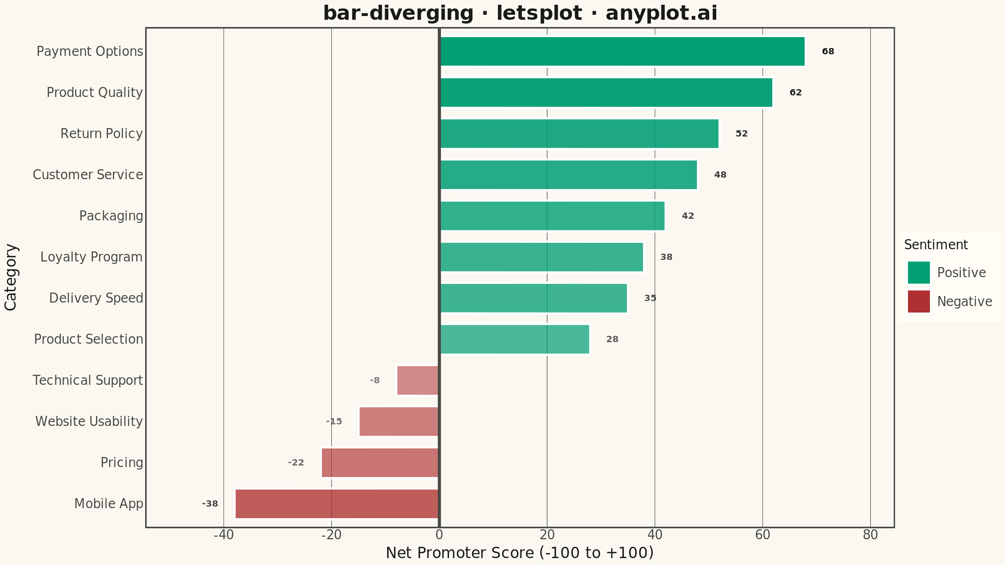
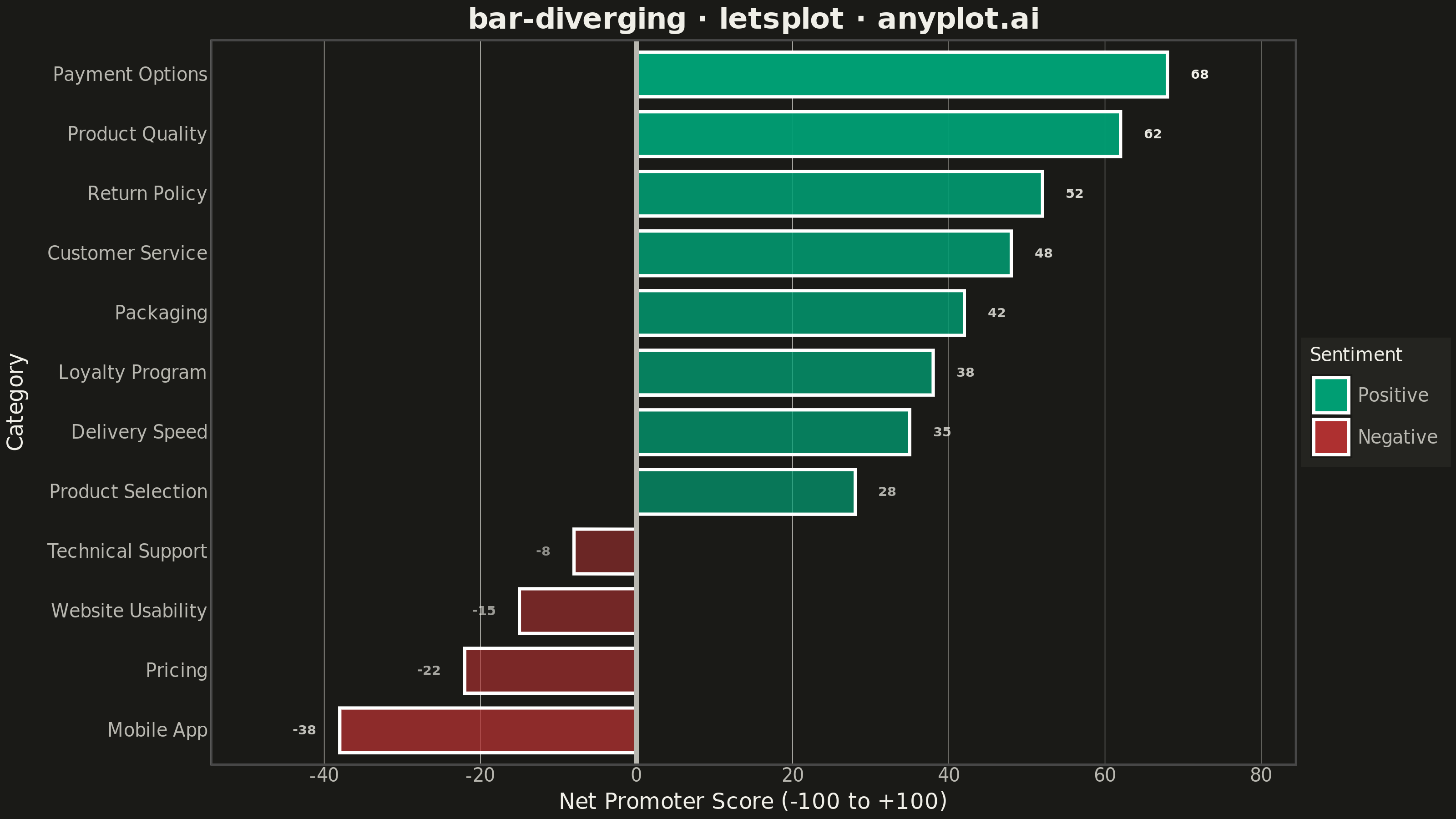
A diverging bar chart displays bars extending in opposite directions from a central baseline, typically at zero. This visualization is ideal for comparing positive and negative values, showing responses above and below a neutral point, or contrasting opposing categories. Different colors distinguish positive from negative values, making it easy to identify magnitude and direction at a glance.
""" anyplot.ai
bar-diverging: Diverging Bar Chart
Library: letsplot 4.11.0 | Python 3.13.15
Quality: 94/100 | Updated: 2026-08-18
"""

import os

import pandas as pd
from lets_plot import *
from lets_plot.export import ggsave as export_ggsave


LetsPlot.setup_html()

# Theme tokens
THEME = os.getenv("ANYPLOT_THEME", "light")
PAGE_BG = "#FAF8F1" if THEME == "light" else "#1A1A17"
ELEVATED_BG = "#FFFDF6" if THEME == "light" else "#242420"
INK = "#1A1A17" if THEME == "light" else "#F0EFE8"
INK_SOFT = "#4A4A44" if THEME == "light" else "#B8B7B0"

# Imprint palette anchors for diverging sentiment bars
POSITIVE_COLOR = "#009E73"  # Brand green — positive sentiment
NEGATIVE_COLOR = "#AE3030"  # Imprint matte red — semantic anchor for negative sentiment

# Data - Customer satisfaction survey (Net Promoter Score style)
categories = [
    "Product Quality",
    "Customer Service",
    "Pricing",
    "Delivery Speed",
    "Website Usability",
    "Return Policy",
    "Product Selection",
    "Payment Options",
    "Mobile App",
    "Packaging",
    "Technical Support",
    "Loyalty Program",
]

# More balanced scores: 6 negative, 6 positive
scores = [62, 48, -22, 35, -15, 52, 28, 68, -38, 42, -8, 38]

df = pd.DataFrame(
    {
        "Category": categories,
        "Score": scores,
        "Sentiment": ["Positive" if s >= 0 else "Negative" for s in scores],
        "AbsScore": [abs(s) for s in scores],
    }
)

# Sort by score for better pattern recognition
df = df.sort_values("Score", ascending=True).reset_index(drop=True)

# Preserve category order after sorting
df["Category"] = pd.Categorical(df["Category"], categories=df["Category"].tolist(), ordered=True)

# Direct value labels beyond each bar end — read the exact score without
# cross-referencing the axis, and split into two layers so positive labels
# sit left-aligned past the bar tip while negative labels sit right-aligned.
label_pad = 3
positives = df[df["Score"] >= 0].copy()
positives["label_x"] = positives["Score"] + label_pad
negatives = df[df["Score"] < 0].copy()
negatives["label_x"] = negatives["Score"] - label_pad

# Create horizontal diverging bar chart with theme-adaptive styling.
# Fill opacity scales with |score| so the strongest sentiment (the most
# actionable signal) visually dominates the mild responses, adding a second
# encoding dimension on top of the positive/negative hue split.
plot = (
    ggplot(df, aes(x="Score", y="Category", fill="Sentiment", alpha="AbsScore"))
    + geom_bar(
        stat="identity",
        width=0.75,
        tooltips=layer_tooltips()
        .line("@Category")
        .line("Score|@Score")
        .line("Sentiment|@Sentiment"),
    )
    + geom_vline(xintercept=0, color=INK_SOFT, size=1.0)
    + geom_text(
        aes(x="label_x", y="Category", label="Score"),
        data=positives,
        hjust=0,
        size=3.6,
        fontface="bold",
        color=INK,
    )
    + geom_text(
        aes(x="label_x", y="Category", label="Score"),
        data=negatives,
        hjust=1,
        size=3.6,
        fontface="bold",
        color=INK,
    )
    + scale_fill_manual(
        values={"Positive": POSITIVE_COLOR, "Negative": NEGATIVE_COLOR}
    )
    + scale_alpha(range=[0.55, 1.0], guide="none")
    + scale_x_continuous(expand=[0.12, 0])
    + labs(
        x="Net Promoter Score (-100 to +100)", y="Category", title="bar-diverging · letsplot · anyplot.ai"
    )
    + theme_minimal()
    + theme(
        plot_background=element_rect(fill=PAGE_BG, color=PAGE_BG),
        panel_background=element_rect(fill=PAGE_BG),
        panel_grid_major_x=element_line(color=INK, size=0.3),
        panel_grid_major_y=element_blank(),
        panel_grid_minor=element_blank(),
        plot_title=element_text(size=16, face="bold", color=INK, hjust=0.5),
        axis_title_x=element_text(size=12, color=INK),
        axis_title_y=element_text(size=12, color=INK),
        axis_text_x=element_text(size=10, color=INK_SOFT),
        axis_text_y=element_text(size=10, color=INK_SOFT),
        axis_line_x=element_line(color=INK_SOFT),
        axis_line_y=element_line(color=INK_SOFT),
        legend_title=element_text(size=10, color=INK),
        legend_text=element_text(size=10, color=INK_SOFT),
        legend_background=element_rect(fill=ELEVATED_BG),
        legend_position="right",
    )
    + ggsize(800, 450)
)

# Save PNG with scale 4x to get 3200 × 1800 px
export_ggsave(plot, filename=f"plot-{THEME}.png", path=".", scale=4)

# Save HTML for interactive version
export_ggsave(plot, filename=f"plot-{THEME}.html", path=".")
Runnable source as JSON, for any HTTP client: https://api.anyplot.ai/specs/bar-diverging/letsplot/code. Any spec id and library id listed in llms-full.txt fit the same URL shape; every URL below is complete and callable.
{
  "spec_id": "bar-diverging",
  "language": "python",
  "library": "letsplot",
  "page": "https://anyplot.ai/bar-diverging/python/letsplot",
  "hub": "https://anyplot.ai/bar-diverging",
  "code_json": "https://api.anyplot.ai/specs/bar-diverging/letsplot/code",
  "spec_json": "https://api.anyplot.ai/specs/bar-diverging",
  "render_light_png": "https://storage.googleapis.com/anyplot-images/plots/bar-diverging/python/letsplot/plot-light.png",
  "render_dark_png": "https://storage.googleapis.com/anyplot-images/plots/bar-diverging/python/letsplot/plot-dark.png",
  "interactive_light_html": "https://storage.googleapis.com/anyplot-images/plots/bar-diverging/python/letsplot/plot-light.html",
  "interactive_dark_html": "https://storage.googleapis.com/anyplot-images/plots/bar-diverging/python/letsplot/plot-dark.html",
  "quality_score": 94.0,
  "license": "MIT",
  "guide": "https://anyplot.ai/llms.txt"
}
Part of Diverging Bar Chart on anyplot.ai.