The same plot in 14 other libraries — Python: Altair, Bokeh, lets-plot, Matplotlib, Plotly, plotnine, Pygal, Seaborn; R: ggplot2; JavaScript: Chart.js, D3.js, Apache ECharts, Highcharts, MUI X Charts. Compare all 15 side by side: Diverging Bar Chart in Python, R, Julia and JavaScript.
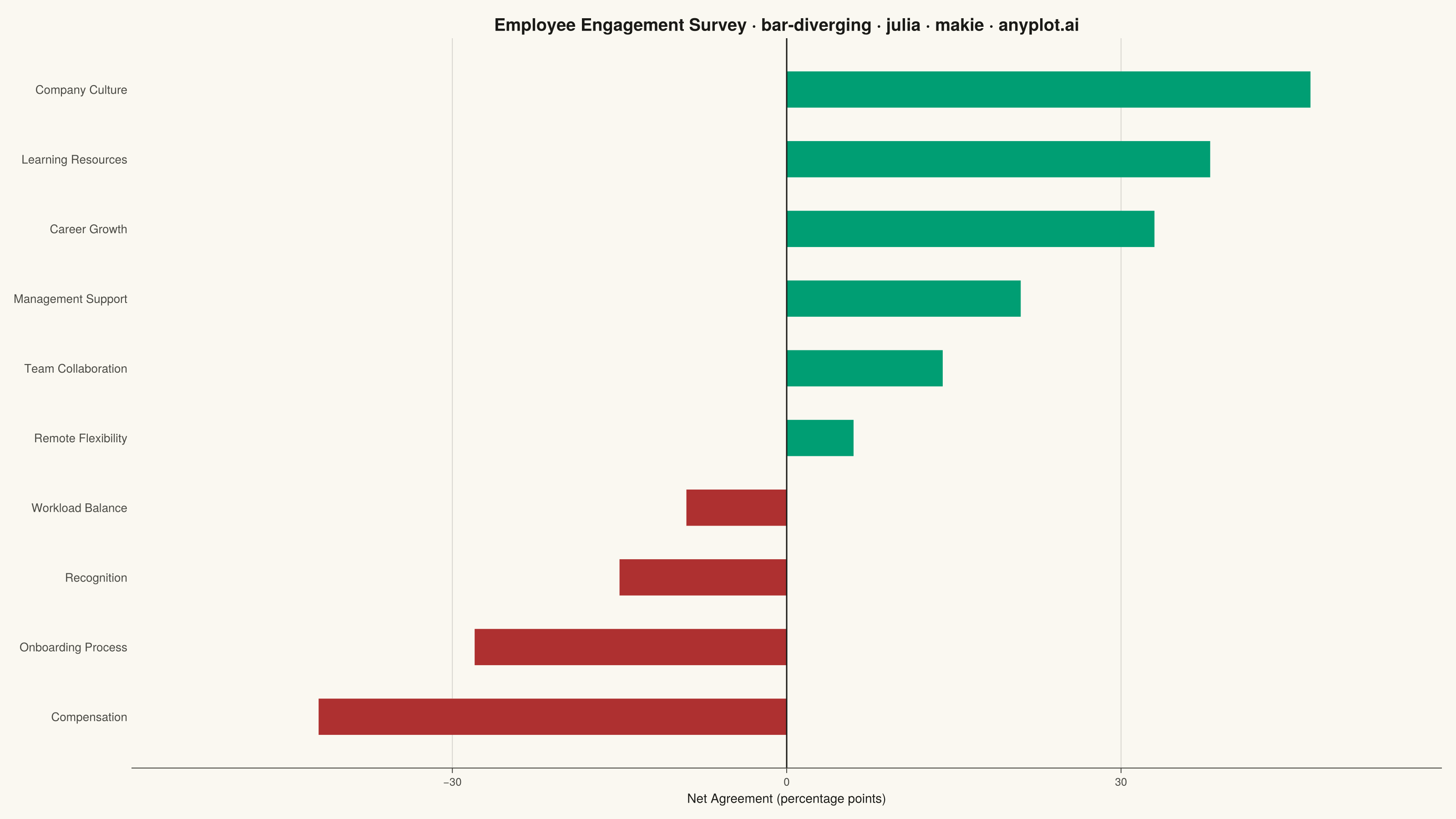
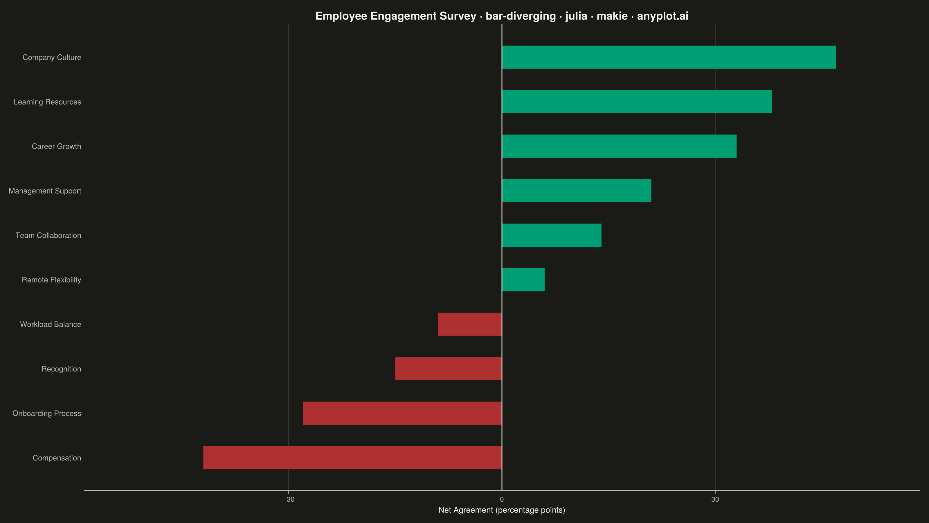
A diverging bar chart displays bars extending in opposite directions from a central baseline, typically at zero. This visualization is ideal for comparing positive and negative values, showing responses above and below a neutral point, or contrasting opposing categories. Different colors distinguish positive from negative values, making it easy to identify magnitude and direction at a glance.
# anyplot.ai
# bar-diverging: Diverging Bar Chart
# Library: makie 0.21.9 | Julia 1.11.9
# Quality: 91/100 | Created: 2026-08-18

using CairoMakie
using Colors

# --- Theme tokens ------------------------------------------------------------
const THEME    = get(ENV, "ANYPLOT_THEME", "light")
const PAGE_BG  = THEME == "light" ? colorant"#FAF8F1" : colorant"#1A1A17"
const INK      = THEME == "light" ? colorant"#1A1A17" : colorant"#F0EFE8"
const INK_SOFT = THEME == "light" ? colorant"#4A4A44" : colorant"#B8B7B0"

# Imprint palette — semantic exception: positive/negative sentiment maps to
# brand green (position 1) and matte red (position 5, the bad/loss anchor).
const POSITIVE = colorant"#009E73"
const NEGATIVE = colorant"#AE3030"

# --- Data ---------------------------------------------------------------------
categories = [
    "Compensation", "Onboarding Process", "Recognition", "Workload Balance",
    "Remote Flexibility", "Team Collaboration", "Management Support",
    "Career Growth", "Learning Resources", "Company Culture",
]
net_agreement = [-42.0, -28.0, -15.0, -9.0, 6.0, 14.0, 21.0, 33.0, 38.0, 47.0]

order = sortperm(net_agreement)
categories = categories[order]
net_agreement = net_agreement[order]
bar_colors = [v >= 0 ? POSITIVE : NEGATIVE for v in net_agreement]

# --- Plot -----------------------------------------------------------------
fig = Figure(
    size            = (1600, 900),
    fontsize        = 14,
    backgroundcolor = PAGE_BG,
)

ax = Axis(
    fig[1, 1];
    title              = "Employee Engagement Survey · bar-diverging · julia · makie · anyplot.ai",
    titlesize          = 19,
    titlecolor         = INK,
    xlabel             = "Net Agreement (percentage points)",
    xlabelsize         = 14,
    xlabelcolor        = INK,
    xticklabelsize     = 12,
    yticklabelsize     = 13,
    xticklabelcolor    = INK_SOFT,
    yticklabelcolor    = INK_SOFT,
    xtickcolor         = INK_SOFT,
    ytickcolor         = INK_SOFT,
    backgroundcolor    = PAGE_BG,
    topspinevisible    = false,
    rightspinevisible  = false,
    leftspinevisible   = false,
    bottomspinecolor   = INK_SOFT,
    xgridcolor         = RGBAf(INK.r, INK.g, INK.b, 0.15),
    ygridvisible       = false,
    yticks             = (1:length(categories), categories),
    yticksvisible      = false,
)

barplot!(
    ax, 1:length(categories), net_agreement;
    direction = :x, color = bar_colors, width = 0.65,
)
vlines!(ax, [0.0]; color = INK, linewidth = 1.5)

span = maximum(abs.(net_agreement)) * 1.25
xlims!(ax, -span, span)

# --- Save -------------------------------------------------------------------
save("plot-$(THEME).png", fig; px_per_unit = 2)
Runnable source as JSON, for any HTTP client: https://api.anyplot.ai/specs/bar-diverging/makie/code. Any spec id and library id listed in llms-full.txt fit the same URL shape; every URL below is complete and callable.
{
  "spec_id": "bar-diverging",
  "language": "julia",
  "library": "makie",
  "page": "https://anyplot.ai/bar-diverging/julia/makie",
  "hub": "https://anyplot.ai/bar-diverging",
  "code_json": "https://api.anyplot.ai/specs/bar-diverging/makie/code",
  "spec_json": "https://api.anyplot.ai/specs/bar-diverging",
  "render_light_png": "https://storage.googleapis.com/anyplot-images/plots/bar-diverging/julia/makie/plot-light.png",
  "render_dark_png": "https://storage.googleapis.com/anyplot-images/plots/bar-diverging/julia/makie/plot-dark.png",
  "quality_score": 91.0,
  "license": "MIT",
  "guide": "https://anyplot.ai/llms.txt"
}
Part of Diverging Bar Chart on anyplot.ai.