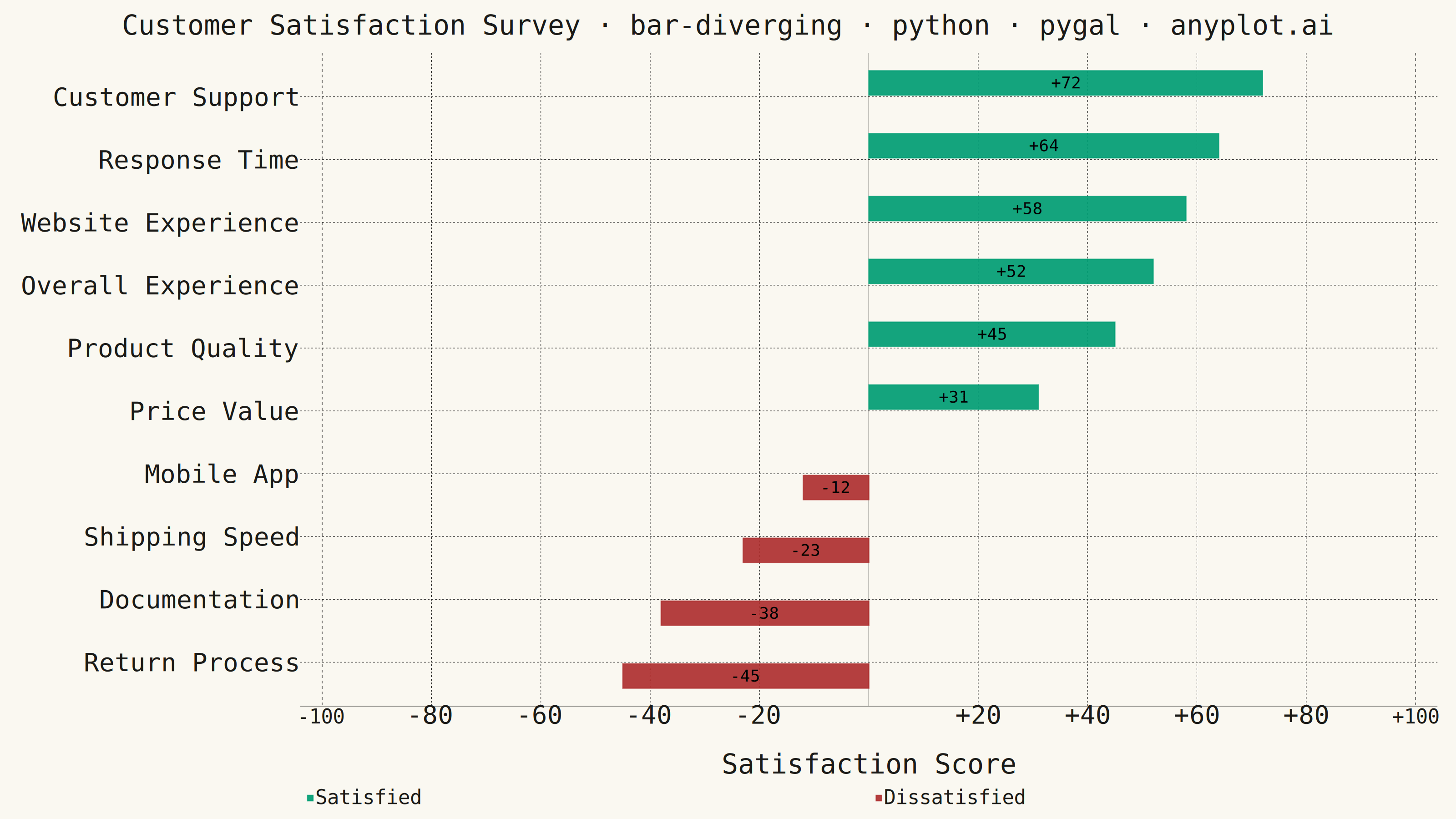
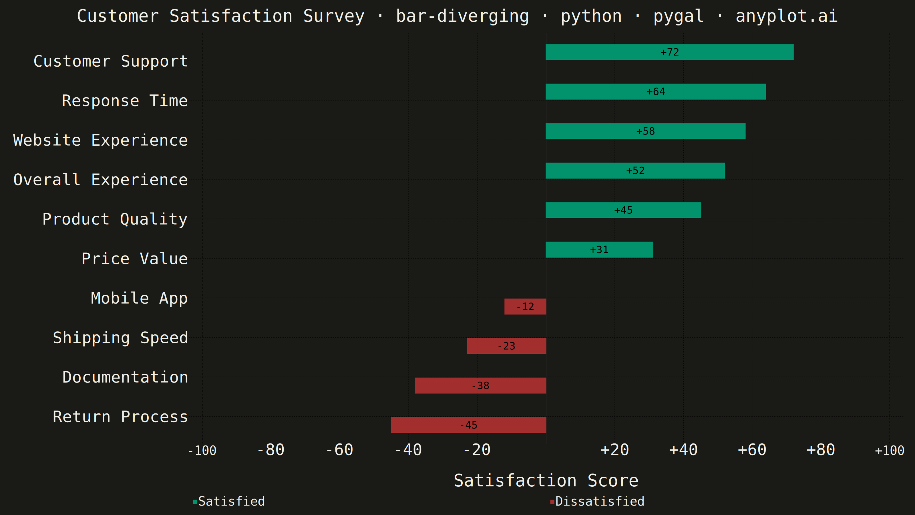
A diverging bar chart displays bars extending in opposite directions from a central baseline, typically at zero. This visualization is ideal for comparing positive and negative values, showing responses above and below a neutral point, or contrasting opposing categories. Different colors distinguish positive from negative values, making it easy to identify magnitude and direction at a glance.
""" anyplot.ai
bar-diverging: Diverging Bar Chart
Library: pygal 3.1.3 | Python 3.13.15
Quality: 91/100 | Updated: 2026-08-18
"""

import os
import sys


if sys.path[0] == os.path.dirname(os.path.abspath(__file__)):
    sys.path.pop(0)

import pygal
from pygal.style import Style


# Theme tokens from prompts/default-style-guide.md
THEME = os.getenv("ANYPLOT_THEME", "light")
PAGE_BG = "#FAF8F1" if THEME == "light" else "#1A1A17"
INK = "#1A1A17" if THEME == "light" else "#F0EFE8"
INK_SOFT = "#4A4A44" if THEME == "light" else "#B8B7B0"
INK_MUTED = "#6B6A63" if THEME == "light" else "#A8A79F"

# Imprint palette: brand green for positive, matte-red semantic anchor for negative
IMPRINT = ("#009E73", "#AE3030")

# Data - Customer satisfaction survey scores by department
# Positive = satisfied, Negative = dissatisfied (scale -100 to +100)
departments = [
    "Customer Support",
    "Product Quality",
    "Shipping Speed",
    "Website Experience",
    "Return Process",
    "Price Value",
    "Mobile App",
    "Documentation",
    "Response Time",
    "Overall Experience",
]

scores = [72, 45, -23, 58, -45, 31, -12, -38, 64, 52]

# Sort by value for better pattern recognition
sorted_data = sorted(zip(departments, scores, strict=True), key=lambda x: x[1])
sorted_departments = [d[0] for d in sorted_data]
sorted_scores = [d[1] for d in sorted_data]

# Custom style with theme-adaptive colors and proper font sizing.
# Title is longer than the 67-char baseline, so its size is scaled down
# proportionally (see prompts/plot-generator.md "Title fontsize must scale").
custom_style = Style(
    background=PAGE_BG,
    plot_background=PAGE_BG,
    foreground=INK,
    foreground_strong=INK,
    foreground_subtle=INK_MUTED,
    colors=IMPRINT,
    opacity=".92",
    opacity_hover="1",
    title_font_size=60,
    label_font_size=56,
    major_label_font_size=44,
    legend_font_size=44,
    value_font_size=36,
    value_label_font_size=36,
    tooltip_font_size=32,
    stroke_width=2.5,
)

# Create horizontal bar chart (better for long labels)
chart = pygal.HorizontalBar(
    width=3200,
    height=1800,
    style=custom_style,
    title="Customer Satisfaction Survey · bar-diverging · python · pygal · anyplot.ai",
    x_title="Satisfaction Score",
    show_legend=True,
    legend_at_bottom=True,
    legend_at_bottom_columns=2,
    show_x_guides=True,
    show_y_guides=False,
    print_values=True,
    print_values_position="center",
    value_formatter=lambda x: f"{x:+.0f}" if x else "",
    range=(-100, 100),
    margin=40,
    spacing=16,
    truncate_label=-1,
)

# Add data with color based on positive/negative
# Separate positive and negative for legend clarity
positive_scores = [s if s >= 0 else None for s in sorted_scores]
negative_scores = [s if s < 0 else None for s in sorted_scores]

chart.add("Satisfied", positive_scores)
chart.add("Dissatisfied", negative_scores)

# Set category labels
chart.x_labels = sorted_departments

# Save outputs with theme-suffixed filenames
chart.render_to_png(f"plot-{THEME}.png")
with open(f"plot-{THEME}.html", "wb") as f:
    f.write(chart.render())
Runnable source as JSON, for any HTTP client: https://api.anyplot.ai/specs/bar-diverging/pygal/code. Any spec id and library id listed in llms-full.txt fit the same URL shape; every URL below is complete and callable.
{
  "spec_id": "bar-diverging",
  "language": "python",
  "library": "pygal",
  "page": "https://anyplot.ai/bar-diverging/python/pygal",
  "hub": "https://anyplot.ai/bar-diverging",
  "code_json": "https://api.anyplot.ai/specs/bar-diverging/pygal/code",
  "spec_json": "https://api.anyplot.ai/specs/bar-diverging",
  "render_light_png": "https://storage.googleapis.com/anyplot-images/plots/bar-diverging/python/pygal/plot-light.png",
  "render_dark_png": "https://storage.googleapis.com/anyplot-images/plots/bar-diverging/python/pygal/plot-dark.png",
  "interactive_light_html": "https://storage.googleapis.com/anyplot-images/plots/bar-diverging/python/pygal/plot-light.html",
  "interactive_dark_html": "https://storage.googleapis.com/anyplot-images/plots/bar-diverging/python/pygal/plot-dark.html",
  "quality_score": 91.0,
  "license": "MIT",
  "guide": "https://anyplot.ai/llms.txt"
}
Part of Diverging Bar Chart on anyplot.ai.