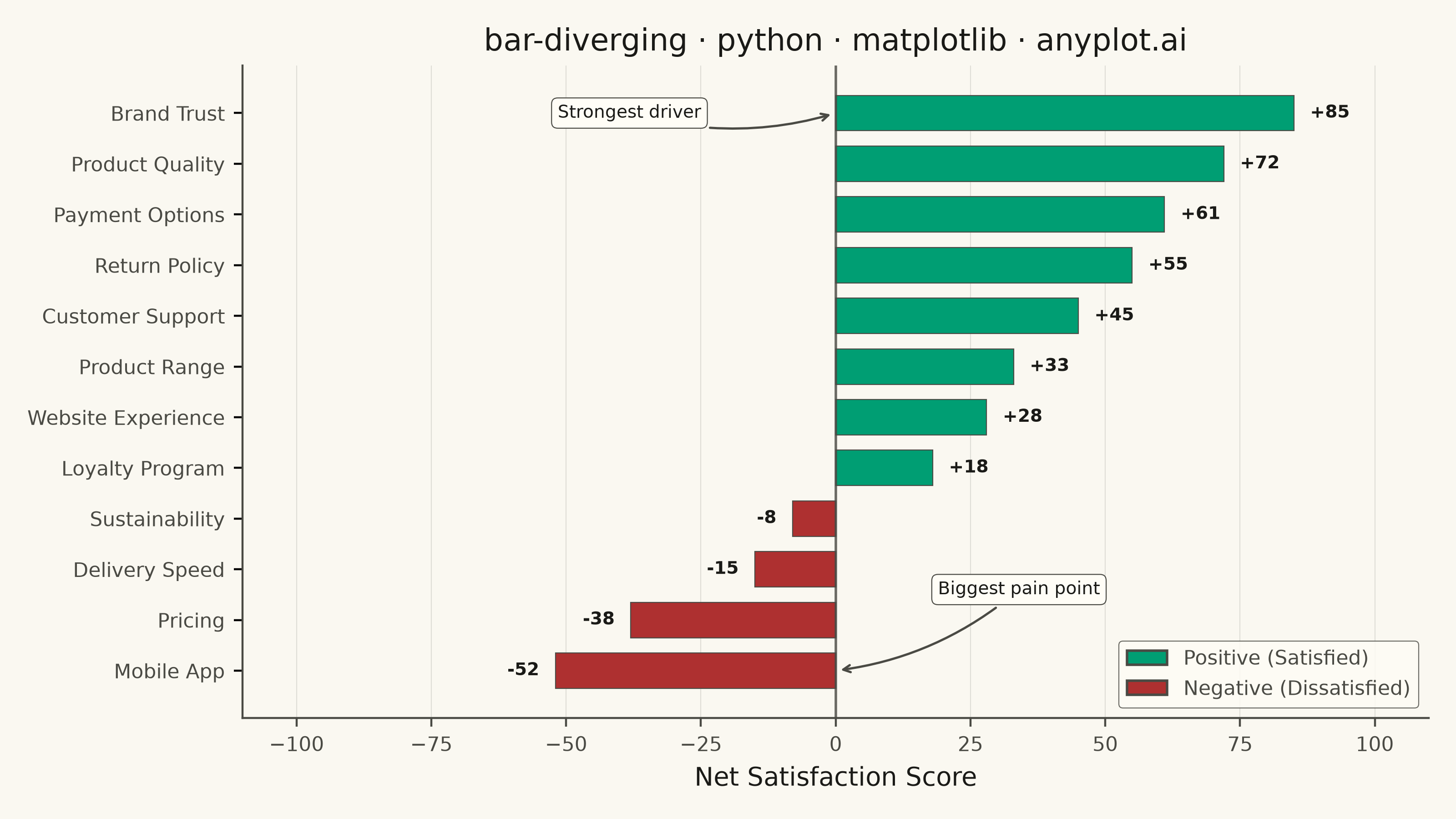
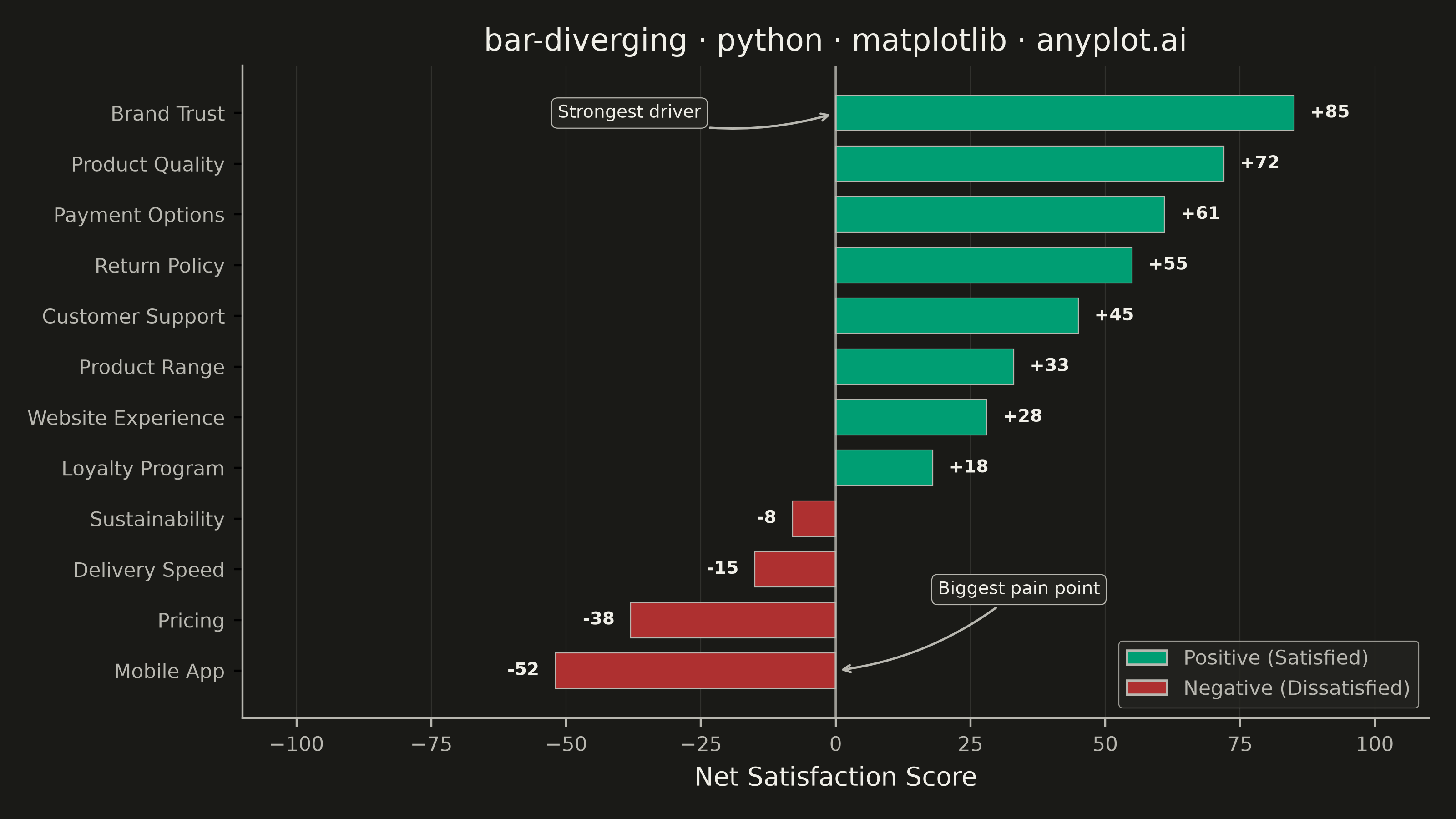
A diverging bar chart displays bars extending in opposite directions from a central baseline, typically at zero. This visualization is ideal for comparing positive and negative values, showing responses above and below a neutral point, or contrasting opposing categories. Different colors distinguish positive from negative values, making it easy to identify magnitude and direction at a glance.
""" anyplot.ai
bar-diverging: Diverging Bar Chart
Library: matplotlib 3.11.1 | Python 3.13.15
Quality: 93/100 | Updated: 2026-08-18
"""

import os

import matplotlib.pyplot as plt
import numpy as np
from matplotlib.patches import Patch


# Theme tokens
THEME = os.getenv("ANYPLOT_THEME", "light")
PAGE_BG = "#FAF8F1" if THEME == "light" else "#1A1A17"
ELEVATED_BG = "#FFFDF6" if THEME == "light" else "#242420"
INK = "#1A1A17" if THEME == "light" else "#F0EFE8"
INK_SOFT = "#4A4A44" if THEME == "light" else "#B8B7B0"

# Data - Product satisfaction survey scores (-100 to +100)
categories = [
    "Customer Support",
    "Product Quality",
    "Pricing",
    "Website Experience",
    "Delivery Speed",
    "Return Policy",
    "Mobile App",
    "Product Range",
    "Payment Options",
    "Brand Trust",
    "Sustainability",
    "Loyalty Program",
]

# Net satisfaction scores (positive = satisfied, negative = dissatisfied)
values = np.array([45, 72, -38, 28, -15, 55, -52, 33, 61, 85, -8, 18])

# Sort by value for better pattern recognition
sorted_indices = np.argsort(values)
categories_sorted = [categories[i] for i in sorted_indices]
values_sorted = values[sorted_indices]

# Imprint palette: brand green for positive (sentiment positive -> green),
# matte-red semantic anchor for negative (sentiment negative -> red)
colors = ["#009E73" if v >= 0 else "#AE3030" for v in values_sorted]

# Plot
fig, ax = plt.subplots(figsize=(8, 4.5), dpi=400, facecolor=PAGE_BG)
ax.set_facecolor(PAGE_BG)

# Create horizontal bars
y_pos = np.arange(len(categories_sorted))
ax.barh(y_pos, values_sorted, color=colors, height=0.7, edgecolor=INK_SOFT, linewidth=0.4)

# Add vertical line at zero
ax.axvline(x=0, color=INK_SOFT, linewidth=1, alpha=0.8)

# Styling
ax.set_yticks(y_pos)
ax.set_yticklabels(categories_sorted, fontsize=8, color=INK_SOFT)
ax.set_xlabel("Net Satisfaction Score", fontsize=10, color=INK)
ax.set_title("bar-diverging · python · matplotlib · anyplot.ai", fontsize=12, fontweight="medium", color=INK)
ax.tick_params(axis="x", labelsize=8, colors=INK_SOFT)

# Grid on x-axis only, subtle
ax.xaxis.grid(True, alpha=0.15, linewidth=0.4, color=INK_SOFT)
ax.set_axisbelow(True)

# Add value labels at the end of each bar
for val, y in zip(values_sorted, y_pos, strict=True):
    offset = 3 if val >= 0 else -3
    ha = "left" if val >= 0 else "right"
    ax.text(val + offset, y, f"{val:+d}", va="center", ha=ha, fontsize=7, color=INK, fontweight="bold")

# Set x-axis limits with padding
max_abs = max(abs(values_sorted.min()), abs(values_sorted.max()))
ax.set_xlim(-max_abs - 25, max_abs + 25)

# Remove top and right spines for cleaner look
ax.spines["top"].set_visible(False)
ax.spines["right"].set_visible(False)
ax.spines["left"].set_color(INK_SOFT)
ax.spines["bottom"].set_color(INK_SOFT)

# Callout annotations on the extremes — a matplotlib-distinctive touch (curved
# connectionstyle arrow + themed bbox) that raises the chart's storytelling
# beyond the bare sort-and-color-split baseline.
best_idx = int(np.argmax(values_sorted))
worst_idx = int(np.argmin(values_sorted))

ax.annotate(
    "Strongest driver",
    xy=(0, y_pos[best_idx]),
    xytext=(-max_abs * 0.45, y_pos[best_idx]),
    fontsize=7,
    color=INK,
    ha="center",
    va="center",
    arrowprops={"arrowstyle": "->", "connectionstyle": "arc3,rad=0.15", "color": INK_SOFT, "linewidth": 0.9},
    bbox={"facecolor": ELEVATED_BG, "edgecolor": INK_SOFT, "linewidth": 0.4, "boxstyle": "round,pad=0.35"},
)

ax.annotate(
    "Biggest pain point",
    xy=(0, y_pos[worst_idx]),
    xytext=(max_abs * 0.4, y_pos[worst_idx] + 1.6),
    fontsize=7,
    color=INK,
    ha="center",
    va="center",
    arrowprops={"arrowstyle": "->", "connectionstyle": "arc3,rad=-0.15", "color": INK_SOFT, "linewidth": 0.9},
    bbox={"facecolor": ELEVATED_BG, "edgecolor": INK_SOFT, "linewidth": 0.4, "boxstyle": "round,pad=0.35"},
)

# Add legend
legend_elements = [
    Patch(facecolor="#009E73", edgecolor=INK_SOFT, label="Positive (Satisfied)"),
    Patch(facecolor="#AE3030", edgecolor=INK_SOFT, label="Negative (Dissatisfied)"),
]
leg = ax.legend(handles=legend_elements, loc="lower right", fontsize=8)
if leg:
    leg.get_frame().set_facecolor(ELEVATED_BG)
    leg.get_frame().set_edgecolor(INK_SOFT)
    leg.get_frame().set_linewidth(0.4)
    plt.setp(leg.get_texts(), color=INK_SOFT)

plt.tight_layout()
plt.savefig(f"plot-{THEME}.png", dpi=400, facecolor=PAGE_BG)
Runnable source as JSON, for any HTTP client: https://api.anyplot.ai/specs/bar-diverging/matplotlib/code. Any spec id and library id listed in llms-full.txt fit the same URL shape; every URL below is complete and callable.
{
  "spec_id": "bar-diverging",
  "language": "python",
  "library": "matplotlib",
  "page": "https://anyplot.ai/bar-diverging/python/matplotlib",
  "hub": "https://anyplot.ai/bar-diverging",
  "code_json": "https://api.anyplot.ai/specs/bar-diverging/matplotlib/code",
  "spec_json": "https://api.anyplot.ai/specs/bar-diverging",
  "render_light_png": "https://storage.googleapis.com/anyplot-images/plots/bar-diverging/python/matplotlib/plot-light.png",
  "render_dark_png": "https://storage.googleapis.com/anyplot-images/plots/bar-diverging/python/matplotlib/plot-dark.png",
  "quality_score": 93.0,
  "license": "MIT",
  "guide": "https://anyplot.ai/llms.txt"
}
Part of Diverging Bar Chart on anyplot.ai.