The same plot in 14 other libraries — JavaScript: Chart.js, D3.js, Highcharts, MUI X Charts; Python: Altair, Bokeh, lets-plot, Matplotlib, Plotly, plotnine, Pygal, Seaborn; R: ggplot2; Julia: Makie.jl. Compare all 15 side by side: Diverging Bar Chart in Python, R, Julia and JavaScript.
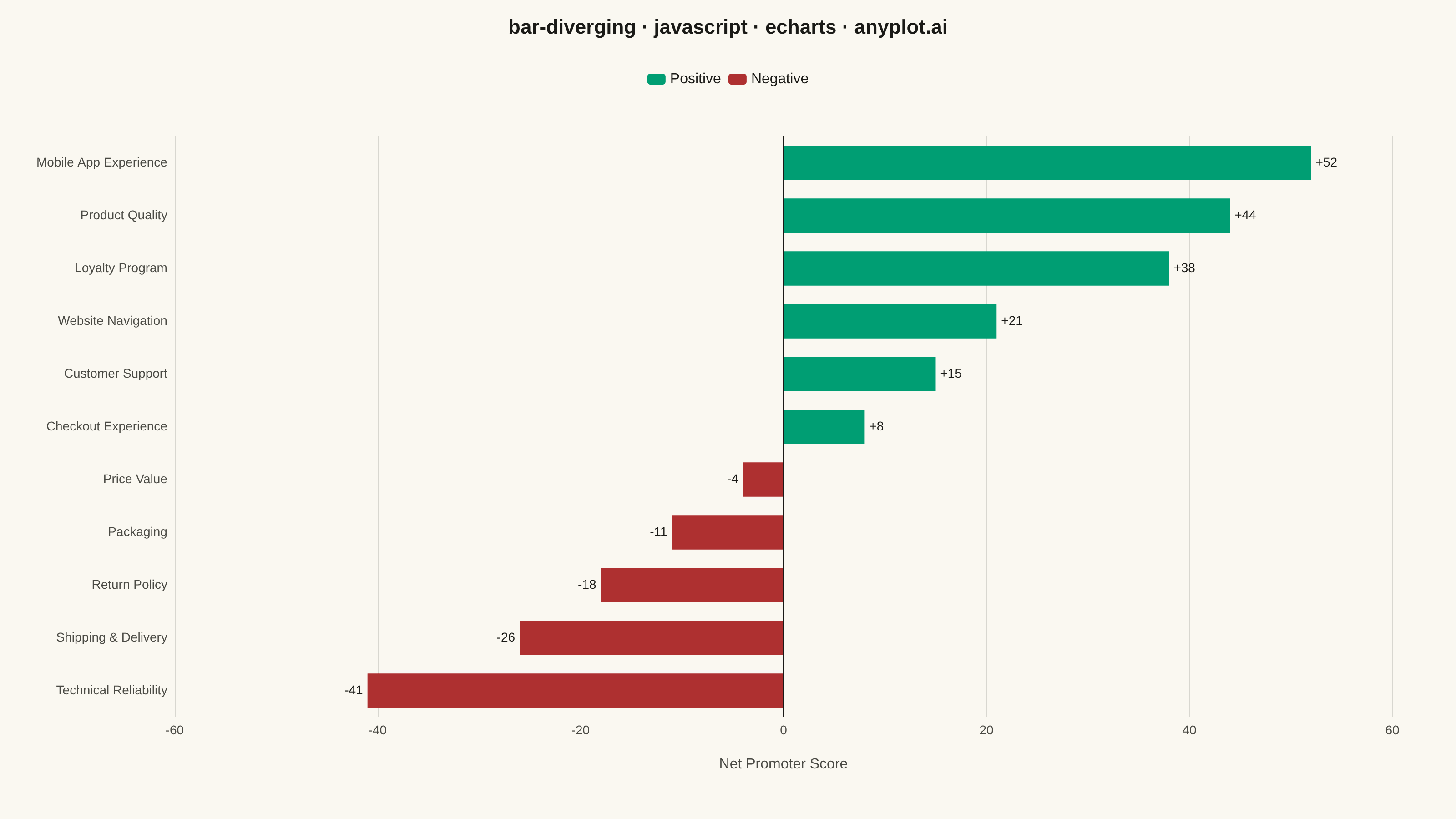
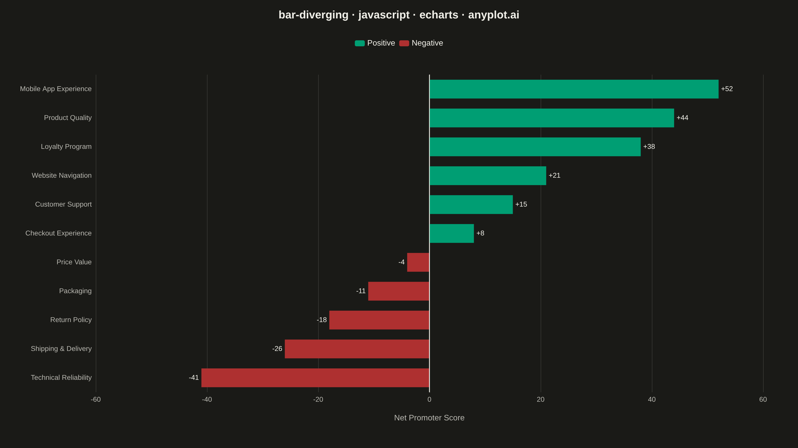
A diverging bar chart displays bars extending in opposite directions from a central baseline, typically at zero. This visualization is ideal for comparing positive and negative values, showing responses above and below a neutral point, or contrasting opposing categories. Different colors distinguish positive from negative values, making it easy to identify magnitude and direction at a glance.
// anyplot.ai
// bar-diverging: Diverging Bar Chart
// Library: echarts 6.1.0 | JavaScript 22.23.2
// Quality: 92/100 | Created: 2026-08-18

const t = window.ANYPLOT_TOKENS;

// --- Data (in-memory, deterministic) ----------------------------------------
// Net Promoter Score by product feature, sorted ascending so the highest
// score renders at the top of the category axis (echarts draws category
// index 0 at the bottom).
const features = [
  "Technical Reliability",
  "Shipping & Delivery",
  "Return Policy",
  "Packaging",
  "Price Value",
  "Checkout Experience",
  "Customer Support",
  "Website Navigation",
  "Loyalty Program",
  "Product Quality",
  "Mobile App Experience",
];
const scores = [-41, -26, -18, -11, -4, 8, 15, 21, 38, 44, 52];

const positiveData = scores.map((v) => (v >= 0 ? v : null));
const negativeData = scores.map((v) => (v < 0 ? v : null));

// --- Init ---------------------------------------------------------------
const chart = echarts.init(document.getElementById("container"));

// --- Option -----------------------------------------------------------------
chart.setOption({
  animation: false,
  backgroundColor: "transparent",
  title: {
    text: "bar-diverging · javascript · echarts · anyplot.ai",
    left: "center",
    textStyle: { color: t.ink, fontSize: 22 },
  },
  legend: {
    data: ["Positive", "Negative"],
    top: 74,
    left: "center",
    textStyle: { color: t.ink, fontSize: 16 },
    itemWidth: 20,
    itemHeight: 12,
  },
  grid: { left: 40, right: 70, top: 150, bottom: 90, containLabel: true },
  xAxis: {
    type: "value",
    min: -60,
    max: 60,
    name: "Net Promoter Score",
    nameLocation: "middle",
    nameGap: 44,
    nameTextStyle: { color: t.inkSoft, fontSize: 16 },
    axisLabel: { color: t.inkSoft, fontSize: 14 },
    axisLine: { lineStyle: { color: t.inkSoft } },
    splitLine: { lineStyle: { color: t.grid } },
  },
  yAxis: {
    type: "category",
    data: features,
    axisLabel: { color: t.inkSoft, fontSize: 14 },
    axisLine: { lineStyle: { color: t.inkSoft } },
    splitLine: { show: false },
  },
  series: [
    {
      name: "Positive",
      type: "bar",
      stack: "score",
      barCategoryGap: "35%",
      itemStyle: { color: t.palette[0] },
      label: {
        show: true,
        position: "right",
        color: t.ink,
        fontSize: 14,
        formatter: (params) => `+${params.value}`,
      },
      markLine: {
        symbol: "none",
        silent: true,
        animation: false,
        lineStyle: { color: t.ink, width: 1.5, type: "solid" },
        label: { show: false },
        data: [{ xAxis: 0 }],
      },
      data: positiveData,
    },
    {
      name: "Negative",
      type: "bar",
      stack: "score",
      itemStyle: { color: t.palette[4] },
      label: {
        show: true,
        position: "left",
        color: t.ink,
        fontSize: 14,
        formatter: (params) => `${params.value}`,
      },
      data: negativeData,
    },
  ],
});
Runnable source as JSON, for any HTTP client: https://api.anyplot.ai/specs/bar-diverging/echarts/code. Any spec id and library id listed in llms-full.txt fit the same URL shape; every URL below is complete and callable.
{
  "spec_id": "bar-diverging",
  "language": "javascript",
  "library": "echarts",
  "page": "https://anyplot.ai/bar-diverging/javascript/echarts",
  "hub": "https://anyplot.ai/bar-diverging",
  "code_json": "https://api.anyplot.ai/specs/bar-diverging/echarts/code",
  "spec_json": "https://api.anyplot.ai/specs/bar-diverging",
  "render_light_png": "https://storage.googleapis.com/anyplot-images/plots/bar-diverging/javascript/echarts/plot-light.png",
  "render_dark_png": "https://storage.googleapis.com/anyplot-images/plots/bar-diverging/javascript/echarts/plot-dark.png",
  "interactive_light_html": "https://storage.googleapis.com/anyplot-images/plots/bar-diverging/javascript/echarts/plot-light.html",
  "interactive_dark_html": "https://storage.googleapis.com/anyplot-images/plots/bar-diverging/javascript/echarts/plot-dark.html",
  "quality_score": 92.0,
  "license": "MIT",
  "guide": "https://anyplot.ai/llms.txt"
}
Part of Diverging Bar Chart on anyplot.ai.