The same plot in 14 other libraries — Python: Altair, Bokeh, lets-plot, Matplotlib, Plotly, plotnine, Pygal, Seaborn; Julia: Makie.jl; JavaScript: Chart.js, D3.js, Apache ECharts, Highcharts, MUI X Charts. Compare all 15 side by side: Diverging Bar Chart in Python, R, Julia and JavaScript.
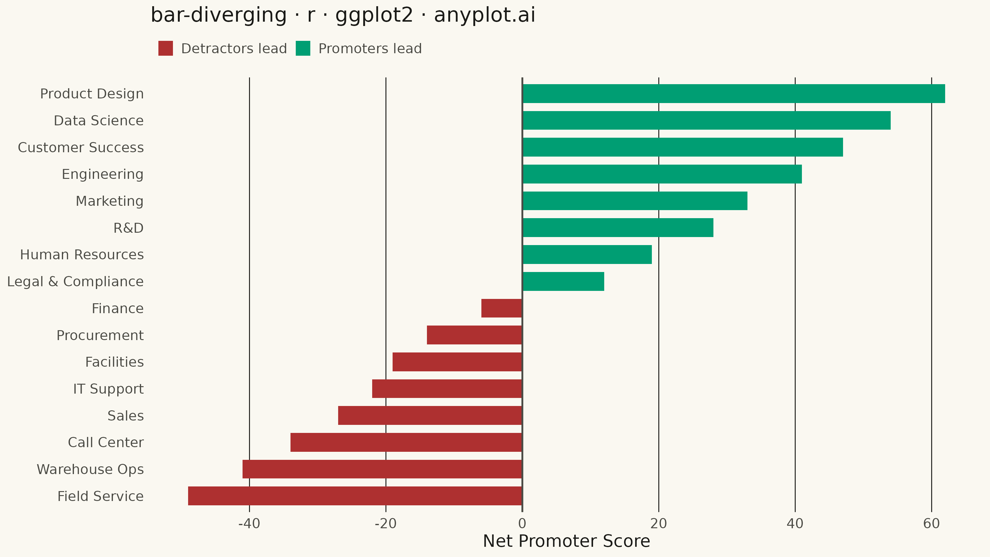
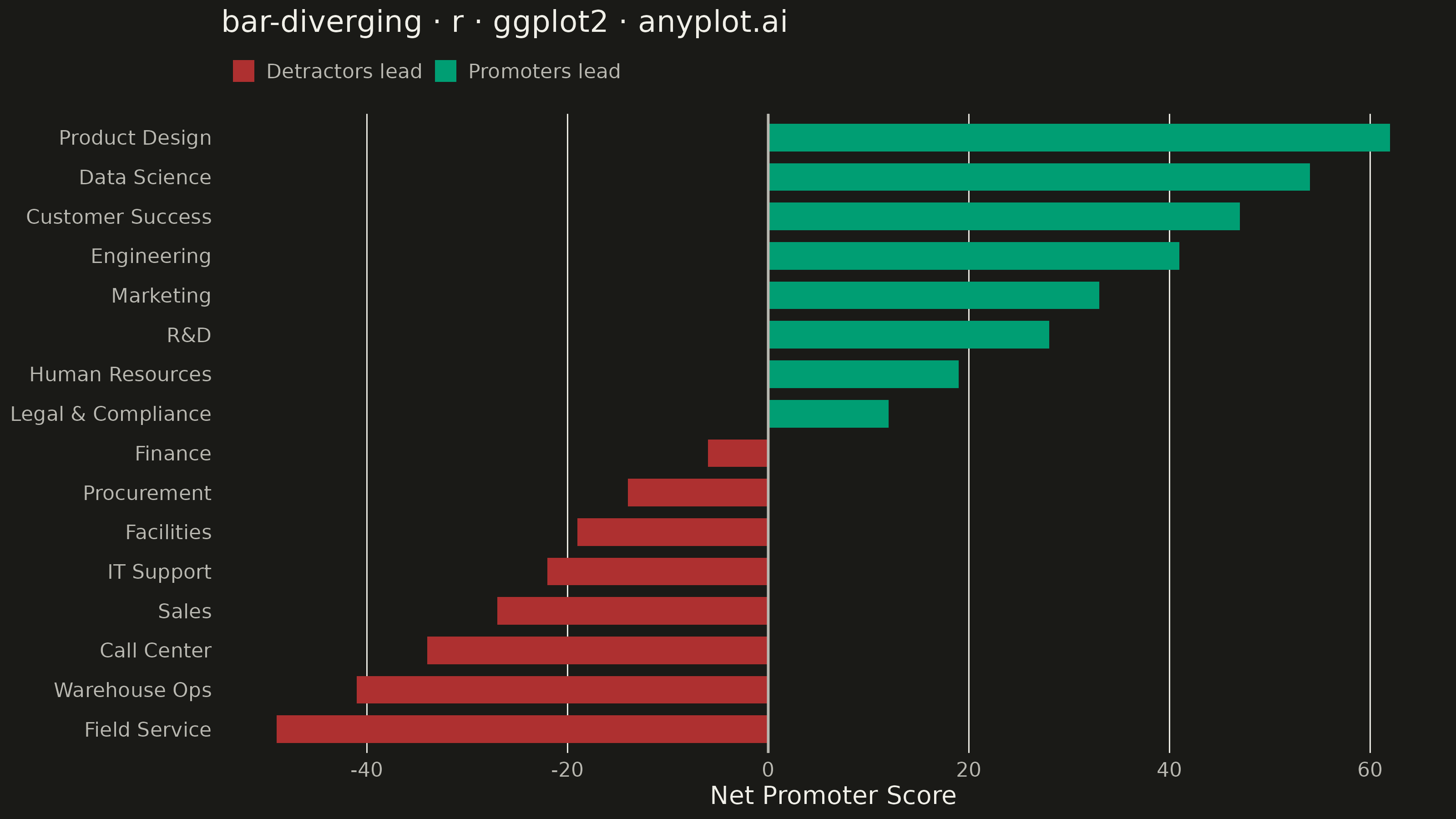
A diverging bar chart displays bars extending in opposite directions from a central baseline, typically at zero. This visualization is ideal for comparing positive and negative values, showing responses above and below a neutral point, or contrasting opposing categories. Different colors distinguish positive from negative values, making it easy to identify magnitude and direction at a glance.
#' anyplot.ai
#' bar-diverging: Diverging Bar Chart
#' Library: ggplot2 3.5.1 | R 4.4.1
#' Quality: 86/100 | Created: 2026-08-18

library(ggplot2)
library(dplyr)
library(ragg)

set.seed(42)

# --- Theme tokens -------------------------------------------------------
THEME <- Sys.getenv("ANYPLOT_THEME", "light")
PAGE_BG <- if (THEME == "light") "#FAF8F1" else "#1A1A17"
INK <- if (THEME == "light") "#1A1A17" else "#F0EFE8"
INK_SOFT <- if (THEME == "light") "#4A4A44" else "#B8B7B0"
IMPRINT_PALETTE <- c(
  "#009E73", "#C475FD", "#4467A3", "#BD8233",
  "#AE3030", "#2ABCCD", "#954477", "#99B314"
)

# --- Data -----------------------------------------------------------------
# Employee engagement survey: net promoter score per department
# (% promoters - % detractors), sentiment polarity -> green/red semantic exception
df <- tibble::tibble(
  department = c(
    "Product Design", "Data Science", "Customer Success", "Engineering",
    "Marketing", "R&D", "Human Resources", "Legal & Compliance",
    "Finance", "Procurement", "Facilities", "IT Support",
    "Sales", "Call Center", "Warehouse Ops", "Field Service"
  ),
  nps = c(
    62, 54, 47, 41, 33, 28, 19, 12,
    -6, -14, -19, -22, -27, -34, -41, -49
  )
) %>%
  mutate(
    sentiment = ifelse(nps >= 0, "Promoters lead", "Detractors lead"),
    department = factor(department, levels = department[order(nps)])
  )

# Direct-label only the two extremes (best/worst department) so the funnel's
# endpoints carry their exact score without cluttering the 14 bars in between.
top_row <- df[which.max(df$nps), ]
bottom_row <- df[which.min(df$nps), ]

# --- Plot -------------------------------------------------------------------
p <- ggplot(df, aes(x = nps, y = department, fill = sentiment)) +
  geom_col(width = 0.7) +
  geom_vline(xintercept = 0, color = INK_SOFT, linewidth = 0.5) +
  annotate(
    "text",
    x = top_row$nps, y = top_row$department,
    label = sprintf("%+d", top_row$nps), hjust = -0.25,
    size = 3, color = INK, fontface = "bold"
  ) +
  annotate(
    "text",
    x = bottom_row$nps, y = bottom_row$department,
    label = sprintf("%+d", bottom_row$nps), hjust = 1.25,
    size = 3, color = INK, fontface = "bold"
  ) +
  scale_fill_manual(
    values = c(
      "Promoters lead" = IMPRINT_PALETTE[1],
      "Detractors lead" = IMPRINT_PALETTE[5]
    ),
    name = NULL
  ) +
  scale_x_continuous(breaks = seq(-60, 60, 20), expand = expansion(mult = 0.08)) +
  labs(
    title = "bar-diverging · r · ggplot2 · anyplot.ai",
    x = "Net Promoter Score",
    y = NULL
  ) +
  theme_minimal(base_size = 8) +
  theme(
    plot.background = element_rect(fill = PAGE_BG, color = PAGE_BG),
    panel.background = element_rect(fill = PAGE_BG, color = NA),
    panel.border = element_blank(),
    panel.grid.major.y = element_blank(),
    panel.grid.minor = element_blank(),
    panel.grid.major.x = element_line(color = INK, linewidth = 0.25),
    axis.title = element_text(color = INK, size = 10),
    axis.text = element_text(color = INK_SOFT, size = 8),
    axis.ticks = element_blank(),
    plot.title = element_text(color = INK, size = 12, face = "bold"),
    plot.title.position = "plot",
    plot.margin = margin(t = 10, r = 18, b = 8, l = 10),
    legend.position = "top",
    legend.justification = "left",
    legend.margin = margin(t = 2, b = 4),
    legend.spacing.x = unit(6, "pt"),
    legend.text = element_text(color = INK_SOFT, size = 8),
    legend.key.size = unit(10, "pt")
  )

# --- Save -------------------------------------------------------------------
ggsave(
  filename = sprintf("plot-%s.png", THEME),
  plot = p,
  device = ragg::agg_png,
  width = 8,
  height = 4.5,
  units = "in",
  dpi = 400
)
Runnable source as JSON, for any HTTP client: https://api.anyplot.ai/specs/bar-diverging/ggplot2/code. Any spec id and library id listed in llms-full.txt fit the same URL shape; every URL below is complete and callable.
{
  "spec_id": "bar-diverging",
  "language": "r",
  "library": "ggplot2",
  "page": "https://anyplot.ai/bar-diverging/r/ggplot2",
  "hub": "https://anyplot.ai/bar-diverging",
  "code_json": "https://api.anyplot.ai/specs/bar-diverging/ggplot2/code",
  "spec_json": "https://api.anyplot.ai/specs/bar-diverging",
  "render_light_png": "https://storage.googleapis.com/anyplot-images/plots/bar-diverging/r/ggplot2/plot-light.png",
  "render_dark_png": "https://storage.googleapis.com/anyplot-images/plots/bar-diverging/r/ggplot2/plot-dark.png",
  "quality_score": 86.0,
  "license": "MIT",
  "guide": "https://anyplot.ai/llms.txt"
}
Part of Diverging Bar Chart on anyplot.ai.