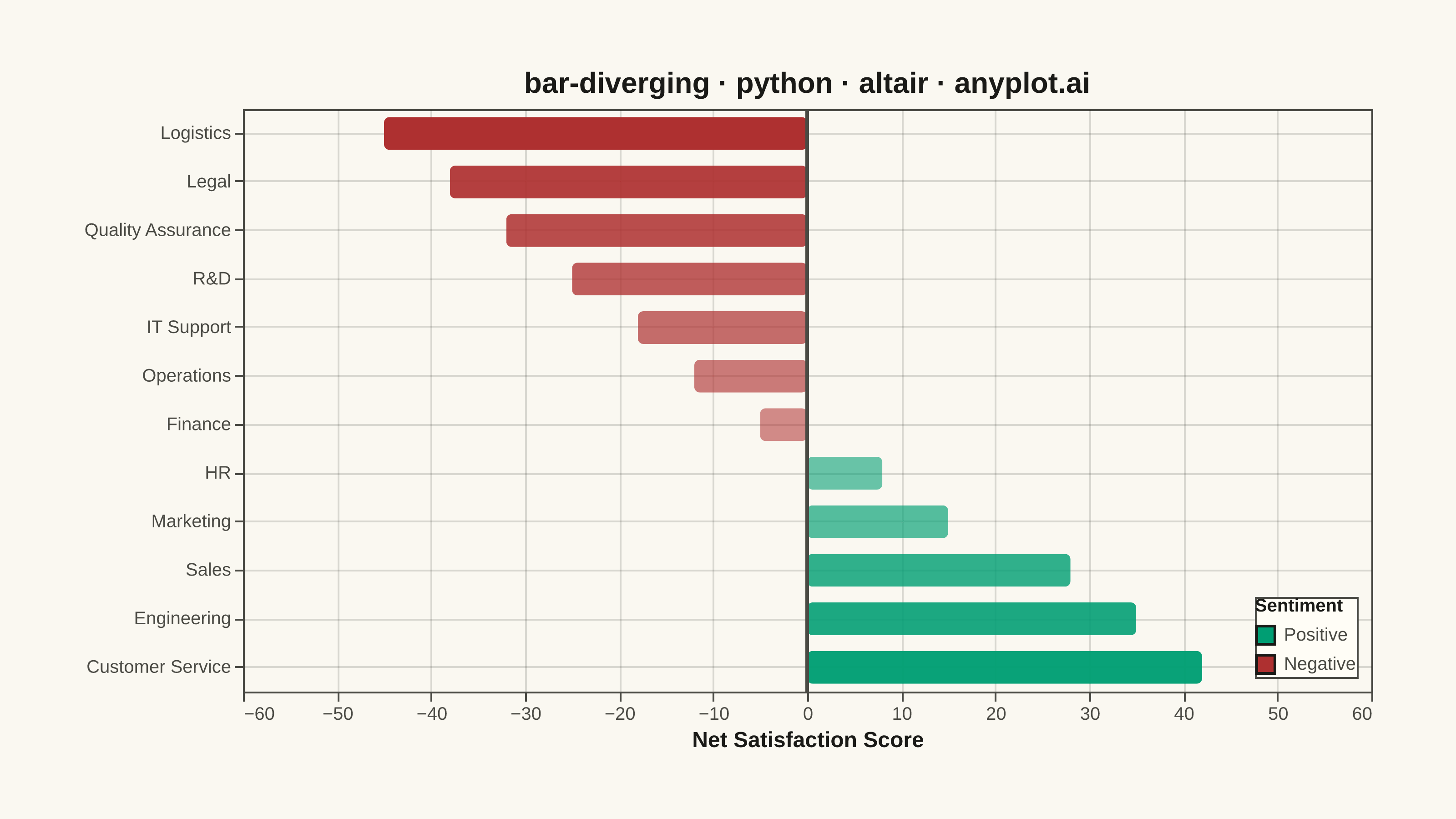
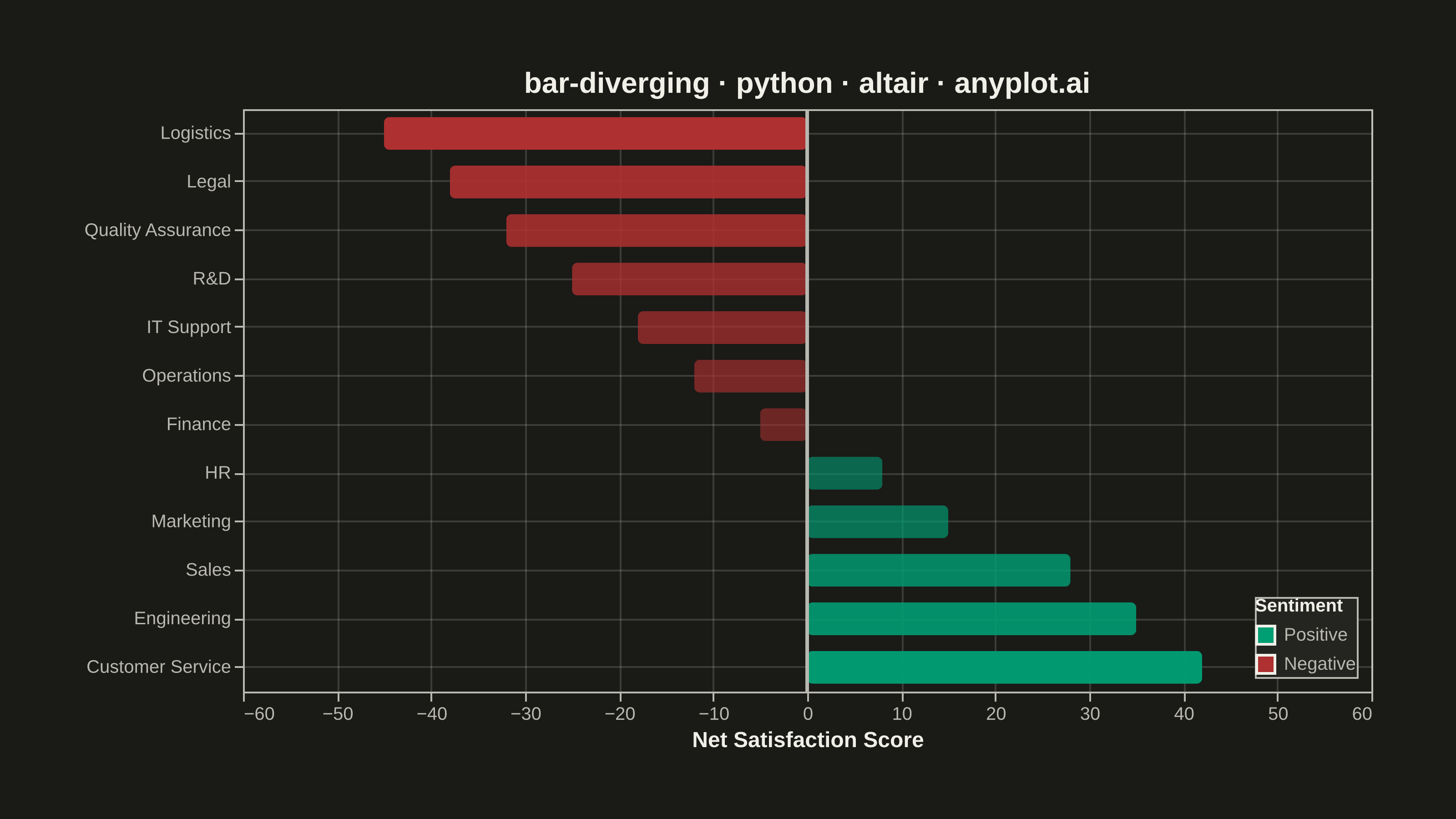
A diverging bar chart displays bars extending in opposite directions from a central baseline, typically at zero. This visualization is ideal for comparing positive and negative values, showing responses above and below a neutral point, or contrasting opposing categories. Different colors distinguish positive from negative values, making it easy to identify magnitude and direction at a glance.
""" anyplot.ai
bar-diverging: Diverging Bar Chart
Library: altair 6.2.2 | Python 3.13.15
Quality: 92/100 | Updated: 2026-08-18
"""

import os
import sys


# Prevent import collision with this script's filename
sys.path = [p for p in sys.path if not p.endswith("/python")]

import altair as alt
import pandas as pd
from PIL import Image


# Theme tokens
THEME = os.getenv("ANYPLOT_THEME", "light")
PAGE_BG = "#FAF8F1" if THEME == "light" else "#1A1A17"
ELEVATED_BG = "#FFFDF6" if THEME == "light" else "#242420"
INK = "#1A1A17" if THEME == "light" else "#F0EFE8"
INK_SOFT = "#4A4A44" if THEME == "light" else "#B8B7B0"

# Imprint palette — brand green for positive; the semantic red anchor (position
# 5) for negative, since sentiment polarity is a canonical red/green pairing
POSITIVE_COLOR = "#009E73"
NEGATIVE_COLOR = "#AE3030"

# Data - Customer satisfaction survey results by department
data = pd.DataFrame(
    {
        "department": [
            "Customer Service",
            "Engineering",
            "Sales",
            "Marketing",
            "HR",
            "Finance",
            "Operations",
            "IT Support",
            "R&D",
            "Quality Assurance",
            "Legal",
            "Logistics",
        ],
        "satisfaction_score": [42, 35, 28, 15, 8, -5, -12, -18, -25, -32, -38, -45],
    }
)
data["sentiment"] = data["satisfaction_score"].apply(lambda x: "Positive" if x >= 0 else "Negative")
data["magnitude"] = data["satisfaction_score"].abs()
data = data.sort_values("satisfaction_score", ascending=True)

# Hover selection highlights one bar at a time in the exported HTML (genuine
# altair/vega-lite interactivity, not a static-image simulation)
hover = alt.selection_point(on="pointerover", fields=["department"], empty=False)

# Opacity scales with magnitude so the most extreme scores — the story — pull
# the eye before the near-neutral ones
bars = (
    alt.Chart(data)
    .mark_bar(cornerRadius=3, height=18)
    .encode(
        x=alt.X(
            "satisfaction_score:Q",
            title="Net Satisfaction Score",
            axis=alt.Axis(titleFontSize=12, labelFontSize=10, tickCount=10),
            scale=alt.Scale(domain=[-60, 60]),
        ),
        y=alt.Y(
            "department:N",
            title=None,
            sort=alt.EncodingSortField(field="satisfaction_score", order="ascending"),
            axis=alt.Axis(labelFontSize=10),
        ),
        color=alt.Color(
            "sentiment:N",
            scale=alt.Scale(domain=["Positive", "Negative"], range=[POSITIVE_COLOR, NEGATIVE_COLOR]),
            legend=alt.Legend(title="Sentiment", titleFontSize=10, labelFontSize=10, orient="bottom-right", offset=8),
        ),
        opacity=alt.Opacity("magnitude:Q", scale=alt.Scale(range=[0.55, 1.0]), legend=None),
        stroke=alt.value(INK),
        strokeWidth=alt.condition(hover, alt.value(2.5), alt.value(0)),
        tooltip=[alt.Tooltip("department:N", title="Department"), alt.Tooltip("satisfaction_score:Q", title="Score")],
    )
    .add_params(hover)
)

# Zero baseline rule with theme-adaptive color
zero_line = alt.Chart(pd.DataFrame({"x": [0]})).mark_rule(color=INK_SOFT, strokeWidth=2).encode(x="x:Q")

# Combine chart and zero line with theme-adaptive styling
chart = (
    (bars + zero_line)
    .properties(
        width=620,
        height=320,
        padding={"left": 0, "right": 0, "top": 0, "bottom": 0},
        title=alt.Title("bar-diverging · python · altair · anyplot.ai", fontSize=16, anchor="middle"),
        background=PAGE_BG,
    )
    .configure_view(fill=PAGE_BG, stroke=INK_SOFT, continuousWidth=620, continuousHeight=320)
    .configure_axis(
        grid=True,
        gridOpacity=0.15,
        gridColor=INK,
        domainColor=INK_SOFT,
        tickColor=INK_SOFT,
        labelColor=INK_SOFT,
        titleColor=INK,
    )
    .configure_title(color=INK, anchor="middle")
    .configure_legend(fillColor=ELEVATED_BG, strokeColor=INK_SOFT, labelColor=INK_SOFT, titleColor=INK)
)

# Save as PNG, then pad to the exact canonical canvas — vl-convert pads title
# and legend outside width/height, so the raw save rarely lands on target
chart.save(f"plot-{THEME}.png", scale_factor=4.0)

TARGET_W, TARGET_H = 3200, 1800
_img = Image.open(f"plot-{THEME}.png").convert("RGB")
_w, _h = _img.size
if _w > TARGET_W or _h > TARGET_H:
    raise SystemExit(
        f"altair vl-convert produced {_w}x{_h}, exceeds target {TARGET_W}x{TARGET_H}. "
        f"Shrink chart .properties(width=, height=) values and re-render."
    )
if _w < TARGET_W or _h < TARGET_H:
    _canvas = Image.new("RGB", (TARGET_W, TARGET_H), PAGE_BG)
    _canvas.paste(_img, ((TARGET_W - _w) // 2, (TARGET_H - _h) // 2))
    _canvas.save(f"plot-{THEME}.png")

chart.save(f"plot-{THEME}.html")
Runnable source as JSON, for any HTTP client: https://api.anyplot.ai/specs/bar-diverging/altair/code. Any spec id and library id listed in llms-full.txt fit the same URL shape; every URL below is complete and callable.
{
  "spec_id": "bar-diverging",
  "language": "python",
  "library": "altair",
  "page": "https://anyplot.ai/bar-diverging/python/altair",
  "hub": "https://anyplot.ai/bar-diverging",
  "code_json": "https://api.anyplot.ai/specs/bar-diverging/altair/code",
  "spec_json": "https://api.anyplot.ai/specs/bar-diverging",
  "render_light_png": "https://storage.googleapis.com/anyplot-images/plots/bar-diverging/python/altair/plot-light.png",
  "render_dark_png": "https://storage.googleapis.com/anyplot-images/plots/bar-diverging/python/altair/plot-dark.png",
  "interactive_light_html": "https://storage.googleapis.com/anyplot-images/plots/bar-diverging/python/altair/plot-light.html",
  "interactive_dark_html": "https://storage.googleapis.com/anyplot-images/plots/bar-diverging/python/altair/plot-dark.html",
  "quality_score": 92.0,
  "license": "MIT",
  "guide": "https://anyplot.ai/llms.txt"
}
Part of Diverging Bar Chart on anyplot.ai.