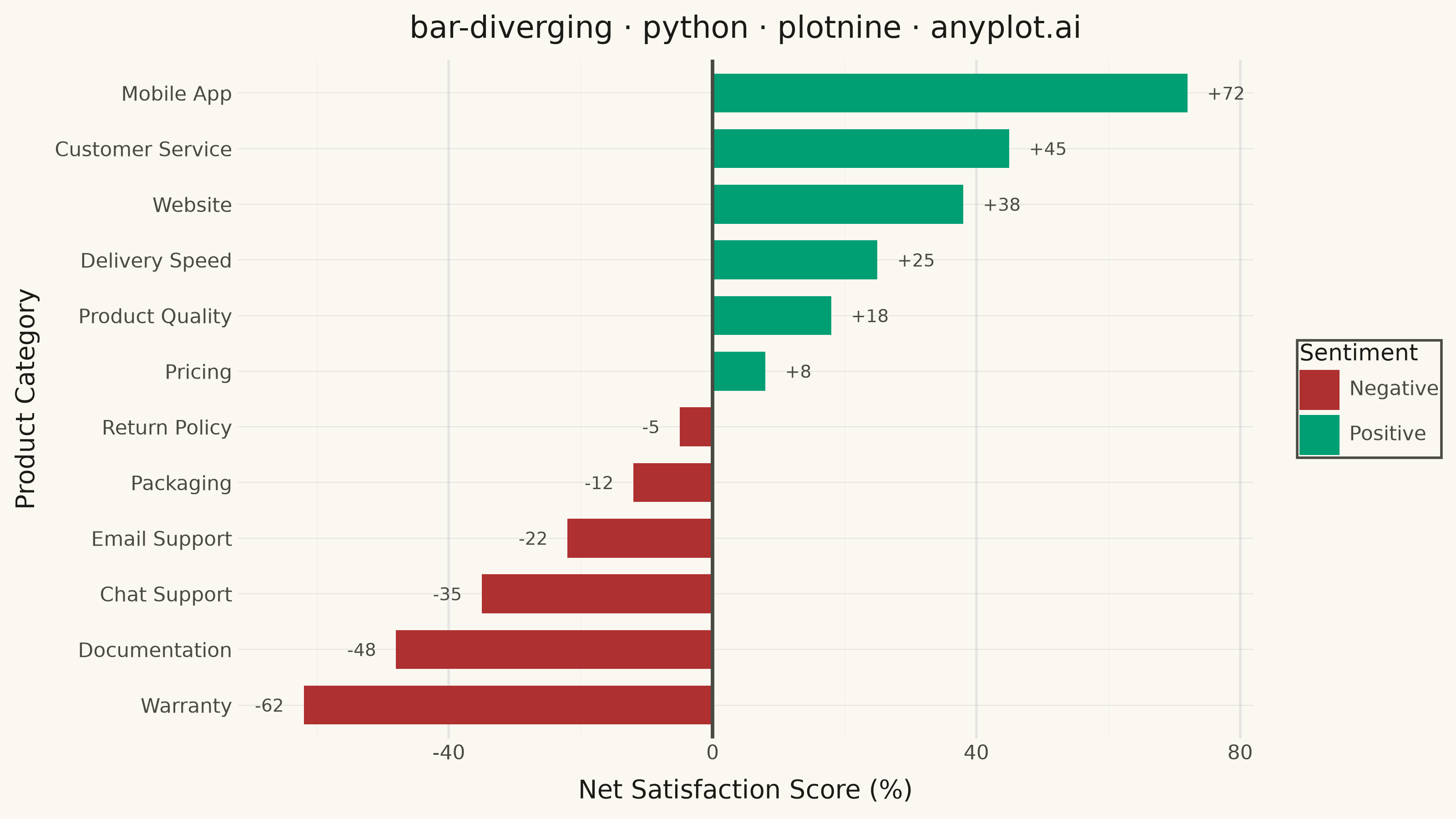
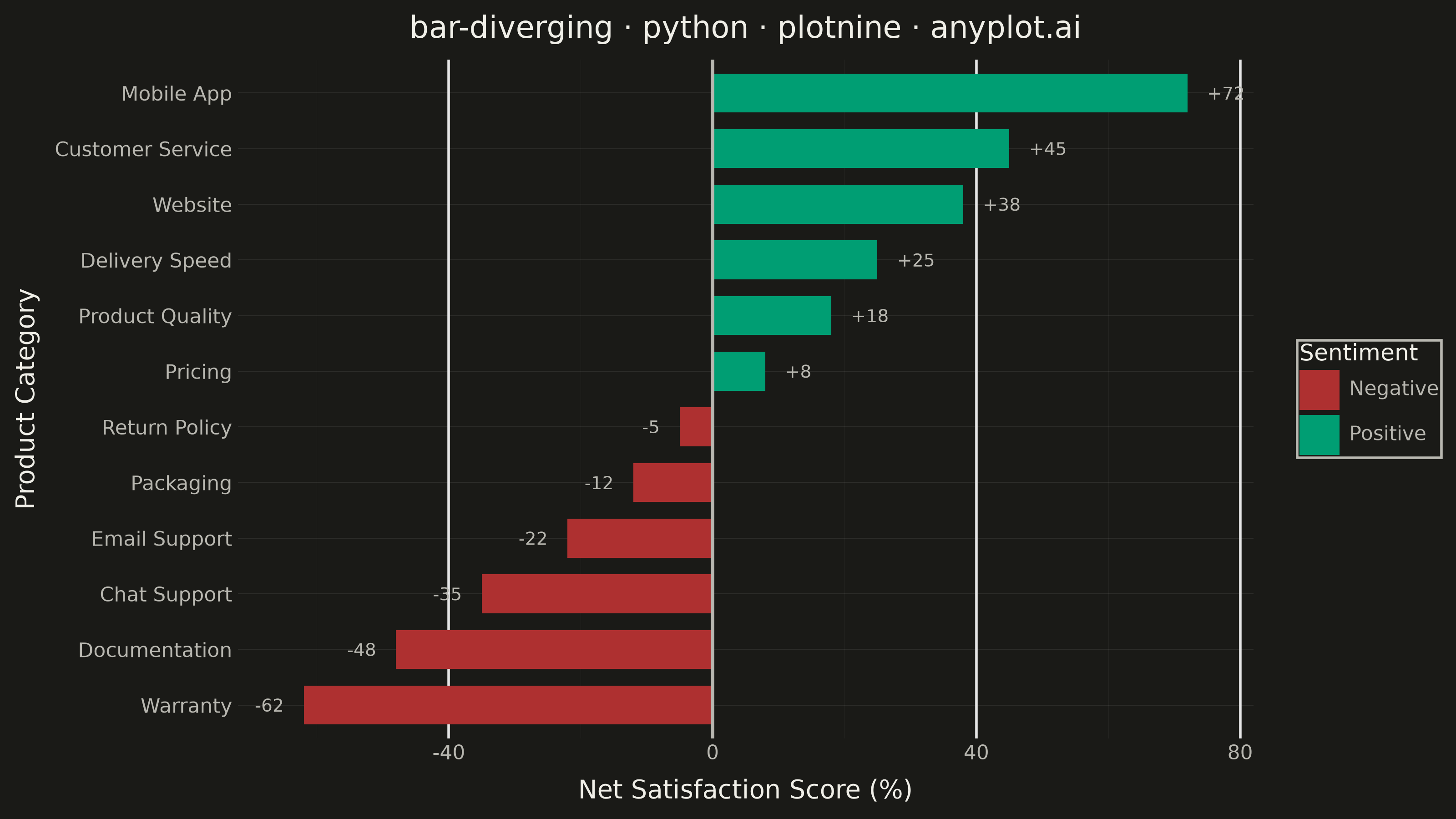
A diverging bar chart displays bars extending in opposite directions from a central baseline, typically at zero. This visualization is ideal for comparing positive and negative values, showing responses above and below a neutral point, or contrasting opposing categories. Different colors distinguish positive from negative values, making it easy to identify magnitude and direction at a glance.
""" anyplot.ai
bar-diverging: Diverging Bar Chart
Library: plotnine 0.15.8 | Python 3.13.15
Quality: 89/100 | Updated: 2026-08-18
"""

import importlib.util
import os
import sys

import pandas as pd


# Handle import conflicts: remove current dir and cache
sys.path = [p for p in sys.path if not p.endswith("python")]
if "plotnine" in sys.modules:
    del sys.modules["plotnine"]

# Import plotnine explicitly from site-packages
plotnine_spec = importlib.util.find_spec("plotnine")
plotnine = importlib.util.module_from_spec(plotnine_spec)
sys.modules["plotnine"] = plotnine
plotnine_spec.loader.exec_module(plotnine)

aes = plotnine.aes
coord_flip = plotnine.coord_flip
element_line = plotnine.element_line
element_rect = plotnine.element_rect
element_text = plotnine.element_text
geom_bar = plotnine.geom_bar
geom_hline = plotnine.geom_hline
geom_text = plotnine.geom_text
ggplot = plotnine.ggplot
labs = plotnine.labs
scale_fill_manual = plotnine.scale_fill_manual
theme = plotnine.theme
theme_minimal = plotnine.theme_minimal

THEME = os.getenv("ANYPLOT_THEME", "light")
PAGE_BG = "#FAF8F1" if THEME == "light" else "#1A1A17"
INK = "#1A1A17" if THEME == "light" else "#F0EFE8"
INK_SOFT = "#4A4A44" if THEME == "light" else "#B8B7B0"

# Data - Customer satisfaction survey across product categories
categories = [
    "Mobile App",
    "Customer Service",
    "Website",
    "Delivery Speed",
    "Product Quality",
    "Pricing",
    "Return Policy",
    "Packaging",
    "Email Support",
    "Chat Support",
    "Documentation",
    "Warranty",
]

values = [72, 45, 38, 25, 18, 8, -5, -12, -22, -35, -48, -62]

df = pd.DataFrame({"category": categories, "value": values})

# Sort by value for better pattern recognition
df = df.sort_values("value", ascending=True).reset_index(drop=True)

# Create ordered categorical for proper sorting in plot
df["category"] = pd.Categorical(df["category"], categories=df["category"], ordered=True)

# Color based on positive/negative (Imprint palette, semantic red/green anchors)
df["sentiment"] = df["value"].apply(lambda x: "Positive" if x >= 0 else "Negative")

# Value labels give a redundant, color-independent cue for direction/magnitude
# (not just hue) and call out the standout categories (+72 leader, -62 laggard).
pos_df = df[df["value"] >= 0].copy()
pos_df["label"] = pos_df["value"].apply(lambda v: f"+{v}")
neg_df = df[df["value"] < 0].copy()
neg_df["label"] = neg_df["value"].apply(lambda v: f"{v}")

# Plot
plot = (
    ggplot(df, aes(x="category", y="value", fill="sentiment"))
    + geom_bar(stat="identity", width=0.7)
    + geom_hline(yintercept=0, color=INK_SOFT, size=0.8)
    + geom_text(pos_df, aes(y="value + 3", label="label"), color=INK_SOFT, size=7, ha="left")
    + geom_text(neg_df, aes(y="value - 3", label="label"), color=INK_SOFT, size=7, ha="right")
    + coord_flip()
    + scale_fill_manual(values={"Positive": "#009E73", "Negative": "#AE3030"})
    + labs(
        x="Product Category",
        y="Net Satisfaction Score (%)",
        title="bar-diverging · python · plotnine · anyplot.ai",
        fill="Sentiment",
    )
    + theme_minimal()
    + theme(
        plot_background=element_rect(fill=PAGE_BG, color=PAGE_BG),
        panel_background=element_rect(fill=PAGE_BG),
        panel_grid_major_y=element_line(color=INK, size=0.3, alpha=0.10),
        panel_grid_minor=element_line(color=INK, size=0.2, alpha=0.05),
        axis_title=element_text(color=INK, size=10),
        axis_text=element_text(color=INK_SOFT, size=8),
        plot_title=element_text(color=INK, size=12),
        legend_background=element_rect(fill=PAGE_BG, color=INK_SOFT),
        legend_text=element_text(color=INK_SOFT, size=8),
        legend_title=element_text(color=INK, size=9),
        figure_size=(8, 4.5),
    )
)

# Save
plot.save(f"plot-{THEME}.png", dpi=400, width=8, height=4.5, units="in", verbose=False)
Runnable source as JSON, for any HTTP client: https://api.anyplot.ai/specs/bar-diverging/plotnine/code. Any spec id and library id listed in llms-full.txt fit the same URL shape; every URL below is complete and callable.
{
  "spec_id": "bar-diverging",
  "language": "python",
  "library": "plotnine",
  "page": "https://anyplot.ai/bar-diverging/python/plotnine",
  "hub": "https://anyplot.ai/bar-diverging",
  "code_json": "https://api.anyplot.ai/specs/bar-diverging/plotnine/code",
  "spec_json": "https://api.anyplot.ai/specs/bar-diverging",
  "render_light_png": "https://storage.googleapis.com/anyplot-images/plots/bar-diverging/python/plotnine/plot-light.png",
  "render_dark_png": "https://storage.googleapis.com/anyplot-images/plots/bar-diverging/python/plotnine/plot-dark.png",
  "quality_score": 89.0,
  "license": "MIT",
  "guide": "https://anyplot.ai/llms.txt"
}
Part of Diverging Bar Chart on anyplot.ai.