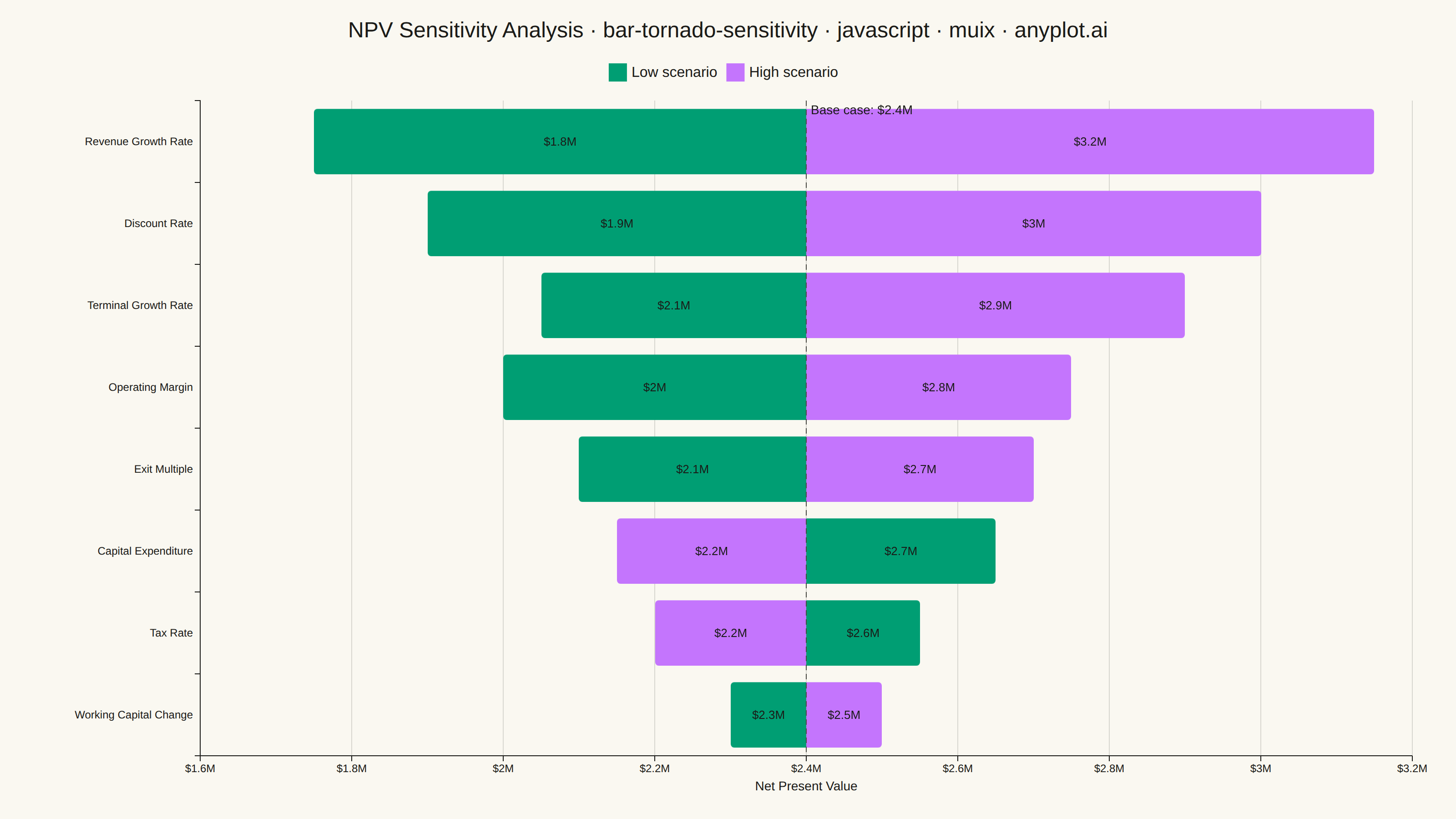
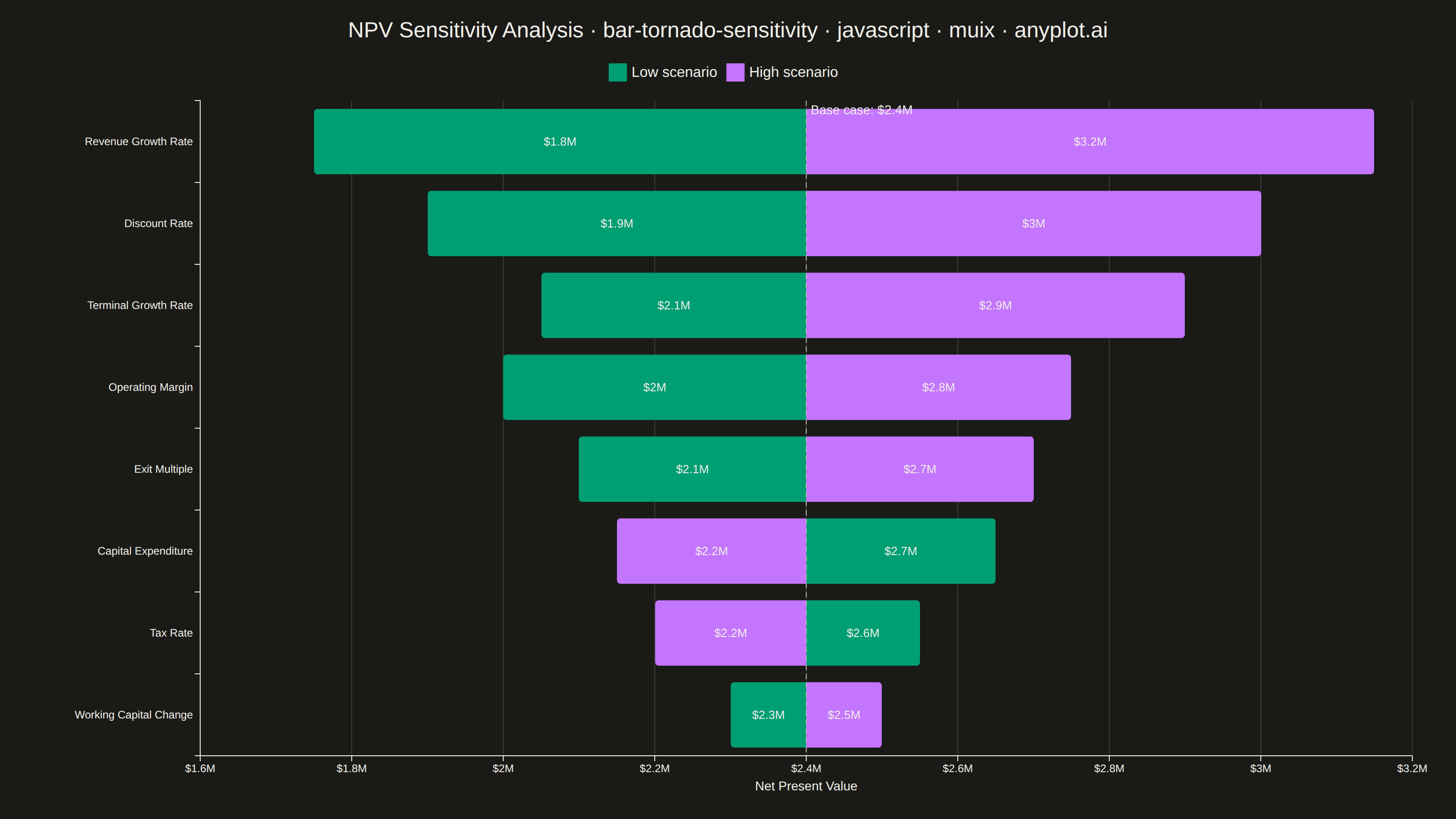
The same plot in 14 other libraries — JavaScript: Chart.js, D3.js, Apache ECharts, Highcharts; Python: Altair, Bokeh, lets-plot, Matplotlib, Plotly, plotnine, Pygal, Seaborn; R: ggplot2; Julia: Makie.jl. Compare all 15 side by side: Tornado Diagram for Sensitivity Analysis in Python, R, Julia and JavaScript.
A horizontal bar chart where bars are sorted by influence magnitude, extending left and right from a base case vertical reference line. Each bar represents one input parameter and shows how varying that parameter between its low and high values affects the output, creating a characteristic tornado shape (widest bars at top, narrowest at bottom). Dual colors distinguish low-input from high-input effects, making it immediately clear which parameters drive the most uncertainty.
// anyplot.ai
// bar-tornado-sensitivity: Tornado Diagram for Sensitivity Analysis
// Library: muix 7.29.1 | JavaScript 22.23.2
// Quality: 91/100 | Created: 2026-08-20
import { BarChart } from "@mui/x-charts/BarChart";
import { ChartsReferenceLine } from "@mui/x-charts/ChartsReferenceLine";
import Box from "@mui/material/Box";
import Typography from "@mui/material/Typography";

const t = window.ANYPLOT_TOKENS;

// --- Data (in-memory, deterministic) ----------------------------------------
// One-way sensitivity analysis of a project's Net Present Value (NPV): each
// parameter is varied independently between a low and a high scenario while
// holding all others at the base case, ranked by the widest resulting swing.
const BASE_NPV = 2_400_000;
const parameters = [
  "Revenue Growth Rate",
  "Discount Rate",
  "Terminal Growth Rate",
  "Operating Margin",
  "Exit Multiple",
  "Capital Expenditure",
  "Tax Rate",
  "Working Capital Change",
];
const lowValues = [1_750_000, 1_900_000, 2_050_000, 2_000_000, 2_100_000, 2_650_000, 2_550_000, 2_300_000];
const highValues = [3_150_000, 3_000_000, 2_900_000, 2_750_000, 2_700_000, 2_150_000, 2_200_000, 2_500_000];

// Bars are stacked as offsets from the base case so they diverge from a
// shared zero point, which lands exactly on the base-case reference line.
const lowOffsets = lowValues.map((v) => v - BASE_NPV);
const highOffsets = highValues.map((v) => v - BASE_NPV);

const currencyFormatter = new Intl.NumberFormat("en-US", {
  style: "currency",
  currency: "USD",
  notation: "compact",
  maximumFractionDigits: 1,
});

const TITLE_HEIGHT = 60;
const TITLE = "NPV Sensitivity Analysis · bar-tornado-sensitivity · javascript · muix · anyplot.ai";
// Base multiplier raised from the 22px style-guide default so this long
// descriptive+mandated title still reads with strong visual presence once
// scaled down by the length ratio (review feedback: title was ~39% of width).
const TITLE_FONT_SIZE = Math.round(30 * Math.min(1, 67 / TITLE.length));

// --- Chart (default-exported component — the harness mounts it) -------------
export default function Chart() {
  const { width, height } = window.ANYPLOT_SIZE;

  return (
    <Box sx={{ width, height, display: "flex", flexDirection: "column", paddingTop: "20px" }}>
      <Typography
        sx={{ color: t.ink, fontSize: TITLE_FONT_SIZE, fontWeight: 500, textAlign: "center", lineHeight: 1.2 }}
      >
        {TITLE}
      </Typography>
      <BarChart
        width={width}
        height={height - TITLE_HEIGHT}
        layout="horizontal"
        skipAnimation
        barLabel={(item) =>
          currencyFormatter.format(item.seriesId === "low" ? lowValues[item.dataIndex] : highValues[item.dataIndex])
        }
        colors={[t.palette[0], t.palette[1]]}
        borderRadius={4}
        yAxis={[{ scaleType: "band", data: parameters }]}
        xAxis={[
          {
            label: "Net Present Value",
            valueFormatter: (v) => currencyFormatter.format(BASE_NPV + v),
            // Widen the vertical grid to ~$0.2M increments (was ~$0.1M / ~15
            // lines) so the background stays subtle and doesn't compete with
            // the bars.
            tickMinStep: 200_000,
          },
        ]}
        series={[
          {
            id: "low",
            data: lowOffsets,
            label: "Low scenario",
            stack: "delta",
            valueFormatter: (v, { dataIndex }) => (v == null ? "" : currencyFormatter.format(lowValues[dataIndex])),
          },
          {
            id: "high",
            data: highOffsets,
            label: "High scenario",
            stack: "delta",
            valueFormatter: (v, { dataIndex }) => (v == null ? "" : currencyFormatter.format(highValues[dataIndex])),
          },
        ]}
        grid={{ vertical: true }}
        margin={{ top: 56, right: 48, bottom: 64, left: 220 }}
        slotProps={{ legend: { position: { vertical: "top", horizontal: "middle" } } }}
        sx={{
          "& .MuiChartsAxis-tickLabel": { fontSize: "14px" },
          "& .MuiChartsAxis-label": { fontSize: "16px" },
          "& .MuiBarLabel-root": { fontSize: "13px", fill: t.ink },
          "& .MuiChartsLegend-label": { fontSize: "14px" },
        }}
      >
        <ChartsReferenceLine
          x={0}
          label={`Base case: ${currencyFormatter.format(BASE_NPV)}`}
          labelAlign="start"
          lineStyle={{ stroke: t.inkSoft, strokeDasharray: "6 4" }}
          labelStyle={{ fill: t.ink, fontSize: 14 }}
        />
      </BarChart>
    </Box>
  );
}
Runnable source as JSON, for any HTTP client: https://api.anyplot.ai/specs/bar-tornado-sensitivity/muix/code. Any spec id and library id listed in llms-full.txt fit the same URL shape; every URL below is complete and callable.
{
  "spec_id": "bar-tornado-sensitivity",
  "language": "javascript",
  "library": "muix",
  "page": "https://anyplot.ai/bar-tornado-sensitivity/javascript/muix",
  "hub": "https://anyplot.ai/bar-tornado-sensitivity",
  "code_json": "https://api.anyplot.ai/specs/bar-tornado-sensitivity/muix/code",
  "spec_json": "https://api.anyplot.ai/specs/bar-tornado-sensitivity",
  "render_light_png": "https://storage.googleapis.com/anyplot-images/plots/bar-tornado-sensitivity/javascript/muix/plot-light.png",
  "render_dark_png": "https://storage.googleapis.com/anyplot-images/plots/bar-tornado-sensitivity/javascript/muix/plot-dark.png",
  "interactive_light_html": "https://storage.googleapis.com/anyplot-images/plots/bar-tornado-sensitivity/javascript/muix/plot-light.html",
  "interactive_dark_html": "https://storage.googleapis.com/anyplot-images/plots/bar-tornado-sensitivity/javascript/muix/plot-dark.html",
  "quality_score": 91.0,
  "license": "MIT",
  "guide": "https://anyplot.ai/llms.txt"
}
Part of Tornado Diagram for Sensitivity Analysis on anyplot.ai.