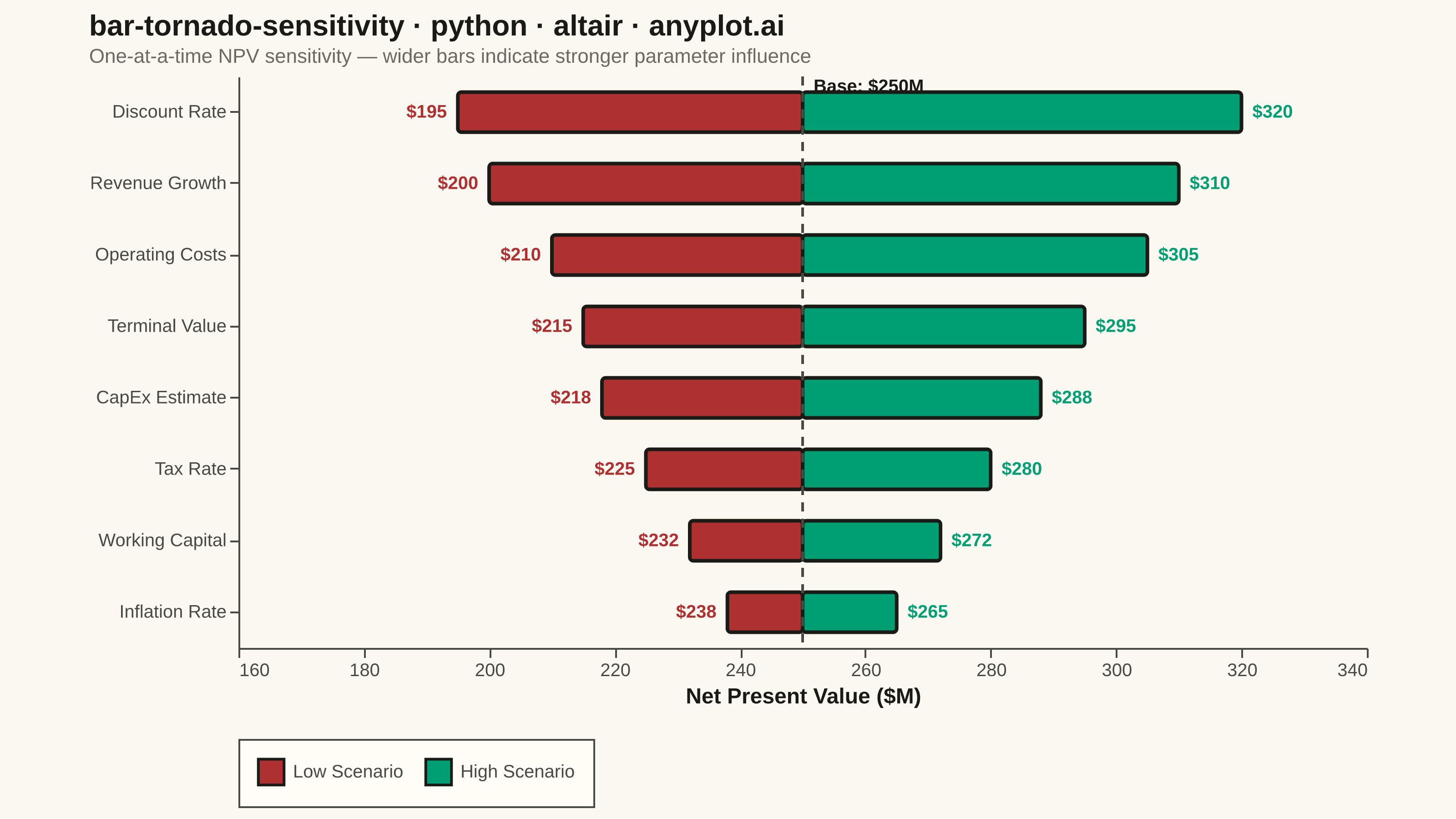
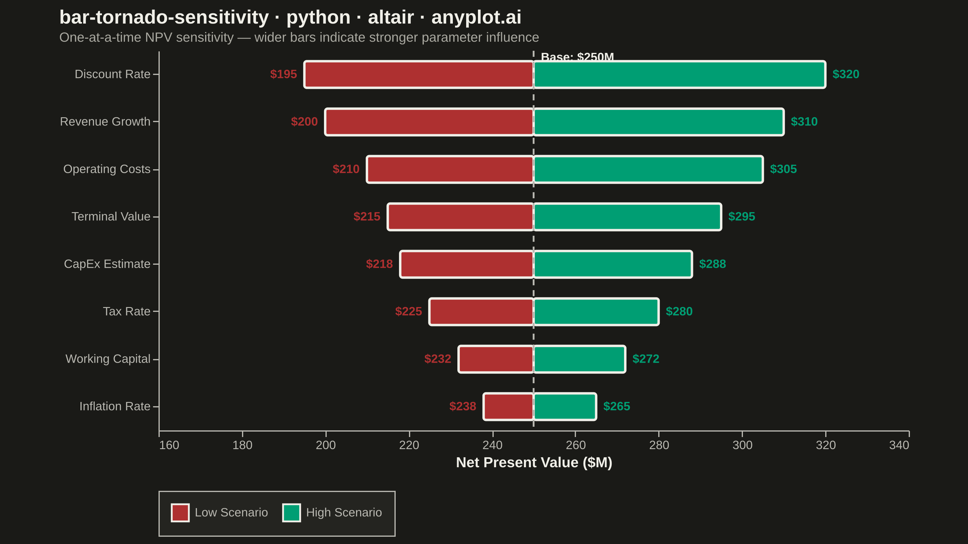
A horizontal bar chart where bars are sorted by influence magnitude, extending left and right from a base case vertical reference line. Each bar represents one input parameter and shows how varying that parameter between its low and high values affects the output, creating a characteristic tornado shape (widest bars at top, narrowest at bottom). Dual colors distinguish low-input from high-input effects, making it immediately clear which parameters drive the most uncertainty.
""" anyplot.ai
bar-tornado-sensitivity: Tornado Diagram for Sensitivity Analysis
Library: altair 6.1.0 | Python 3.13.13
Quality: 91/100 | Updated: 2026-06-02
"""

import importlib
import os
import sys

import pandas as pd
from PIL import Image


# Drop script directory from sys.path so `altair` resolves the package, not this file
sys.path[:] = [p for p in sys.path if os.path.abspath(p or ".") != os.path.dirname(os.path.abspath(__file__))]
alt = importlib.import_module("altair")

# Theme tokens
THEME = os.getenv("ANYPLOT_THEME", "light")
PAGE_BG = "#FAF8F1" if THEME == "light" else "#1A1A17"
ELEVATED_BG = "#FFFDF6" if THEME == "light" else "#242420"
INK = "#1A1A17" if THEME == "light" else "#F0EFE8"
INK_SOFT = "#4A4A44" if THEME == "light" else "#B8B7B0"
INK_MUTED = "#6B6A63" if THEME == "light" else "#A8A79F"

# Imprint palette — semantic: green=upside gain, red=downside loss
HIGH_COLOR = "#009E73"  # Imprint position 1, brand green — High Scenario (upside)
LOW_COLOR = "#AE3030"  # Imprint position 5, matte red — Low Scenario (downside)

# Data — NPV sensitivity analysis for a capital investment project
base_npv = 250.0  # Base case NPV in $M

parameters = [
    ("Discount Rate", 195.0, 320.0),
    ("Revenue Growth", 200.0, 310.0),
    ("Operating Costs", 210.0, 305.0),
    ("Terminal Value", 215.0, 295.0),
    ("CapEx Estimate", 218.0, 288.0),
    ("Tax Rate", 225.0, 280.0),
    ("Working Capital", 232.0, 272.0),
    ("Inflation Rate", 238.0, 265.0),
]

records = []
for param, low, high in parameters:
    span = abs(high - low)
    records.append({"parameter": param, "value": low, "side": "Low Scenario", "span": span, "base": base_npv})
    records.append({"parameter": param, "value": high, "side": "High Scenario", "span": span, "base": base_npv})

df = pd.DataFrame(records)

# Sort by span descending — widest bar at top
y_sort = alt.EncodingSortField(field="span", order="descending")

title_str = "bar-tornado-sensitivity · python · altair · anyplot.ai"

# Bars
bars = (
    alt.Chart(df)
    .mark_bar(cornerRadius=2, height=22)
    .encode(
        x=alt.X(
            "value:Q",
            title="Net Present Value ($M)",
            scale=alt.Scale(domain=[175, 335]),
            axis=alt.Axis(tickCount=7, grid=False),
        ),
        x2="base:Q",
        y=alt.Y("parameter:N", sort=y_sort, title=None, axis=alt.Axis(grid=False)),
        color=alt.Color(
            "side:N",
            scale=alt.Scale(domain=["Low Scenario", "High Scenario"], range=[LOW_COLOR, HIGH_COLOR]),
            title=None,
        ),
        tooltip=[
            alt.Tooltip("parameter:N", title="Parameter"),
            alt.Tooltip("side:N", title="Scenario"),
            alt.Tooltip("value:Q", title="NPV ($M)", format=",.0f"),
        ],
    )
)

# Value labels — low scenario (left side, outside bar)
low_labels = (
    alt.Chart(df)
    .transform_filter(alt.datum.side == "Low Scenario")
    .mark_text(fontSize=10, fontWeight="bold", dx=-6, align="right", color=LOW_COLOR)
    .encode(x="value:Q", y=alt.Y("parameter:N", sort=y_sort), text=alt.Text("value:Q", format="$,.0f"))
)

# Value labels — high scenario (right side, outside bar)
high_labels = (
    alt.Chart(df)
    .transform_filter(alt.datum.side == "High Scenario")
    .mark_text(fontSize=10, fontWeight="bold", dx=6, align="left", color=HIGH_COLOR)
    .encode(x="value:Q", y=alt.Y("parameter:N", sort=y_sort), text=alt.Text("value:Q", format="$,.0f"))
)

# Base case reference line
rule = (
    alt.Chart(pd.DataFrame({"x": [base_npv]}))
    .mark_rule(strokeDash=[5, 4], strokeWidth=1.5, color=INK_SOFT)
    .encode(x="x:Q")
)

# Base case label anchored to top parameter
sort_order = [p for p, _, _ in sorted(parameters, key=lambda x: abs(x[2] - x[1]), reverse=True)]
base_label_df = pd.DataFrame(
    {
        "x": [base_npv],
        "y": [sort_order[0]],
        "label": [f"Base: ${base_npv:.0f}M"],
        "span": [max(abs(high - low) for _, low, high in parameters)],
    }
)
base_label = (
    alt.Chart(base_label_df)
    .mark_text(align="left", dx=6, dy=-14, fontSize=10, fontWeight="bold", color=INK)
    .encode(x="x:Q", y=alt.Y("y:N", sort=y_sort), text="label:N")
)

# Interactive: hover highlights, click selects for persistent focus
highlight = alt.selection_point(on="pointerover", fields=["parameter"], empty=False)
click = alt.selection_point(fields=["parameter"])

bars = bars.add_params(highlight, click).encode(
    opacity=alt.condition(highlight | click, alt.value(1.0), alt.value(0.65)),
    strokeWidth=alt.condition(click, alt.value(2), alt.value(0)),
    stroke=alt.condition(click, alt.value(INK), alt.value(None)),
)

chart = (
    (bars + low_labels + high_labels + rule + base_label)
    .properties(
        width=620,
        height=314,
        title=alt.Title(
            title_str,
            subtitle="One-at-a-time NPV sensitivity — wider bars indicate stronger parameter influence",
            fontSize=16,
            subtitleFontSize=11,
            subtitleColor=INK_MUTED,
            anchor="start",
            color=INK,
        ),
        background=PAGE_BG,
    )
    .configure_view(fill=PAGE_BG, strokeWidth=0, continuousWidth=620, continuousHeight=314)
    .configure_axis(
        labelFontSize=10,
        titleFontSize=12,
        domainColor=INK_SOFT,
        tickColor=INK_SOFT,
        labelColor=INK_SOFT,
        titleColor=INK,
        gridColor=INK,
        gridOpacity=0.15,
    )
    .configure_legend(
        labelFontSize=10,
        labelColor=INK_SOFT,
        titleColor=INK,
        symbolSize=200,
        orient="bottom",
        direction="horizontal",
        titleFontSize=0,
        padding=10,
        fillColor=ELEVATED_BG,
        strokeColor=INK_SOFT,
    )
    .configure_title(color=INK)
)

# Save PNG then pad to exact 3200×1800
chart.save(f"plot-{THEME}.png", scale_factor=4.0)

TW, TH = 3200, 1800
_img = Image.open(f"plot-{THEME}.png").convert("RGB")
_w, _h = _img.size
if _w > TW or _h > TH:
    raise SystemExit(
        f"altair vl-convert produced {_w}×{_h}, exceeds target {TW}×{TH}. "
        f"Shrink chart .properties(width=, height=) values and re-render."
    )
if _w < TW or _h < TH:
    _canvas = Image.new("RGB", (TW, TH), PAGE_BG)
    _canvas.paste(_img, ((TW - _w) // 2, (TH - _h) // 2))
    _canvas.save(f"plot-{THEME}.png")

# Save HTML (interactive)
chart.save(f"plot-{THEME}.html")
Runnable source as JSON, for any HTTP client: https://api.anyplot.ai/specs/bar-tornado-sensitivity/altair/code. Any spec id and library id listed in llms-full.txt fit the same URL shape; every URL below is complete and callable.
{
  "spec_id": "bar-tornado-sensitivity",
  "language": "python",
  "library": "altair",
  "page": "https://anyplot.ai/bar-tornado-sensitivity/python/altair",
  "hub": "https://anyplot.ai/bar-tornado-sensitivity",
  "code_json": "https://api.anyplot.ai/specs/bar-tornado-sensitivity/altair/code",
  "spec_json": "https://api.anyplot.ai/specs/bar-tornado-sensitivity",
  "render_light_png": "https://storage.googleapis.com/anyplot-images/plots/bar-tornado-sensitivity/python/altair/plot-light.png",
  "render_dark_png": "https://storage.googleapis.com/anyplot-images/plots/bar-tornado-sensitivity/python/altair/plot-dark.png",
  "interactive_light_html": "https://storage.googleapis.com/anyplot-images/plots/bar-tornado-sensitivity/python/altair/plot-light.html",
  "interactive_dark_html": "https://storage.googleapis.com/anyplot-images/plots/bar-tornado-sensitivity/python/altair/plot-dark.html",
  "quality_score": 91.0,
  "license": "MIT",
  "guide": "https://anyplot.ai/llms.txt"
}
Part of Tornado Diagram for Sensitivity Analysis on anyplot.ai.