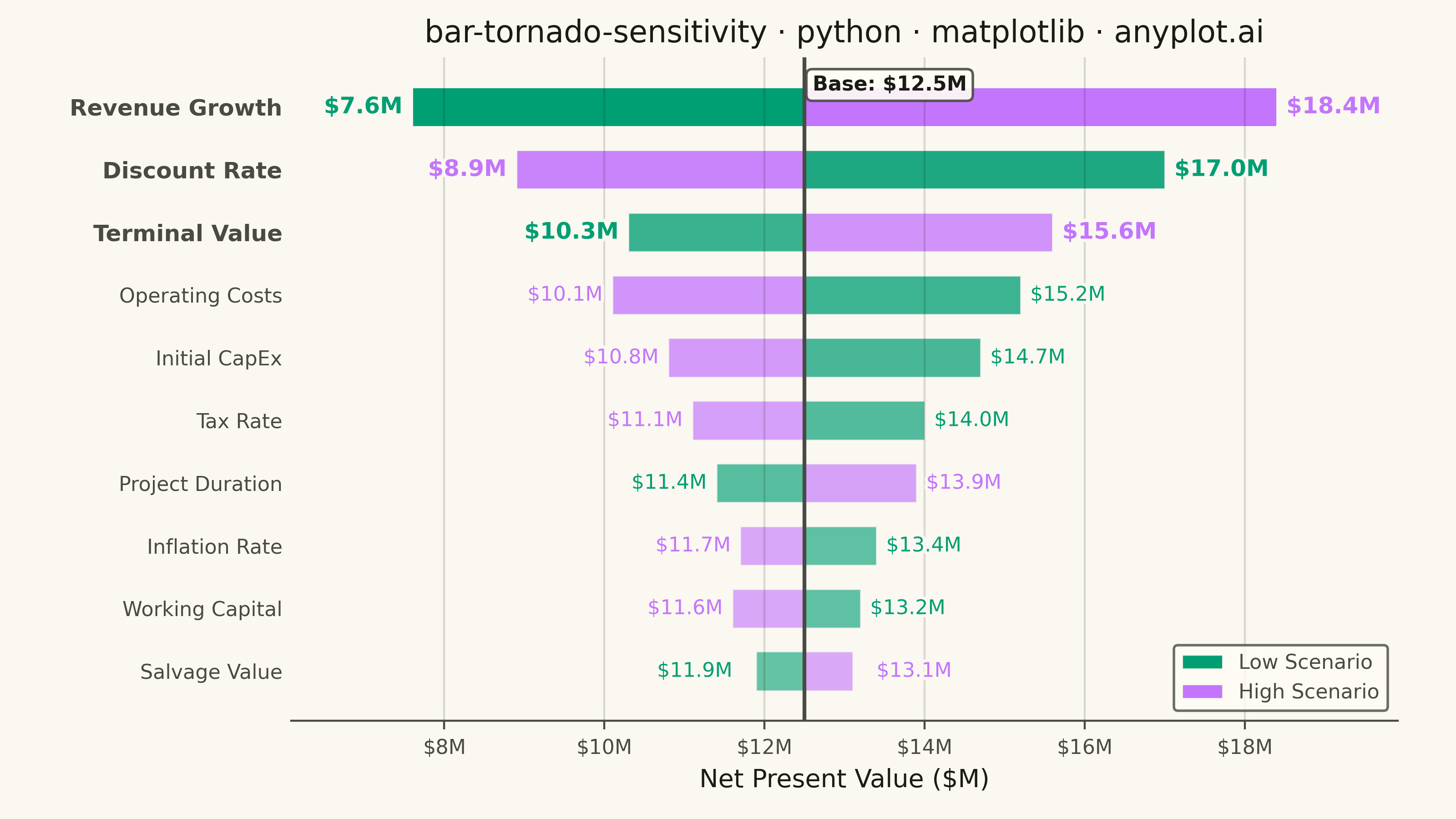
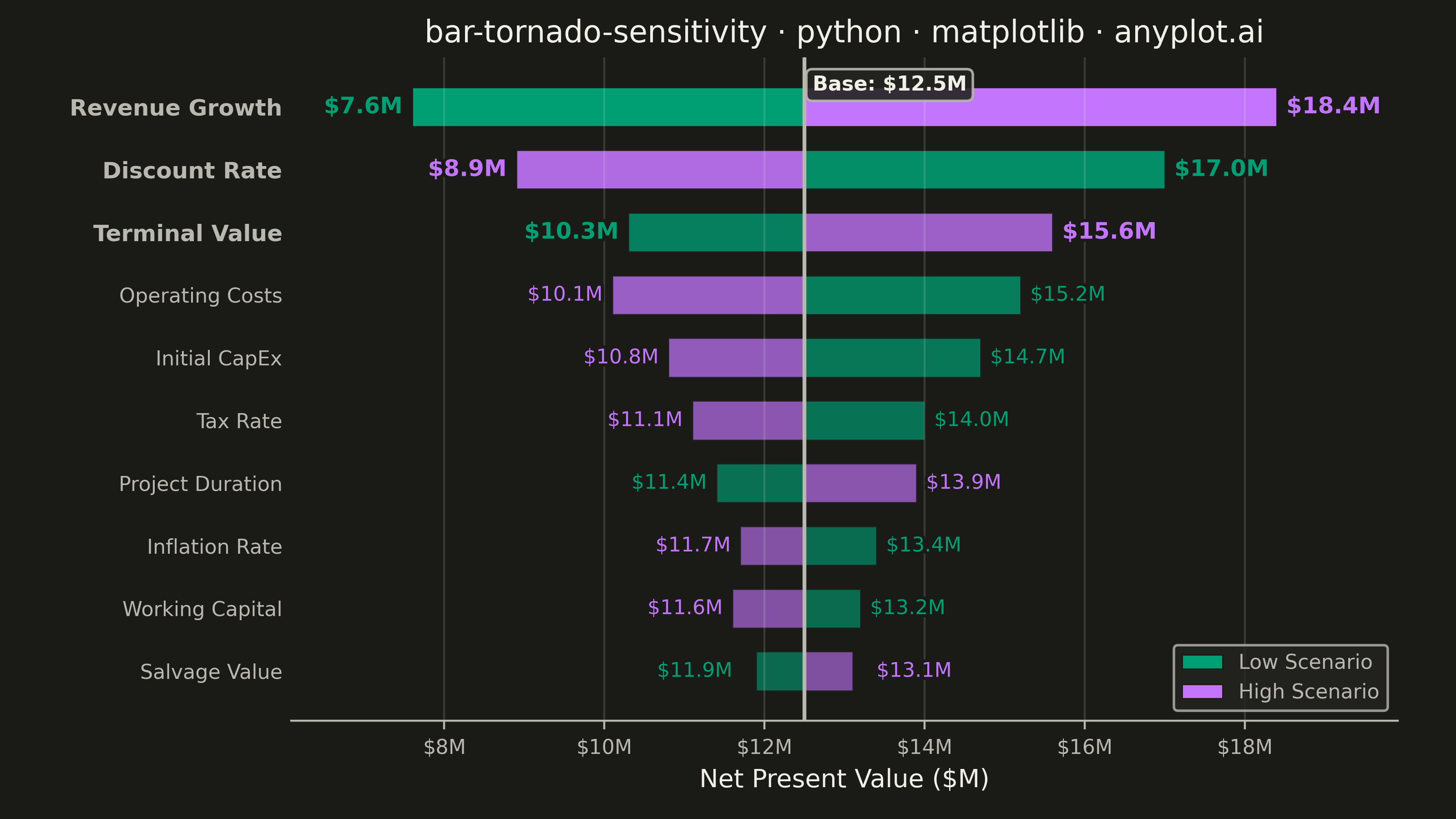
A horizontal bar chart where bars are sorted by influence magnitude, extending left and right from a base case vertical reference line. Each bar represents one input parameter and shows how varying that parameter between its low and high values affects the output, creating a characteristic tornado shape (widest bars at top, narrowest at bottom). Dual colors distinguish low-input from high-input effects, making it immediately clear which parameters drive the most uncertainty.
""" anyplot.ai
bar-tornado-sensitivity: Tornado Diagram for Sensitivity Analysis
Library: matplotlib 3.10.9 | Python 3.13.13
Quality: 92/100 | Updated: 2026-06-02
"""

import os

import matplotlib.patheffects as pe
import matplotlib.pyplot as plt
import matplotlib.ticker as mticker
import numpy as np


# Theme tokens — Imprint palette chrome
THEME = os.getenv("ANYPLOT_THEME", "light")
PAGE_BG = "#FAF8F1" if THEME == "light" else "#1A1A17"
ELEVATED_BG = "#FFFDF6" if THEME == "light" else "#242420"
INK = "#1A1A17" if THEME == "light" else "#F0EFE8"
INK_SOFT = "#4A4A44" if THEME == "light" else "#B8B7B0"

# Imprint categorical palette — positions 1 and 2 for dual-series tornado
COLOR_LOW = "#009E73"  # Imprint position 1 — brand green (Low Scenario)
COLOR_HIGH = "#C475FD"  # Imprint position 2 — lavender   (High Scenario)

# Data — NPV sensitivity analysis for a capital investment project ($M)
base_npv = 12.5

parameters = [
    "Discount Rate",
    "Revenue Growth",
    "Initial CapEx",
    "Operating Costs",
    "Tax Rate",
    "Terminal Value",
    "Working Capital",
    "Inflation Rate",
    "Project Duration",
    "Salvage Value",
]
low_npv = np.array([17.0, 7.6, 14.7, 15.2, 14.0, 10.3, 13.2, 13.4, 11.4, 11.9])
high_npv = np.array([8.9, 18.4, 10.8, 10.1, 11.1, 15.6, 11.6, 11.7, 13.9, 13.1])

# Sort by total range — widest bar at top
total_range = np.abs(high_npv - low_npv)
sort_idx = np.argsort(total_range)
parameters = [parameters[i] for i in sort_idx]
low_npv = low_npv[sort_idx]
high_npv = high_npv[sort_idx]

low_delta = low_npv - base_npv
high_delta = high_npv - base_npv

y_pos = np.arange(len(parameters))
n = len(parameters)
top_k = 3

# Intensity gradient — wider bars are more saturated; floor at 0.55 keeps narrow bars visible
sorted_range = np.abs(high_npv - low_npv)
range_norm = sorted_range / sorted_range.max()
alphas = 0.55 + 0.45 * range_norm

# Plot
fig, ax = plt.subplots(figsize=(8, 4.5), dpi=400, facecolor=PAGE_BG)
ax.set_facecolor(PAGE_BG)

for i in range(n):
    ax.barh(
        y_pos[i],
        low_delta[i],
        left=base_npv,
        height=0.62,
        color=COLOR_LOW,
        alpha=alphas[i],
        label="Low Scenario" if i == n - 1 else None,
        edgecolor=PAGE_BG,
        linewidth=0.5,
    )
    ax.barh(
        y_pos[i],
        high_delta[i],
        left=base_npv,
        height=0.62,
        color=COLOR_HIGH,
        alpha=alphas[i],
        label="High Scenario" if i == n - 1 else None,
        edgecolor=PAGE_BG,
        linewidth=0.5,
    )

# Bar-end value labels with PathEffects halos for legibility
label_halo = [pe.withStroke(linewidth=2.5, foreground=PAGE_BG)]

for i in range(n):
    is_top = i >= n - top_k
    lsize = 9 if is_top else 8
    lweight = "bold" if is_top else "medium"

    # Wider nudge for narrow bars so label pairs don't crowd together
    nudge = 0.30 if sorted_range[i] < 1.5 else 0.12

    lx = low_npv[i]
    lo = -nudge if low_delta[i] < 0 else nudge
    lh = "right" if low_delta[i] < 0 else "left"
    ax.text(
        lx + lo,
        y_pos[i],
        f"${lx:.1f}M",
        va="center",
        ha=lh,
        fontsize=lsize,
        fontweight=lweight,
        color=COLOR_LOW,
        path_effects=label_halo,
    )

    hx = high_npv[i]
    ho = nudge if high_delta[i] > 0 else -nudge
    hh = "left" if high_delta[i] > 0 else "right"
    ax.text(
        hx + ho,
        y_pos[i],
        f"${hx:.1f}M",
        va="center",
        ha=hh,
        fontsize=lsize,
        fontweight=lweight,
        color=COLOR_HIGH,
        path_effects=label_halo,
    )

# Base case reference line with styled annotation box (FancyBboxPatch via bbox kwarg)
ax.axvline(x=base_npv, color=INK_SOFT, linewidth=1.5, linestyle="-", zorder=3)
ax.text(
    base_npv + 0.10,
    n - 0.65,
    f"Base: ${base_npv:.1f}M",
    fontsize=8,
    fontweight="bold",
    color=INK,
    ha="left",
    va="center",
    bbox={"facecolor": ELEVATED_BG, "edgecolor": INK_SOFT, "alpha": 0.9, "boxstyle": "round,pad=0.3"},
)

# X-axis dollar tick formatting
ax.xaxis.set_major_formatter(mticker.FuncFormatter(lambda x, _: f"${x:.0f}M"))

# Style — bold y-tick labels for top drivers
ax.set_yticks(y_pos)
ytick_labels = ax.set_yticklabels(parameters, fontsize=8, color=INK_SOFT)
for i in range(n):
    if i >= n - top_k:
        ytick_labels[i].set_fontweight("bold")
        ytick_labels[i].set_fontsize(9)
        ytick_labels[i].set_color(INK)

title = "bar-tornado-sensitivity · python · matplotlib · anyplot.ai"
title_fs = max(8, round(12 * 67 / len(title))) if len(title) > 67 else 12

ax.set_xlabel("Net Present Value ($M)", fontsize=10, color=INK)
ax.set_title(title, fontsize=title_fs, fontweight="medium", color=INK)
ax.tick_params(axis="x", labelsize=8, colors=INK_SOFT, labelcolor=INK_SOFT)
ax.tick_params(axis="y", length=0, colors=INK_SOFT, labelcolor=INK_SOFT)

leg = ax.legend(fontsize=8, loc="lower right", frameon=True)
if leg:
    leg.get_frame().set_facecolor(ELEVATED_BG)
    leg.get_frame().set_edgecolor(INK_SOFT)
    plt.setp(leg.get_texts(), color=INK_SOFT)

ax.spines["top"].set_visible(False)
ax.spines["right"].set_visible(False)
ax.spines["left"].set_visible(False)
ax.spines["bottom"].set_color(INK_SOFT)
ax.xaxis.grid(True, alpha=0.15, linewidth=0.8, color=INK)

# Tight x-limits — minimize excess padding while leaving room for bar-end labels
x_min = min(low_npv.min(), high_npv.min())
x_max = max(low_npv.max(), high_npv.max())
x_span = x_max - x_min
ax.set_xlim(x_min - 0.14 * x_span, x_max + 0.14 * x_span)

fig.subplots_adjust(left=0.20, right=0.96, top=0.93, bottom=0.12)

# Save
plt.savefig(f"plot-{THEME}.png", dpi=400, facecolor=PAGE_BG)
Runnable source as JSON, for any HTTP client: https://api.anyplot.ai/specs/bar-tornado-sensitivity/matplotlib/code. Any spec id and library id listed in llms-full.txt fit the same URL shape; every URL below is complete and callable.
{
  "spec_id": "bar-tornado-sensitivity",
  "language": "python",
  "library": "matplotlib",
  "page": "https://anyplot.ai/bar-tornado-sensitivity/python/matplotlib",
  "hub": "https://anyplot.ai/bar-tornado-sensitivity",
  "code_json": "https://api.anyplot.ai/specs/bar-tornado-sensitivity/matplotlib/code",
  "spec_json": "https://api.anyplot.ai/specs/bar-tornado-sensitivity",
  "render_light_png": "https://storage.googleapis.com/anyplot-images/plots/bar-tornado-sensitivity/python/matplotlib/plot-light.png",
  "render_dark_png": "https://storage.googleapis.com/anyplot-images/plots/bar-tornado-sensitivity/python/matplotlib/plot-dark.png",
  "quality_score": 92.0,
  "license": "MIT",
  "guide": "https://anyplot.ai/llms.txt"
}
Part of Tornado Diagram for Sensitivity Analysis on anyplot.ai.