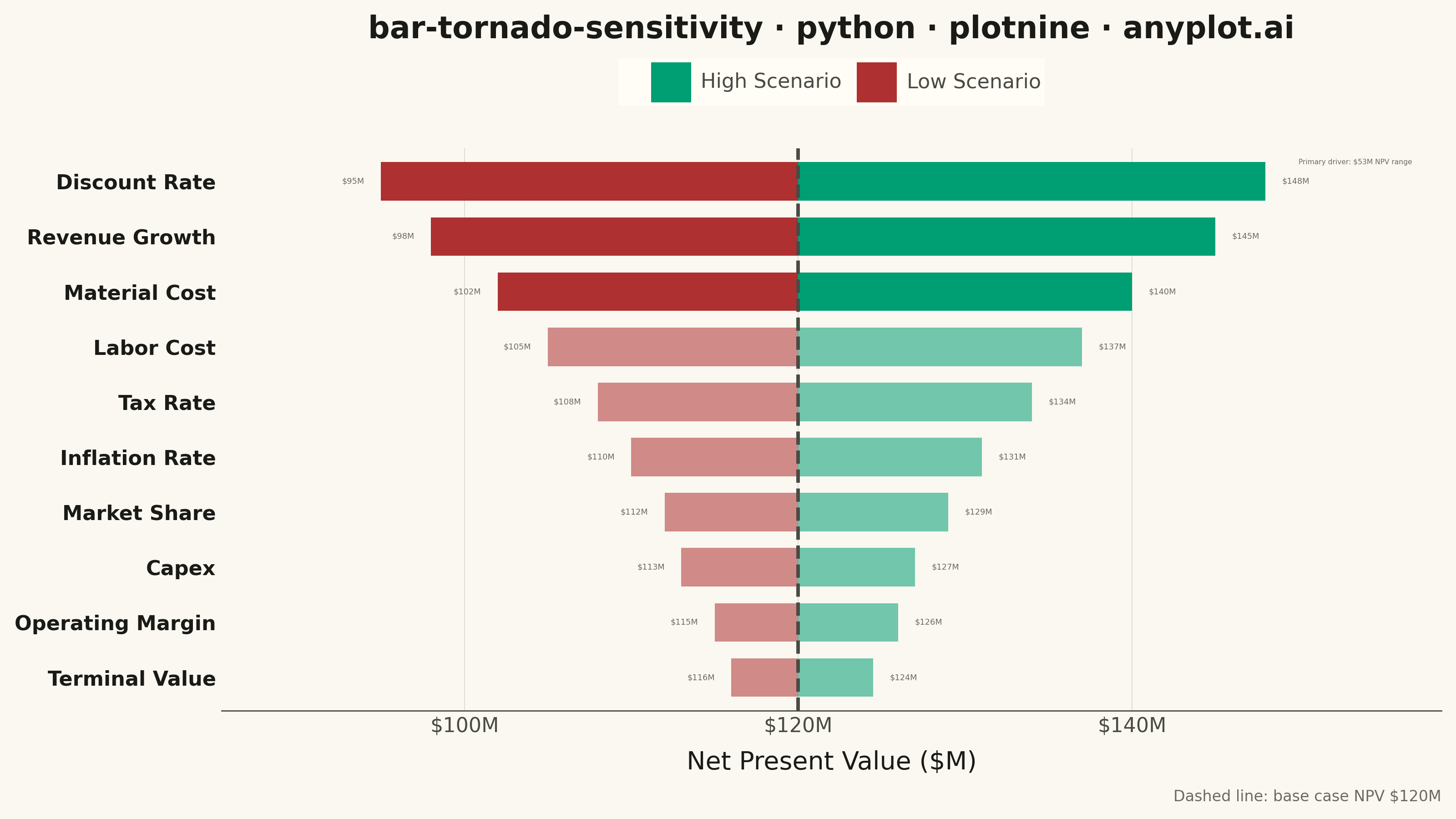
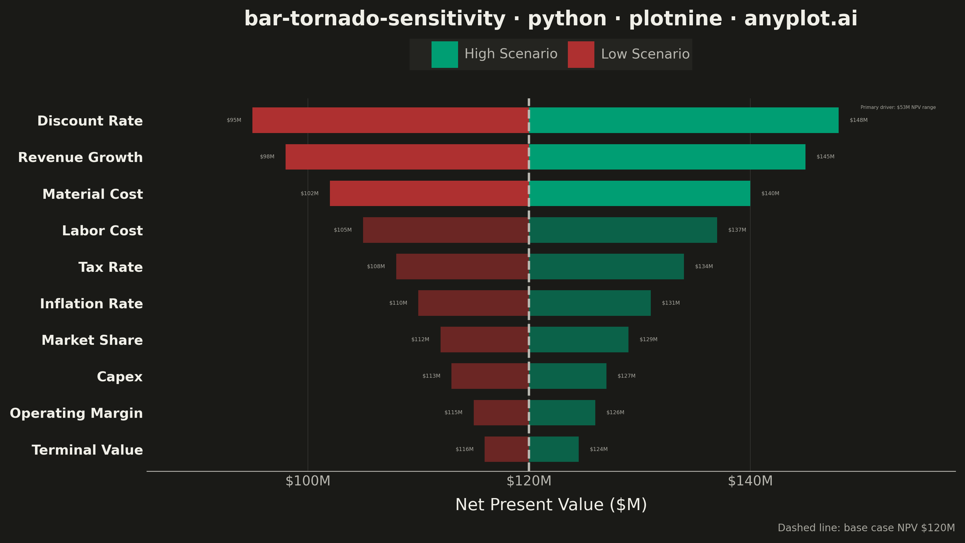
A horizontal bar chart where bars are sorted by influence magnitude, extending left and right from a base case vertical reference line. Each bar represents one input parameter and shows how varying that parameter between its low and high values affects the output, creating a characteristic tornado shape (widest bars at top, narrowest at bottom). Dual colors distinguish low-input from high-input effects, making it immediately clear which parameters drive the most uncertainty.
""" anyplot.ai
bar-tornado-sensitivity: Tornado Diagram for Sensitivity Analysis
Library: plotnine 0.15.5 | Python 3.13.13
Quality: 90/100 | Updated: 2026-06-02
"""

import os
import sys


# Prevent current directory from shadowing the plotnine package
sys.path = [p for p in sys.path if p and not p.endswith("implementations") and not p.endswith("python")]

import pandas as pd
from plotnine import (
    aes,
    annotate,
    coord_flip,
    element_blank,
    element_line,
    element_rect,
    element_text,
    geom_col,
    geom_hline,
    geom_text,
    ggplot,
    labs,
    scale_alpha_identity,
    scale_fill_manual,
    scale_y_continuous,
    theme,
    theme_minimal,
)


# Theme tokens (see prompts/default-style-guide.md "Theme-adaptive Chrome")
THEME = os.getenv("ANYPLOT_THEME", "light")
PAGE_BG = "#FAF8F1" if THEME == "light" else "#1A1A17"
ELEVATED_BG = "#FFFDF6" if THEME == "light" else "#242420"
INK = "#1A1A17" if THEME == "light" else "#F0EFE8"
INK_SOFT = "#4A4A44" if THEME == "light" else "#B8B7B0"
INK_MUTED = "#6B6A63" if THEME == "light" else "#A8A79F"

# Imprint palette — semantic exception applies:
# High Scenario (positive/gain) → brand green; Low Scenario (negative/loss) → matte red
CLR_HIGH = "#009E73"  # Imprint position 1 — brand green, gain
CLR_LOW = "#AE3030"  # Imprint semantic anchor — matte red, loss

# Data
base_npv = 120.0

parameters = [
    "Discount Rate",
    "Revenue Growth",
    "Material Cost",
    "Labor Cost",
    "Tax Rate",
    "Inflation Rate",
    "Market Share",
    "Capex",
    "Operating Margin",
    "Terminal Value",
]
low_values = [95.0, 98.0, 102.0, 105.0, 108.0, 110.0, 112.0, 113.0, 115.0, 116.0]
high_values = [148.0, 145.0, 140.0, 137.0, 134.0, 131.0, 129.0, 127.0, 126.0, 124.5]

# Compute deviations from base case
records = []
for param, low, high in zip(parameters, low_values, high_values, strict=True):
    total_range = high - low
    records.append(
        {
            "parameter": param,
            "scenario": "Low Scenario",
            "deviation": low - base_npv,
            "npv_label": f"${low:.0f}M",
            "total_range": total_range,
        }
    )
    records.append(
        {
            "parameter": param,
            "scenario": "High Scenario",
            "deviation": high - base_npv,
            "npv_label": f"${high:.0f}M",
            "total_range": total_range,
        }
    )

df = pd.DataFrame(records)

# Sort by total range: ascending so widest bar sits at top after coord_flip
sort_order = df.groupby("parameter")["total_range"].first().sort_values(ascending=True).index.tolist()
top_range = int(high_values[0] - low_values[0])  # Discount Rate: 148 - 95 = 53
df["parameter"] = pd.Categorical(df["parameter"], categories=sort_order, ordered=True)

# Visual emphasis: top 3 influential parameters at full opacity, rest muted
top3 = set(sort_order[-3:])
df["bar_alpha"] = df["parameter"].apply(lambda p: 1.0 if p in top3 else 0.55)

df_low = df[df["scenario"] == "Low Scenario"]
df_high = df[df["scenario"] == "High Scenario"]

# Title — scale fontsize if title exceeds 67-char baseline
title = "bar-tornado-sensitivity · python · plotnine · anyplot.ai"
title_n = len(title)
default_title_fs = 12
title_fontsize = round(default_title_fs * 67 / title_n) if title_n > 67 else default_title_fs
title_fontsize = max(title_fontsize, 8)

# Plot
plot = (
    ggplot(df, aes(x="parameter", y="deviation", fill="scenario"))
    + geom_col(aes(alpha="bar_alpha"), position="identity", width=0.7)
    + geom_hline(yintercept=0, linetype="dashed", color=INK_SOFT, size=0.8)
    + geom_text(aes(label="npv_label", y="deviation"), data=df_low, ha="right", nudge_y=-1.0, size=3.2, color=INK_MUTED)
    + geom_text(aes(label="npv_label", y="deviation"), data=df_high, ha="left", nudge_y=1.0, size=3.2, color=INK_MUTED)
    + annotate(
        "text",
        x=10.35,
        y=30.0,
        label=f"Primary driver: ${top_range}M NPV range",
        size=2.8,
        color=INK_MUTED,
        ha="left",
        va="center",
    )
    + coord_flip()
    + scale_fill_manual(values={"Low Scenario": CLR_LOW, "High Scenario": CLR_HIGH})
    + scale_alpha_identity(guide=None)
    + scale_y_continuous(labels=lambda vals: [f"${base_npv + v:.0f}M" for v in vals], expand=(0.15, 0.15))
    + labs(
        x="", y="Net Present Value ($M)", title=title, fill="", caption=f"Dashed line: base case NPV ${base_npv:.0f}M"
    )
    + theme_minimal()
    + theme(
        figure_size=(8, 4.5),
        text=element_text(size=7, color=INK_SOFT),
        axis_title=element_text(size=10, color=INK),
        axis_text=element_text(size=8, color=INK_SOFT),
        axis_text_y=element_text(size=8, weight="bold", color=INK),
        plot_title=element_text(size=title_fontsize, weight="bold", color=INK),
        legend_text=element_text(size=8, color=INK_SOFT),
        legend_position="top",
        legend_background=element_rect(fill=ELEVATED_BG, color=ELEVATED_BG),
        plot_background=element_rect(fill=PAGE_BG, color=PAGE_BG),
        panel_background=element_rect(fill=PAGE_BG),
        panel_grid_major_x=element_line(color=INK, size=0.3, alpha=0.15),
        panel_grid_major_y=element_blank(),
        panel_grid_minor=element_blank(),
        axis_line_x=element_line(size=0.5, color=INK_SOFT),
        plot_caption=element_text(size=6, color=INK_MUTED, ha="right"),
    )
)

# Save
plot.save(f"plot-{THEME}.png", dpi=400, width=8, height=4.5, units="in", verbose=False)
Runnable source as JSON, for any HTTP client: https://api.anyplot.ai/specs/bar-tornado-sensitivity/plotnine/code. Any spec id and library id listed in llms-full.txt fit the same URL shape; every URL below is complete and callable.
{
  "spec_id": "bar-tornado-sensitivity",
  "language": "python",
  "library": "plotnine",
  "page": "https://anyplot.ai/bar-tornado-sensitivity/python/plotnine",
  "hub": "https://anyplot.ai/bar-tornado-sensitivity",
  "code_json": "https://api.anyplot.ai/specs/bar-tornado-sensitivity/plotnine/code",
  "spec_json": "https://api.anyplot.ai/specs/bar-tornado-sensitivity",
  "render_light_png": "https://storage.googleapis.com/anyplot-images/plots/bar-tornado-sensitivity/python/plotnine/plot-light.png",
  "render_dark_png": "https://storage.googleapis.com/anyplot-images/plots/bar-tornado-sensitivity/python/plotnine/plot-dark.png",
  "quality_score": 90.0,
  "license": "MIT",
  "guide": "https://anyplot.ai/llms.txt"
}
Part of Tornado Diagram for Sensitivity Analysis on anyplot.ai.