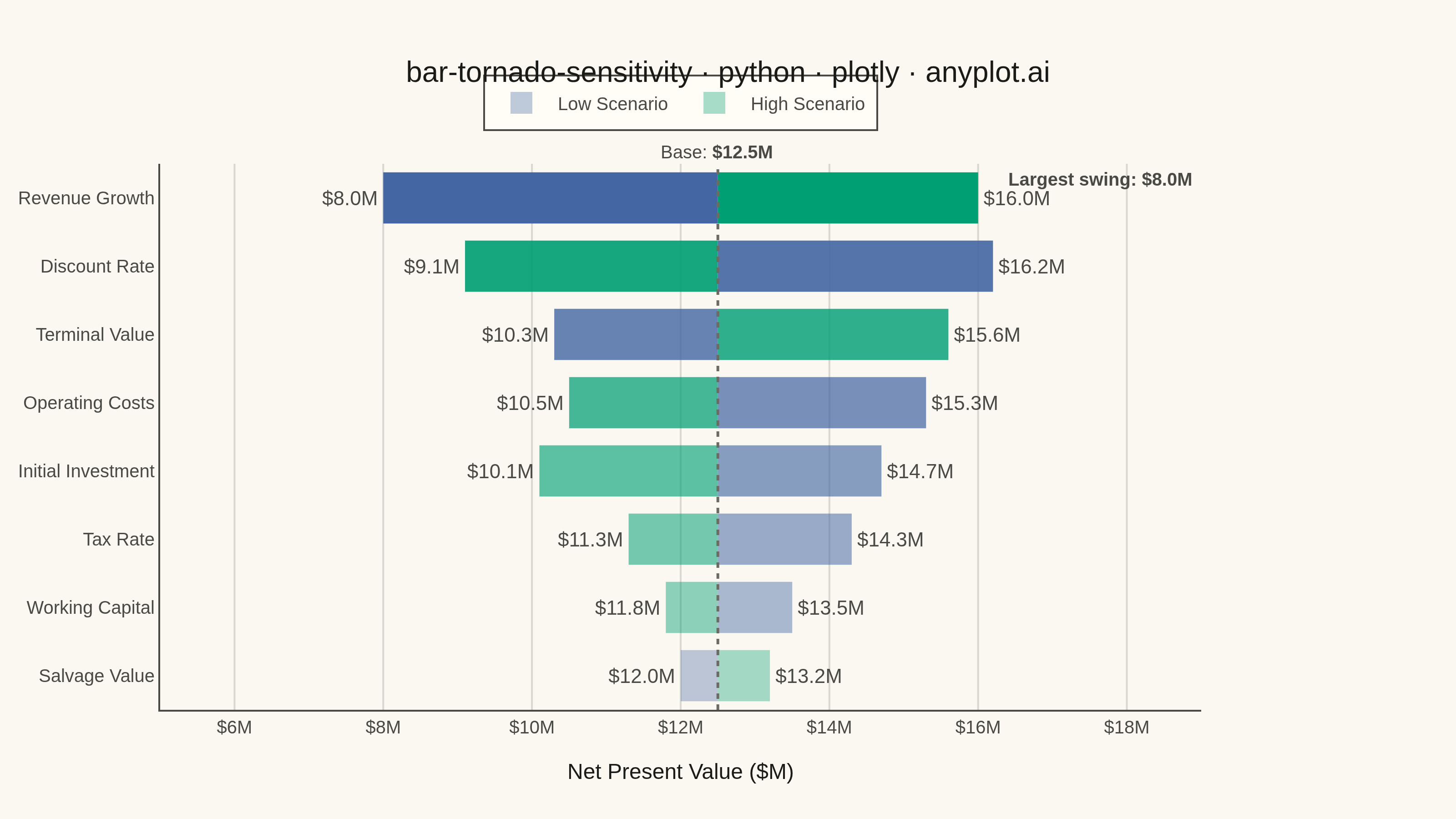
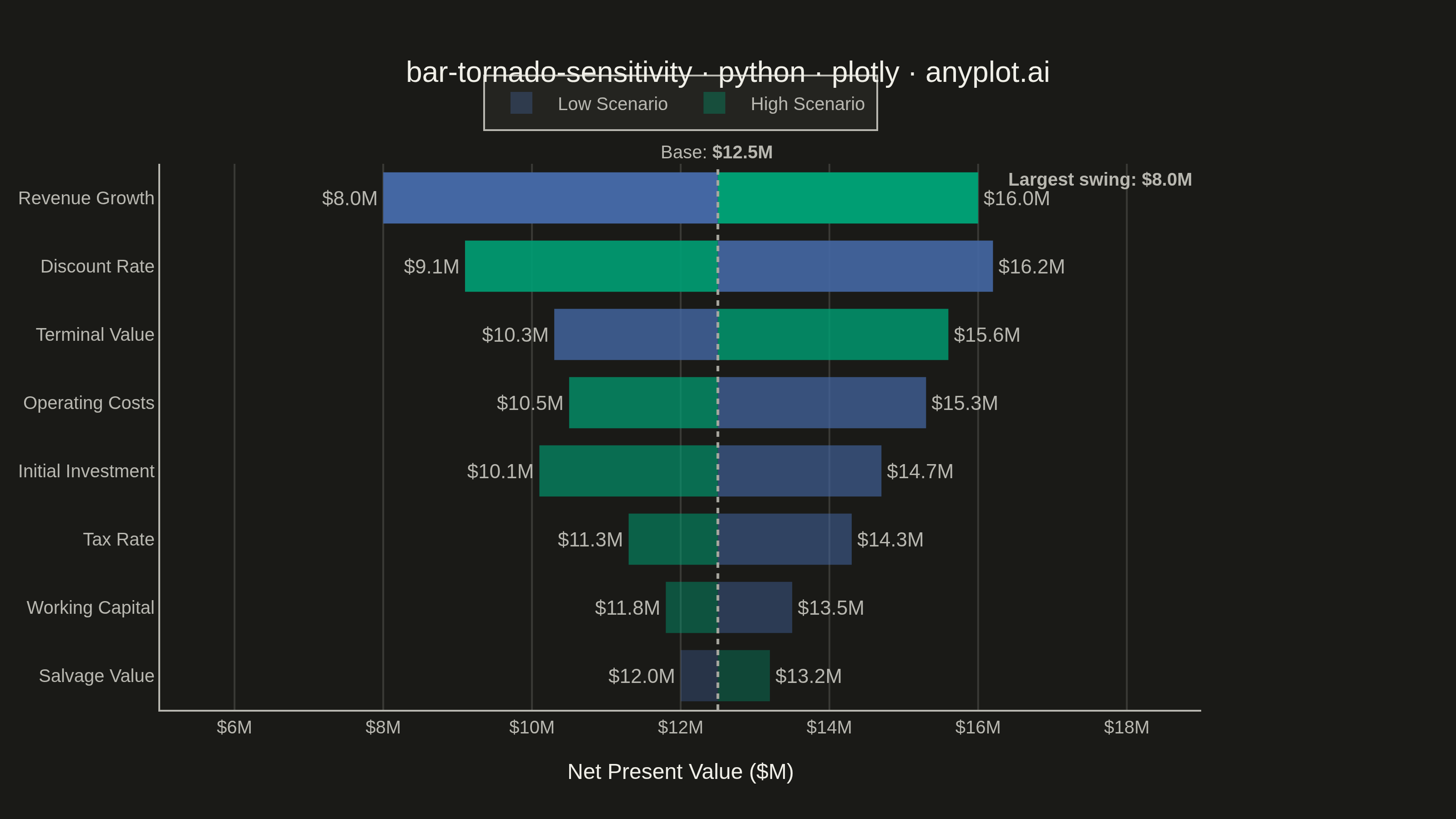
A horizontal bar chart where bars are sorted by influence magnitude, extending left and right from a base case vertical reference line. Each bar represents one input parameter and shows how varying that parameter between its low and high values affects the output, creating a characteristic tornado shape (widest bars at top, narrowest at bottom). Dual colors distinguish low-input from high-input effects, making it immediately clear which parameters drive the most uncertainty.
""" anyplot.ai
bar-tornado-sensitivity: Tornado Diagram for Sensitivity Analysis
Library: plotly 6.7.0 | Python 3.13.13
Quality: 89/100 | Updated: 2026-06-02
"""

import os

import numpy as np
import plotly.graph_objects as go


# Theme tokens (Imprint palette + adaptive chrome)
THEME = os.getenv("ANYPLOT_THEME", "light")
PAGE_BG = "#FAF8F1" if THEME == "light" else "#1A1A17"
ELEVATED_BG = "#FFFDF6" if THEME == "light" else "#242420"
INK = "#1A1A17" if THEME == "light" else "#F0EFE8"
INK_SOFT = "#4A4A44" if THEME == "light" else "#B8B7B0"
INK_MUTED = "#6B6A63" if THEME == "light" else "#A8A79F"
GRID = "rgba(26,26,23,0.15)" if THEME == "light" else "rgba(240,239,232,0.15)"

# Imprint palette — semantic: green = high/upside, blue = low/downside
_HIGH_RGB = "0,158,115"  # #009E73 — Imprint position 1, brand green
_LOW_RGB = "68,103,163"  # #4467A3 — Imprint position 3, blue

# Data — NPV sensitivity analysis for a capital investment project
parameters = [
    "Discount Rate",
    "Revenue Growth",
    "Initial Investment",
    "Operating Costs",
    "Tax Rate",
    "Terminal Value",
    "Working Capital",
    "Salvage Value",
]
base_npv = 12.5  # Base case NPV in $M

# Output NPV at each scenario — varied asymmetry highlights different parameter behaviours
low_values = np.array([16.2, 8.0, 14.7, 15.3, 14.3, 10.3, 13.5, 12.0])
high_values = np.array([9.1, 16.0, 10.1, 10.5, 11.3, 15.6, 11.8, 13.2])

# Sort by total range — widest bar at top, narrowest at bottom (tornado shape)
total_range = np.abs(high_values - low_values)
sort_idx = np.argsort(total_range)
parameters = [parameters[i] for i in sort_idx]
low_values = low_values[sort_idx]
high_values = high_values[sort_idx]
total_range = total_range[sort_idx]

# Deltas from base case (bar width/direction)
low_deltas = low_values - base_npv
high_deltas = high_values - base_npv

# Gradient opacity by influence rank — more vivid = wider bar = stronger driver
n = len(parameters)
low_colors = [f"rgba({_LOW_RGB},{0.50 + 0.50 * i / (n - 1):.2f})" for i in range(n)]
high_colors = [f"rgba({_HIGH_RGB},{0.50 + 0.50 * i / (n - 1):.2f})" for i in range(n)]

# Plot
fig = go.Figure()

fig.add_trace(
    go.Bar(
        y=parameters,
        x=low_deltas,
        base=base_npv,
        orientation="h",
        name="Low Scenario",
        marker={"color": low_colors, "line": {"width": 0}},
        text=[f"${v:.1f}M" for v in low_values],
        textposition="outside",
        textfont={"size": 11, "color": INK_SOFT},
        cliponaxis=False,
        hovertemplate="%{y}<br>Low: %{text}<br>Change: %{x:+.1f}M<extra></extra>",
    )
)

fig.add_trace(
    go.Bar(
        y=parameters,
        x=high_deltas,
        base=base_npv,
        orientation="h",
        name="High Scenario",
        marker={"color": high_colors, "line": {"width": 0}},
        text=[f"${v:.1f}M" for v in high_values],
        textposition="outside",
        textfont={"size": 11, "color": INK_SOFT},
        cliponaxis=False,
        hovertemplate="%{y}<br>High: %{text}<br>Change: %{x:+.1f}M<extra></extra>",
    )
)

# Base case reference line
fig.add_vline(x=base_npv, line={"color": INK_MUTED, "width": 1.5, "dash": "dot"})

# Base case label above reference line
fig.add_annotation(
    x=base_npv,
    y=1.0,
    yref="paper",
    text=f"Base: <b>${base_npv}M</b>",
    showarrow=False,
    font={"size": 10, "color": INK_SOFT},
    yshift=14,
    xanchor="center",
)

# Largest swing annotation — top driver highlighted for the reader
fig.add_annotation(
    x=max(high_values[-1], low_values[-1]) + 0.35,
    y=parameters[-1],
    text=f"<b>Largest swing: ${total_range[-1]:.1f}M</b>",
    showarrow=False,
    xanchor="left",
    font={"size": 10, "color": INK_SOFT},
    yshift=20,
)

title_text = "bar-tornado-sensitivity · python · plotly · anyplot.ai"
title_size = round(16 * min(1.0, 67 / len(title_text)))  # 54 chars < 67, stays 16

fig.update_layout(
    autosize=False,
    title={
        "text": title_text,
        "font": {"size": title_size, "color": INK, "family": "Arial, sans-serif"},
        "x": 0.5,
        "xanchor": "center",
    },
    xaxis={
        "title": {"text": "Net Present Value ($M)", "font": {"size": 12, "color": INK}, "standoff": 15},
        "tickfont": {"size": 10, "color": INK_SOFT},
        "tickprefix": "$",
        "ticksuffix": "M",
        "range": [5.0, 19.0],
        "showgrid": True,
        "gridcolor": GRID,
        "gridwidth": 1,
        "zeroline": False,
        "showline": False,
        "mirror": False,
    },
    yaxis={
        "tickfont": {"size": 10, "color": INK_SOFT},
        "showgrid": False,
        "automargin": True,
        "showline": False,
        "mirror": False,
    },
    barmode="overlay",
    bargap=0.25,
    legend={
        "font": {"size": 10, "color": INK_SOFT},
        "orientation": "h",
        "yanchor": "bottom",
        "y": 1.06,
        "xanchor": "center",
        "x": 0.5,
        "bgcolor": ELEVATED_BG,
        "bordercolor": INK_SOFT,
        "borderwidth": 1,
        "itemsizing": "constant",
    },
    margin={"l": 10, "r": 140, "t": 90, "b": 60},
    plot_bgcolor=PAGE_BG,
    paper_bgcolor=PAGE_BG,
    font={"color": INK},
)

# Save — theme-suffixed PNG + interactive HTML
fig.write_image(f"plot-{THEME}.png", width=800, height=450, scale=4)
fig.write_html(f"plot-{THEME}.html", include_plotlyjs="cdn")
Runnable source as JSON, for any HTTP client: https://api.anyplot.ai/specs/bar-tornado-sensitivity/plotly/code. Any spec id and library id listed in llms-full.txt fit the same URL shape; every URL below is complete and callable.
{
  "spec_id": "bar-tornado-sensitivity",
  "language": "python",
  "library": "plotly",
  "page": "https://anyplot.ai/bar-tornado-sensitivity/python/plotly",
  "hub": "https://anyplot.ai/bar-tornado-sensitivity",
  "code_json": "https://api.anyplot.ai/specs/bar-tornado-sensitivity/plotly/code",
  "spec_json": "https://api.anyplot.ai/specs/bar-tornado-sensitivity",
  "render_light_png": "https://storage.googleapis.com/anyplot-images/plots/bar-tornado-sensitivity/python/plotly/plot-light.png",
  "render_dark_png": "https://storage.googleapis.com/anyplot-images/plots/bar-tornado-sensitivity/python/plotly/plot-dark.png",
  "interactive_light_html": "https://storage.googleapis.com/anyplot-images/plots/bar-tornado-sensitivity/python/plotly/plot-light.html",
  "interactive_dark_html": "https://storage.googleapis.com/anyplot-images/plots/bar-tornado-sensitivity/python/plotly/plot-dark.html",
  "quality_score": 89.0,
  "license": "MIT",
  "guide": "https://anyplot.ai/llms.txt"
}
Part of Tornado Diagram for Sensitivity Analysis on anyplot.ai.