The same plot in 14 other libraries — Python: Altair, Bokeh, lets-plot, Matplotlib, Plotly, plotnine, Pygal, Seaborn; Julia: Makie.jl; JavaScript: Chart.js, D3.js, Apache ECharts, Highcharts, MUI X Charts. Compare all 15 side by side: Tornado Diagram for Sensitivity Analysis in Python, R, Julia and JavaScript.
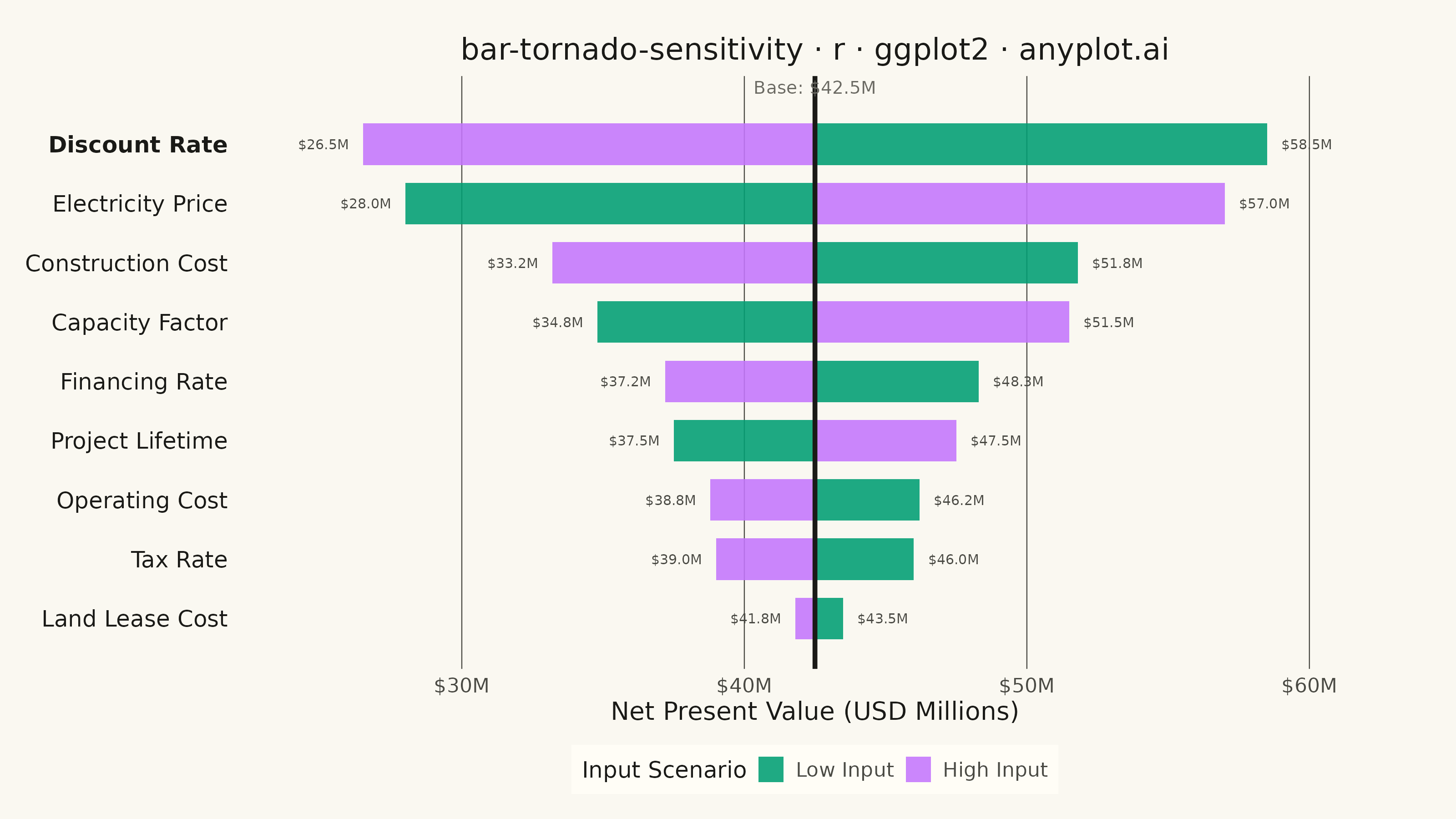
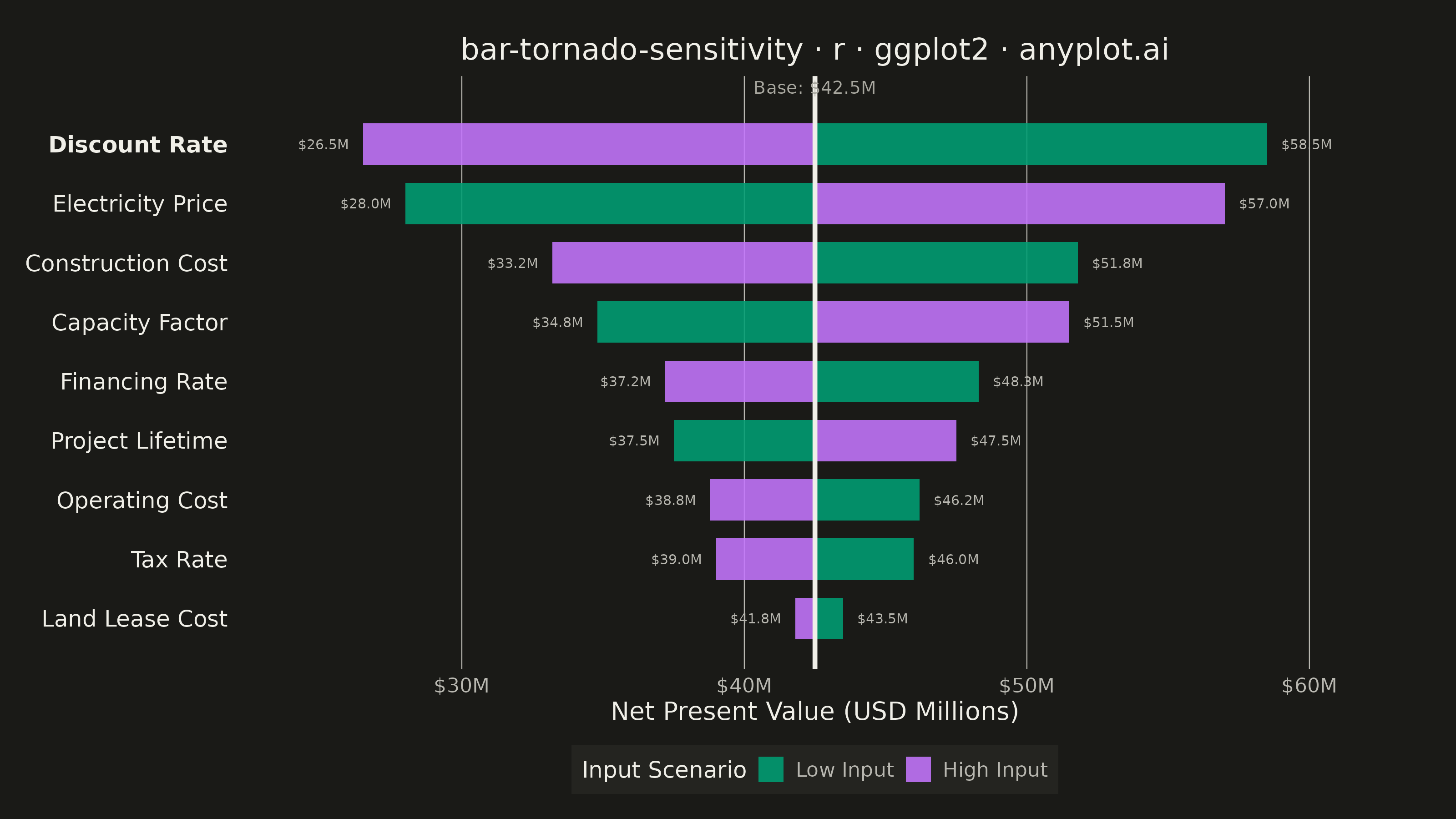
A horizontal bar chart where bars are sorted by influence magnitude, extending left and right from a base case vertical reference line. Each bar represents one input parameter and shows how varying that parameter between its low and high values affects the output, creating a characteristic tornado shape (widest bars at top, narrowest at bottom). Dual colors distinguish low-input from high-input effects, making it immediately clear which parameters drive the most uncertainty.
#' anyplot.ai
#' bar-tornado-sensitivity: Tornado Diagram for Sensitivity Analysis
#' Library: ggplot2 3.5.1 | R 4.4.1
#' Quality: 89/100 | Created: 2026-06-02

library(ggplot2)
library(dplyr)
library(ragg)

set.seed(42)

# Theme tokens
THEME       <- Sys.getenv("ANYPLOT_THEME", "light")
PAGE_BG     <- if (THEME == "light") "#FAF8F1" else "#1A1A17"
ELEVATED_BG <- if (THEME == "light") "#FFFDF6" else "#242420"
INK         <- if (THEME == "light") "#1A1A17" else "#F0EFE8"
INK_SOFT    <- if (THEME == "light") "#4A4A44" else "#B8B7B0"
INK_MUTED   <- if (THEME == "light") "#6B6A63" else "#A8A79F"

# Imprint palette — Low Input (position 1) and High Input (position 2)
COLOR_LOW  <- "#009E73"  # brand green — first series
COLOR_HIGH <- "#C475FD"  # lavender — second series

# Base case NPV for a solar energy project
base_npv <- 42.5

# Sensitivity analysis: NPV (USD millions) when each parameter is at its low/high bound
params <- tibble::tibble(
  parameter = c(
    "Electricity Price",
    "Discount Rate",
    "Construction Cost",
    "Capacity Factor",
    "Operating Cost",
    "Project Lifetime",
    "Financing Rate",
    "Tax Rate",
    "Land Lease Cost"
  ),
  low_value  = c(28.0, 58.5, 51.8, 34.8, 46.2, 37.5, 48.3, 46.0, 43.5),
  high_value = c(57.0, 26.5, 33.2, 51.5, 38.8, 47.5, 37.2, 39.0, 41.8)
)

# Sort by range ascending — smallest range at bottom, widest at top (tornado shape)
df <- params |>
  mutate(range = abs(high_value - low_value)) |>
  arrange(range) |>
  mutate(
    parameter = factor(parameter, levels = parameter),
    y_pos     = as.integer(parameter)
  )

# Bold the top parameter (widest range = most sensitive) to guide viewer's eye
y_faces <- c(rep("plain", nrow(df) - 1L), "bold")

# Build bar segments: one row per (parameter x scenario) with tip label coords
bar_h <- 0.35

df_bars <- bind_rows(
  df |> transmute(
    y_pos,
    xmin        = pmin(low_value,  base_npv),
    xmax        = pmax(low_value,  base_npv),
    outer_x     = low_value,
    label_hjust = if_else(low_value  > base_npv, 0, 1),
    scenario    = "Low Input"
  ),
  df |> transmute(
    y_pos,
    xmin        = pmin(high_value, base_npv),
    xmax        = pmax(high_value, base_npv),
    outer_x     = high_value,
    label_hjust = if_else(high_value > base_npv, 0, 1),
    scenario    = "High Input"
  )
) |>
  mutate(
    ymin     = y_pos - bar_h,
    ymax     = y_pos + bar_h,
    scenario = factor(scenario, levels = c("Low Input", "High Input")),
    label    = sprintf("$%.1fM", outer_x),
    label_x  = if_else(label_hjust == 0L, outer_x + 0.5, outer_x - 0.5)
  )

title_text <- "bar-tornado-sensitivity · r · ggplot2 · anyplot.ai"

p <- ggplot(df_bars) +
  geom_rect(
    aes(xmin = xmin, xmax = xmax, ymin = ymin, ymax = ymax, fill = scenario),
    color = NA,
    alpha = 0.88
  ) +
  geom_text(
    aes(x = label_x, y = y_pos, label = label, hjust = label_hjust),
    color = INK_SOFT,
    size  = 1.9
  ) +
  geom_vline(
    xintercept = base_npv,
    color      = INK,
    linewidth  = 0.9
  ) +
  annotate(
    "text",
    x     = base_npv,
    y     = Inf,
    label = sprintf("Base: $%.1fM", base_npv),
    color = INK_MUTED,
    size  = 2.5,
    hjust = 0.5,
    vjust = 1.4
  ) +
  scale_fill_manual(
    values = c("Low Input" = COLOR_LOW, "High Input" = COLOR_HIGH),
    name   = "Input Scenario"
  ) +
  scale_x_continuous(
    labels = function(x) sprintf("$%gM", x),
    expand = expansion(mult = 0.12)
  ) +
  scale_y_continuous(
    breaks = df$y_pos,
    labels = levels(df$parameter),
    expand = expansion(add = c(0.5, 0.8))
  ) +
  labs(
    title = title_text,
    x     = "Net Present Value (USD Millions)",
    y     = NULL
  ) +
  theme_minimal(base_size = 8) +
  theme(
    plot.background    = element_rect(fill = PAGE_BG,     color = PAGE_BG),
    panel.background   = element_rect(fill = PAGE_BG,     color = NA),
    panel.grid.major.x = element_line(color = INK_SOFT,   linewidth = 0.2),
    panel.grid.major.y = element_blank(),
    panel.grid.minor   = element_blank(),
    panel.border       = element_blank(),
    axis.line          = element_blank(),
    axis.title.x       = element_text(color = INK,        size = 10),
    axis.text.x        = element_text(color = INK_SOFT,   size = 8),
    axis.text.y        = element_text(color = INK,        size = 9,  hjust = 1,
                                      face = y_faces),
    axis.ticks.y       = element_blank(),
    plot.title         = element_text(color = INK,        size = 12, hjust = 0.5),
    legend.background  = element_rect(fill = ELEVATED_BG, color = NA),
    legend.text        = element_text(color = INK_SOFT,   size = 8),
    legend.title       = element_text(color = INK,        size = 9),
    legend.key.size    = unit(0.4, "cm"),
    legend.position    = "bottom",
    legend.direction   = "horizontal",
    legend.key         = element_rect(fill = ELEVATED_BG, color = NA),
    plot.margin        = margin(t = 15, r = 25, b = 10, l = 10)
  )

ggsave(
  filename = sprintf("plot-%s.png", THEME),
  plot     = p,
  device   = ragg::agg_png,
  width    = 8,
  height   = 4.5,
  units    = "in",
  dpi      = 400
)
Runnable source as JSON, for any HTTP client: https://api.anyplot.ai/specs/bar-tornado-sensitivity/ggplot2/code. Any spec id and library id listed in llms-full.txt fit the same URL shape; every URL below is complete and callable.
{
  "spec_id": "bar-tornado-sensitivity",
  "language": "r",
  "library": "ggplot2",
  "page": "https://anyplot.ai/bar-tornado-sensitivity/r/ggplot2",
  "hub": "https://anyplot.ai/bar-tornado-sensitivity",
  "code_json": "https://api.anyplot.ai/specs/bar-tornado-sensitivity/ggplot2/code",
  "spec_json": "https://api.anyplot.ai/specs/bar-tornado-sensitivity",
  "render_light_png": "https://storage.googleapis.com/anyplot-images/plots/bar-tornado-sensitivity/r/ggplot2/plot-light.png",
  "render_dark_png": "https://storage.googleapis.com/anyplot-images/plots/bar-tornado-sensitivity/r/ggplot2/plot-dark.png",
  "quality_score": 89.0,
  "license": "MIT",
  "guide": "https://anyplot.ai/llms.txt"
}
Part of Tornado Diagram for Sensitivity Analysis on anyplot.ai.