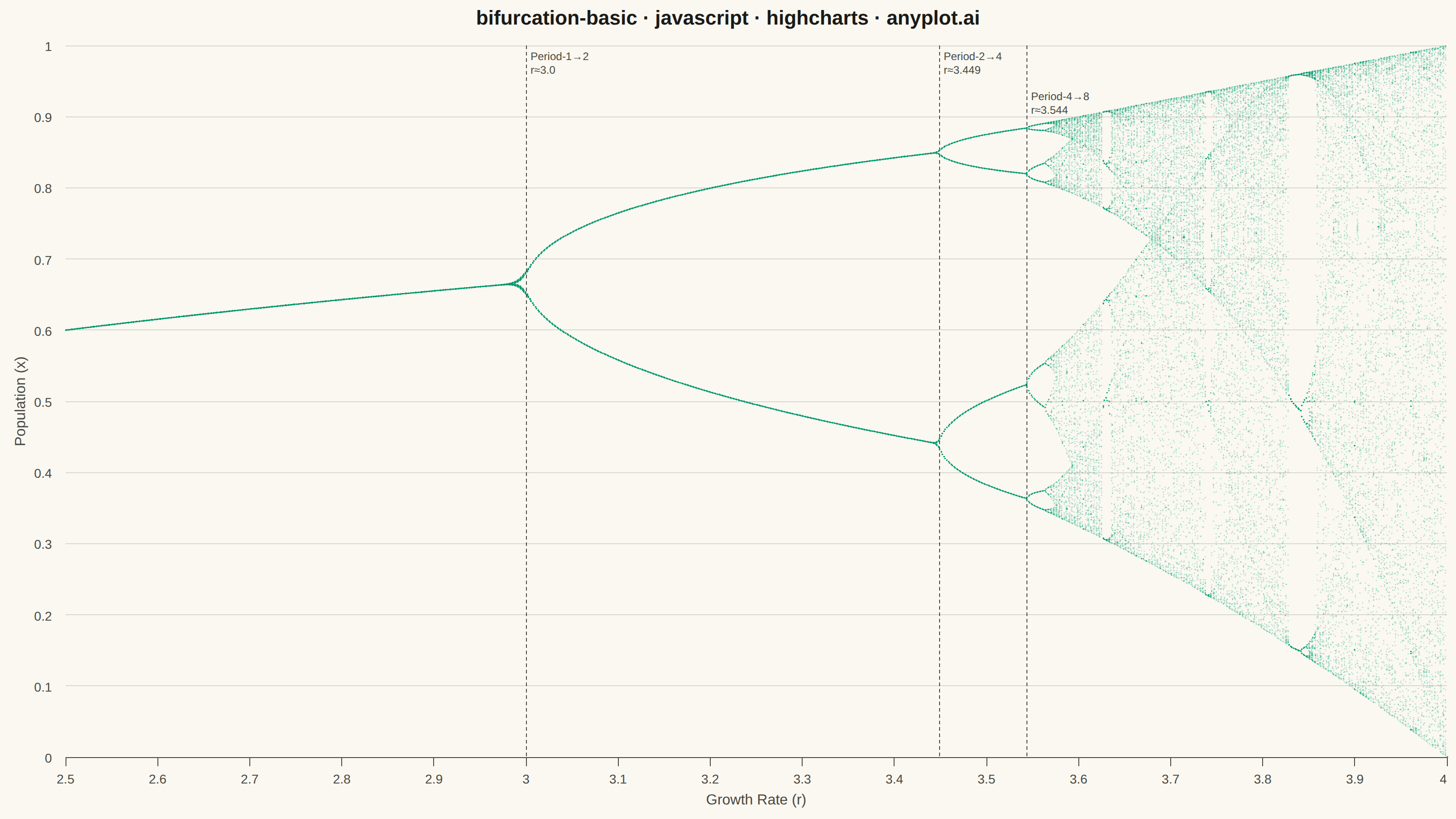
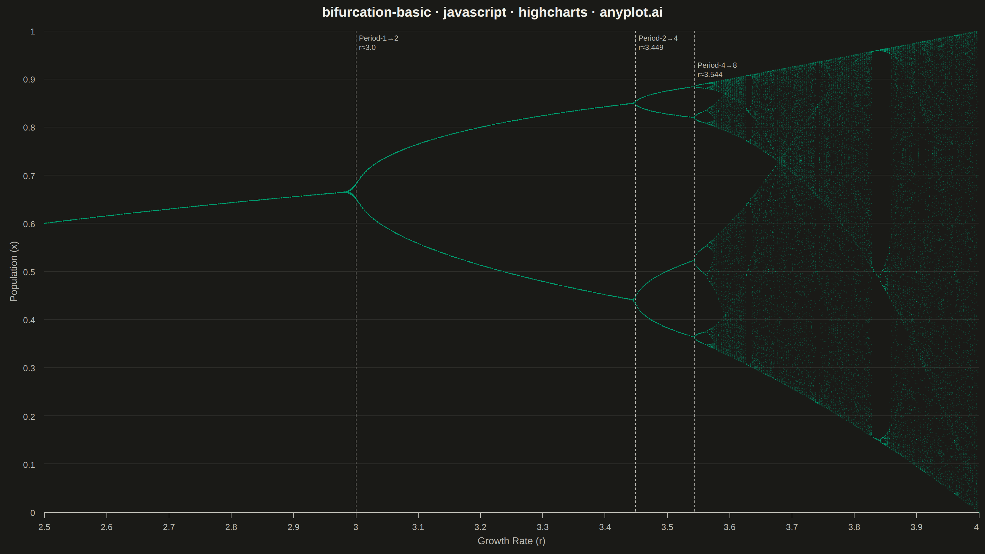
A bifurcation diagram shows how the steady-state behavior of a dynamical system changes as a control parameter varies. By plotting the long-term values of a state variable against a continuously varied parameter, it reveals transitions from stable fixed points through period-doubling cascades to chaotic regimes. The classic example is the logistic map, where the route to chaos is clearly visible as the growth rate parameter increases.
// anyplot.ai
// bifurcation-basic: Bifurcation Diagram for Dynamical Systems
// Library: highcharts 12.6.0 | JavaScript 22.22.3
// Quality: 90/100 | Created: 2026-06-17

//# anyplot-orientation: landscape

const t = window.ANYPLOT_TOKENS;

// --- Data: logistic map x(n+1) = r * x(n) * (1 - x(n)) -------------------
const R_MIN = 2.5;
const R_MAX = 4.0;
const N_R = 1000;
const TRANSIENT = 200;
const STABLE = 100;

const data = [];
for (let i = 0; i <= N_R; i++) {
    const r = R_MIN + (R_MAX - R_MIN) * (i / N_R);
    let x = 0.5;
    for (let j = 0; j < TRANSIENT; j++) x = r * x * (1 - x);
    for (let j = 0; j < STABLE; j++) {
        x = r * x * (1 - x);
        data.push([r, x]);
    }
}

// Brand green (#009E73) at partial opacity for density-based visualization
const seriesColor = "rgba(0, 158, 115, 0.30)";

// --- Chart -----------------------------------------------------------------
Highcharts.chart("container", {
    chart: {
        type: "scatter",
        backgroundColor: "transparent",
        animation: false,
        style: { fontFamily: "inherit" }
    },
    credits: { enabled: false },
    title: {
        text: "bifurcation-basic · javascript · highcharts · anyplot.ai",
        style: { color: t.ink, fontSize: "22px", fontWeight: "600" }
    },
    xAxis: {
        title: {
            text: "Growth Rate (r)",
            style: { color: t.inkSoft, fontSize: "16px" }
        },
        min: R_MIN,
        max: R_MAX,
        lineColor: t.inkSoft,
        tickColor: t.inkSoft,
        gridLineWidth: 0,
        labels: { style: { color: t.inkSoft, fontSize: "14px" } },
        plotLines: [
            {
                value: 3.0,
                color: t.inkSoft,
                dashStyle: "Dash",
                width: 1,
                label: {
                    text: "Period-1→2<br/>r≈3.0",
                    style: { color: t.inkSoft, fontSize: "12px" },
                    rotation: 0,
                    align: "left",
                    x: 4,
                    y: 16
                }
            },
            {
                value: 3.449,
                color: t.inkSoft,
                dashStyle: "Dash",
                width: 1,
                label: {
                    text: "Period-2→4<br/>r≈3.449",
                    style: { color: t.inkSoft, fontSize: "12px" },
                    rotation: 0,
                    align: "left",
                    x: 4,
                    y: 16
                }
            },
            {
                value: 3.544,
                color: t.inkSoft,
                dashStyle: "Dash",
                width: 1,
                label: {
                    text: "Period-4→8<br/>r≈3.544",
                    style: { color: t.inkSoft, fontSize: "12px" },
                    rotation: 0,
                    align: "left",
                    x: 4,
                    y: 60
                }
            }
        ]
    },
    yAxis: {
        title: {
            text: "Population (x)",
            style: { color: t.inkSoft, fontSize: "16px" }
        },
        min: 0,
        max: 1,
        lineColor: t.inkSoft,
        tickColor: t.inkSoft,
        gridLineColor: t.grid,
        labels: { style: { color: t.inkSoft, fontSize: "14px" } }
    },
    legend: { enabled: false },
    tooltip: { enabled: false },
    plotOptions: {
        series: {
            animation: false,
            enableMouseTracking: false,
            turboThreshold: 0
        },
        scatter: {
            marker: {
                radius: 0.7,
                symbol: "circle",
                lineWidth: 0
            }
        }
    },
    series: [{
        name: "x(r)",
        data: data,
        color: seriesColor
    }]
});
Runnable source as JSON, for any HTTP client: https://api.anyplot.ai/specs/bifurcation-basic/highcharts/code. Any spec id and library id listed in llms-full.txt fit the same URL shape; every URL below is complete and callable.
{
  "spec_id": "bifurcation-basic",
  "language": "javascript",
  "library": "highcharts",
  "page": "https://anyplot.ai/bifurcation-basic/javascript/highcharts",
  "hub": "https://anyplot.ai/bifurcation-basic",
  "code_json": "https://api.anyplot.ai/specs/bifurcation-basic/highcharts/code",
  "spec_json": "https://api.anyplot.ai/specs/bifurcation-basic",
  "render_light_png": "https://storage.googleapis.com/anyplot-images/plots/bifurcation-basic/javascript/highcharts/plot-light.png",
  "render_dark_png": "https://storage.googleapis.com/anyplot-images/plots/bifurcation-basic/javascript/highcharts/plot-dark.png",
  "interactive_light_html": "https://storage.googleapis.com/anyplot-images/plots/bifurcation-basic/javascript/highcharts/plot-light.html",
  "interactive_dark_html": "https://storage.googleapis.com/anyplot-images/plots/bifurcation-basic/javascript/highcharts/plot-dark.html",
  "quality_score": 90.0,
  "license": "MIT",
  "guide": "https://anyplot.ai/llms.txt"
}
Part of Bifurcation Diagram for Dynamical Systems on anyplot.ai.