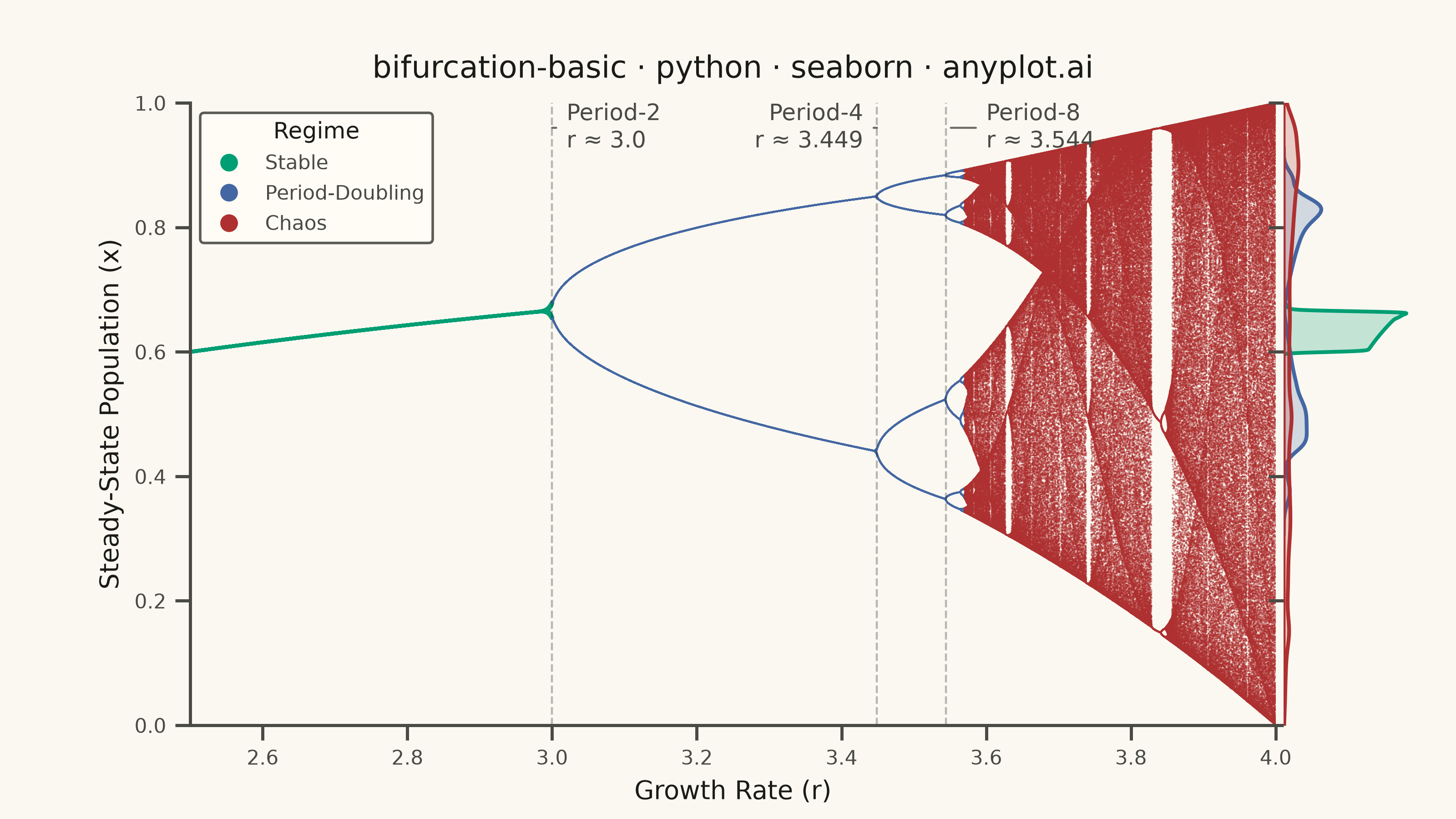
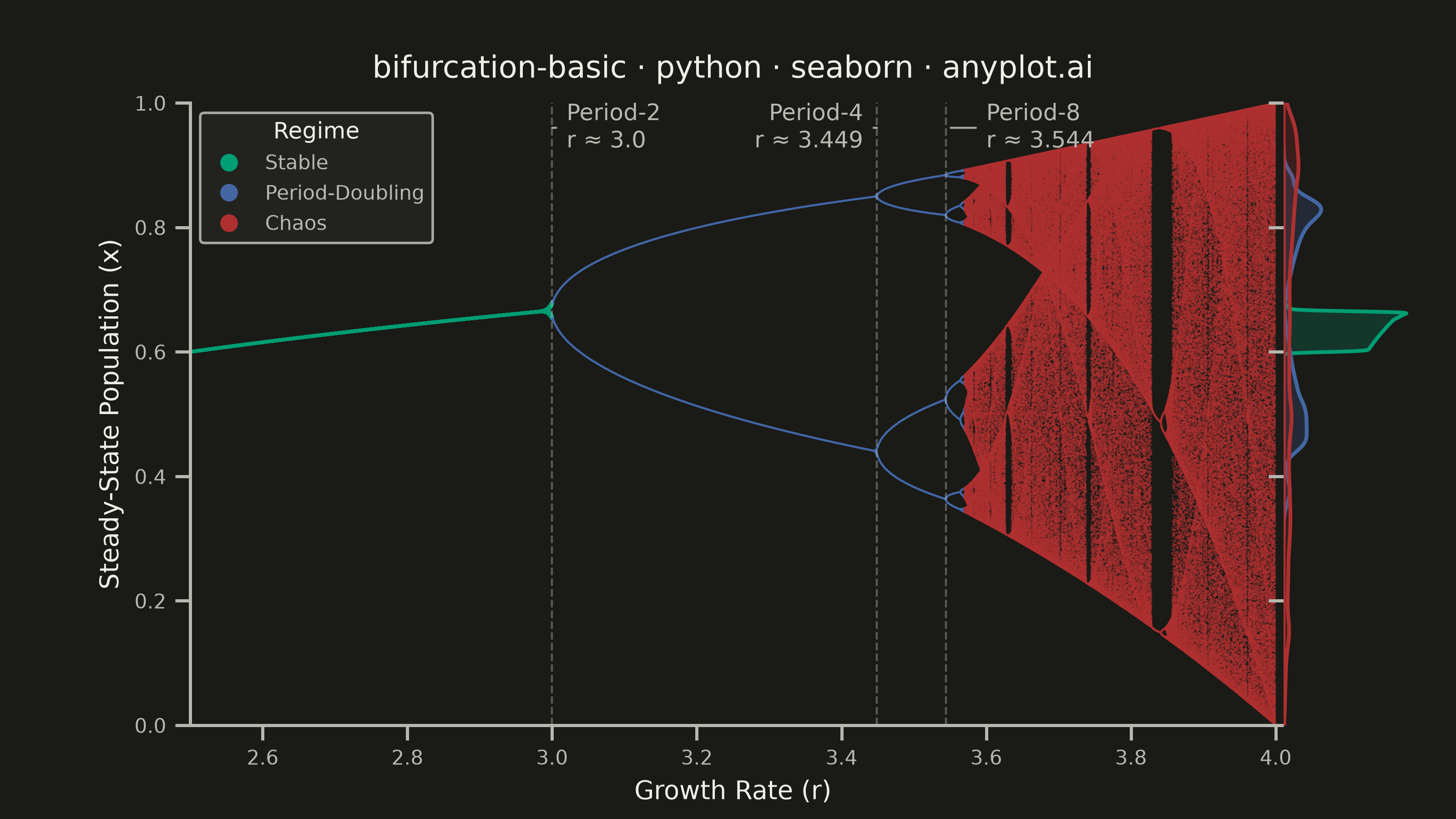
A bifurcation diagram shows how the steady-state behavior of a dynamical system changes as a control parameter varies. By plotting the long-term values of a state variable against a continuously varied parameter, it reveals transitions from stable fixed points through period-doubling cascades to chaotic regimes. The classic example is the logistic map, where the route to chaos is clearly visible as the growth rate parameter increases.
""" anyplot.ai
bifurcation-basic: Bifurcation Diagram for Dynamical Systems
Library: seaborn 0.13.2 | Python 3.13.13
Quality: 91/100 | Updated: 2026-06-17
"""

import os

import matplotlib.pyplot as plt
import numpy as np
import pandas as pd
import seaborn as sns
from matplotlib.lines import Line2D


# Theme tokens (see prompts/default-style-guide.md "Theme-adaptive Chrome")
THEME = os.getenv("ANYPLOT_THEME", "light")
PAGE_BG = "#FAF8F1" if THEME == "light" else "#1A1A17"
ELEVATED_BG = "#FFFDF6" if THEME == "light" else "#242420"
INK = "#1A1A17" if THEME == "light" else "#F0EFE8"
INK_SOFT = "#4A4A44" if THEME == "light" else "#B8B7B0"
INK_MUTED = "#6B6A63" if THEME == "light" else "#A8A79F"

# Data — Logistic map: x(n+1) = r * x(n) * (1 - x(n))
r_values = np.linspace(2.5, 4.0, 5000)
transient = 300
n_plot = 200

r_all = np.empty(len(r_values) * n_plot)
x_all = np.empty(len(r_values) * n_plot)

idx = 0
for r in r_values:
    x = 0.5
    for _ in range(transient):
        x = r * x * (1.0 - x)
    for _ in range(n_plot):
        x = r * x * (1.0 - x)
        r_all[idx] = r
        x_all[idx] = x
        idx += 1

# Classify the route to chaos for color storytelling.
regime = np.where(r_all < 3.0, "Stable", np.where(r_all < 3.57, "Period-Doubling", "Chaos"))

df = pd.DataFrame({"r": r_all, "x": x_all, "Regime": regime})

# Imprint palette — semantic mapping: stable→brand green (calm), chaos→matte red
# (semantic anchor for the extreme/disordered regime), period-doubling→blue between.
palette = {
    "Stable": "#009E73",  # Imprint position 1 (brand) — first series
    "Period-Doubling": "#4467A3",  # Imprint position 3 (blue)
    "Chaos": "#AE3030",  # Imprint position 5 (matte red, semantic: chaotic/extreme)
}
regime_order = ["Stable", "Period-Doubling", "Chaos"]

# JointGrid with a marginal KDE — a distinctive seaborn feature that reveals the
# density structure of each regime alongside the bifurcation cascade.
sns.set_theme(
    style="ticks",
    rc={
        "figure.facecolor": PAGE_BG,
        "axes.facecolor": PAGE_BG,
        "axes.edgecolor": INK_SOFT,
        "axes.labelcolor": INK,
        "text.color": INK,
        "xtick.color": INK_SOFT,
        "ytick.color": INK_SOFT,
        "font.family": "sans-serif",
    },
)

g = sns.JointGrid(data=df, x="r", y="x", ratio=8, space=0.06, marginal_ticks=False)
g.figure.set_size_inches(8, 4.5)  # × dpi 400 → 3200 × 1800 px
g.figure.set_dpi(400)
g.figure.set_facecolor(PAGE_BG)

ax = g.ax_joint
ax.set_facecolor(PAGE_BG)
g.ax_marg_y.set_facecolor(PAGE_BG)

# Main plot: density-aware scatter per regime. The stable branch has few unique
# points per r → larger markers; the chaotic fan is dense → tiny markers + alpha.
for regime_name, marker_s, marker_alpha in [("Stable", 2.0, 0.85), ("Period-Doubling", 0.5, 0.55), ("Chaos", 0.5, 0.5)]:
    subset = df[df["Regime"] == regime_name]
    sns.scatterplot(
        data=subset,
        x="r",
        y="x",
        color=palette[regime_name],
        s=marker_s,
        alpha=marker_alpha,
        linewidth=0,
        edgecolor="none",
        ax=ax,
        rasterized=True,
        legend=False,
    )

# Marginal KDE on the y-axis: per-regime density of steady-state values.
for regime_name in regime_order:
    subset = df[df["Regime"] == regime_name]
    sns.kdeplot(
        y=subset["x"], color=palette[regime_name], fill=True, alpha=0.22, linewidth=1.5, ax=g.ax_marg_y, clip=(0, 1)
    )

# Remove the x-marginal — uniform r sampling adds no density insight.
g.ax_marg_x.set_visible(False)

# Annotate key period-doubling bifurcation points. Labels sit in the empty upper
# band and are spread horizontally (Period-2/4 share the gap before r≈3.45, Period-8
# to the right) so no two label boxes intersect and none collide with the legend.
bifurcation_points = [
    (3.0, "Period-2\nr ≈ 3.0", 3.02, 0.96, "left"),
    (3.449, "Period-4\nr ≈ 3.449", 3.43, 0.96, "right"),
    (3.544, "Period-8\nr ≈ 3.544", 3.60, 0.96, "left"),
]

for r_bif, label, x_text, y_text, ha in bifurcation_points:
    ax.axvline(r_bif, color=INK, linewidth=0.8, linestyle="--", alpha=0.3)
    ax.annotate(
        label,
        xy=(r_bif, y_text),
        xytext=(x_text, y_text),
        fontsize=9,
        color=INK_SOFT,
        ha=ha,
        va="center",
        arrowprops={"arrowstyle": "-", "color": INK_MUTED, "lw": 0.8},
    )

# Style
ax.set_title("bifurcation-basic · python · seaborn · anyplot.ai", fontsize=12, fontweight="medium", color=INK, pad=10)
ax.set_xlabel("Growth Rate (r)", fontsize=10, color=INK)
ax.set_ylabel("Steady-State Population (x)", fontsize=10, color=INK)
ax.set_xlim(2.5, 4.0)
ax.set_ylim(0, 1)
ax.tick_params(axis="both", labelsize=8, colors=INK_SOFT)
sns.despine(ax=ax)
sns.despine(ax=g.ax_marg_y, bottom=True, left=True)

# Legend with readable marker proxies (the scatter markers themselves are sub-pixel).
handles = [
    Line2D(
        [0],
        [0],
        marker="o",
        linestyle="",
        markersize=7,
        markerfacecolor=palette[name],
        markeredgecolor="none",
        label=name,
    )
    for name in regime_order
]
legend = ax.legend(handles=handles, title="Regime", loc="upper left", fontsize=8, title_fontsize=9, framealpha=0.9)
legend.get_frame().set_facecolor(ELEVATED_BG)
legend.get_frame().set_edgecolor(INK_SOFT)
legend.get_title().set_color(INK)
for text in legend.get_texts():
    text.set_color(INK_SOFT)

plt.savefig(f"plot-{THEME}.png", dpi=400, facecolor=PAGE_BG)
Runnable source as JSON, for any HTTP client: https://api.anyplot.ai/specs/bifurcation-basic/seaborn/code. Any spec id and library id listed in llms-full.txt fit the same URL shape; every URL below is complete and callable.
{
  "spec_id": "bifurcation-basic",
  "language": "python",
  "library": "seaborn",
  "page": "https://anyplot.ai/bifurcation-basic/python/seaborn",
  "hub": "https://anyplot.ai/bifurcation-basic",
  "code_json": "https://api.anyplot.ai/specs/bifurcation-basic/seaborn/code",
  "spec_json": "https://api.anyplot.ai/specs/bifurcation-basic",
  "render_light_png": "https://storage.googleapis.com/anyplot-images/plots/bifurcation-basic/python/seaborn/plot-light.png",
  "render_dark_png": "https://storage.googleapis.com/anyplot-images/plots/bifurcation-basic/python/seaborn/plot-dark.png",
  "quality_score": 91.0,
  "license": "MIT",
  "guide": "https://anyplot.ai/llms.txt"
}
Part of Bifurcation Diagram for Dynamical Systems on anyplot.ai.