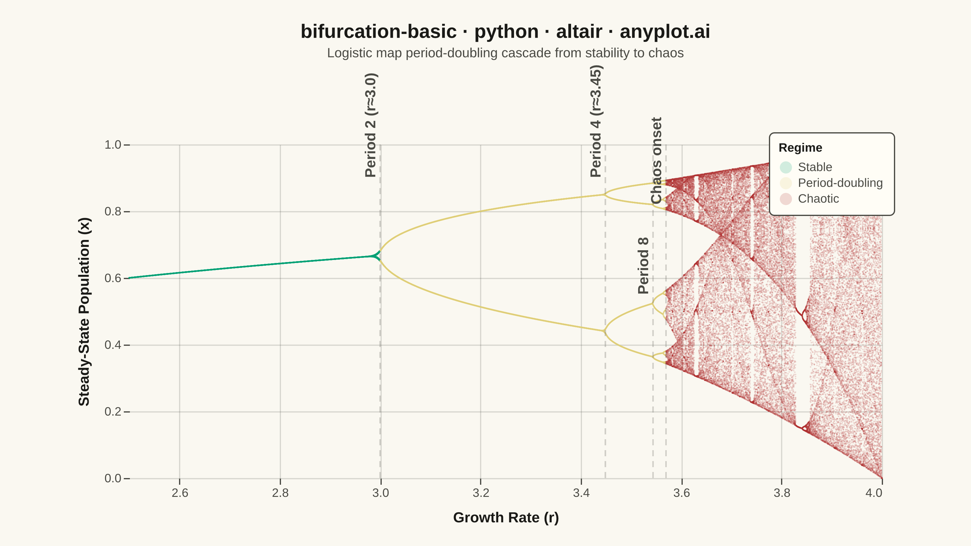
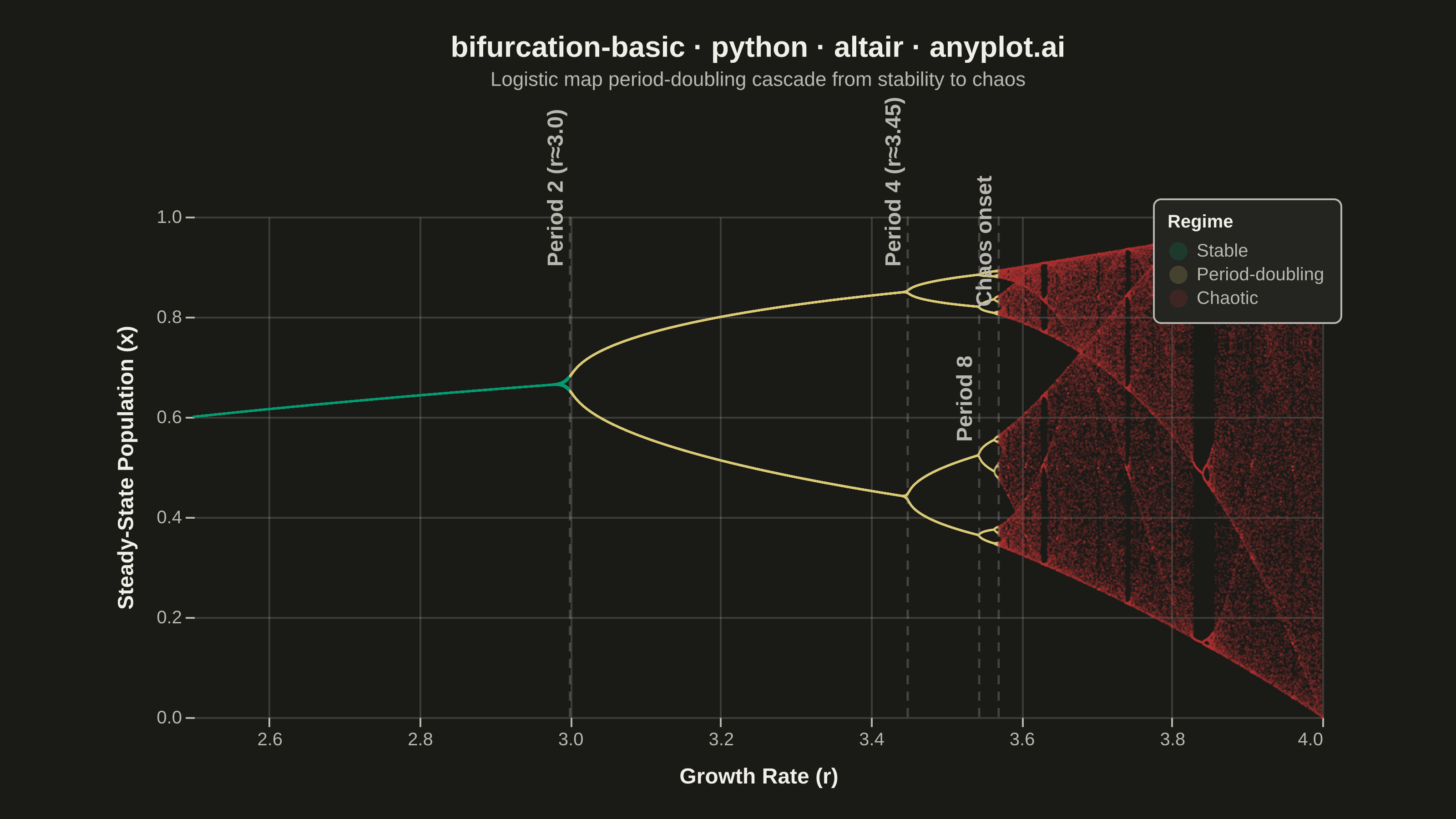
A bifurcation diagram shows how the steady-state behavior of a dynamical system changes as a control parameter varies. By plotting the long-term values of a state variable against a continuously varied parameter, it reveals transitions from stable fixed points through period-doubling cascades to chaotic regimes. The classic example is the logistic map, where the route to chaos is clearly visible as the growth rate parameter increases.
""" anyplot.ai
bifurcation-basic: Bifurcation Diagram for Dynamical Systems
Library: altair 6.2.1 | Python 3.13.14
Quality: 90/100 | Updated: 2026-06-17
"""

import os

import altair as alt
import numpy as np
import pandas as pd
from PIL import Image


THEME = os.getenv("ANYPLOT_THEME", "light")
PAGE_BG = "#FAF8F1" if THEME == "light" else "#1A1A17"
ELEVATED_BG = "#FFFDF6" if THEME == "light" else "#242420"
INK = "#1A1A17" if THEME == "light" else "#F0EFE8"
INK_SOFT = "#4A4A44" if THEME == "light" else "#B8B7B0"
INK_MUTED = "#6B6A63" if THEME == "light" else "#A8A79F"

# Imprint palette — semantic mapping: stable→green, period-doubling→amber(caution), chaos→red
STABLE_COLOR = "#009E73"  # Imprint position 1 — brand green = stable / ok
PERIOD_COLOR = "#DDCC77"  # Imprint amber anchor — warning / transition
CHAOS_COLOR = "#AE3030"  # Imprint position 5 — matte red = bad / chaos

# Data — Logistic map: x(n+1) = r * x(n) * (1 - x(n))
np.random.seed(42)
r_values = np.linspace(2.5, 4.0, 2000)
transient = 200
iterations = 100

r_all = []
x_all = []
for r in r_values:
    x = 0.5
    for _ in range(transient):
        x = r * x * (1.0 - x)
    for _ in range(iterations):
        x = r * x * (1.0 - x)
        r_all.append(r)
        x_all.append(x)

df = pd.DataFrame({"r": r_all, "x": x_all})

# Classify regions for semantic coloring
df["region"] = np.where(df["r"] < 3.0, "Stable", np.where(df["r"] < 3.57, "Period-doubling", "Chaotic"))

# Key bifurcation points — staggered y to avoid label overlap near the chaos onset
bifurcation_points = pd.DataFrame(
    {
        "r": [3.0, 3.449, 3.544, 3.5699],
        "label": ["Period 2 (r≈3.0)", "Period 4 (r≈3.45)", "Period 8", "Chaos onset"],
        "y": [0.90, 0.90, 0.55, 0.82],
    }
)

# Selection for interactive crosshair on nearest point
nearest = alt.selection_point(nearest=True, on="pointerover", fields=["r"], empty=False)

# Semantic color scale from Imprint palette
region_color = alt.Scale(
    domain=["Stable", "Period-doubling", "Chaotic"], range=[STABLE_COLOR, PERIOD_COLOR, CHAOS_COLOR]
)

# Base scatter layer — density-adapted size and opacity for 200K points
points = (
    alt.Chart(df)
    .mark_circle(size=1.5, opacity=0.18)
    .encode(
        x=alt.X(
            "r:Q",
            title="Growth Rate (r)",
            scale=alt.Scale(domain=[2.5, 4.0], nice=False),
            axis=alt.Axis(tickCount=7, titleColor=INK, labelColor=INK_SOFT, domain=False),
        ),
        y=alt.Y(
            "x:Q",
            title="Steady-State Population (x)",
            scale=alt.Scale(domain=[0, 1.0], nice=False),
            axis=alt.Axis(tickCount=6, titleColor=INK, labelColor=INK_SOFT, domain=False),
        ),
        color=alt.Color(
            "region:N",
            scale=region_color,
            legend=alt.Legend(
                title="Regime",
                titleFontSize=10,
                labelFontSize=10,
                orient="top-right",
                offset=-10,
                fillColor=ELEVATED_BG,
                strokeColor=INK_SOFT,
                padding=8,
                cornerRadius=4,
                labelColor=INK_SOFT,
                titleColor=INK,
            ),
        ),
        tooltip=[alt.Tooltip("r:Q", title="r", format=".4f"), alt.Tooltip("x:Q", title="x", format=".4f"), "region:N"],
    )
)

# Transparent layer for nearest-point selection (voronoi-like hover)
voronoi = (
    alt.Chart(df.sample(n=5000, random_state=42))
    .mark_point(size=1, opacity=0)
    .encode(x="r:Q", y="x:Q")
    .add_params(nearest)
)

# Vertical crosshair following pointer
crosshair = (
    alt.Chart(df.sample(n=5000, random_state=42))
    .mark_rule(color=INK_SOFT, strokeWidth=1.5, opacity=0.5)
    .encode(x="r:Q")
    .transform_filter(nearest)
)

# Dashed vertical rules at bifurcation points
rules = (
    alt.Chart(bifurcation_points)
    .mark_rule(strokeDash=[5, 4], strokeWidth=1.2, opacity=0.30, color=INK_MUTED)
    .encode(x="r:Q")
)

# Rotated text labels at bifurcation points — fontSize=12 for clear readability at full res
labels = (
    alt.Chart(bifurcation_points)
    .mark_text(fontSize=12, fontWeight="bold", color=INK_SOFT, angle=270, align="left", dx=0, dy=-8)
    .encode(x="r:Q", y="y:Q", text="label:N")
)

# Compose layers with theme-adaptive chrome
chart = (
    (points + voronoi + crosshair + rules + labels)
    .properties(
        width=620,
        height=275,
        background=PAGE_BG,
        title=alt.Title(
            "bifurcation-basic · python · altair · anyplot.ai",
            fontSize=16,
            fontWeight="bold",
            color=INK,
            subtitle="Logistic map period-doubling cascade from stability to chaos",
            subtitleFontSize=11,
            subtitleColor=INK_SOFT,
            subtitlePadding=4,
        ),
    )
    .configure_view(fill=PAGE_BG, strokeWidth=0)
    .configure_axis(
        labelFontSize=10,
        titleFontSize=12,
        titlePadding=10,
        grid=True,
        gridOpacity=0.15,
        gridColor=INK,
        domainColor=INK_SOFT,
        tickColor=INK_SOFT,
    )
    .configure_title(color=INK)
    .configure_legend(
        fillColor=ELEVATED_BG,
        strokeColor=INK_SOFT,
        labelColor=INK_SOFT,
        titleColor=INK,
        labelFontSize=10,
        titleFontSize=10,
    )
)

# Save PNG then pad to exactly 3200×1800 (landscape target)
TW, TH = 3200, 1800
chart.save(f"plot-{THEME}.png", scale_factor=4.0)
_img = Image.open(f"plot-{THEME}.png").convert("RGB")
_w, _h = _img.size
if _w > TW or _h > TH:
    raise SystemExit(
        f"altair vl-convert produced {_w}×{_h}, exceeds target {TW}×{TH}. "
        "Shrink chart .properties(width=, height=) values and re-render."
    )
if _w < TW or _h < TH:
    _canvas = Image.new("RGB", (TW, TH), PAGE_BG)
    _canvas.paste(_img, ((TW - _w) // 2, (TH - _h) // 2))
    _canvas.save(f"plot-{THEME}.png")

# Save interactive HTML
chart.save(f"plot-{THEME}.html")
Runnable source as JSON, for any HTTP client: https://api.anyplot.ai/specs/bifurcation-basic/altair/code. Any spec id and library id listed in llms-full.txt fit the same URL shape; every URL below is complete and callable.
{
  "spec_id": "bifurcation-basic",
  "language": "python",
  "library": "altair",
  "page": "https://anyplot.ai/bifurcation-basic/python/altair",
  "hub": "https://anyplot.ai/bifurcation-basic",
  "code_json": "https://api.anyplot.ai/specs/bifurcation-basic/altair/code",
  "spec_json": "https://api.anyplot.ai/specs/bifurcation-basic",
  "render_light_png": "https://storage.googleapis.com/anyplot-images/plots/bifurcation-basic/python/altair/plot-light.png",
  "render_dark_png": "https://storage.googleapis.com/anyplot-images/plots/bifurcation-basic/python/altair/plot-dark.png",
  "interactive_light_html": "https://storage.googleapis.com/anyplot-images/plots/bifurcation-basic/python/altair/plot-light.html",
  "interactive_dark_html": "https://storage.googleapis.com/anyplot-images/plots/bifurcation-basic/python/altair/plot-dark.html",
  "quality_score": 90.0,
  "license": "MIT",
  "guide": "https://anyplot.ai/llms.txt"
}
Part of Bifurcation Diagram for Dynamical Systems on anyplot.ai.