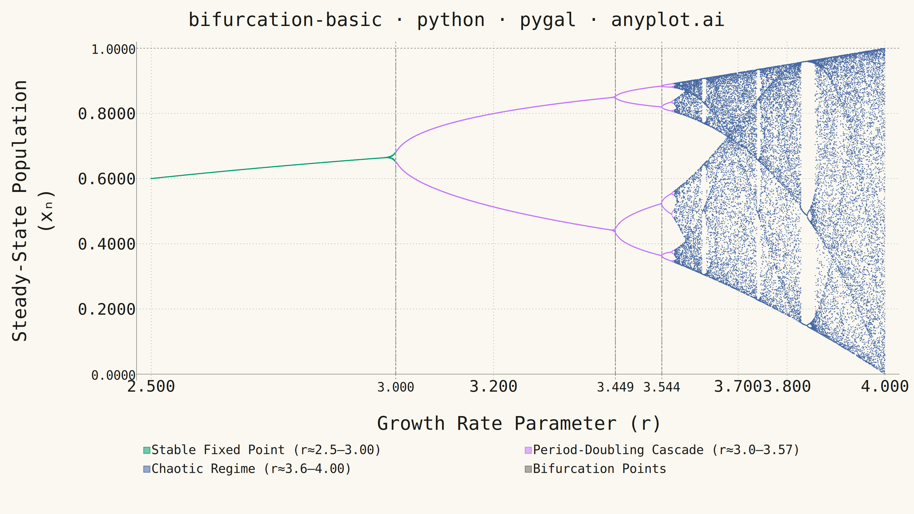
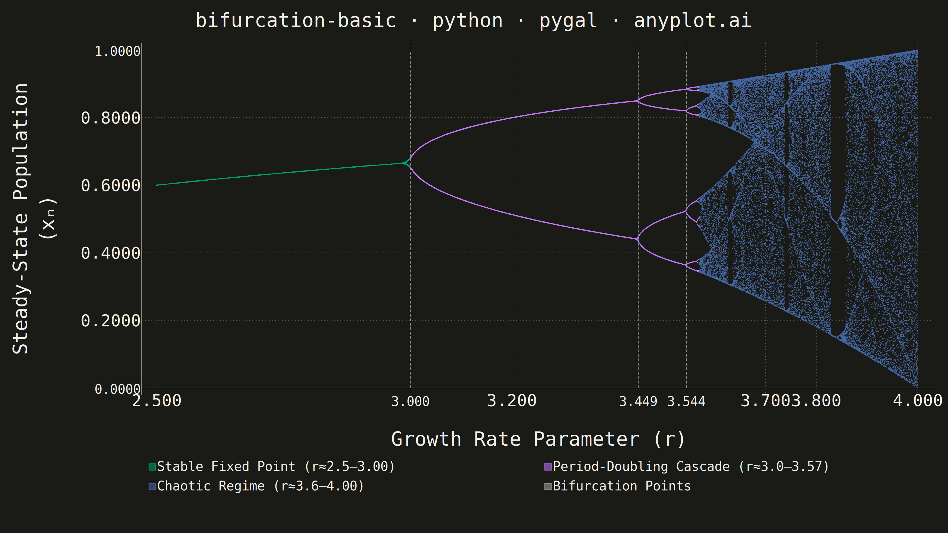
A bifurcation diagram shows how the steady-state behavior of a dynamical system changes as a control parameter varies. By plotting the long-term values of a state variable against a continuously varied parameter, it reveals transitions from stable fixed points through period-doubling cascades to chaotic regimes. The classic example is the logistic map, where the route to chaos is clearly visible as the growth rate parameter increases.
""" anyplot.ai
bifurcation-basic: Bifurcation Diagram for Dynamical Systems
Library: pygal 3.1.0 | Python 3.13.13
Quality: 82/100 | Updated: 2026-06-17
"""

import os

import numpy as np
import pygal
from pygal.style import Style


# Theme tokens — Imprint palette chrome
THEME = os.getenv("ANYPLOT_THEME", "light")
PAGE_BG = "#FAF8F1" if THEME == "light" else "#1A1A17"
INK = "#1A1A17" if THEME == "light" else "#F0EFE8"
INK_SOFT = "#4A4A44" if THEME == "light" else "#B8B7B0"
INK_MUTED = "#6B6A63" if THEME == "light" else "#A8A79F"

# Imprint categorical palette — 8 hues, hybrid-v3 sort
IMPRINT_PALETTE = ("#009E73", "#C475FD", "#4467A3", "#BD8233", "#AE3030", "#2ABCCD", "#954477", "#99B314")

# Logistic map data — x(n+1) = r * x(n) * (1 - x(n))
np.random.seed(42)
TRANSIENT = 200
ITERATIONS = 100
x0 = 0.1 + np.random.uniform(-0.01, 0.01)

# Key bifurcation thresholds
R_PERIOD2 = 3.0
R_PERIOD4 = 3.449
R_PERIOD8 = 3.544
R_CHAOS = 3.57

# Variable-density sampling: more points where structure is richer
r_stable = np.linspace(2.5, R_PERIOD2, 250)
r_periodic = np.linspace(R_PERIOD2, R_CHAOS, 500)
r_chaotic = np.linspace(R_CHAOS, 4.0, 700)
r_values = np.concatenate([r_stable, r_periodic, r_chaotic])

# Three dynamical regions mapped to first three Imprint palette positions
regions = {
    "Stable Fixed Point": (2.5, R_PERIOD2, IMPRINT_PALETTE[0]),
    "Period-Doubling Cascade": (R_PERIOD2, R_CHAOS, IMPRINT_PALETTE[1]),
    "Chaotic Regime": (R_CHAOS, 4.0, IMPRINT_PALETTE[2]),
}

region_data = {name: [] for name in regions}

for r in r_values:
    x = x0
    for _ in range(TRANSIENT):
        x = r * x * (1.0 - x)
    for _ in range(ITERATIONS):
        x = r * x * (1.0 - x)
        for name, (lo, hi, _) in regions.items():
            if lo <= r < hi or (name == "Chaotic Regime" and r == 4.0):
                region_data[name].append(
                    {"value": (round(float(r), 5), round(float(x), 5)), "label": f"r={r:.4f}, x={x:.4f}"}
                )
                break

# Downsample each region to balance visual density
max_per_region = {"Stable Fixed Point": 6000, "Period-Doubling Cascade": 18000, "Chaotic Regime": 28000}
for name in region_data:
    pts = region_data[name]
    cap = max_per_region[name]
    if len(pts) > cap:
        idx = np.random.choice(len(pts), cap, replace=False)
        idx.sort()
        region_data[name] = [pts[i] for i in idx]

# Color tuple: 3 Imprint data series + INK_MUTED for dashed annotation lines
region_colors = tuple(color for _, (_, _, color) in regions.items())
all_colors = region_colors + (INK_MUTED,)

custom_style = Style(
    background=PAGE_BG,
    plot_background=PAGE_BG,
    foreground=INK,
    foreground_strong=INK,
    foreground_subtle=INK_MUTED,
    guide_stroke_color=INK_MUTED,
    guide_stroke_dasharray="3, 8",
    colors=all_colors,
    title_font_size=66,
    label_font_size=56,
    major_label_font_size=44,
    legend_font_size=44,
    value_font_size=36,
    tooltip_font_size=32,
    stroke_width=2.5,
    opacity=0.55,
    opacity_hover=1.0,
)

chart = pygal.XY(
    width=3200,
    height=1800,
    style=custom_style,
    title="bifurcation-basic · python · pygal · anyplot.ai",
    x_title="Growth Rate Parameter (r)",
    y_title="Steady-State Population (xₙ)",
    show_legend=True,
    legend_at_bottom=True,
    legend_at_bottom_columns=2,
    legend_box_size=22,
    stroke=False,
    dots_size=1.2,
    show_x_guides=True,
    show_y_guides=True,
    x_value_formatter=lambda v: f"{v:.3f}",
    value_formatter=lambda v: f"{v:.4f}",
    margin_bottom=160,
    margin_left=70,
    margin_right=50,
    margin_top=55,
    xrange=(2.5, 4.0),
    range=(0.0, 1.0),
    print_values=False,
    print_zeroes=False,
    js=[],
    x_labels=[2.5, R_PERIOD2, 3.2, R_PERIOD4, R_PERIOD8, 3.7, 3.8, 4.0],
    x_labels_major=[R_PERIOD2, R_PERIOD4, R_PERIOD8],
    y_labels=[0.0, 0.2, 0.4, 0.6, 0.8, 1.0],
    truncate_legend=-1,
    no_data_text="",
    show_x_labels=True,
    show_y_labels=True,
    allow_interruptions=True,
    show_minor_x_labels=True,
    spacing=25,
    include_x_axis=True,
)

# Add each dynamical region as a separate series with per-point tooltip metadata
for name in regions:
    lo, hi, _ = regions[name]
    chart.add(
        f"{name} (r≈{lo:.1f}–{hi:.2f})", region_data[name], stroke=False, show_dots=True, allow_interruptions=True
    )

# Dashed vertical lines at key bifurcation thresholds — no secondary axis
annotation_points = [
    (R_PERIOD2, "r≈3.0: Period-2 onset"),
    (R_PERIOD4, "r≈3.449: Period-4 onset"),
    (R_PERIOD8, "r≈3.544: Period-8 onset"),
]

annotation_data = []
for r_val, label in annotation_points:
    annotation_data.append({"value": (r_val, 0.0), "label": label})
    annotation_data.append({"value": (r_val, 1.0), "label": label})
    annotation_data.append(None)

chart.add(
    "Bifurcation Points",
    annotation_data,
    stroke=True,
    stroke_style={"width": 2.5, "dasharray": "10, 5"},
    show_dots=False,
    dots_size=0,
)

chart.render_to_png(f"plot-{THEME}.png")
with open(f"plot-{THEME}.html", "wb") as f:
    f.write(chart.render())
Runnable source as JSON, for any HTTP client: https://api.anyplot.ai/specs/bifurcation-basic/pygal/code. Any spec id and library id listed in llms-full.txt fit the same URL shape; every URL below is complete and callable.
{
  "spec_id": "bifurcation-basic",
  "language": "python",
  "library": "pygal",
  "page": "https://anyplot.ai/bifurcation-basic/python/pygal",
  "hub": "https://anyplot.ai/bifurcation-basic",
  "code_json": "https://api.anyplot.ai/specs/bifurcation-basic/pygal/code",
  "spec_json": "https://api.anyplot.ai/specs/bifurcation-basic",
  "render_light_png": "https://storage.googleapis.com/anyplot-images/plots/bifurcation-basic/python/pygal/plot-light.png",
  "render_dark_png": "https://storage.googleapis.com/anyplot-images/plots/bifurcation-basic/python/pygal/plot-dark.png",
  "interactive_light_html": "https://storage.googleapis.com/anyplot-images/plots/bifurcation-basic/python/pygal/plot-light.html",
  "interactive_dark_html": "https://storage.googleapis.com/anyplot-images/plots/bifurcation-basic/python/pygal/plot-dark.html",
  "quality_score": 82.0,
  "license": "MIT",
  "guide": "https://anyplot.ai/llms.txt"
}
Part of Bifurcation Diagram for Dynamical Systems on anyplot.ai.