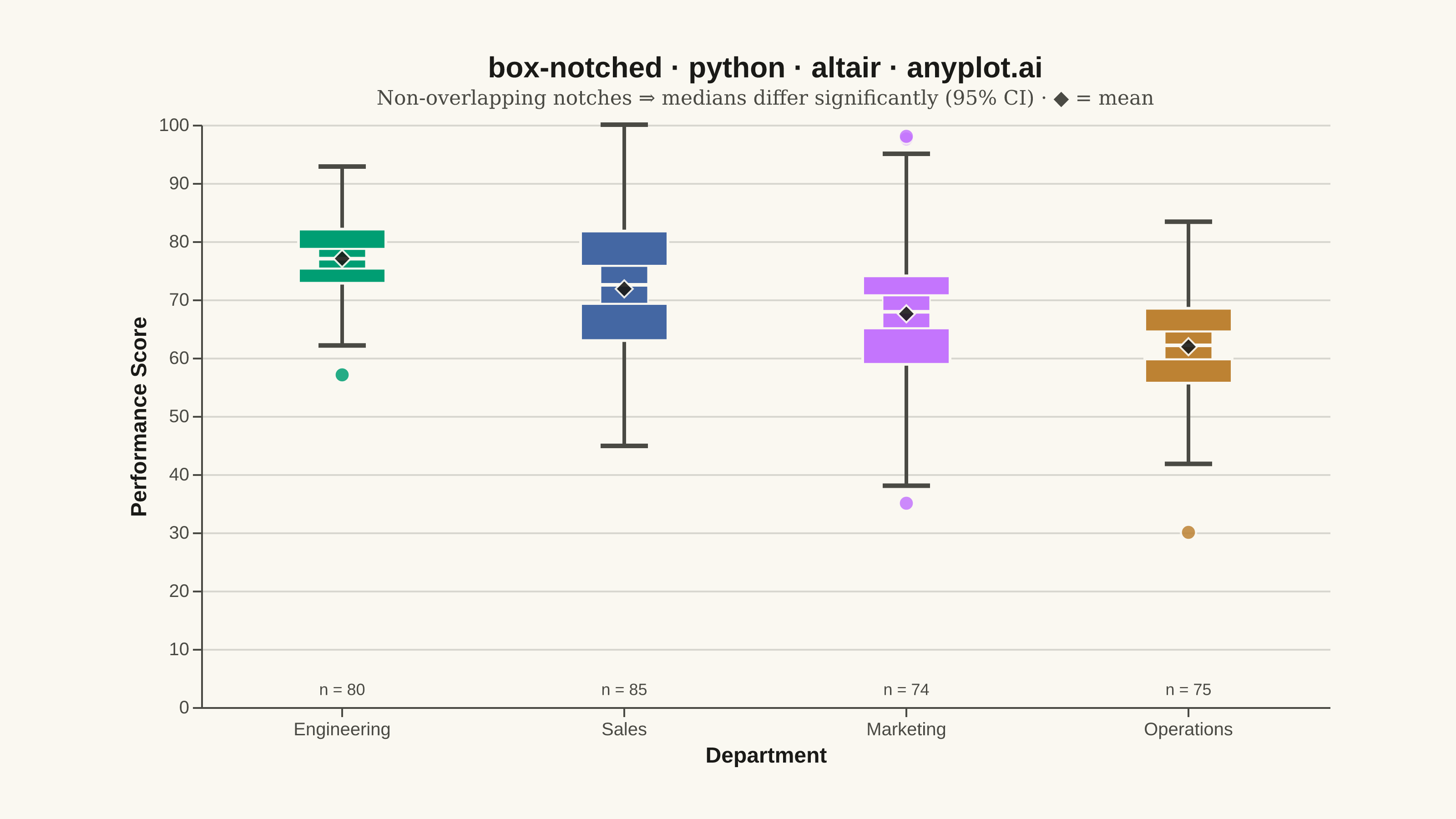
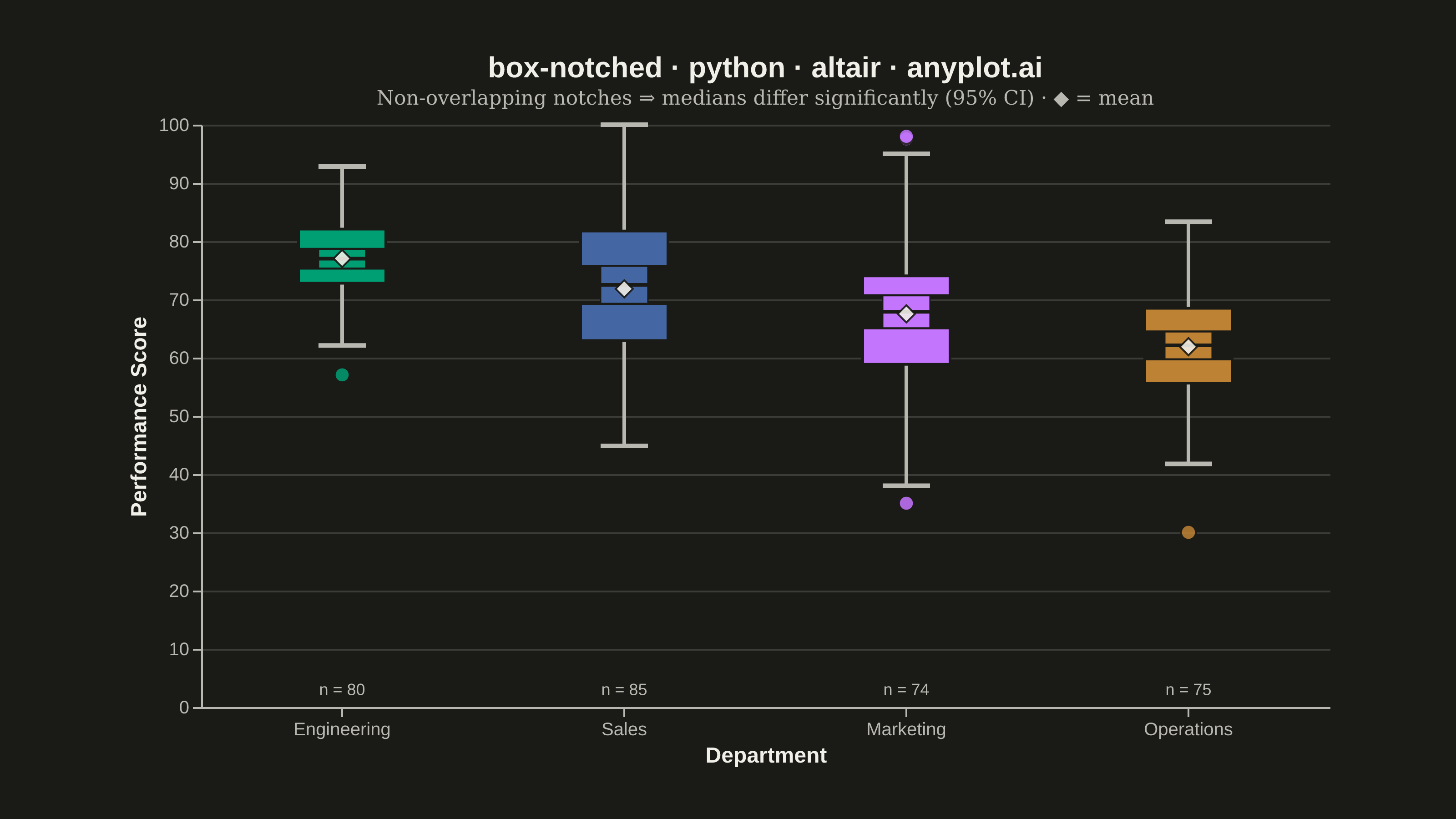
A notched box plot extends the standard box plot by adding notches around the median that represent a confidence interval. If the notches of two boxes do not overlap, this provides visual evidence that the medians differ significantly. This variant is particularly valuable for quick visual hypothesis testing and comparing group medians in statistical analysis.
""" anyplot.ai
box-notched: Notched Box Plot
Library: altair 6.2.2 | Python 3.13.15
Quality: 94/100 | Updated: 2026-08-18
"""

import os

import altair as alt
import numpy as np
import pandas as pd
from PIL import Image


# Theme tokens (see prompts/default-style-guide.md "Background" + "Theme-adaptive Chrome")
THEME = os.getenv("ANYPLOT_THEME", "light")
PAGE_BG = "#FAF8F1" if THEME == "light" else "#1A1A17"
ELEVATED_BG = "#FFFDF6" if THEME == "light" else "#242420"
INK = "#1A1A17" if THEME == "light" else "#F0EFE8"
INK_SOFT = "#4A4A44" if THEME == "light" else "#B8B7B0"

# Imprint categorical palette — canonical order, departments are abstract groups
IMPRINT_PALETTE = ["#009E73", "#C475FD", "#4467A3", "#BD8233"]

# Data - Employee performance scores across departments
np.random.seed(42)

departments = ["Engineering", "Marketing", "Sales", "Operations"]
data = []

# Create varied distributions to showcase notched box plot features
# Engineering: high scores, tight distribution
engineering = np.random.normal(78, 8, 80)
engineering = np.clip(engineering, 50, 100)
data.extend([{"Department": "Engineering", "Performance Score": v} for v in engineering])

# Marketing: moderate scores, wider distribution with some outliers
marketing = np.concatenate(
    [
        np.random.normal(68, 12, 70),
        np.array([35, 38, 95, 98]),  # outliers
    ]
)
data.extend([{"Department": "Marketing", "Performance Score": v} for v in marketing])

# Sales: bimodal-ish, high variability
sales = np.concatenate([np.random.normal(60, 10, 40), np.random.normal(80, 8, 45)])
sales = np.clip(sales, 25, 100)  # keep within the 0-100 performance-score ceiling
data.extend([{"Department": "Sales", "Performance Score": v} for v in sales])

# Operations: lower median, different from Engineering (to show non-overlapping notches)
operations = np.random.normal(62, 10, 75)
operations = np.clip(operations, 30, 95)
data.extend([{"Department": "Operations", "Performance Score": v} for v in operations])

df = pd.DataFrame(data)

# Altair does not natively support notched box plots — calculate the notch
# geometry manually and assemble it from layered marks.
stats_list = []
for dept in departments:
    values = df[df["Department"] == dept]["Performance Score"].values
    q1 = np.percentile(values, 25)
    median = np.percentile(values, 50)
    q3 = np.percentile(values, 75)
    iqr = q3 - q1
    n = len(values)

    # Notch: ±1.57 × IQR / √n (95% CI around the median)
    notch_size = 1.57 * iqr / np.sqrt(n)
    notch_lower = median - notch_size
    notch_upper = median + notch_size

    # Whiskers: furthest non-outlier point within 1.5×IQR of the box
    non_outliers = values[(values >= q1 - 1.5 * iqr) & (values <= q3 + 1.5 * iqr)]
    whisker_lower = non_outliers.min()
    whisker_upper = non_outliers.max()

    outliers = values[(values < q1 - 1.5 * iqr) | (values > q3 + 1.5 * iqr)]

    stats_list.append(
        {
            "Department": dept,
            "q1": q1,
            "median": median,
            "q3": q3,
            "mean": float(np.mean(values)),
            "notch_lower": notch_lower,
            "notch_upper": notch_upper,
            "whisker_lower": whisker_lower,
            "whisker_upper": whisker_upper,
            "n": n,
            "n_label": f"n = {n}",
            "n_label_y": 3,  # fixed low baseline, in the near-zero whitespace below every whisker
            "outliers": outliers.tolist(),
        }
    )

stats_df = pd.DataFrame(stats_list)
# Sort by median (descending) so the ranking reads left-to-right — storytelling win over alphabetical order
dept_order = stats_df.sort_values("median", ascending=False)["Department"].tolist()

outlier_data = []
for _, row in stats_df.iterrows():
    for outlier in row["outliers"]:
        outlier_data.append({"Department": row["Department"], "Performance Score": outlier})
outliers_df = pd.DataFrame(outlier_data) if outlier_data else pd.DataFrame(columns=["Department", "Performance Score"])

color_scale = alt.Scale(domain=departments, range=IMPRINT_PALETTE)
tooltip_fields = [
    alt.Tooltip("Department:N"),
    alt.Tooltip("q1:Q", title="Q1", format=".1f"),
    alt.Tooltip("median:Q", title="Median", format=".1f"),
    alt.Tooltip("q3:Q", title="Q3", format=".1f"),
    alt.Tooltip("mean:Q", title="Mean", format=".1f"),
    alt.Tooltip("notch_lower:Q", title="Notch low (95% CI)", format=".1f"),
    alt.Tooltip("notch_upper:Q", title="Notch high (95% CI)", format=".1f"),
    alt.Tooltip("n:Q", title="Sample size"),
]

# Hover highlight — mouseover a department's box to bring it to full opacity
# and dim the rest, an Altair-native selection_point driving a shared param
# across every colored layer (only visible in the interactive HTML export;
# the empty selection matches all rows so the static PNG is unaffected).
hover = alt.selection_point(fields=["Department"], on="mouseover", empty=True)
hover_opacity = alt.condition(hover, alt.value(1.0), alt.value(0.55))

x_enc = alt.X("Department:N", title="Department", sort=dept_order, axis=alt.Axis(labelAngle=0, grid=False))

# Whiskers drawn first so the box marks layer cleanly on top
whisker_rule = (
    alt.Chart(stats_df)
    .mark_rule(strokeWidth=2, color=INK_SOFT)
    .encode(x=x_enc, y="whisker_lower:Q", y2="whisker_upper:Q")
)
lower_cap = (
    alt.Chart(stats_df)
    .mark_tick(size=26, thickness=2.5, color=INK_SOFT, opacity=1)
    .encode(x=x_enc, y="whisker_lower:Q")
)
upper_cap = (
    alt.Chart(stats_df)
    .mark_tick(size=26, thickness=2.5, color=INK_SOFT, opacity=1)
    .encode(x=x_enc, y="whisker_upper:Q")
)

# Notched box: lower box (Q1 -> notch_lower), waist (notch_lower -> notch_upper), upper box (notch_upper -> Q3)
lower_box = (
    alt.Chart(stats_df)
    .mark_bar(size=48, stroke=PAGE_BG, strokeWidth=1.5)
    .encode(
        x=x_enc,
        y=alt.Y("q1:Q", title="Performance Score"),
        y2="notch_lower:Q",
        color=alt.Color("Department:N", scale=color_scale, legend=None),
        opacity=hover_opacity,
        tooltip=tooltip_fields,
    )
    .add_params(hover)
)
upper_box = (
    alt.Chart(stats_df)
    .mark_bar(size=48, stroke=PAGE_BG, strokeWidth=1.5)
    .encode(
        x=x_enc,
        y="notch_upper:Q",
        y2="q3:Q",
        color=alt.Color("Department:N", scale=color_scale, legend=None),
        opacity=hover_opacity,
        tooltip=tooltip_fields,
    )
)
notch_box = (
    alt.Chart(stats_df)
    .mark_bar(size=26, stroke=PAGE_BG, strokeWidth=0.75)
    .encode(
        x=x_enc,
        y="notch_lower:Q",
        y2="notch_upper:Q",
        color=alt.Color("Department:N", scale=color_scale, legend=None),
        opacity=hover_opacity,
        tooltip=tooltip_fields,
    )
)
# Median tick cut in the page background color — reads as a gap through the waist, theme-adaptive by construction
median_line = (
    alt.Chart(stats_df).mark_tick(color=PAGE_BG, size=26, thickness=2, opacity=1).encode(x=x_enc, y="median:Q")
)

# Mean diamond — a second, distinct central-tendency marker beside the median notch
mean_marker = (
    alt.Chart(stats_df)
    .mark_point(shape="diamond", size=90, filled=True, color=INK, opacity=0.9, stroke=PAGE_BG, strokeWidth=1)
    .encode(x=x_enc, y="mean:Q", tooltip=tooltip_fields)
)

# On-canvas sample-size annotation, sitting in the near-zero whitespace under every box
n_label = (
    alt.Chart(stats_df)
    .mark_text(fontSize=9, color=INK_SOFT, baseline="middle", align="center")
    .encode(x=x_enc, y=alt.Y("n_label_y:Q"), text="n_label:N")
)

outliers_chart = (
    alt.Chart(outliers_df)
    .mark_point(size=70, filled=True, opacity=0.85, stroke=PAGE_BG, strokeWidth=1.2)
    .encode(x=x_enc, y=alt.Y("Performance Score:Q"), color=alt.Color("Department:N", scale=color_scale, legend=None))
    if len(outliers_df) > 0
    else alt.Chart(pd.DataFrame()).mark_point()
)

chart = (
    alt.layer(
        whisker_rule,
        lower_cap,
        upper_cap,
        lower_box,
        upper_box,
        notch_box,
        median_line,
        mean_marker,
        n_label,
        outliers_chart,
    )
    .properties(
        width=620,
        height=320,
        background=PAGE_BG,
        title=alt.Title(
            "box-notched · python · altair · anyplot.ai",
            fontSize=16,
            anchor="middle",
            color=INK,
            subtitle="Non-overlapping notches ⇒ medians differ significantly (95% CI) · ◆ = mean",
            subtitleFontSize=11,
            subtitleColor=INK_SOFT,
        ),
    )
    .configure_view(fill=PAGE_BG, stroke=INK_SOFT, strokeWidth=0)
    .configure_axis(
        domainColor=INK_SOFT,
        tickColor=INK_SOFT,
        labelFontSize=10,
        titleFontSize=12,
        labelColor=INK_SOFT,
        titleColor=INK,
    )
    .configure_axisY(grid=True, gridColor=INK, gridOpacity=0.15)
)

chart.save(f"plot-{THEME}.png", scale_factor=4.0)

# PAD-only to the canonical 3200x1800 landscape target — see prompts/library/altair.md "Canvas".
TW, TH = 3200, 1800
_img = Image.open(f"plot-{THEME}.png").convert("RGB")
_w, _h = _img.size
if _w > TW or _h > TH:
    raise SystemExit(
        f"altair vl-convert produced {_w}x{_h}, exceeds target {TW}x{TH}. "
        f"Shrink chart .properties(width=, height=) values and re-render."
    )
if _w < TW or _h < TH:
    _canvas = Image.new("RGB", (TW, TH), PAGE_BG)
    _canvas.paste(_img, ((TW - _w) // 2, (TH - _h) // 2))
    _canvas.save(f"plot-{THEME}.png")

chart.save(f"plot-{THEME}.html")
Runnable source as JSON, for any HTTP client: https://api.anyplot.ai/specs/box-notched/altair/code. Any spec id and library id listed in llms-full.txt fit the same URL shape; every URL below is complete and callable.
{
  "spec_id": "box-notched",
  "language": "python",
  "library": "altair",
  "page": "https://anyplot.ai/box-notched/python/altair",
  "hub": "https://anyplot.ai/box-notched",
  "code_json": "https://api.anyplot.ai/specs/box-notched/altair/code",
  "spec_json": "https://api.anyplot.ai/specs/box-notched",
  "render_light_png": "https://storage.googleapis.com/anyplot-images/plots/box-notched/python/altair/plot-light.png",
  "render_dark_png": "https://storage.googleapis.com/anyplot-images/plots/box-notched/python/altair/plot-dark.png",
  "interactive_light_html": "https://storage.googleapis.com/anyplot-images/plots/box-notched/python/altair/plot-light.html",
  "interactive_dark_html": "https://storage.googleapis.com/anyplot-images/plots/box-notched/python/altair/plot-dark.html",
  "quality_score": 94.0,
  "license": "MIT",
  "guide": "https://anyplot.ai/llms.txt"
}
Part of Notched Box Plot on anyplot.ai.