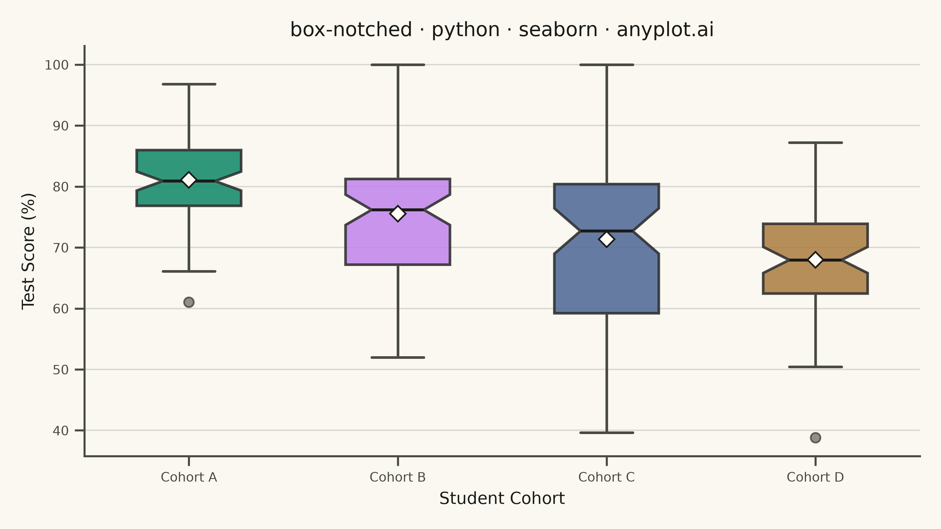
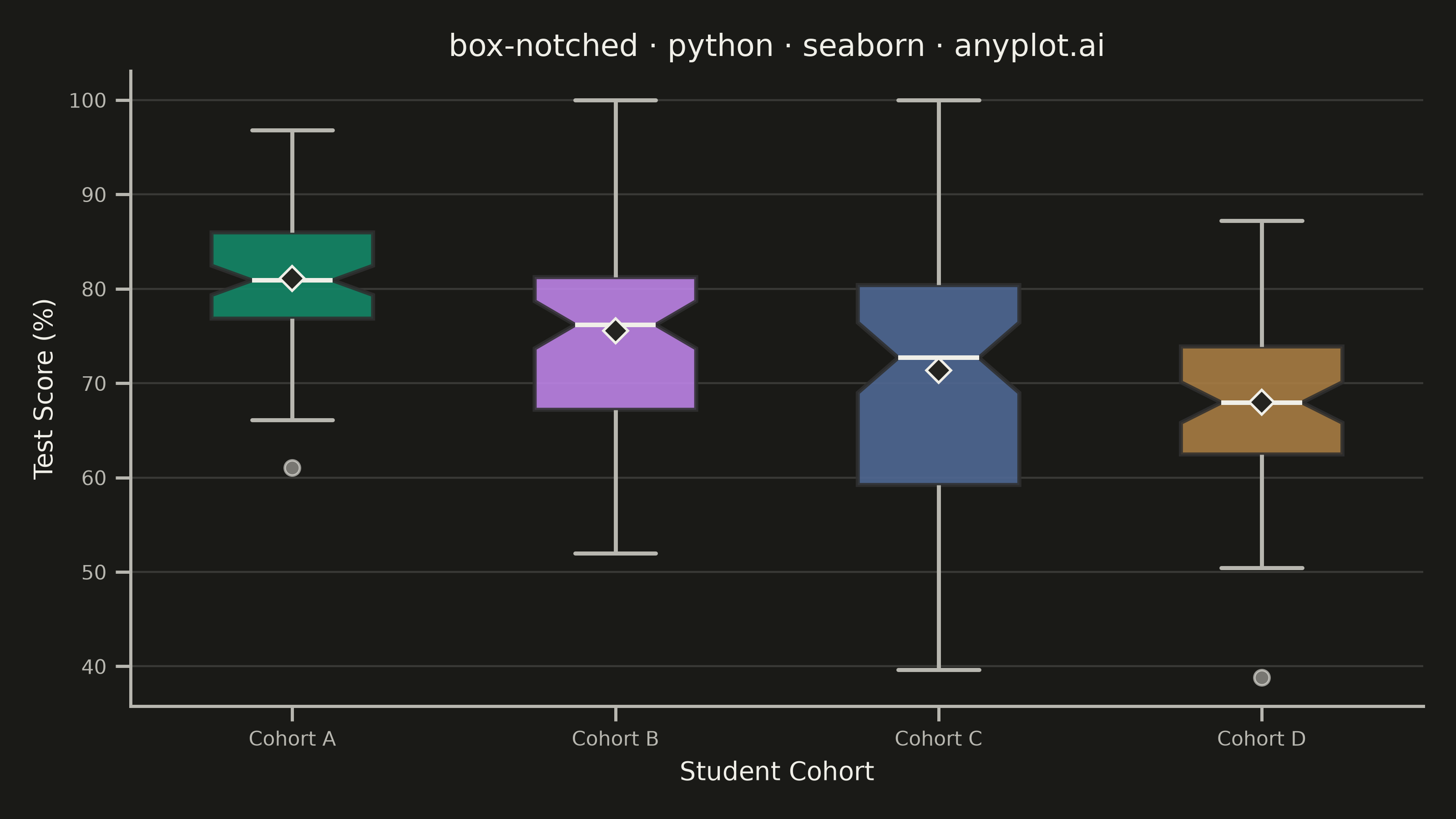
A notched box plot extends the standard box plot by adding notches around the median that represent a confidence interval. If the notches of two boxes do not overlap, this provides visual evidence that the medians differ significantly. This variant is particularly valuable for quick visual hypothesis testing and comparing group medians in statistical analysis.
""" anyplot.ai
box-notched: Notched Box Plot
Library: seaborn 0.13.2 | Python 3.13.15
Quality: 91/100 | Updated: 2026-08-18
"""

import os

import matplotlib.pyplot as plt
import numpy as np
import pandas as pd
import seaborn as sns


THEME = os.getenv("ANYPLOT_THEME", "light")
PAGE_BG = "#FAF8F1" if THEME == "light" else "#1A1A17"
ELEVATED_BG = "#FFFDF6" if THEME == "light" else "#242420"
INK = "#1A1A17" if THEME == "light" else "#F0EFE8"
INK_SOFT = "#4A4A44" if THEME == "light" else "#B8B7B0"

# Imprint palette — canonical order, first series always #009E73
IMPRINT = ["#009E73", "#C475FD", "#4467A3", "#BD8233", "#AE3030", "#2ABCCD"]

# Data - Test score distributions across student cohorts
np.random.seed(42)

cohorts = ["Cohort A", "Cohort B", "Cohort C", "Cohort D"]
data = []

# Cohort A: strong performance, tight cluster
data.extend([{"Cohort": "Cohort A", "Test Score": val} for val in np.clip(np.random.normal(82, 8, 85), 0, 100)])

# Cohort B: moderate performance, some high outliers
cohort_b_base = np.clip(np.random.normal(75, 12, 75), 0, 100)
cohort_b_outliers = np.array([95, 96, 98])
data.extend([{"Cohort": "Cohort B", "Test Score": val} for val in np.concatenate([cohort_b_base, cohort_b_outliers])])

# Cohort C: wide variation in performance
data.extend([{"Cohort": "Cohort C", "Test Score": val} for val in np.clip(np.random.normal(70, 15, 80), 0, 100)])

# Cohort D: lower performance, tight clustering
data.extend([{"Cohort": "Cohort D", "Test Score": val} for val in np.clip(np.random.normal(68, 9, 70), 0, 100)])

df = pd.DataFrame(data)

# Setup theme
sns.set_theme(
    style="ticks",
    rc={
        "figure.facecolor": PAGE_BG,
        "axes.facecolor": PAGE_BG,
        "axes.edgecolor": INK_SOFT,
        "axes.labelcolor": INK,
        "text.color": INK,
        "xtick.color": INK_SOFT,
        "ytick.color": INK_SOFT,
        "grid.color": INK,
        "grid.alpha": 0.15,
        "legend.facecolor": ELEVATED_BG,
        "legend.edgecolor": INK_SOFT,
    },
)

# Create plot
fig, ax = plt.subplots(figsize=(8, 4.5), dpi=400, facecolor=PAGE_BG)

# Notched box plot on the Imprint palette; mean diamonds sit alongside the
# notched median so a skewed mean (e.g. Cohort B's high-scoring outliers)
# reads at a glance without needing text annotations.
sns.boxplot(
    data=df,
    x="Cohort",
    y="Test Score",
    hue="Cohort",
    palette=IMPRINT[: len(cohorts)],
    notch=True,
    width=0.5,
    linewidth=1.6,
    boxprops={"alpha": 0.88},
    medianprops={"color": INK, "linewidth": 1.8},
    whiskerprops={"color": INK_SOFT},
    capprops={"color": INK_SOFT},
    showmeans=True,
    meanprops={"marker": "D", "markerfacecolor": ELEVATED_BG, "markeredgecolor": INK, "markersize": 7},
    fliersize=6,
    flierprops={"marker": "o", "markerfacecolor": INK_SOFT, "markeredgecolor": INK, "alpha": 0.6},
    ax=ax,
    legend=False,
)

# Styling
ax.set_title("box-notched · python · seaborn · anyplot.ai", fontsize=12, fontweight="medium", color=INK)
ax.set_xlabel("Student Cohort", fontsize=10, color=INK)
ax.set_ylabel("Test Score (%)", fontsize=10, color=INK)
ax.tick_params(axis="both", labelsize=8, colors=INK_SOFT)

# Remove top and right spines
ax.spines["top"].set_visible(False)
ax.spines["right"].set_visible(False)
ax.spines["left"].set_color(INK_SOFT)
ax.spines["bottom"].set_color(INK_SOFT)

# Grid styling
ax.yaxis.grid(True, alpha=0.15, linewidth=0.8, color=INK)
ax.set_axisbelow(True)

plt.tight_layout()
plt.savefig(f"plot-{THEME}.png", dpi=400, facecolor=PAGE_BG)
Runnable source as JSON, for any HTTP client: https://api.anyplot.ai/specs/box-notched/seaborn/code. Any spec id and library id listed in llms-full.txt fit the same URL shape; every URL below is complete and callable.
{
  "spec_id": "box-notched",
  "language": "python",
  "library": "seaborn",
  "page": "https://anyplot.ai/box-notched/python/seaborn",
  "hub": "https://anyplot.ai/box-notched",
  "code_json": "https://api.anyplot.ai/specs/box-notched/seaborn/code",
  "spec_json": "https://api.anyplot.ai/specs/box-notched",
  "render_light_png": "https://storage.googleapis.com/anyplot-images/plots/box-notched/python/seaborn/plot-light.png",
  "render_dark_png": "https://storage.googleapis.com/anyplot-images/plots/box-notched/python/seaborn/plot-dark.png",
  "quality_score": 91.0,
  "license": "MIT",
  "guide": "https://anyplot.ai/llms.txt"
}
Part of Notched Box Plot on anyplot.ai.