The same plot in 14 other libraries — JavaScript: Chart.js, D3.js, Highcharts, MUI X Charts; Python: Altair, Bokeh, lets-plot, Matplotlib, Plotly, plotnine, Pygal, Seaborn; R: ggplot2; Julia: Makie.jl. Compare all 15 side by side: Basic Bubble Chart in Python, R, Julia and JavaScript.
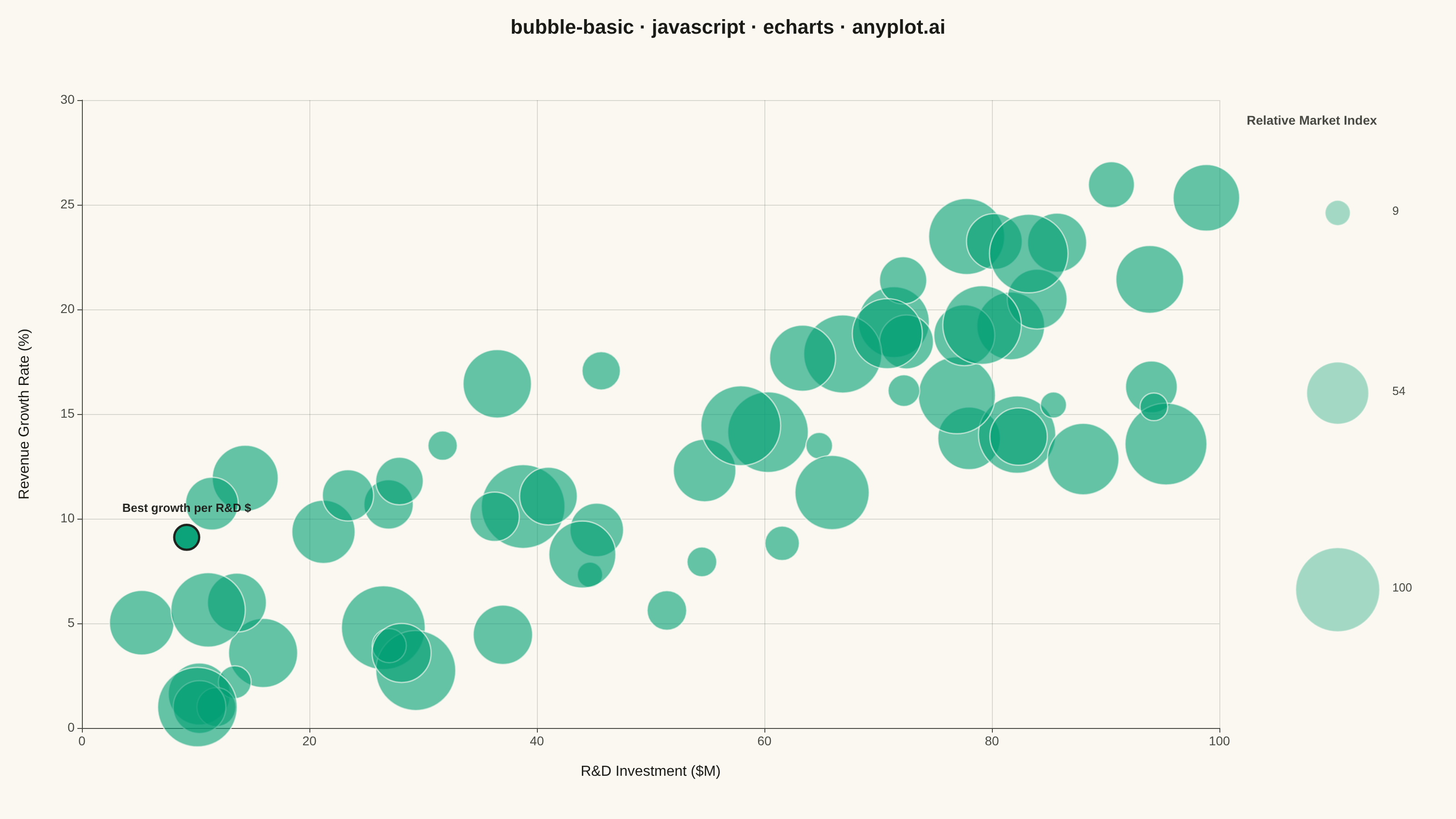
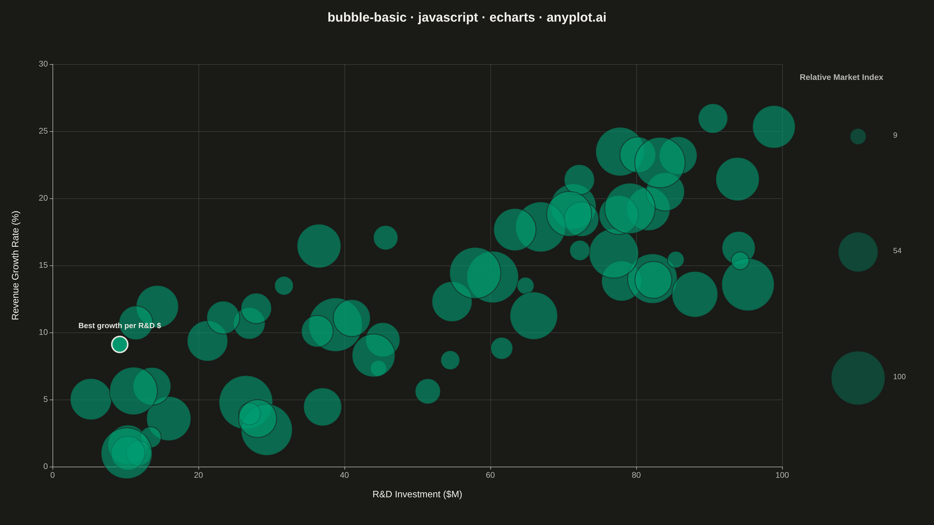
A bubble chart extending scatter plots by adding a third dimension through bubble size. Each point's position shows two variables (x, y) while the bubble size represents a third quantitative variable. This visualization is excellent for understanding relationships between three numerical variables simultaneously, revealing patterns that would be hidden in traditional 2D scatter plots.
// anyplot.ai
// bubble-basic: Basic Bubble Chart
// Library: echarts 6.1.0 | JavaScript 22.23.2
// Quality: 86/100 | Updated: 2026-09-30

const t = window.ANYPLOT_TOKENS;
const size = window.ANYPLOT_SIZE;

// --- Data (in-memory, deterministic) ----------------------------------------
// Tiny fixed-seed LCG — the browser has no seeded RNG.
let seed = 42;
function rand() {
  seed = (seed * 1103515245 + 12345) & 0x7fffffff;
  return seed / 0x7fffffff;
}

// Market analysis: R&D investment vs. revenue growth, bubble size = a relative
// market-strength index (0-100 scale, scored independently per company — not a
// literal share of one shared 100% pie).
const companyCount = 65;
const bubbles = [];
for (let i = 0; i < companyCount; i++) {
  const rdSpend = 5 + rand() * 95; // R&D investment, $M
  const noise = (rand() - 0.5) * 30; // wide noise band so the trend isn't a tight line
  const rawGrowth = 3 + rdSpend * 0.18 + noise;
  // Soft floor: companies whose trend + noise would go non-positive settle at
  // a small randomized value instead of a hard clamp, so the low-R&D cluster
  // spreads naturally near the origin rather than piling up as concentric
  // bubbles at a single y.
  const growthRate = rawGrowth > 1 ? rawGrowth : 0.3 + rand() * 1.7; // revenue growth, %
  const marketIndex = 10 + rand() * 90; // relative market-strength index
  bubbles.push([rdSpend, growthRate, marketIndex]);
}

// A handful of deliberate outliers break the x/y trend, showing what the
// bubble encoding reveals that a plain 2D scatter would blur: heavy R&D spend
// doesn't guarantee growth, and a small agile spender can still break out.
bubbles[3] = [88, 5, 71]; // legacy incumbent: heavy spend, weak growth
bubbles[17] = [9, 46, 24]; // agile startup: tiny spend, breakout growth
bubbles[41] = [61, 3, 85]; // large but stagnant market leader

const indexValues = bubbles.map((b) => b[2]);
const indexMin = Math.min(...indexValues);
const indexMax = Math.max(...indexValues);

// Scale bubble diameter by sqrt(value) so on-screen AREA (not radius) is
// proportional to the market index.
const minDiameter = 14;
const maxDiameter = 92;
const sizeScale = maxDiameter / Math.sqrt(indexMax);
function diameterFor(value) {
  return Math.max(minDiameter, sizeScale * Math.sqrt(value));
}

// Painter's-order fix: draw the largest bubbles first and the smallest last,
// so small bubbles in the dense low-spend cluster render on top of large ones
// instead of disappearing underneath them.
const orderedBubbles = bubbles.slice().sort((a, b) => b[2] - a[2]);

// --- Init ---------------------------------------------------------------
const chart = echarts.init(document.getElementById("container"));

// --- Size legend (three reference bubbles drawn as graphic elements) -------
const legendCx = size.width - 105;
const legendSamples = [
  { value: indexMin, cy: size.height * 0.26 },
  { value: (indexMin + indexMax) / 2, cy: size.height * 0.48 },
  { value: indexMax, cy: size.height * 0.72 },
];

const legendGraphics = [
  {
    type: "text",
    left: legendCx - 100,
    top: size.height * 0.14,
    style: {
      text: "Relative Market Index",
      fill: t.inkSoft,
      fontSize: 16,
      fontWeight: "bold",
    },
  },
  ...legendSamples.map((sample) => {
    const r = diameterFor(sample.value) / 2;
    return {
      type: "circle",
      shape: { cx: legendCx, cy: sample.cy, r },
      style: { fill: t.palette[0], opacity: 0.68, stroke: t.pageBg, lineWidth: 1.5 },
    };
  }),
  ...legendSamples.map((sample) => ({
    type: "text",
    left: legendCx + maxDiameter / 2 + 14,
    top: sample.cy - 9,
    style: {
      text: `${Math.round(sample.value)}`,
      fill: t.inkSoft,
      fontSize: 16,
    },
  })),
];

// --- Option ------------------------------------------------------------
chart.setOption({
  animation: false,
  color: t.palette,
  backgroundColor: "transparent",
  title: {
    text: "bubble-basic · javascript · echarts · anyplot.ai",
    left: "center",
    textStyle: { color: t.ink, fontSize: 22 },
  },
  grid: { left: 100, right: 210, top: 110, bottom: 100 },
  xAxis: {
    type: "value",
    name: "R&D Investment ($M)",
    nameLocation: "middle",
    nameGap: 40,
    nameTextStyle: { color: t.ink, fontSize: 16 },
    axisLabel: { color: t.inkSoft, fontSize: 14 },
    axisLine: { lineStyle: { color: t.inkSoft } },
    axisTick: { show: false },
    splitLine: { lineStyle: { color: t.grid } },
  },
  yAxis: {
    type: "value",
    name: "Revenue Growth Rate (%)",
    nameLocation: "middle",
    nameGap: 55,
    nameTextStyle: { color: t.ink, fontSize: 16 },
    axisLabel: { color: t.inkSoft, fontSize: 14 },
    axisLine: { lineStyle: { color: t.inkSoft } },
    axisTick: { show: false },
    splitLine: { lineStyle: { color: t.grid } },
  },
  series: [
    {
      type: "scatter",
      data: orderedBubbles,
      symbolSize: (value) => diameterFor(value[2]),
      itemStyle: {
        color: t.palette[0],
        opacity: 0.68,
        borderColor: t.pageBg,
        borderWidth: 1.5,
      },
    },
  ],
  graphic: legendGraphics,
});
Runnable source as JSON, for any HTTP client: https://api.anyplot.ai/specs/bubble-basic/echarts/code. Any spec id and library id listed in llms-full.txt fit the same URL shape; every URL below is complete and callable.
{
  "spec_id": "bubble-basic",
  "language": "javascript",
  "library": "echarts",
  "page": "https://anyplot.ai/bubble-basic/javascript/echarts",
  "hub": "https://anyplot.ai/bubble-basic",
  "code_json": "https://api.anyplot.ai/specs/bubble-basic/echarts/code",
  "spec_json": "https://api.anyplot.ai/specs/bubble-basic",
  "render_light_png": "https://storage.googleapis.com/anyplot-images/plots/bubble-basic/javascript/echarts/plot-light.png",
  "render_dark_png": "https://storage.googleapis.com/anyplot-images/plots/bubble-basic/javascript/echarts/plot-dark.png",
  "interactive_light_html": "https://storage.googleapis.com/anyplot-images/plots/bubble-basic/javascript/echarts/plot-light.html",
  "interactive_dark_html": "https://storage.googleapis.com/anyplot-images/plots/bubble-basic/javascript/echarts/plot-dark.html",
  "quality_score": 86.0,
  "license": "MIT",
  "guide": "https://anyplot.ai/llms.txt"
}
Part of Basic Bubble Chart on anyplot.ai.