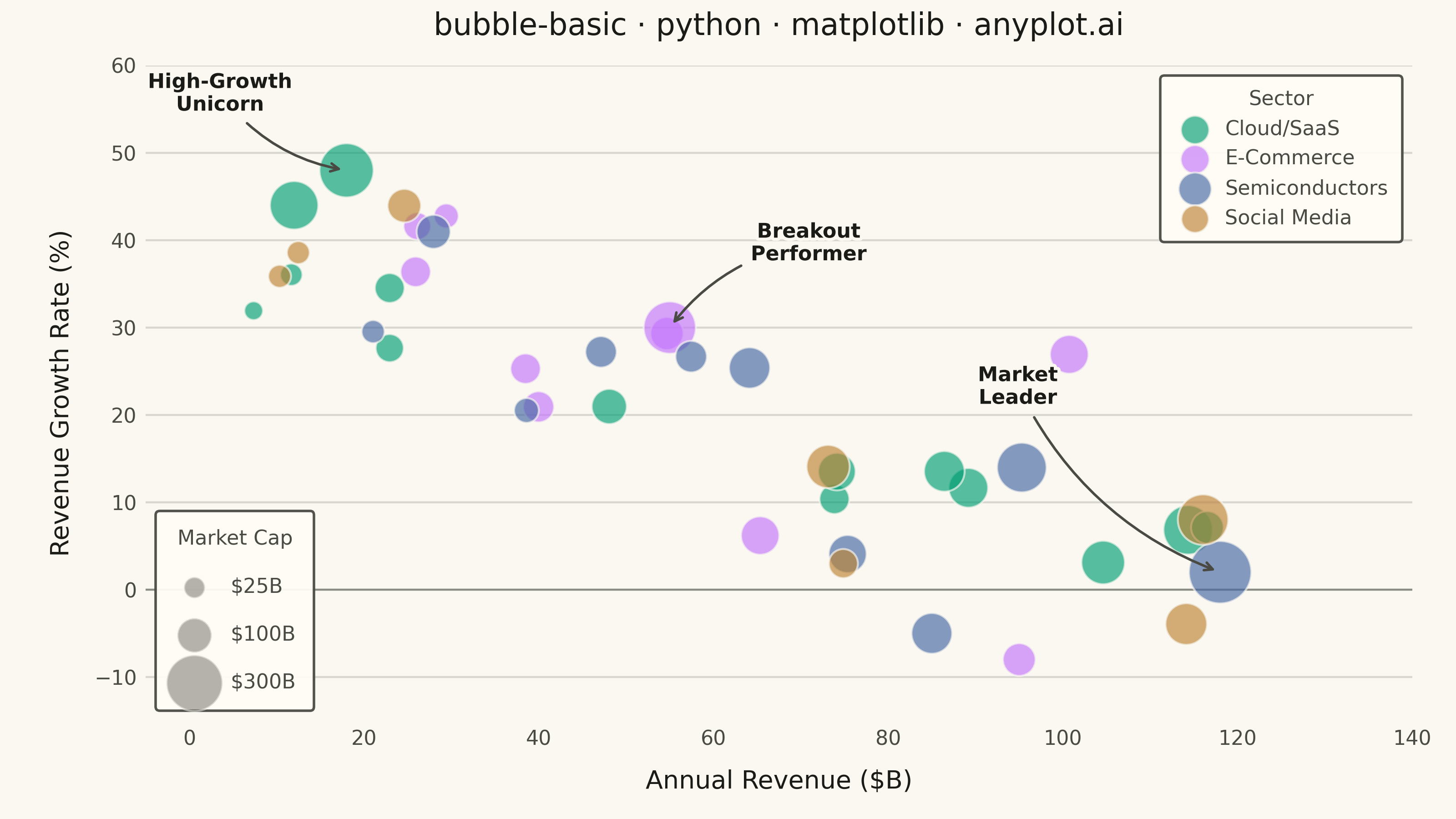
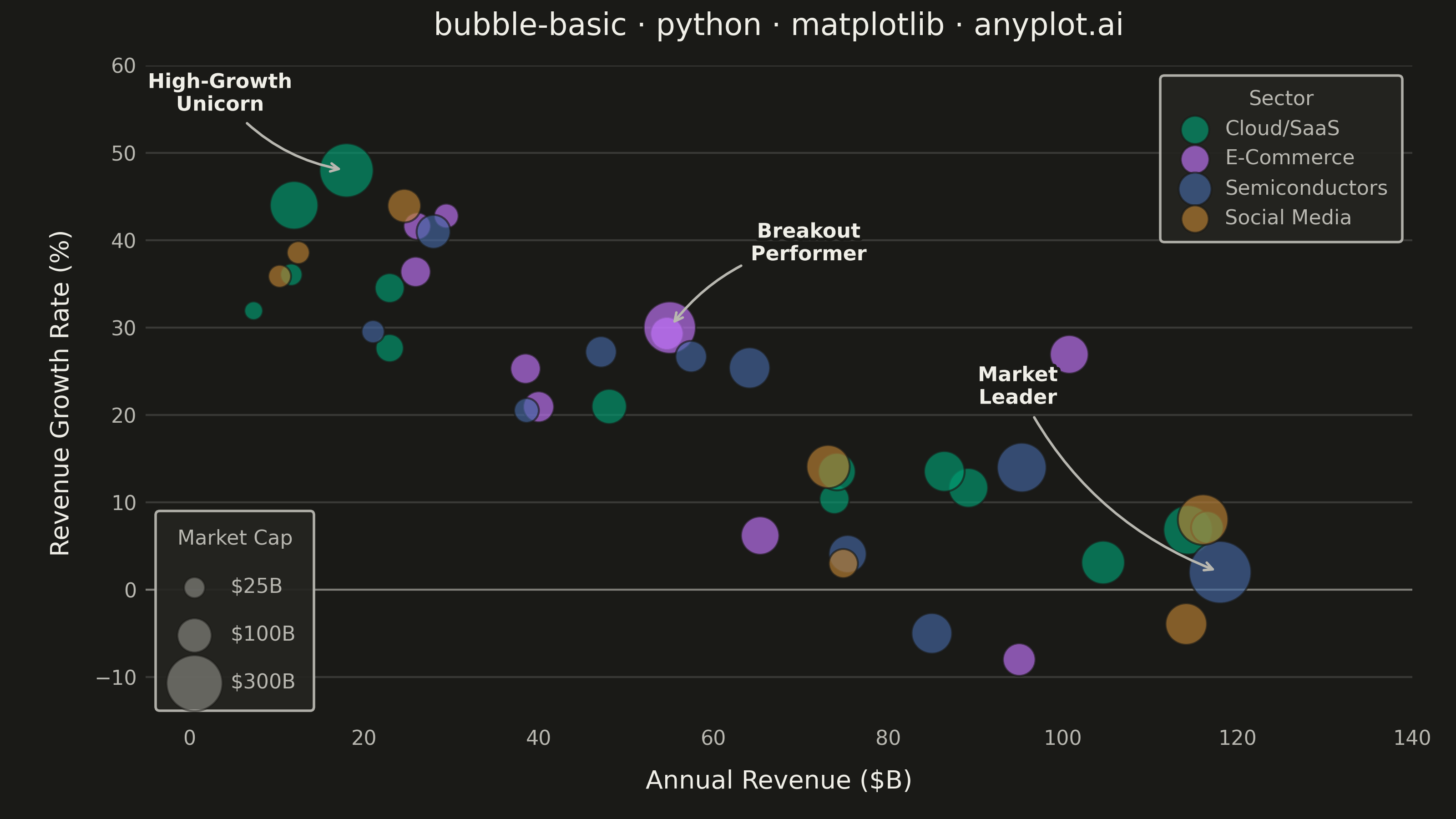
A bubble chart extending scatter plots by adding a third dimension through bubble size. Each point's position shows two variables (x, y) while the bubble size represents a third quantitative variable. This visualization is excellent for understanding relationships between three numerical variables simultaneously, revealing patterns that would be hidden in traditional 2D scatter plots.
""" anyplot.ai
bubble-basic: Basic Bubble Chart
Library: matplotlib 3.10.9 | Python 3.13.13
Quality: 90/100 | Updated: 2026-05-28
"""

import os

import matplotlib.patheffects as pe
import matplotlib.pyplot as plt
import numpy as np


# Theme tokens
THEME = os.getenv("ANYPLOT_THEME", "light")
PAGE_BG = "#FAF8F1" if THEME == "light" else "#1A1A17"
ELEVATED_BG = "#FFFDF6" if THEME == "light" else "#242420"
INK = "#1A1A17" if THEME == "light" else "#F0EFE8"
INK_SOFT = "#4A4A44" if THEME == "light" else "#B8B7B0"
INK_MUTED = "#6B6A63" if THEME == "light" else "#A8A79F"

ANYPLOT_PALETTE = ["#009E73", "#C475FD", "#4467A3", "#BD8233", "#AE3030", "#2ABCCD", "#954477", "#99B314"]

# Data — tech company metrics: revenue vs growth with market cap as bubble size
np.random.seed(42)
n_base = 35

revenue_base = np.random.uniform(5, 120, n_base)
growth_base = 0.4 * (100 - revenue_base) / 100 + np.random.randn(n_base) * 0.08 + 0.05
growth_base = np.clip(growth_base, -0.10, 0.55)
cap_base = revenue_base * (1 + growth_base * 3) * np.random.uniform(0.6, 1.8, n_base)
cap_base = np.clip(cap_base, 5, 400)

outlier_revenue = np.array([18, 12, 118, 55, 85, 95])
outlier_growth = np.array([0.48, 0.44, 0.02, 0.30, -0.05, -0.08])
outlier_cap = np.array([280, 220, 380, 260, 150, 90])

revenue = np.concatenate([revenue_base, outlier_revenue])
growth_rate = np.concatenate([growth_base, outlier_growth])
market_cap = np.concatenate([cap_base, outlier_cap])

sectors = np.array(
    ["Cloud/SaaS"] * 12
    + ["E-Commerce"] * 8
    + ["Semiconductors"] * 8
    + ["Social Media"] * 7
    + ["Cloud/SaaS", "Cloud/SaaS", "Semiconductors", "E-Commerce", "Semiconductors", "E-Commerce"]
)
sector_names = ["Cloud/SaaS", "E-Commerce", "Semiconductors", "Social Media"]
sector_colors = ANYPLOT_PALETTE[:4]

# Scale bubble sizes by area for accurate visual perception (tuned for 3200×1800 canvas)
size_scaled = (market_cap / market_cap.max()) * 580 + 30

# Plot
fig, ax = plt.subplots(figsize=(8, 4.5), dpi=400, facecolor=PAGE_BG)
ax.set_facecolor(PAGE_BG)

for sector, color in zip(sector_names, sector_colors, strict=True):
    mask = sectors == sector
    ax.scatter(
        revenue[mask],
        growth_rate[mask] * 100,
        s=size_scaled[mask],
        alpha=0.65,
        color=color,
        edgecolors=PAGE_BG,
        linewidths=0.8,
        label=sector,
        zorder=3,
    )

# Annotate notable outliers to guide the viewer
annotations = [
    (n_base, "High-Growth\nUnicorn", (-50, 22)),
    (n_base + 2, "Market\nLeader", (-80, 65)),
    (n_base + 3, "Breakout\nPerformer", (55, 25)),
]
for idx, label, offset in annotations:
    ax.annotate(
        label,
        (revenue[idx], growth_rate[idx] * 100),
        fontsize=8,
        fontweight="bold",
        color=INK,
        ha="center",
        va="bottom",
        xytext=offset,
        textcoords="offset points",
        arrowprops={"arrowstyle": "->", "color": INK_SOFT, "lw": 1.0, "connectionstyle": "arc3,rad=0.2"},
        path_effects=[pe.withStroke(linewidth=2.5, foreground=PAGE_BG)],
    )

# Size legend — lower left to avoid data overlap
legend_caps = [25, 100, 300]
legend_handles = [
    ax.scatter([], [], s=(v / market_cap.max()) * 580 + 30, c=INK_MUTED, alpha=0.5, edgecolors=PAGE_BG, linewidths=0.8)
    for v in legend_caps
]
size_legend = ax.legend(
    legend_handles,
    [f"${v}B" for v in legend_caps],
    title="Market Cap",
    title_fontsize=8,
    fontsize=8,
    loc="lower left",
    framealpha=0.95,
    facecolor=ELEVATED_BG,
    edgecolor=INK_SOFT,
    scatterpoints=1,
    labelspacing=1.4,
    borderpad=0.9,
)
plt.setp(size_legend.get_title(), color=INK_SOFT)
plt.setp(size_legend.get_texts(), color=INK_SOFT)
ax.add_artist(size_legend)

# Sector color legend — upper right
sector_legend = ax.legend(
    fontsize=8,
    loc="upper right",
    framealpha=0.95,
    facecolor=ELEVATED_BG,
    edgecolor=INK_SOFT,
    title="Sector",
    title_fontsize=8,
    markerscale=0.7,
    handletextpad=0.5,
    borderpad=0.7,
)
plt.setp(sector_legend.get_title(), color=INK_SOFT)
plt.setp(sector_legend.get_texts(), color=INK_SOFT)

# Style
title = "bubble-basic · python · matplotlib · anyplot.ai"
ax.set_xlabel("Annual Revenue ($B)", fontsize=10, color=INK, labelpad=8)
ax.set_ylabel("Revenue Growth Rate (%)", fontsize=10, color=INK, labelpad=8)
ax.set_title(title, fontsize=12, fontweight="medium", color=INK, pad=12)
ax.tick_params(axis="both", labelsize=8, labelcolor=INK_SOFT, length=0)

for spine in ax.spines.values():
    spine.set_visible(False)

ax.yaxis.grid(True, alpha=0.15, linewidth=0.8, color=INK, zorder=0)
ax.xaxis.grid(False)
ax.axhline(y=0, color=INK_SOFT, linewidth=0.8, zorder=1, alpha=0.5)

ax.set_xlim(-5, 140)
ax.set_ylim(-15, 60)

fig.subplots_adjust(left=0.10, right=0.97, top=0.92, bottom=0.12)

# Save
plt.savefig(f"plot-{THEME}.png", dpi=400, facecolor=PAGE_BG)
Runnable source as JSON, for any HTTP client: https://api.anyplot.ai/specs/bubble-basic/matplotlib/code. Any spec id and library id listed in llms-full.txt fit the same URL shape; every URL below is complete and callable.
{
  "spec_id": "bubble-basic",
  "language": "python",
  "library": "matplotlib",
  "page": "https://anyplot.ai/bubble-basic/python/matplotlib",
  "hub": "https://anyplot.ai/bubble-basic",
  "code_json": "https://api.anyplot.ai/specs/bubble-basic/matplotlib/code",
  "spec_json": "https://api.anyplot.ai/specs/bubble-basic",
  "render_light_png": "https://storage.googleapis.com/anyplot-images/plots/bubble-basic/python/matplotlib/plot-light.png",
  "render_dark_png": "https://storage.googleapis.com/anyplot-images/plots/bubble-basic/python/matplotlib/plot-dark.png",
  "quality_score": 90.0,
  "license": "MIT",
  "guide": "https://anyplot.ai/llms.txt"
}
Part of Basic Bubble Chart on anyplot.ai.