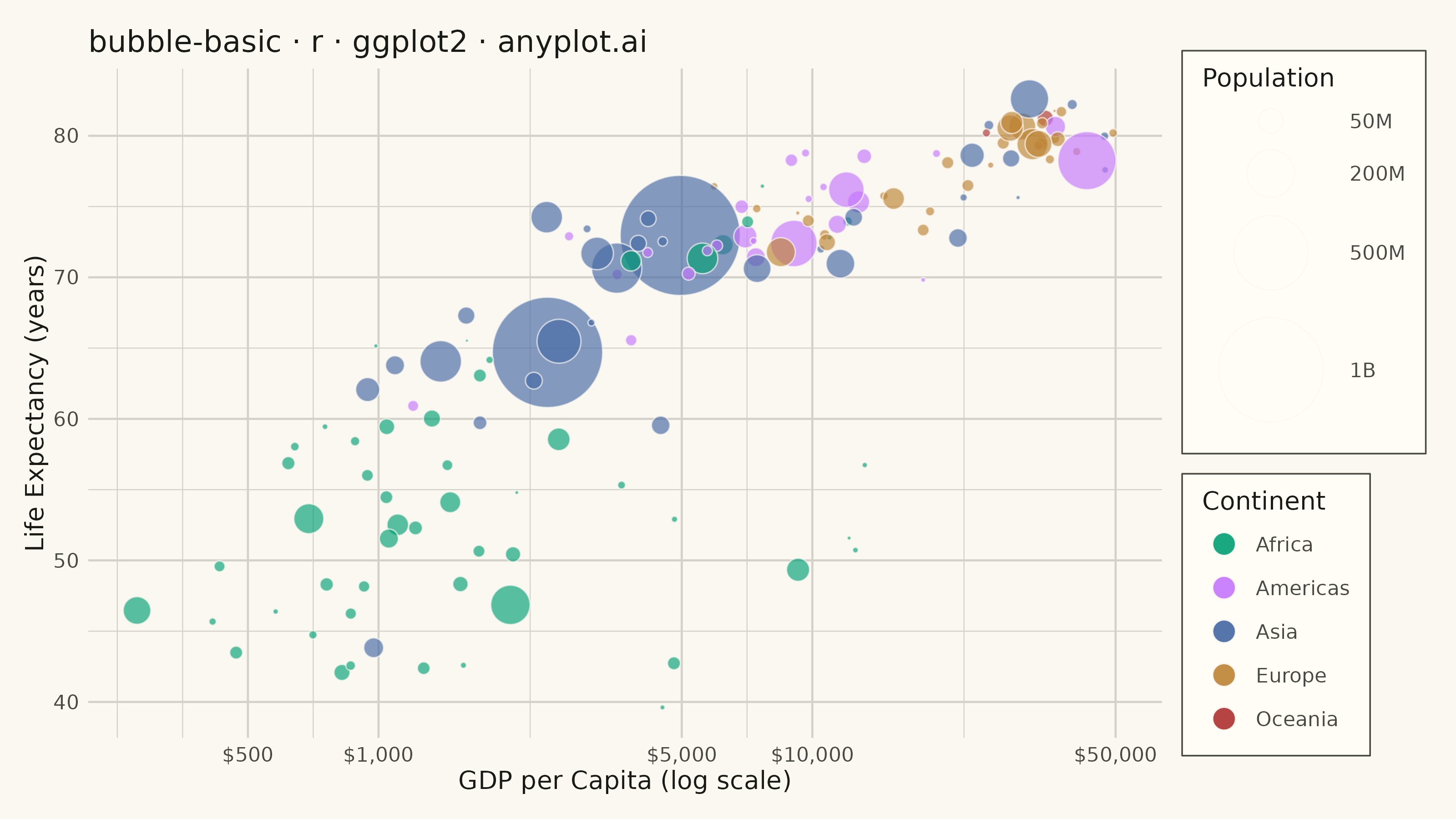
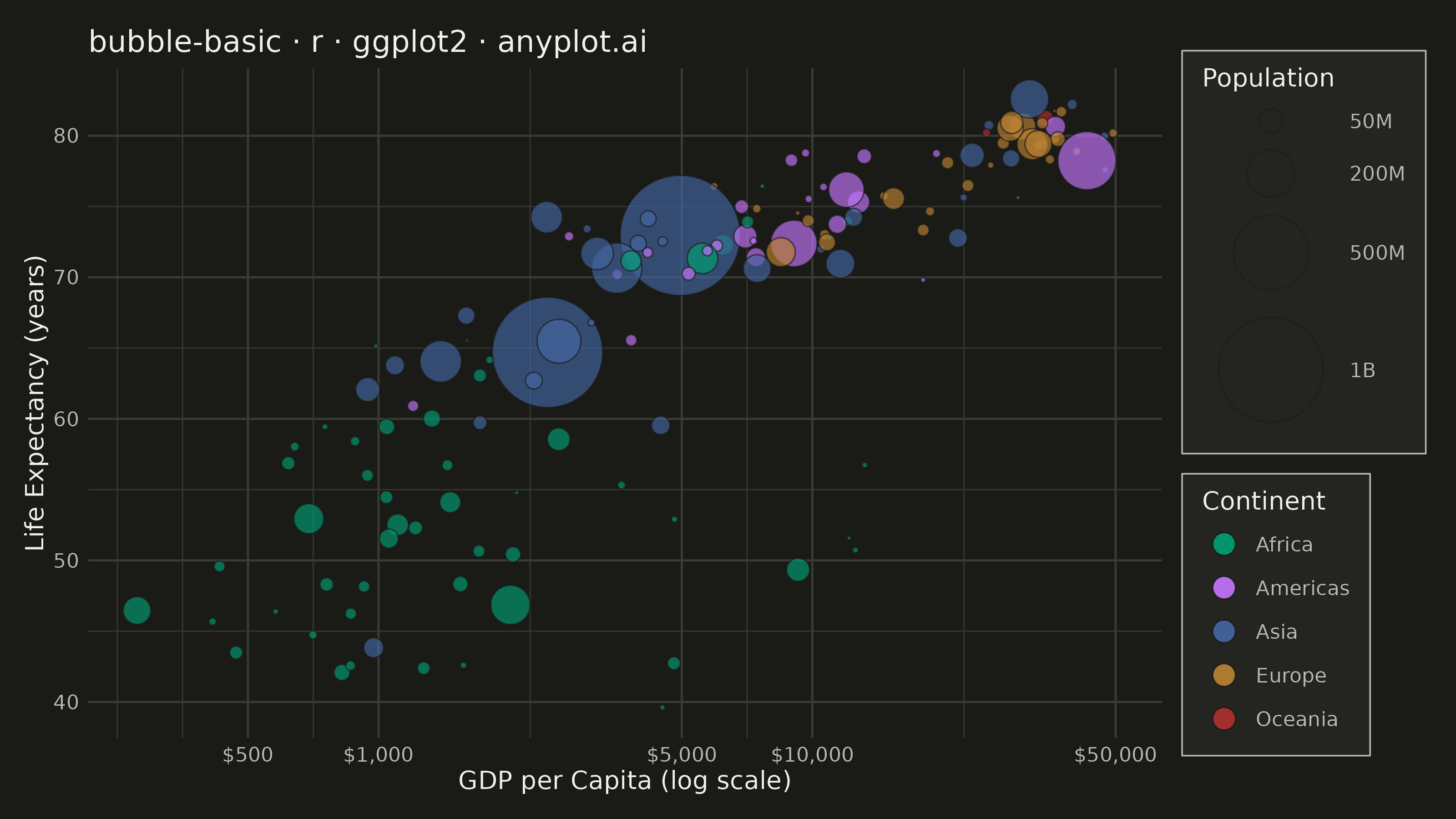
The same plot in 14 other libraries — Python: Altair, Bokeh, lets-plot, Matplotlib, Plotly, plotnine, Pygal, Seaborn; Julia: Makie.jl; JavaScript: Chart.js, D3.js, Apache ECharts, Highcharts, MUI X Charts. Compare all 15 side by side: Basic Bubble Chart in Python, R, Julia and JavaScript.
A bubble chart extending scatter plots by adding a third dimension through bubble size. Each point's position shows two variables (x, y) while the bubble size represents a third quantitative variable. This visualization is excellent for understanding relationships between three numerical variables simultaneously, revealing patterns that would be hidden in traditional 2D scatter plots.
#' anyplot.ai
#' bubble-basic: Basic Bubble Chart
#' Library: ggplot2 3.5.1 | R 4.4.1
#' Quality: 76/100 | Updated: 2026-09-30

library(ggplot2)
library(dplyr)
library(scales)
library(ragg)

set.seed(42)

# Theme tokens
THEME       <- Sys.getenv("ANYPLOT_THEME", "light")
PAGE_BG     <- if (THEME == "light") "#FAF8F1" else "#1A1A17"
ELEVATED_BG <- if (THEME == "light") "#FFFDF6" else "#242420"
INK         <- if (THEME == "light") "#1A1A17" else "#F0EFE8"
INK_SOFT    <- if (THEME == "light") "#4A4A44" else "#B8B7B0"
GRID        <- if (THEME == "light") "#D3D1CA" else "#3A3A37"

# Slot 5 (#AE3030, matte red) is the deferred semantic anchor for bad/loss/
# error — there's no such category here, so Sporting Goods takes slot 6
# (cyan) instead of spending red on an ordinary category.
IMPRINT_PALETTE <- c("#009E73", "#C475FD", "#4467A3", "#BD8233", "#2ABCCD")

# Data — synthetic retail product-portfolio scenario: customer satisfaction
# score vs. average retail price, bubble = monthly sales volume, colored by
# product category. Price bands are the dimension that keeps the five
# categories visually separated (satisfaction scores alone overlap a lot more
# across categories than price does), which avoids stacking every category
# into one dense cluster.
n_per_category <- 22

category_params <- tibble::tibble(
    category      = c("Consumer Electronics", "Apparel & Footwear", "Home & Kitchen", "Beauty & Personal Care", "Sporting Goods"),
    code          = c("ELEC", "APRL", "HOMK", "BEAU", "SPRT"),
    quality_mu    = c(74, 66, 79, 84, 70),
    quality_sd    = c(8, 9, 7, 6, 8),
    price_mu      = c(280, 52, 90, 36, 130),
    price_sd      = c(70, 10, 22, 7, 35),
    sales_meanlog = log(c(22, 68, 40, 75, 30)),
    sales_sd      = c(0.30, 0.28, 0.32, 0.28, 0.32)
)

# Flat, vectorized generation: repeat each category's params n_per_category
# times, then draw all rows in one rnorm()/rlnorm() call each (both accept
# vectorized mean/sd arguments) instead of looping per category.
row_params <- category_params[rep(seq_len(nrow(category_params)), each = n_per_category), ]
n_total <- nrow(row_params)

products <- tibble::tibble(
    category      = row_params$category,
    satisfaction  = pmin(98, pmax(35, rnorm(n_total, mean = row_params$quality_mu, sd = row_params$quality_sd))),
    price         = pmin(650, pmax(22, rnorm(n_total, mean = row_params$price_mu, sd = row_params$price_sd))),
    sales_volume  = pmin(100, pmax(10, rlnorm(n_total, meanlog = row_params$sales_meanlog, sdlog = row_params$sales_sd)))
) |>
    dplyr::mutate(category = factor(category, levels = category_params$category)) |>
    # Draw largest bubbles first (bottom layer) so smaller bubbles stay
    # visible on top instead of being buried under high-volume sellers.
    dplyr::arrange(dplyr::desc(sales_volume))

category_colors <- stats::setNames(IMPRINT_PALETTE, levels(products$category))

# Bubble-size domain floor: anchoring scale_size_area() at an absolute zero
# buries the smallest real values at a couple of visible pixels. Flooring the
# lower limit just below the observed minimum keeps sizing strictly area-true
# across the data range while giving the smallest bubbles real presence.
sales_range <- range(products$sales_volume)
size_limits <- c(sales_range[1] * 0.75, sales_range[2])

# Plot
p <- ggplot(products, aes(
    x    = satisfaction,
    y    = price,
    size = sales_volume,
    fill = category
)) +
    geom_point(
        shape  = 21,
        color  = PAGE_BG,
        alpha  = 0.42,
        stroke = 1.0
    ) +
    scale_x_continuous(
        breaks = seq(40, 100, 10),
        expand = expansion(mult = c(0.08, 0.06))
    ) +
    scale_y_continuous(
        breaks = seq(0, 600, 100),
        labels = label_dollar(),
        expand = expansion(mult = c(0.08, 0.08))
    ) +
    scale_size_area(
        max_size = 13,
        limits   = size_limits,
        breaks   = c(10, 40, 70, 100),
        labels   = c("10", "40", "70", "100"),
        name     = "Monthly Sales Volume (K units)"
    ) +
    scale_fill_manual(values = category_colors, name = "Product Category") +
    labs(
        title    = "bubble-basic · r · ggplot2 · anyplot.ai",
        subtitle = "Bubble size encodes monthly sales volume",
        x        = "Customer Satisfaction Score (0-100)",
        y        = "Average Retail Price"
    ) +
    guides(
        fill = guide_legend(override.aes = list(size = 4, alpha = 0.9))
    ) +
    theme_minimal(base_size = 8) +
    theme(
        plot.background    = element_rect(fill = PAGE_BG,     color = PAGE_BG),
        panel.background   = element_rect(fill = PAGE_BG,     color = NA),
        panel.grid.major.x = element_line(color = GRID,       linewidth = 0.25),
        panel.grid.major.y = element_line(color = GRID,       linewidth = 0.25),
        panel.grid.minor   = element_blank(),
        axis.title         = element_text(color = INK,        size = 10),
        axis.text          = element_text(color = INK_SOFT,   size = 8),
        plot.title         = element_text(color = INK,        size = 12),
        plot.subtitle      = element_text(color = INK_SOFT,   size = 9, margin = margin(b = 8)),
        legend.background  = element_rect(fill = ELEVATED_BG, color = NA),
        legend.text        = element_text(color = INK_SOFT,   size = 8),
        legend.title       = element_text(color = INK,        size = 10),
        legend.key         = element_rect(fill = NA,          color = NA),
        legend.key.size    = unit(0.35, "cm"),
        legend.key.spacing.y = unit(1, "pt"),
        legend.spacing.y   = unit(2, "pt"),
        legend.justification.right = "center",
        legend.margin      = margin(4, 6, 4, 6),
        legend.box.spacing = unit(6, "pt"),
        plot.margin        = margin(12, 12, 10, 10)
    )

# Save
ggsave(
    filename = sprintf("plot-%s.png", THEME),
    plot     = p,
    device   = ragg::agg_png,
    width    = 8,
    height   = 4.5,
    units    = "in",
    dpi      = 400
)
Runnable source as JSON, for any HTTP client: https://api.anyplot.ai/specs/bubble-basic/ggplot2/code. Any spec id and library id listed in llms-full.txt fit the same URL shape; every URL below is complete and callable.
{
  "spec_id": "bubble-basic",
  "language": "r",
  "library": "ggplot2",
  "page": "https://anyplot.ai/bubble-basic/r/ggplot2",
  "hub": "https://anyplot.ai/bubble-basic",
  "code_json": "https://api.anyplot.ai/specs/bubble-basic/ggplot2/code",
  "spec_json": "https://api.anyplot.ai/specs/bubble-basic",
  "render_light_png": "https://storage.googleapis.com/anyplot-images/plots/bubble-basic/r/ggplot2/plot-light.png",
  "render_dark_png": "https://storage.googleapis.com/anyplot-images/plots/bubble-basic/r/ggplot2/plot-dark.png",
  "quality_score": 76.0,
  "license": "MIT",
  "guide": "https://anyplot.ai/llms.txt"
}
Part of Basic Bubble Chart on anyplot.ai.