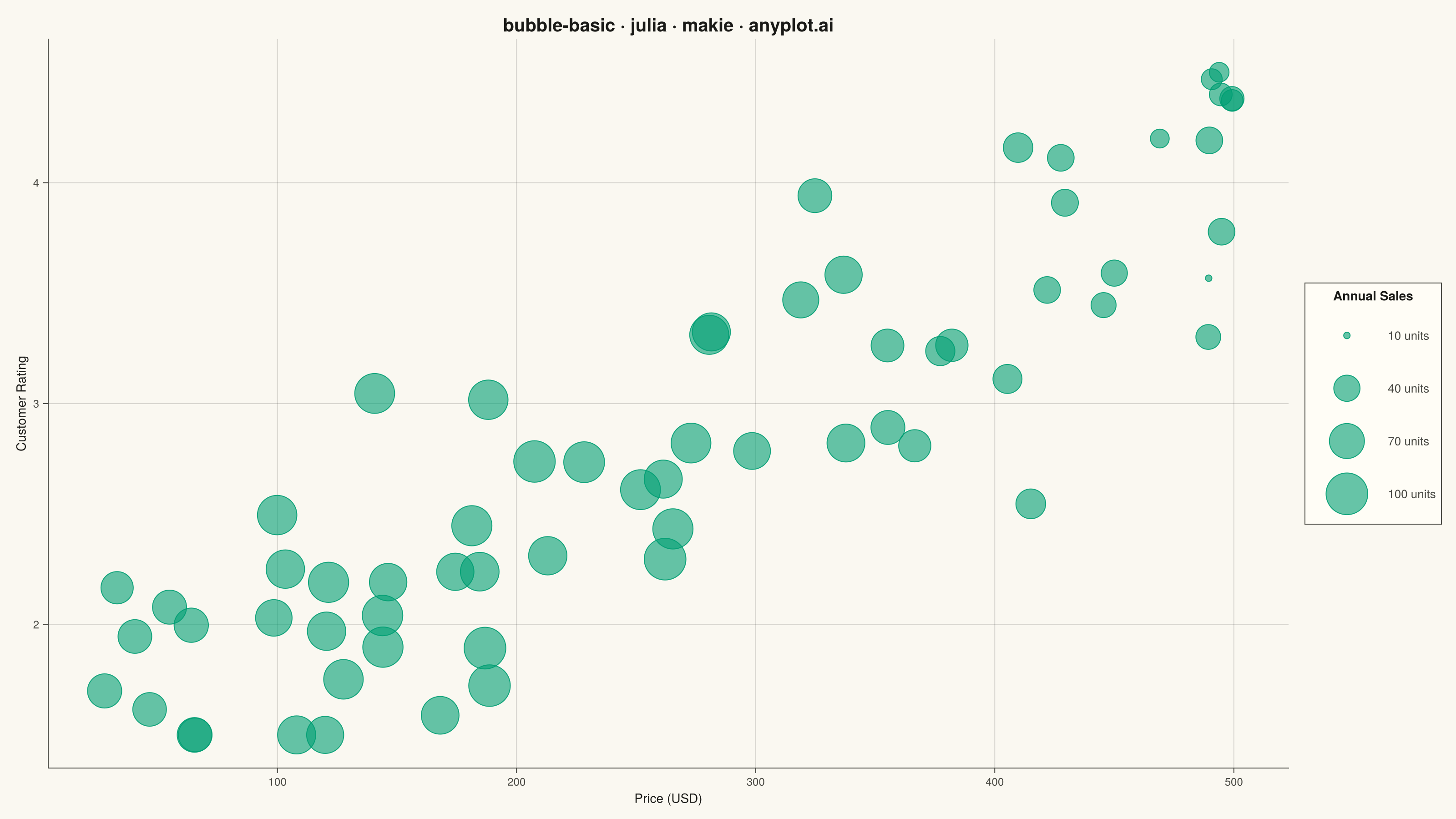
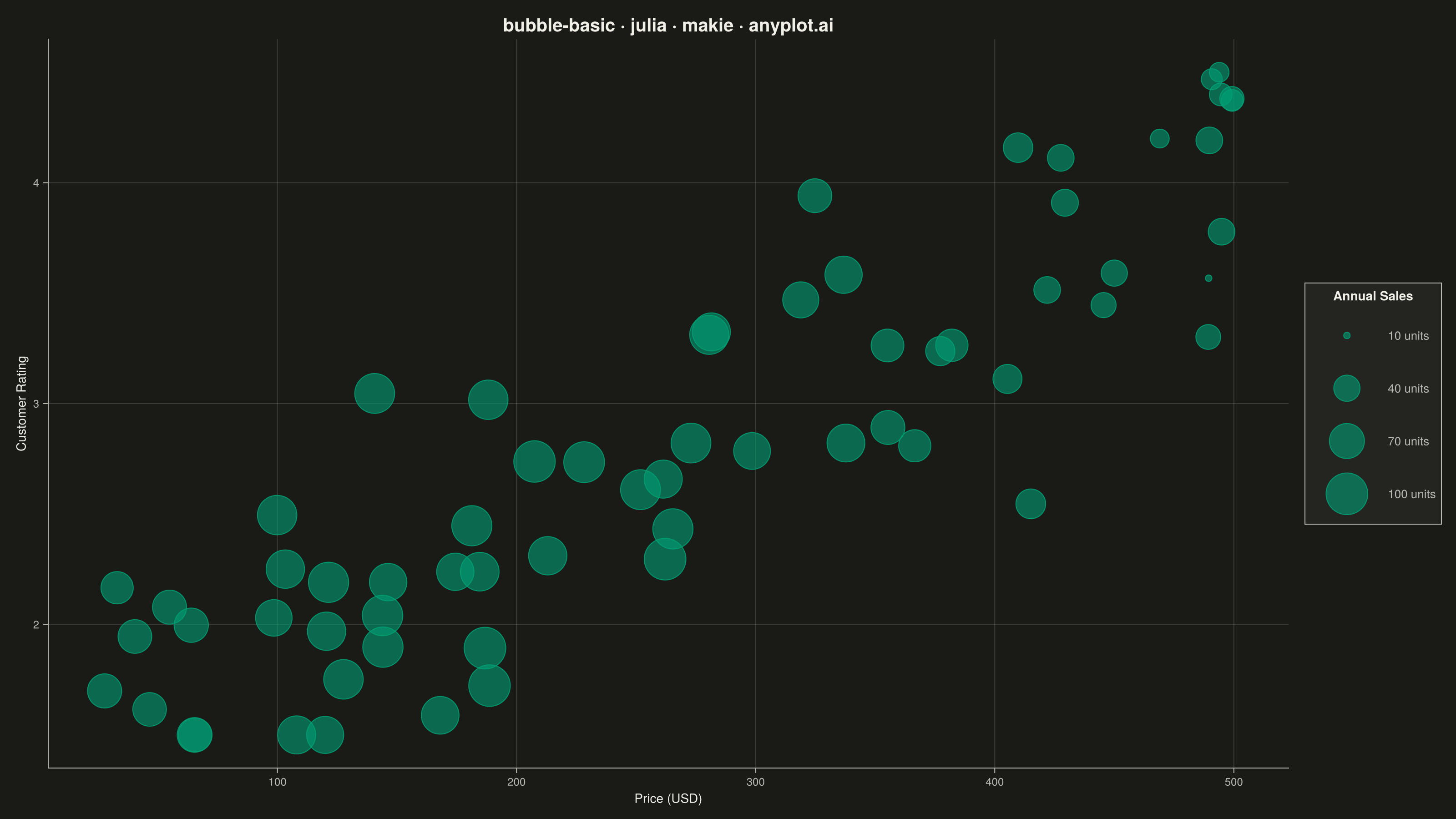
The same plot in 14 other libraries — Python: Altair, Bokeh, lets-plot, Matplotlib, Plotly, plotnine, Pygal, Seaborn; R: ggplot2; JavaScript: Chart.js, D3.js, Apache ECharts, Highcharts, MUI X Charts. Compare all 15 side by side: Basic Bubble Chart in Python, R, Julia and JavaScript.
A bubble chart extending scatter plots by adding a third dimension through bubble size. Each point's position shows two variables (x, y) while the bubble size represents a third quantitative variable. This visualization is excellent for understanding relationships between three numerical variables simultaneously, revealing patterns that would be hidden in traditional 2D scatter plots.
# anyplot.ai
# bubble-basic: Basic Bubble Chart
# Library: makie 0.21.9 | Julia 1.11.9
# Quality: 93/100 | Updated: 2026-09-27

using CairoMakie
using Colors
using Random

Random.seed!(42)

# Theme tokens
const THEME       = get(ENV, "ANYPLOT_THEME", "light")
const PAGE_BG     = THEME == "light" ? colorant"#FAF8F1" : colorant"#1A1A17"
const ELEVATED_BG = THEME == "light" ? colorant"#FFFDF6" : colorant"#242420"
const INK         = THEME == "light" ? colorant"#1A1A17" : colorant"#F0EFE8"
const INK_SOFT    = THEME == "light" ? colorant"#4A4A44" : colorant"#B8B7B0"
const INK_MUTED   = THEME == "light" ? colorant"#6B6A63" : colorant"#A8A79F"
const IMPRINT_PALETTE = [colorant"#009E73", colorant"#C475FD", colorant"#4467A3"]

# Data — film portfolio with a visible narrative:
#   production budget mildly correlates with critic rating, but box-office
#   revenue peaks disproportionately for mid-to-high budget films (~$80-150M
#   "franchise sweet spot") before diminishing returns set in on ultra-high
#   budget tentpoles.
n           = 90
budget_norm = rand(n) .^ 1.4                       # skewed toward low end — more indie
                                                    # films than tentpoles, as in real slates
budget      = 5.0 .+ 245.0 .* budget_norm          # $5M-$250M production budget

# Rating rises mildly with budget (r ≈ 0.5): bigger productions afford more polish.
# Slightly wider jitter than a plain 0.9 stddev spreads out the high-budget
# cluster so blockbuster-tier bubbles don't stack as tightly.
rating = clamp.(5.0 .+ 2.5 .* budget_norm .+ 1.15 .* randn(n), 1.5, 9.8)

# Box office scales with budget but gets an ROI boost near the $80-150M zone
sweet_spot = (budget .- 115.0) ./ 70.0
box_office = clamp.(
    0.8 .* budget .* (1.0 .+ 1.8 .* exp.(-0.5 .* sweet_spot .^ 2)) .+ 25.0 .* randn(n),
    10.0, 900.0,
)

# Scale marker sizes proportional to area (visual area ∝ data value). Floor
# raised and range narrowed vs. earlier drafts so the smallest reference
# bubble stays legible and dense clusters overlap less.
s_min, s_max = extrema(box_office)
s_norm       = (box_office .- s_min) ./ (s_max - s_min)
marker_sizes = 15.0 .+ 42.0 .* sqrt.(s_norm)

# Production scale — a distinct categorical variable (not derived from box
# office) so color and size each carry their own signal instead of duplicating one.
tier_idx    = ifelse.(budget .< 50.0, 1, ifelse.(budget .< 150.0, 2, 3))
tier_names  = ["Indie (<\$50M)", "Studio (\$50–150M)", "Blockbuster (>\$150M)"]
point_color = IMPRINT_PALETTE[tier_idx]

# Plot
title_str = "Film Portfolio Analysis · bubble-basic · julia · makie · anyplot.ai"

fig = Figure(
    size            = (1600, 900),
    fontsize        = 14,
    backgroundcolor = PAGE_BG,
)

ax = Axis(
    fig[1, 1];
    title             = title_str,
    titlesize         = 29,
    titlecolor        = INK,
    xlabel            = "Production Budget (USD Millions)",
    ylabel            = "Critic Rating (out of 10)",
    xlabelsize        = 14,
    ylabelsize        = 14,
    xlabelcolor       = INK,
    ylabelcolor       = INK,
    xticklabelsize    = 12,
    yticklabelsize    = 12,
    xticklabelcolor   = INK_SOFT,
    yticklabelcolor   = INK_SOFT,
    xtickcolor        = INK_SOFT,
    ytickcolor        = INK_SOFT,
    backgroundcolor   = PAGE_BG,
    topspinevisible   = false,
    rightspinevisible = false,
    leftspinecolor    = INK_SOFT,
    bottomspinecolor  = INK_SOFT,
    xgridcolor        = RGBAf(INK.r, INK.g, INK.b, 0.15),
    ygridcolor        = RGBAf(INK.r, INK.g, INK.b, 0.15),
)

# Highlight the franchise sweet spot where box-office ROI peaks — makes the
# DE-03 narrative explicit instead of leaving it implicit in the data alone.
# Heavier band opacity + bold ink-colored text (vs. a previous low-contrast
# gray) so the insight reads at a glance instead of blending into the grid.
vspan!(ax, 80.0, 150.0; color = RGBAf(INK.r, INK.g, INK.b, 0.10))
text!(ax, 115.0, 9.6;
    text     = "franchise sweet spot",
    align    = (:center, :bottom),
    fontsize = 17,
    font     = :bold,
    color    = INK,
)

# Bubble area (sqrt-scaled) encodes box-office revenue; fill color encodes
# production scale — two independent variables, each with its own legend
# group below. Alpha raised to 0.5 (spec calls for 0.5-0.7 to handle
# overlap) so individual bubbles read more solidly while dense low-budget
# indie and mid-budget studio clusters stay distinguishable.
scatter!(ax, budget, rating;
    color       = point_color,
    markersize  = marker_sizes,
    alpha       = 0.5,
    strokewidth = 1.0,
    strokecolor = RGBAf(INK.r, INK.g, INK.b, 0.4),
)

# Tier legend — fixed-size swatches, one per product tier
tier_elems = [
    MarkerElement(
        color       = IMPRINT_PALETTE[i],
        marker      = :circle,
        markersize  = 18,
        strokewidth = 1.0,
        strokecolor = RGBAf(INK.r, INK.g, INK.b, 0.35),
    )
    for i in eachindex(IMPRINT_PALETTE)
]

# Size legend — neutral-colored reference bubbles show the area scale only.
# Values chosen within the actual box_office range so no two clamp to the
# same normalized size (this domain's revenue tops out well under $400M).
ref_vals = [30, 110, 200, 300]
ref_norm = clamp.((Float64.(ref_vals) .- s_min) ./ (s_max - s_min), 0.0, 1.0)
ref_ms   = 15.0 .+ 45.0 .* sqrt.(ref_norm)

size_elems = [
    MarkerElement(
        color       = RGBAf(INK_MUTED.r, INK_MUTED.g, INK_MUTED.b, 0.65),
        marker      = :circle,
        markersize  = ref_ms[i],
        strokewidth = 1.0,
        strokecolor = RGBAf(INK.r, INK.g, INK.b, 0.35),
    )
    for i in eachindex(ref_ms)
]

Legend(fig[1, 2],
    [tier_elems, size_elems],
    [tier_names, "\$" .* string.(ref_vals) .* "M"],
    ["Production Scale", "Box Office Revenue"];
    backgroundcolor = ELEVATED_BG,
    framecolor      = INK_SOFT,
    labelcolor      = INK_SOFT,
    titlecolor      = INK,
    patchsize       = (64, 44),
    labelsize       = 16,
)

# Tighten the gap between the plot panel and the legend column — a small,
# layout-aware polish that Makie's GridLayout makes trivial.
colgap!(fig.layout, 1, 18)

# Save
save("plot-$(THEME).png", fig; px_per_unit = 2)
Runnable source as JSON, for any HTTP client: https://api.anyplot.ai/specs/bubble-basic/makie/code. Any spec id and library id listed in llms-full.txt fit the same URL shape; every URL below is complete and callable.
{
  "spec_id": "bubble-basic",
  "language": "julia",
  "library": "makie",
  "page": "https://anyplot.ai/bubble-basic/julia/makie",
  "hub": "https://anyplot.ai/bubble-basic",
  "code_json": "https://api.anyplot.ai/specs/bubble-basic/makie/code",
  "spec_json": "https://api.anyplot.ai/specs/bubble-basic",
  "render_light_png": "https://storage.googleapis.com/anyplot-images/plots/bubble-basic/julia/makie/plot-light.png",
  "render_dark_png": "https://storage.googleapis.com/anyplot-images/plots/bubble-basic/julia/makie/plot-dark.png",
  "quality_score": 93.0,
  "license": "MIT",
  "guide": "https://anyplot.ai/llms.txt"
}
Part of Basic Bubble Chart on anyplot.ai.