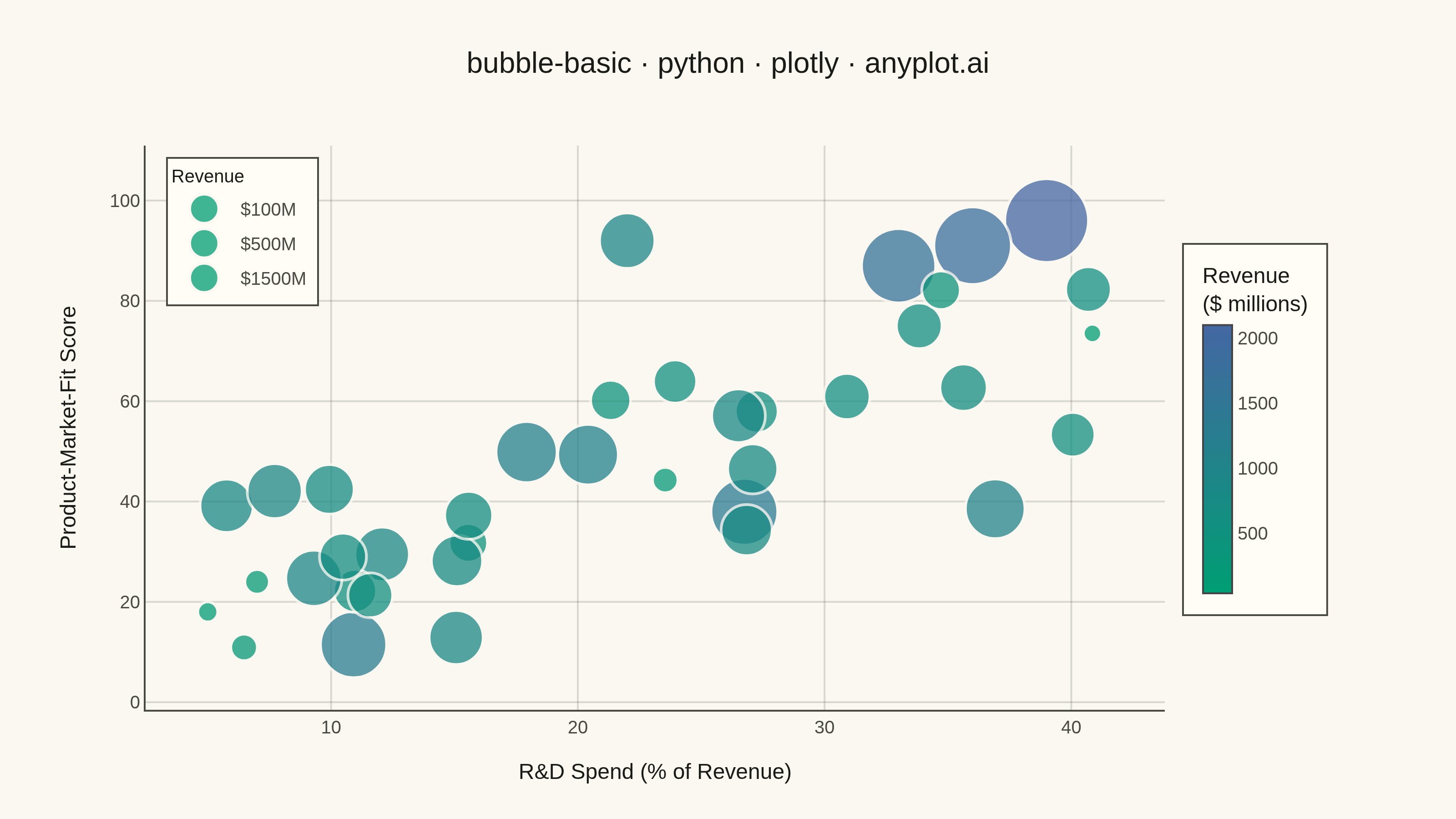
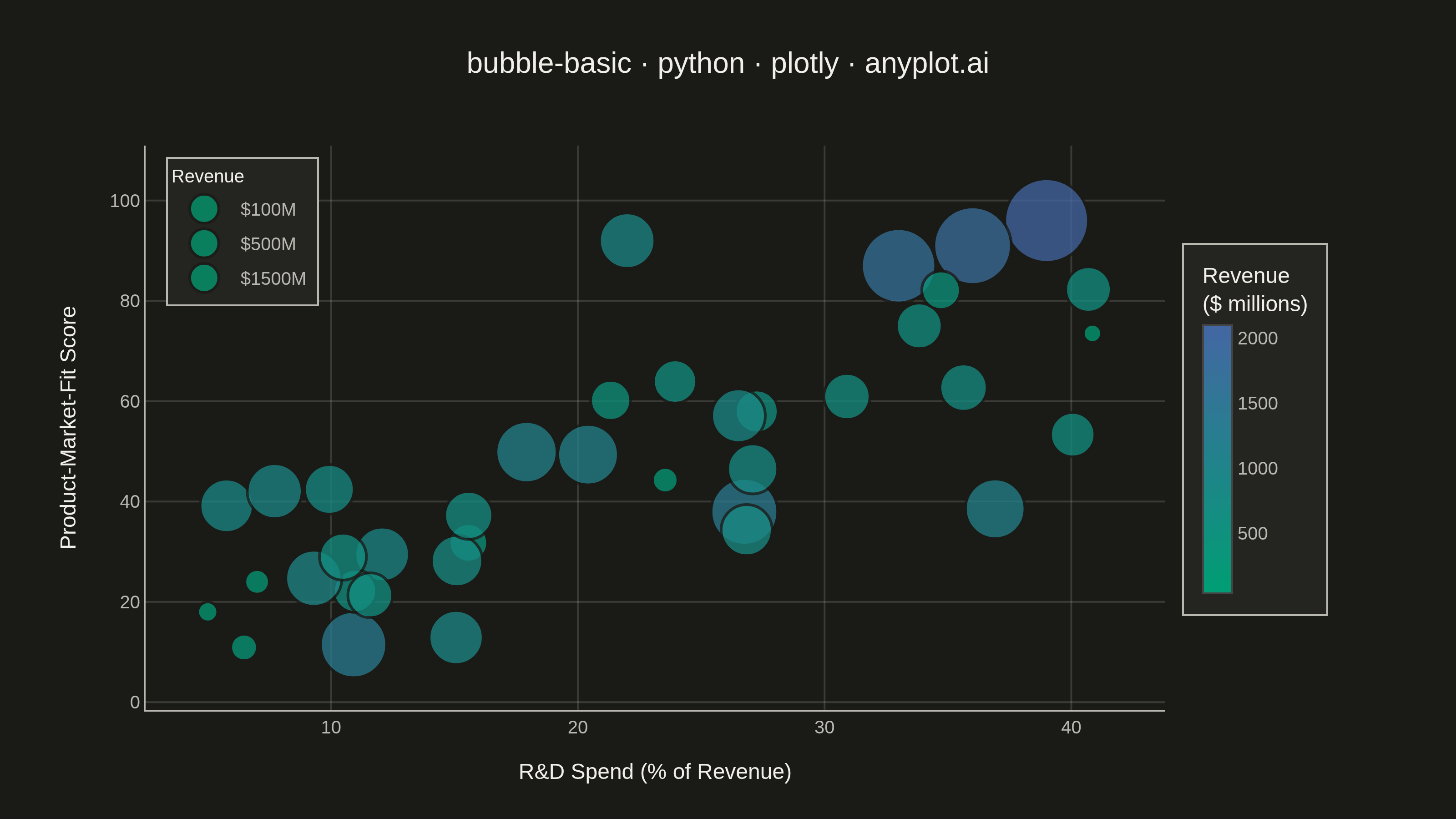
A bubble chart extending scatter plots by adding a third dimension through bubble size. Each point's position shows two variables (x, y) while the bubble size represents a third quantitative variable. This visualization is excellent for understanding relationships between three numerical variables simultaneously, revealing patterns that would be hidden in traditional 2D scatter plots.
""" anyplot.ai
bubble-basic: Basic Bubble Chart
Library: plotly 6.7.0 | Python 3.13.13
Quality: 90/100 | Updated: 2026-05-28
"""

import os

import numpy as np
import plotly.graph_objects as go


# Theme
THEME = os.getenv("ANYPLOT_THEME", "light")
PAGE_BG = "#FAF8F1" if THEME == "light" else "#1A1A17"
ELEVATED_BG = "#FFFDF6" if THEME == "light" else "#242420"
INK = "#1A1A17" if THEME == "light" else "#F0EFE8"
INK_SOFT = "#4A4A44" if THEME == "light" else "#B8B7B0"
GRID = "rgba(26,26,23,0.15)" if THEME == "light" else "rgba(240,239,232,0.15)"

# Continuous colorscale — imprint_seq (brand green → blue, single-polarity)
imprint_seq = [[0.0, "#009E73"], [1.0, "#4467A3"]]

# Data — Tech companies: R&D investment vs. product-market-fit score
np.random.seed(42)
n = 38
rd_pct = np.random.uniform(4, 42, n)  # R&D spend as % of revenue
pmf = np.clip(rd_pct * 1.3 + np.random.normal(0, 14, n) + 18, 8, 98)
revenue_m = np.clip(np.abs(np.random.normal(750, 380, n)), 40, 2200)

# Anchor key data points for visual storytelling
rd_pct[0], pmf[0], revenue_m[0] = 39, 96, 2100  # R&D powerhouse
rd_pct[1], pmf[1], revenue_m[1] = 36, 91, 1800
rd_pct[2], pmf[2], revenue_m[2] = 33, 87, 1650
rd_pct[5], pmf[5], revenue_m[5] = 7, 24, 180  # underinvestors
rd_pct[6], pmf[6], revenue_m[6] = 5, 18, 120
rd_pct[10], pmf[10], revenue_m[10] = 22, 92, 920  # efficient innovator

# Bubble sizing via sizeref (Plotly's idiomatic area-based scaling)
sizeref = 2.0 * float(revenue_m.max()) / (46.0**2)

title = "bubble-basic · python · plotly · anyplot.ai"
title_size = round(16 * 67 / len(title)) if len(title) > 67 else 16

# Plot
fig = go.Figure()

fig.add_trace(
    go.Scatter(
        x=rd_pct,
        y=pmf,
        mode="markers",
        customdata=revenue_m,
        marker={
            "size": revenue_m,
            "sizemode": "area",
            "sizeref": sizeref,
            "sizemin": 5,
            "color": revenue_m,
            "colorscale": imprint_seq,
            "colorbar": {
                "title": {"text": "Revenue<br>($ millions)", "font": {"size": 12, "color": INK}},
                "tickfont": {"size": 10, "color": INK_SOFT},
                "thickness": 16,
                "len": 0.65,
                "y": 0.5,
                "bgcolor": ELEVATED_BG,
                "bordercolor": INK_SOFT,
                "borderwidth": 1,
            },
            "opacity": 0.75,
            "line": {"width": 1.5, "color": PAGE_BG},
        },
        hovertemplate=(
            "<b>R&D Spend:</b> %{x:.1f}%<br>"
            "<b>PMF Score:</b> %{y:.0f}<br>"
            "<b>Revenue:</b> $%{customdata:.0f}M<extra></extra>"
        ),
        showlegend=False,
    )
)

# Size legend — three reference bubbles
for size_label in [100, 500, 1500]:
    fig.add_trace(
        go.Scatter(
            x=[None],
            y=[None],
            mode="markers",
            marker={
                "size": size_label,
                "sizemode": "area",
                "sizeref": sizeref,
                "sizemin": 4,
                "color": "#009E73",
                "opacity": 0.75,
                "line": {"width": 1.5, "color": PAGE_BG},
            },
            name=f"${size_label}M",
            showlegend=True,
        )
    )

fig.update_layout(
    autosize=False,
    title={"text": title, "font": {"size": title_size, "color": INK}, "x": 0.5, "xanchor": "center"},
    xaxis={
        "title": {"text": "R&D Spend (% of Revenue)", "font": {"size": 12, "color": INK}},
        "tickfont": {"size": 10, "color": INK_SOFT},
        "gridcolor": GRID,
        "linecolor": INK_SOFT,
        "zeroline": False,
    },
    yaxis={
        "title": {"text": "Product-Market-Fit Score", "font": {"size": 12, "color": INK}},
        "tickfont": {"size": 10, "color": INK_SOFT},
        "gridcolor": GRID,
        "linecolor": INK_SOFT,
        "zeroline": False,
    },
    paper_bgcolor=PAGE_BG,
    plot_bgcolor=PAGE_BG,
    font={"color": INK},
    legend={
        "title": {"text": "Revenue", "font": {"size": 10, "color": INK}},
        "font": {"size": 10, "color": INK_SOFT},
        "bgcolor": ELEVATED_BG,
        "bordercolor": INK_SOFT,
        "borderwidth": 1,
        "x": 0.02,
        "y": 0.98,
        "xanchor": "left",
        "yanchor": "top",
    },
    margin={"l": 80, "r": 160, "t": 80, "b": 60},
)

# Save
fig.write_image(f"plot-{THEME}.png", width=800, height=450, scale=4)
fig.write_html(f"plot-{THEME}.html", include_plotlyjs="cdn")
Runnable source as JSON, for any HTTP client: https://api.anyplot.ai/specs/bubble-basic/plotly/code. Any spec id and library id listed in llms-full.txt fit the same URL shape; every URL below is complete and callable.
{
  "spec_id": "bubble-basic",
  "language": "python",
  "library": "plotly",
  "page": "https://anyplot.ai/bubble-basic/python/plotly",
  "hub": "https://anyplot.ai/bubble-basic",
  "code_json": "https://api.anyplot.ai/specs/bubble-basic/plotly/code",
  "spec_json": "https://api.anyplot.ai/specs/bubble-basic",
  "render_light_png": "https://storage.googleapis.com/anyplot-images/plots/bubble-basic/python/plotly/plot-light.png",
  "render_dark_png": "https://storage.googleapis.com/anyplot-images/plots/bubble-basic/python/plotly/plot-dark.png",
  "interactive_light_html": "https://storage.googleapis.com/anyplot-images/plots/bubble-basic/python/plotly/plot-light.html",
  "interactive_dark_html": "https://storage.googleapis.com/anyplot-images/plots/bubble-basic/python/plotly/plot-dark.html",
  "quality_score": 90.0,
  "license": "MIT",
  "guide": "https://anyplot.ai/llms.txt"
}
Part of Basic Bubble Chart on anyplot.ai.