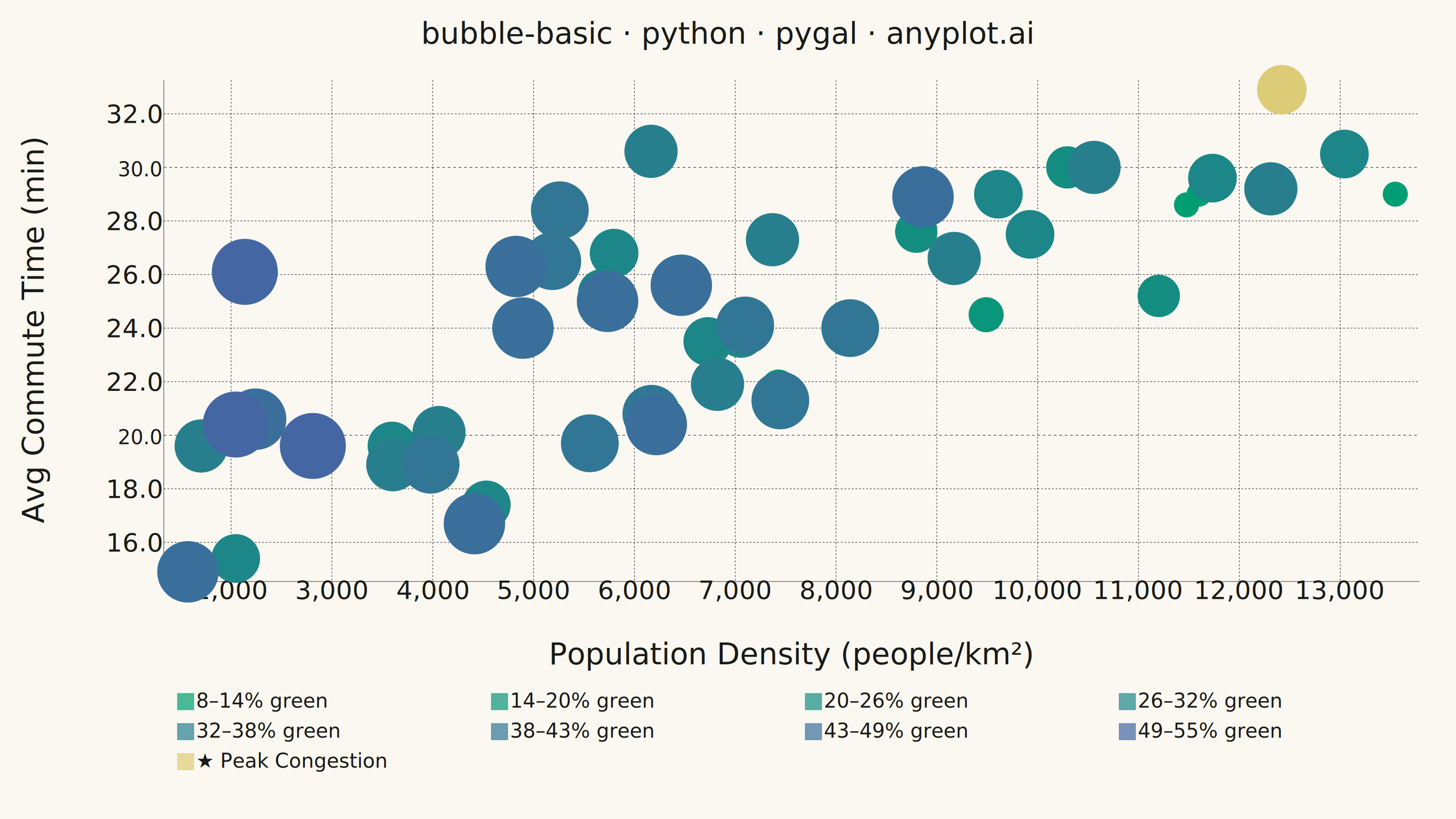
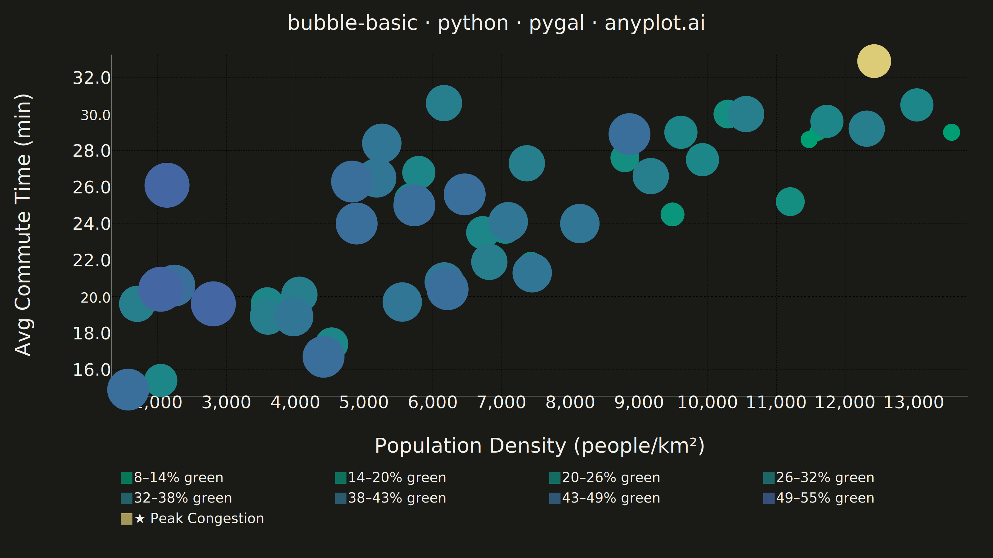
A bubble chart extending scatter plots by adding a third dimension through bubble size. Each point's position shows two variables (x, y) while the bubble size represents a third quantitative variable. This visualization is excellent for understanding relationships between three numerical variables simultaneously, revealing patterns that would be hidden in traditional 2D scatter plots.
""" anyplot.ai
bubble-basic: Basic Bubble Chart
Library: pygal 3.1.0 | Python 3.13.13
Quality: 85/100 | Created: 2026-05-28
"""

import os
import sys


# Remove the script's own directory from sys.path so `import pygal` resolves to the
# installed package rather than this file (which shares the package name).
_here = os.path.dirname(os.path.abspath(__file__))
sys.path = [p for p in sys.path if os.path.abspath(p) != _here]

import numpy as np
import pygal
from pygal.style import Style


# Theme tokens
THEME = os.getenv("ANYPLOT_THEME", "light")
PAGE_BG = "#FAF8F1" if THEME == "light" else "#1A1A17"
INK = "#1A1A17" if THEME == "light" else "#F0EFE8"
INK_MUTED = "#6B6A63" if THEME == "light" else "#A8A79F"

# Data — City comparison: population density vs avg commute time, bubble = green space (%)
np.random.seed(42)
n_cities = 50

# Uniform spread across density range to avoid lower-left clustering
population_density = np.concatenate(
    [np.random.uniform(1500, 5000, 15), np.random.uniform(5000, 9000, 20), np.random.uniform(9000, 14000, 15)]
)
np.random.shuffle(population_density)

commute_time = 15 + population_density / 750 + np.random.normal(0, 2.8, n_cities)
green_space_pct = np.clip(52 - population_density / 380 + np.random.normal(0, 9, n_cities), 5, 55)

# Area-scaled bubble sizing via 8 tiers (pygal has no per-point size API)
gs_min, gs_max = green_space_pct.min(), green_space_pct.max()
bubble_norm = (green_space_pct - gs_min) / (gs_max - gs_min)

n_tiers = 8
tier_bins = np.clip(np.digitize(bubble_norm, np.linspace(0, 1, n_tiers + 1)[1:-1]), 0, n_tiers - 1)

# sqrt scaling for perceptual area accuracy
tier_sizes = [int(12 + 62 * ((t + 0.5) / n_tiers) ** 0.5) for t in range(n_tiers)]

# anyplot imprint_seq: #009E73 (brand green) → #4467A3 (blue), 8 equidistant stops
tier_colors = tuple(
    "#{:02X}{:02X}{:02X}".format(
        round(0x00 + (0x44 - 0x00) * i / (n_tiers - 1)),
        round(0x9E + (0x67 - 0x9E) * i / (n_tiers - 1)),
        round(0x73 + (0xA3 - 0x73) * i / (n_tiers - 1)),
    )
    for i in range(n_tiers)
)

# ANYPLOT_AMBER marks the focal city (9th color in the series cycle)
ANYPLOT_AMBER = "#DDCC77"
style_colors = tier_colors + (ANYPLOT_AMBER,)

# Tier labels serve as the size legend (green-space percentage ranges)
bin_edges_pct = np.linspace(gs_min, gs_max, n_tiers + 1)
tier_labels = [f"{bin_edges_pct[t]:.0f}–{bin_edges_pct[t + 1]:.0f}% green" for t in range(n_tiers)]

# Focal city: highest commute time — visual anchor for data storytelling
focal_idx = int(np.argmax(commute_time))
focal_tier = int(tier_bins[focal_idx])

# Group cities by green-space tier, excluding focal city
tier_data = {t: [] for t in range(n_tiers)}
for i in range(n_cities):
    if i == focal_idx:
        continue
    t = int(tier_bins[i])
    tier_data[t].append(
        {
            "value": (round(float(population_density[i]), 1), round(float(commute_time[i]), 1)),
            "label": (
                f"Density: {population_density[i]:,.0f}/km²  |  "
                f"Commute: {commute_time[i]:.1f} min  |  "
                f"Green space: {green_space_pct[i]:.0f}%"
            ),
        }
    )

focal_point_data = [
    {
        "value": (round(float(population_density[focal_idx]), 1), round(float(commute_time[focal_idx]), 1)),
        "label": (
            f"★ Peak Congestion  |  "
            f"Density: {population_density[focal_idx]:,.0f}/km²  |  "
            f"Commute: {commute_time[focal_idx]:.1f} min  |  "
            f"Green space: {green_space_pct[focal_idx]:.0f}%"
        ),
    }
]

# Style — theme-adaptive, anyplot sizing
custom_style = Style(
    background=PAGE_BG,
    plot_background=PAGE_BG,
    foreground=INK,
    foreground_strong=INK,
    foreground_subtle=INK_MUTED,
    colors=style_colors,
    opacity=0.70,
    opacity_hover=0.95,
    title_font_size=66,
    label_font_size=56,
    major_label_font_size=44,
    legend_font_size=44,
    value_font_size=36,
    tooltip_font_size=36,
    title_font_family="Helvetica Neue, Helvetica, Arial, sans-serif",
    label_font_family="Helvetica Neue, Helvetica, Arial, sans-serif",
    major_label_font_family="Helvetica Neue, Helvetica, Arial, sans-serif",
    legend_font_family="Helvetica Neue, Helvetica, Arial, sans-serif",
)

# Plot
chart = pygal.XY(
    width=3200,
    height=1800,
    style=custom_style,
    title="bubble-basic · python · pygal · anyplot.ai",
    x_title="Population Density (people/km²)",
    y_title="Avg Commute Time (min)",
    show_legend=True,
    legend_at_bottom=True,
    legend_at_bottom_columns=4,
    legend_box_size=36,
    stroke=False,
    dots_size=20,
    show_x_guides=True,
    show_y_guides=True,
    x_value_formatter=lambda x: f"{x:,.0f}",
    value_formatter=lambda x: f"{x:.1f}",
    margin_top=80,
    margin_bottom=200,
    margin_left=100,
    margin_right=80,
    tooltip_border_radius=8,
    tooltip_fancy_mode=True,
    print_values=False,
    truncate_legend=30,
    spacing=30,
)

for t in range(n_tiers):
    chart.add(tier_labels[t], tier_data[t] if tier_data[t] else [], dots_size=tier_sizes[t])

# Focal city rendered last in ANYPLOT_AMBER — stands out as a visual anchor
chart.add("★ Peak Congestion", focal_point_data, dots_size=tier_sizes[focal_tier] + 8)

# Save
chart.render_to_file(f"plot-{THEME}.html")
chart.render_to_png(f"plot-{THEME}.png")
Runnable source as JSON, for any HTTP client: https://api.anyplot.ai/specs/bubble-basic/pygal/code. Any spec id and library id listed in llms-full.txt fit the same URL shape; every URL below is complete and callable.
{
  "spec_id": "bubble-basic",
  "language": "python",
  "library": "pygal",
  "page": "https://anyplot.ai/bubble-basic/python/pygal",
  "hub": "https://anyplot.ai/bubble-basic",
  "code_json": "https://api.anyplot.ai/specs/bubble-basic/pygal/code",
  "spec_json": "https://api.anyplot.ai/specs/bubble-basic",
  "render_light_png": "https://storage.googleapis.com/anyplot-images/plots/bubble-basic/python/pygal/plot-light.png",
  "render_dark_png": "https://storage.googleapis.com/anyplot-images/plots/bubble-basic/python/pygal/plot-dark.png",
  "interactive_light_html": "https://storage.googleapis.com/anyplot-images/plots/bubble-basic/python/pygal/plot-light.html",
  "interactive_dark_html": "https://storage.googleapis.com/anyplot-images/plots/bubble-basic/python/pygal/plot-dark.html",
  "quality_score": 85.0,
  "license": "MIT",
  "guide": "https://anyplot.ai/llms.txt"
}
Part of Basic Bubble Chart on anyplot.ai.