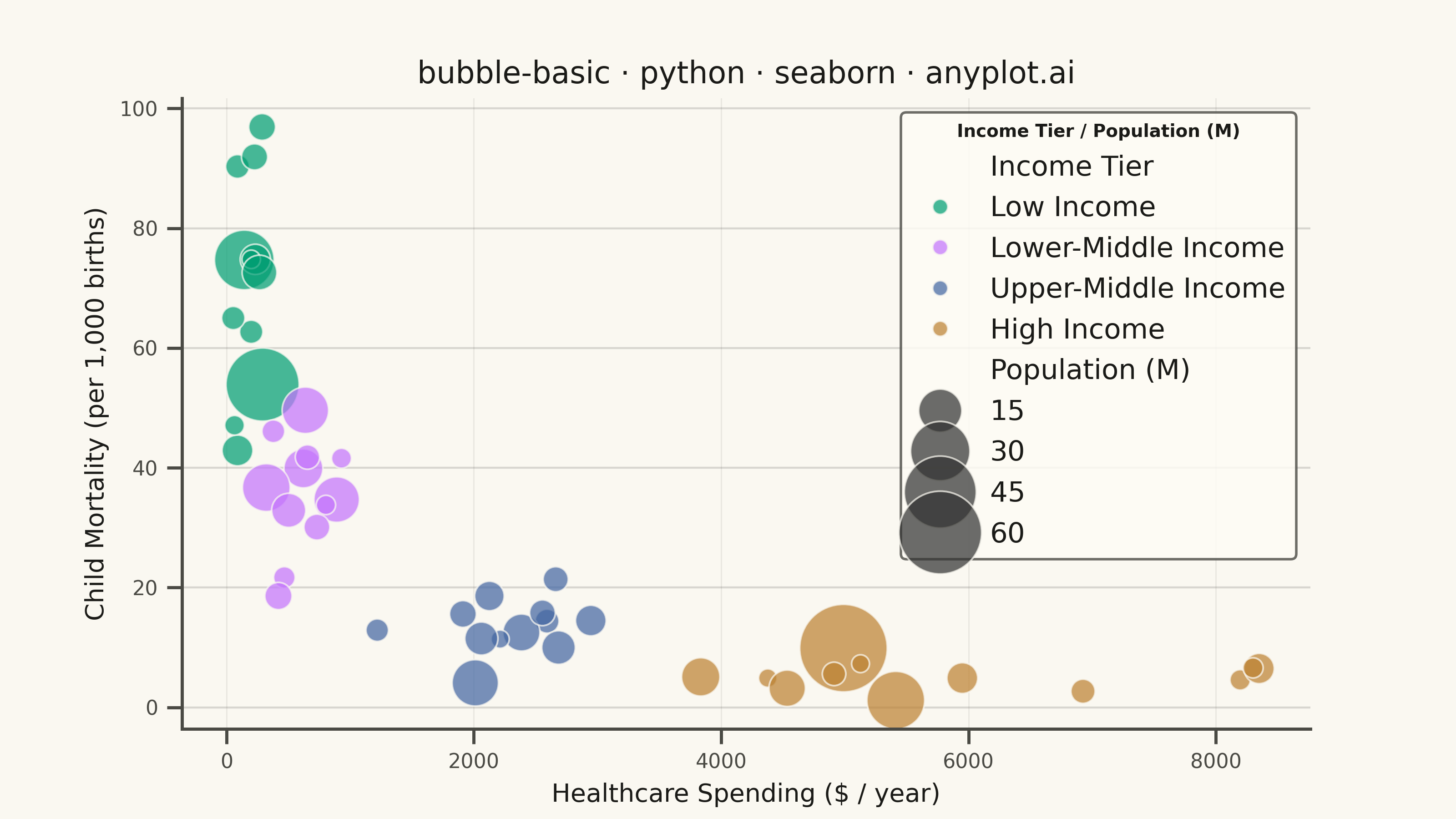
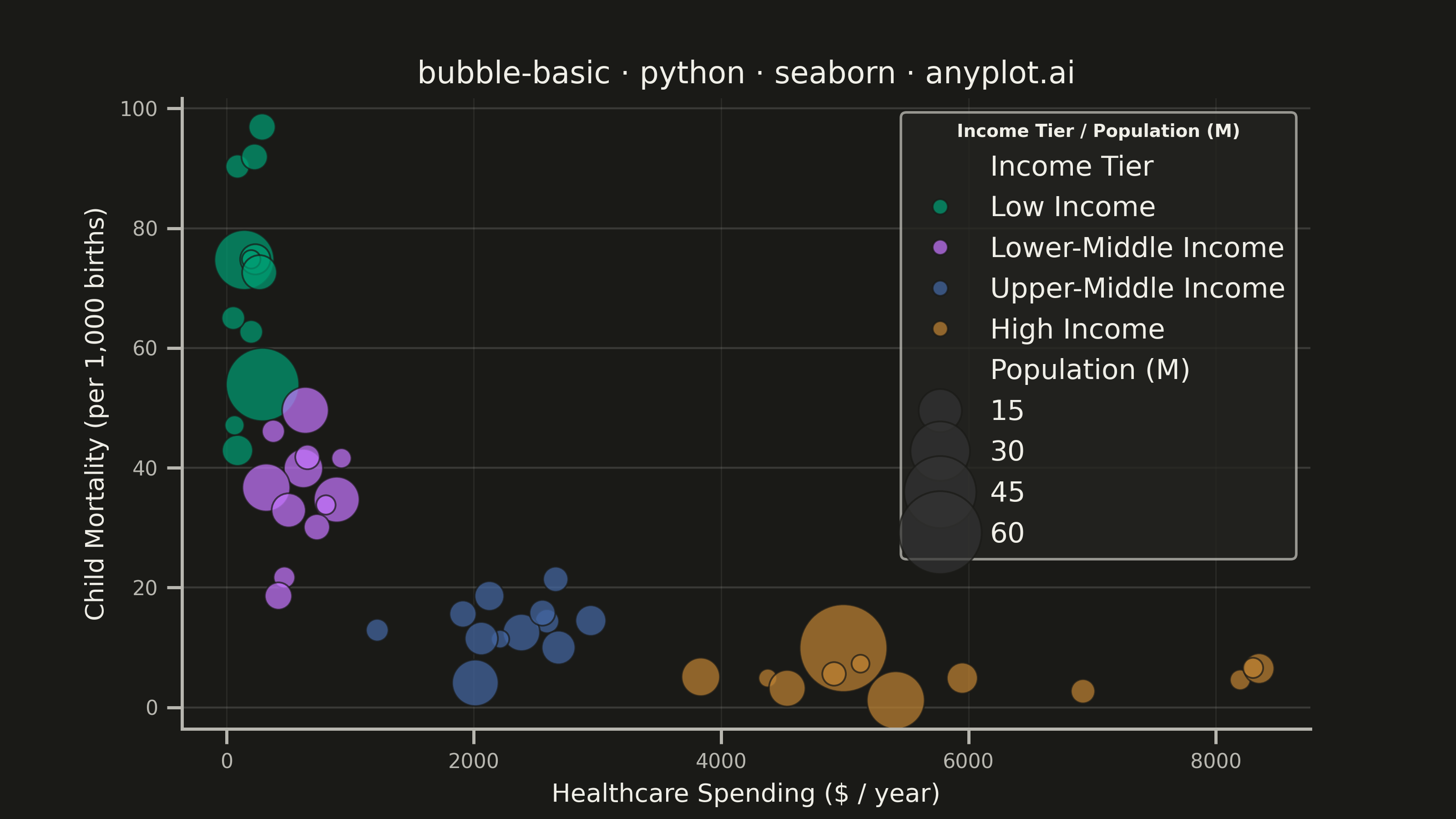
A bubble chart extending scatter plots by adding a third dimension through bubble size. Each point's position shows two variables (x, y) while the bubble size represents a third quantitative variable. This visualization is excellent for understanding relationships between three numerical variables simultaneously, revealing patterns that would be hidden in traditional 2D scatter plots.
""" anyplot.ai
bubble-basic: Basic Bubble Chart
Library: seaborn 0.13.2 | Python 3.13.13
Quality: 88/100 | Updated: 2026-05-28
"""

import os

import matplotlib.pyplot as plt
import numpy as np
import pandas as pd
import seaborn as sns


# Theme tokens
THEME = os.getenv("ANYPLOT_THEME", "light")
PAGE_BG = "#FAF8F1" if THEME == "light" else "#1A1A17"
ELEVATED_BG = "#FFFDF6" if THEME == "light" else "#242420"
INK = "#1A1A17" if THEME == "light" else "#F0EFE8"
INK_SOFT = "#4A4A44" if THEME == "light" else "#B8B7B0"

# anyplot palette — canonical order, first series always #009E73
ANYPLOT_PALETTE = ["#009E73", "#C475FD", "#4467A3", "#BD8233", "#AE3030", "#2ABCCD", "#954477", "#99B314"]

# Data — Countries: healthcare spending vs child mortality, bubble = population
np.random.seed(42)

tier_params = [
    ("Low Income", 50, 300, 85, 22, 12),
    ("Lower-Middle Income", 300, 950, 38, 11, 12),
    ("Upper-Middle Income", 950, 3200, 14, 5, 12),
    ("High Income", 3200, 8500, 5, 2, 12),
]
tier_colors = {t[0]: ANYPLOT_PALETTE[i] for i, t in enumerate(tier_params)}

rows = []
for tier, s_min, s_max, m_ctr, m_std, n in tier_params:
    spending = np.random.uniform(s_min, s_max, n)
    mortality = np.clip(np.random.normal(m_ctr, m_std, n), 0.5, 150)
    population = np.clip(np.random.lognormal(1.8, 1.1, n), 1.0, 200.0)
    for s, m, pop in zip(spending, mortality, population, strict=False):
        rows.append(
            {
                "Healthcare Spending ($/year)": round(s, 0),
                "Child Mortality (per 1,000 births)": round(m, 1),
                "Population (M)": round(pop, 1),
                "Income Tier": tier,
            }
        )
df = pd.DataFrame(rows)

# Configure seaborn theme
sns.set_theme(
    style="ticks",
    rc={
        "figure.facecolor": PAGE_BG,
        "axes.facecolor": PAGE_BG,
        "axes.edgecolor": INK_SOFT,
        "axes.labelcolor": INK,
        "text.color": INK,
        "xtick.color": INK_SOFT,
        "ytick.color": INK_SOFT,
        "grid.color": INK,
        "grid.alpha": 0.15,
        "legend.facecolor": ELEVATED_BG,
        "legend.edgecolor": INK_SOFT,
    },
)

# Plot
fig, ax = plt.subplots(figsize=(8, 4.5), dpi=400, facecolor=PAGE_BG)
ax.set_facecolor(PAGE_BG)

hue_order = [t[0] for t in tier_params]
sns.scatterplot(
    data=df,
    x="Healthcare Spending ($/year)",
    y="Child Mortality (per 1,000 births)",
    size="Population (M)",
    hue="Income Tier",
    hue_order=hue_order,
    sizes=(50, 1200),
    alpha=0.72,
    palette=tier_colors,
    edgecolor=PAGE_BG,
    linewidth=0.7,
    legend="brief",
    ax=ax,
)

# Style
title = "bubble-basic · python · seaborn · anyplot.ai"
n_chars = len(title)
ratio = 67 / n_chars if n_chars > 67 else 1.0
title_fontsize = max(8, round(12 * ratio))

ax.set_xlabel("Healthcare Spending ($ / year)", fontsize=10, color=INK)
ax.set_ylabel("Child Mortality (per 1,000 births)", fontsize=10, color=INK)
ax.set_title(title, fontsize=title_fontsize, fontweight="medium", color=INK)
ax.tick_params(axis="both", labelsize=8, colors=INK_SOFT)
ax.spines["top"].set_visible(False)
ax.spines["right"].set_visible(False)
ax.spines["left"].set_color(INK_SOFT)
ax.spines["bottom"].set_color(INK_SOFT)
ax.yaxis.grid(True, alpha=0.15, linewidth=0.8)
ax.xaxis.grid(True, alpha=0.08, linewidth=0.5)

# Move legend first, then configure the resulting object to avoid losing changes
sns.move_legend(ax, "upper right", frameon=True)
legend = ax.get_legend()
legend.set_title("Income Tier / Population (M)", prop={"size": 8})
legend.get_title().set_fontweight("semibold")
legend.get_title().set_color(INK)
tier_names = {t[0] for t in tier_params}
for handle, text_obj in zip(legend.legend_handles, legend.texts, strict=False):
    text_obj.set_fontsize(8)
    text_obj.set_color(INK)
    # Size handles (non-tier labels): override colors so they're visible in dark mode
    if text_obj.get_text() not in tier_names:
        try:
            handle.set_facecolor(INK_SOFT)
            handle.set_edgecolor(INK_SOFT)
        except AttributeError:
            pass
legend.set_frame_on(True)
legend.get_frame().set_alpha(0.92)
legend.get_frame().set_edgecolor(INK_SOFT)
legend.get_frame().set_facecolor(ELEVATED_BG)

# Save — no bbox_inches='tight' to preserve exact 3200×1800 canvas
plt.savefig(f"plot-{THEME}.png", dpi=400, facecolor=PAGE_BG)
Runnable source as JSON, for any HTTP client: https://api.anyplot.ai/specs/bubble-basic/seaborn/code. Any spec id and library id listed in llms-full.txt fit the same URL shape; every URL below is complete and callable.
{
  "spec_id": "bubble-basic",
  "language": "python",
  "library": "seaborn",
  "page": "https://anyplot.ai/bubble-basic/python/seaborn",
  "hub": "https://anyplot.ai/bubble-basic",
  "code_json": "https://api.anyplot.ai/specs/bubble-basic/seaborn/code",
  "spec_json": "https://api.anyplot.ai/specs/bubble-basic",
  "render_light_png": "https://storage.googleapis.com/anyplot-images/plots/bubble-basic/python/seaborn/plot-light.png",
  "render_dark_png": "https://storage.googleapis.com/anyplot-images/plots/bubble-basic/python/seaborn/plot-dark.png",
  "quality_score": 88.0,
  "license": "MIT",
  "guide": "https://anyplot.ai/llms.txt"
}
Part of Basic Bubble Chart on anyplot.ai.