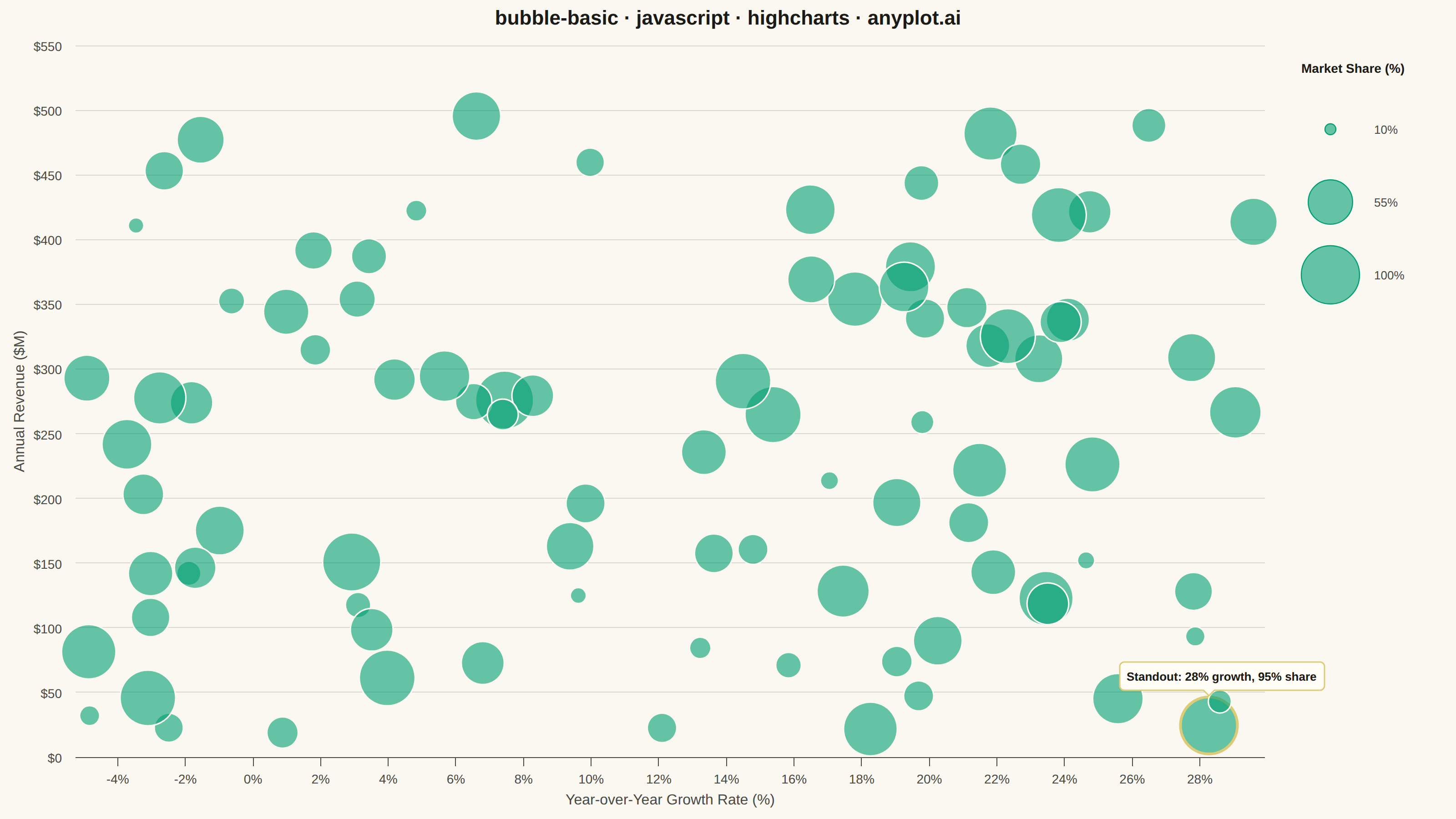
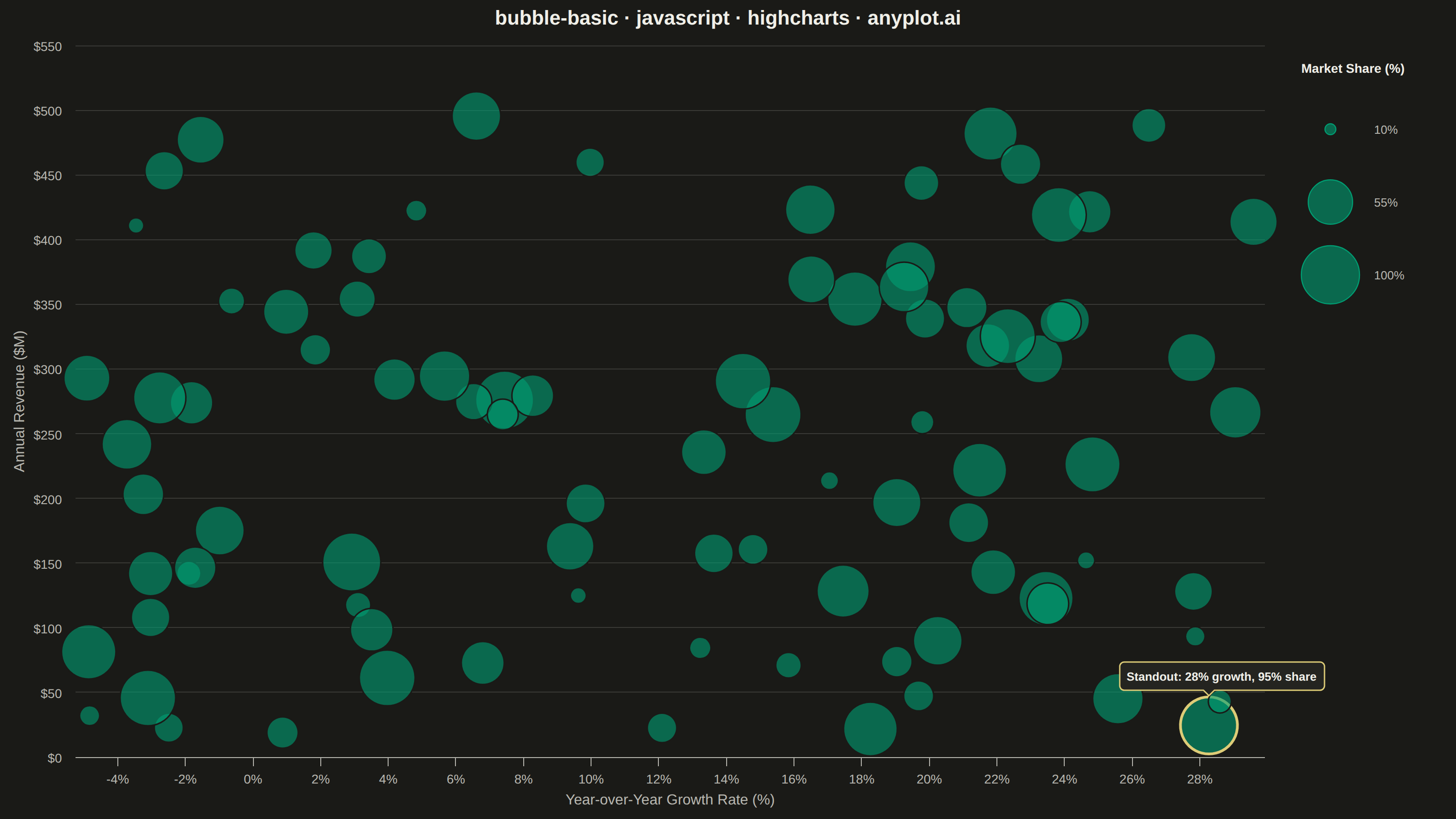
The same plot in 14 other libraries — JavaScript: Chart.js, D3.js, Apache ECharts, MUI X Charts; Python: Altair, Bokeh, lets-plot, Matplotlib, Plotly, plotnine, Pygal, Seaborn; R: ggplot2; Julia: Makie.jl. Compare all 15 side by side: Basic Bubble Chart in Python, R, Julia and JavaScript.
A bubble chart extending scatter plots by adding a third dimension through bubble size. Each point's position shows two variables (x, y) while the bubble size represents a third quantitative variable. This visualization is excellent for understanding relationships between three numerical variables simultaneously, revealing patterns that would be hidden in traditional 2D scatter plots.
// anyplot.ai
// bubble-basic: Basic Bubble Chart
// Library: highcharts 12.6.0 | JavaScript 22.23.3
// Quality: 82/100 | Updated: 2026-09-30

const t = window.ANYPLOT_TOKENS;

// --- Data (in-memory, deterministic LCG) ------------------------------------
// Market analysis: growth rate vs. revenue, bubble size = revenue share of segment.
let seed = 42;
function rand() {
  seed = (seed * 1103515245 + 12345) & 0x7fffffff;
  return seed / 0x7fffffff;
}

const X_MIN = -5;
const X_MAX = 30;
const Y_MIN = 10;
const Y_MAX = 500;
const Z_MIN = 10;
const Z_MAX = 100;
const R_MIN = 9;
const R_MAX = 32;

// Scale by area, not radius, so bubble size reads proportionally.
function radiusForShare(share) {
  const frac = Math.max(0, Math.min(1, (share - Z_MIN) / (Z_MAX - Z_MIN)));
  return R_MIN + (R_MAX - R_MIN) * Math.sqrt(frac);
}

// Small bubbles have the least area to carry color, so nudge their opacity up
// a bit to keep them from washing out against the plot background.
function alphaForShare(share) {
  const frac = Math.max(0, Math.min(1, (share - Z_MIN) / (Z_MAX - Z_MIN)));
  return 0.6 + 0.15 * (1 - frac);
}

// Rough plot-area pixel box (mount minus title/axis/legend margins), used only
// to space out bubbles below — it doesn't need to match the real layout exactly.
const PLOT_W_PX = 1300;
const PLOT_H_PX = 700;

// A candidate is rejected if it would land within 1+ neighbor's combined
// radius: a single near-total overlap already hides the smaller bubble behind
// the larger one, so any close neighbor triggers a resample, not just a
// 2+-way clump. The distance threshold itself (1.0x combined radius) allows
// partial edge-touching overlap through — only near-total fusion is retried.
function closeNeighborCount(candidate, placed) {
  let count = 0;
  for (const p of placed) {
    const dxPx = ((candidate.growthRate - p.growthRate) / (X_MAX - X_MIN)) * PLOT_W_PX;
    const dyPx = ((candidate.revenue - p.revenue) / (Y_MAX - Y_MIN)) * PLOT_H_PX;
    const dist = Math.hypot(dxPx, dyPx);
    if (dist < (candidate.r + p.r) * 1.0) count += 1;
  }
  return count;
}

const companies = [];
for (let i = 0; i < 70; i += 1) {
  let candidate;
  for (let attempt = 0; attempt < 10; attempt += 1) {
    const growthRate = X_MIN + rand() * (X_MAX - X_MIN);
    const revenue = Y_MIN + rand() * (Y_MAX - Y_MIN);
    // Each company's share is relative to its own market segment, not a
    // shared market — so these values do NOT sum to 100 across companies,
    // unlike a conventional "market share" metric. Labelled as such below.
    const segmentShare = Z_MIN + rand() * (Z_MAX - Z_MIN);
    candidate = { growthRate, revenue, segmentShare, r: radiusForShare(segmentShare) };
    if (attempt === 9 || closeNeighborCount(candidate, companies) < 1) break;
  }
  companies.push(candidate);
}

const [fr, fg, fb] = [1, 3, 5].map((i) => parseInt(t.palette[0].slice(i, i + 2), 16));
const fillForShare = (share) => `rgba(${fr}, ${fg}, ${fb}, ${alphaForShare(share)})`;
const seriesData = companies.map((c) => ({
  x: c.growthRate,
  y: c.revenue,
  marker: {
    radius: c.r,
    fillColor: fillForShare(c.segmentShare),
    // Page-bg stroke carves a visible edge between overlapping same-color
    // bubbles instead of them reading as one merged blob.
    lineColor: t.pageBg,
    lineWidth: 3,
  },
  custom: { segmentShare: Math.round(c.segmentShare) },
}));

// --- Chart post-render helpers ------------------------------------------------
function drawSizeLegend(chart) {
  // Highcharts core has no bubbleLegend (that lives in highcharts-more), so
  // the size key is drawn manually in the reserved right margin, vertically
  // centered in the plot area so leftover space splits evenly top/bottom.
  const legendX = chart.plotLeft + chart.plotWidth + 40;
  const rowHeight = 2 * R_MAX + 16;
  const titleHeight = 54;
  const totalHeight = titleHeight + 3 * rowHeight;
  let cursorY = chart.plotTop + Math.max(0, (chart.plotHeight - totalHeight) / 2);

  chart.renderer
    .text("Share of Own<br/>Market Segment (%)", legendX, cursorY, true)
    .css({ color: t.ink, fontSize: "15px", fontWeight: "600" })
    .add();
  cursorY += titleHeight;

  [Z_MIN, (Z_MIN + Z_MAX) / 2, Z_MAX].forEach((share) => {
    const r = radiusForShare(share);
    const cy = cursorY + R_MAX;
    chart.renderer
      .circle(legendX + R_MAX, cy, r)
      .attr({ fill: fillForShare(share), stroke: t.palette[0], "stroke-width": 1.2 })
      .add();
    chart.renderer
      .text(`${Math.round(share)}%`, legendX + 2 * R_MAX + 16, cy + 5)
      .css({ color: t.inkSoft, fontSize: "14px" })
      .add();
    cursorY += rowHeight;
  });
}

// --- Chart -------------------------------------------------------------------
// Core bundle has no highcharts-more, so bubbles are core "scatter" points
// with a per-point marker.radius (area-scaled) instead of the "bubble" series
// type — same visual result using only the loaded core module.
Highcharts.chart(
  "container",
  {
    chart: {
      type: "scatter",
      backgroundColor: "transparent",
      animation: false,
      marginRight: 210,
      style: { fontFamily: "inherit" },
    },
    credits: { enabled: false },
    colors: t.palette,
    title: {
      text: "bubble-basic · javascript · highcharts · anyplot.ai",
      style: { color: t.ink, fontSize: "23px", fontWeight: "700" },
      margin: 26,
    },
    xAxis: {
      title: {
        text: "Year-over-Year Growth Rate (%)",
        style: { color: t.inkSoft, fontSize: "16px", fontWeight: "500" },
      },
      lineColor: t.inkSoft,
      tickColor: t.inkSoft,
      tickWidth: 0,
      tickLength: 0,
      gridLineColor: t.grid,
      gridLineWidth: 1,
      labels: { style: { color: t.inkSoft, fontSize: "14px" }, format: "{value}%" },
    },
    yAxis: {
      title: {
        text: "Annual Revenue ($M)",
        style: { color: t.inkSoft, fontSize: "16px", fontWeight: "500" },
      },
      lineColor: t.inkSoft,
      tickColor: t.inkSoft,
      tickWidth: 0,
      tickLength: 0,
      gridLineColor: t.grid,
      gridLineWidth: 1,
      labels: { style: { color: t.inkSoft, fontSize: "14px" }, format: "${value}" },
    },
    legend: { enabled: false },
    tooltip: {
      backgroundColor: t.elevatedBg,
      borderColor: t.grid,
      style: { color: t.ink, fontSize: "13px" },
      pointFormatter: function pointFormatter() {
        return (
          `Growth: <b>${this.x.toFixed(1)}%</b><br/>` +
          `Revenue: <b>$${this.y.toFixed(0)}M</b><br/>` +
          `Share of own segment: <b>${this.custom.segmentShare}%</b>`
        );
      },
    },
    plotOptions: {
      series: { animation: false },
      scatter: { marker: { symbol: "circle", states: { hover: { lineWidthPlus: 1 } } } },
    },
    series: [{ name: "Companies", data: seriesData, showInLegend: false }],
  },
  function drawExtras(chart) {
    drawSizeLegend(chart);
  },
);
Runnable source as JSON, for any HTTP client: https://api.anyplot.ai/specs/bubble-basic/highcharts/code. Any spec id and library id listed in llms-full.txt fit the same URL shape; every URL below is complete and callable.
{
  "spec_id": "bubble-basic",
  "language": "javascript",
  "library": "highcharts",
  "page": "https://anyplot.ai/bubble-basic/javascript/highcharts",
  "hub": "https://anyplot.ai/bubble-basic",
  "code_json": "https://api.anyplot.ai/specs/bubble-basic/highcharts/code",
  "spec_json": "https://api.anyplot.ai/specs/bubble-basic",
  "render_light_png": "https://storage.googleapis.com/anyplot-images/plots/bubble-basic/javascript/highcharts/plot-light.png",
  "render_dark_png": "https://storage.googleapis.com/anyplot-images/plots/bubble-basic/javascript/highcharts/plot-dark.png",
  "interactive_light_html": "https://storage.googleapis.com/anyplot-images/plots/bubble-basic/javascript/highcharts/plot-light.html",
  "interactive_dark_html": "https://storage.googleapis.com/anyplot-images/plots/bubble-basic/javascript/highcharts/plot-dark.html",
  "quality_score": 82.0,
  "license": "MIT",
  "guide": "https://anyplot.ai/llms.txt"
}
Part of Basic Bubble Chart on anyplot.ai.