The same plot in 14 other libraries — JavaScript: Chart.js, D3.js, Apache ECharts, Highcharts; Python: Altair, Bokeh, lets-plot, Matplotlib, Plotly, plotnine, Pygal, Seaborn; R: ggplot2; Julia: Makie.jl. Compare all 15 side by side: Basic Bubble Chart in Python, R, Julia and JavaScript.
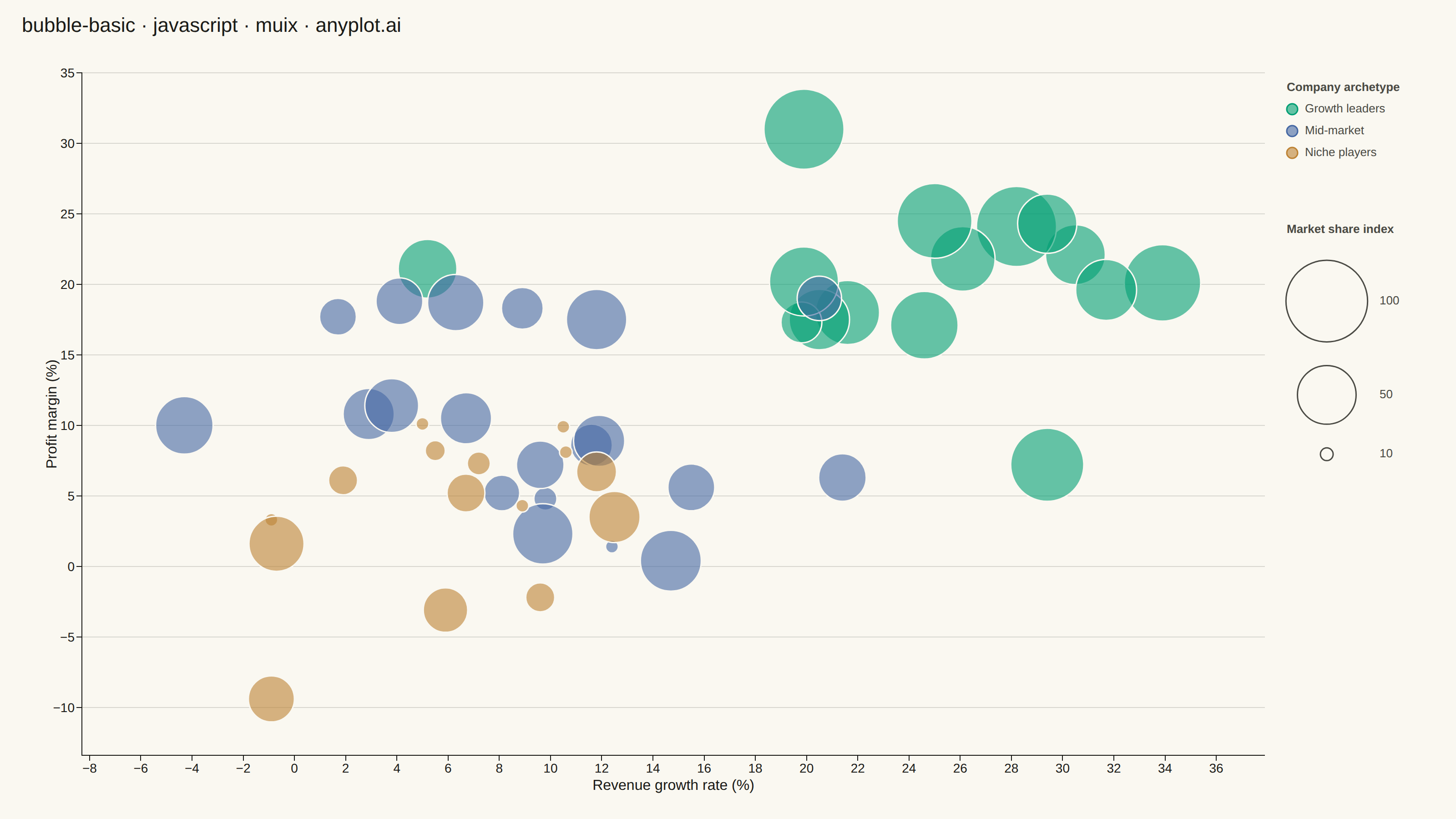
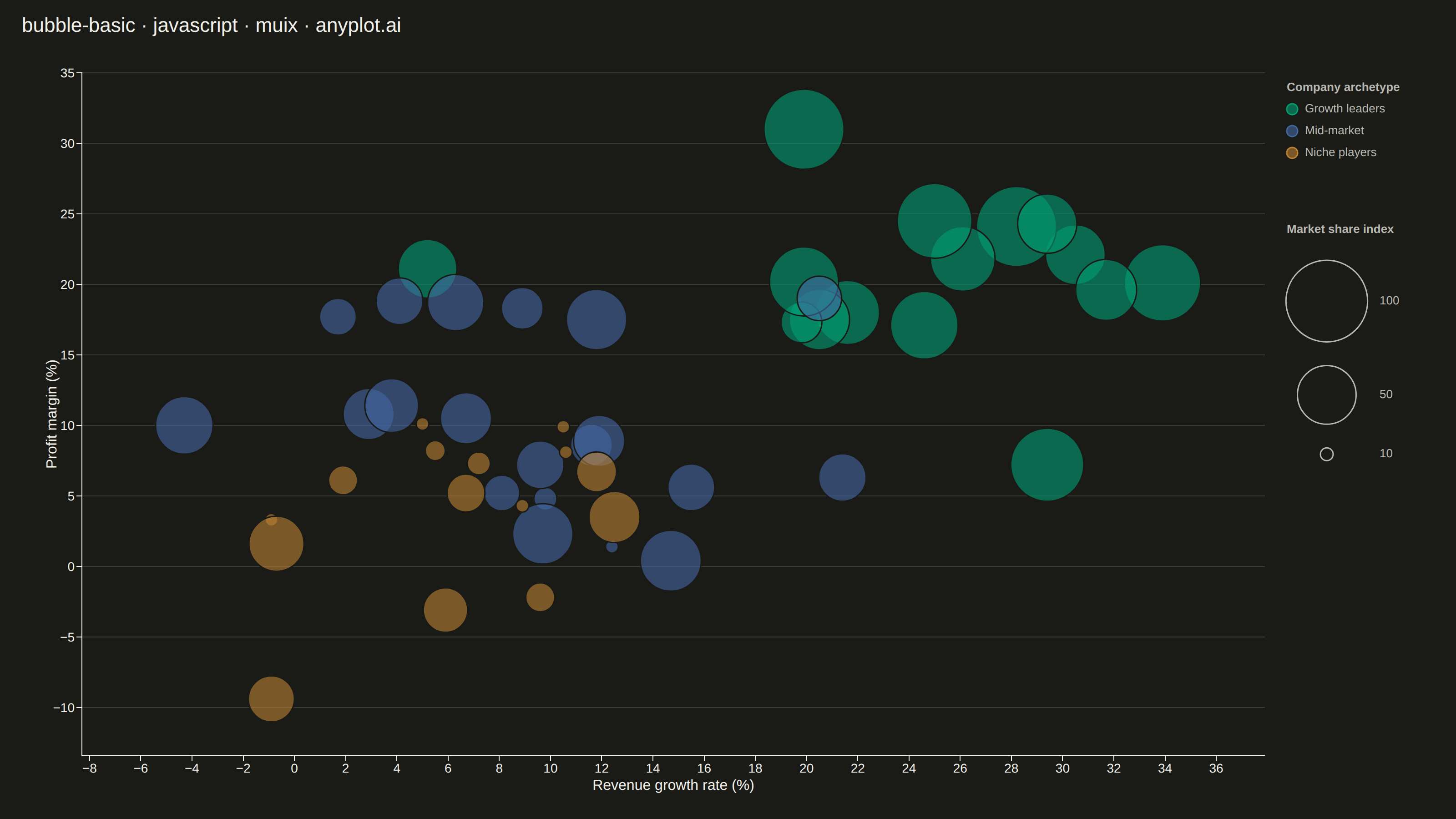
A bubble chart extending scatter plots by adding a third dimension through bubble size. Each point's position shows two variables (x, y) while the bubble size represents a third quantitative variable. This visualization is excellent for understanding relationships between three numerical variables simultaneously, revealing patterns that would be hidden in traditional 2D scatter plots.
// anyplot.ai
// bubble-basic: Basic Bubble Chart
// Library: muix 7.29.1 | JavaScript 22.23.2
// Quality: 83/100 | Updated: 2026-09-27
import { ChartContainer } from "@mui/x-charts/ChartContainer";
import { ChartsGrid } from "@mui/x-charts/ChartsGrid";
import { ChartsXAxis } from "@mui/x-charts/ChartsXAxis";
import { ChartsYAxis } from "@mui/x-charts/ChartsYAxis";
import { useXScale, useYScale } from "@mui/x-charts/hooks";

const t = window.ANYPLOT_TOKENS;
const TITLE = "bubble-basic · javascript · muix · anyplot.ai";
// Explicit callout naming the diagonal the three archetypes trace - without
// it, the growth/margin correlation across clusters is only an unlabeled
// color pattern the viewer has to infer for themselves.
const SUBTITLE = "Growth leaders combine the strongest revenue growth and profit margin";
const TITLE_HEIGHT = 84;
const MARGIN = { top: 24, right: 210, bottom: 70, left: 90 };

// Semi-transparent fill composites differently over the two page backgrounds:
// the same alpha reads more saturated over #1A1A17 than over #FAF8F1, even
// though the underlying Imprint hex values never change. The effect is
// strongest for the palette's paler hues (lavender) — they already read
// brighter/more saturated against the near-black surface with no extra alpha
// at all, so a single flat dark-theme bump over-saturates lavender while
// barely helping the darker blue, which needs the most help staying visible.
// Scale the bump per hue instead, inversely to that hue's own luma.
const LIGHT_OPACITY = 0.52; // within spec's 0.5-0.7 overlap range
const DARK_OPACITY_MAX_BUMP = 0.16;
function relativeLuma(hex) {
  const r = parseInt(hex.slice(1, 3), 16);
  const g = parseInt(hex.slice(3, 5), 16);
  const b = parseInt(hex.slice(5, 7), 16);
  return 0.2126 * r + 0.7152 * g + 0.0722 * b;
}

// --- Data (in-memory, deterministic LCG — no seeded RNG in the browser) -----
function lcg(seed) {
  let state = seed;
  return () => {
    state = (state * 1664525 + 1013904223) % 4294967296;
    return state / 4294967296;
  };
}

function randomNormal(rand, mean, stdDev) {
  const u1 = Math.max(rand(), 1e-9);
  const u2 = rand();
  const z = Math.sqrt(-2 * Math.log(u1)) * Math.cos(2 * Math.PI * u2);
  return mean + z * stdDev;
}

// Three loose company archetypes — fast-growing leaders, steady mid-market
// challengers, and small niche players — so the cloud has real structure
// instead of a formless blob. Each archetype gets its own hue so the
// pattern reads immediately instead of hiding in a single-color cloud.
// Abstract group labels (no semantic color cue), so Imprint positions are
// used in canonical order 1->3, not cherry-picked.
// The community package has no bubble/z-size scatter mode (ZAxisConfig
// only maps z to colour), so bubbles are drawn as a custom SVG layer
// positioned via the chart's own scale hooks.
// Spreads are wide enough that the normal distributions rarely produce
// fully-fused bubbles on their own; fillOpacity plus the pageBg stroke
// (see spec: "use transparency to handle overlapping bubbles") cover the
// rest, so no separate collision-avoidance pass is needed.
const ARCHETYPES = [
  { name: "Growth leaders", growth: 24, margin: 19, share: 62, count: 15, xSpread: 9, ySpread: 7.5, color: t.palette[0] },
  { name: "Mid-market", growth: 12, margin: 10, share: 34, count: 20, xSpread: 7, ySpread: 6, color: t.palette[1] },
  { name: "Niche players", growth: 4, margin: 3, share: 14, count: 15, xSpread: 7, ySpread: 6, color: t.palette[2] },
];

// Per-archetype opacity (see the luma-scaled dark-theme bump above): the
// palest hue in play gets almost none of the bump, the darkest gets the most.
const archetypeLumas = ARCHETYPES.map((a) => relativeLuma(a.color));
const minArchetypeLuma = Math.min(...archetypeLumas);
const maxArchetypeLuma = Math.max(...archetypeLumas);
ARCHETYPES.forEach((a, i) => {
  // Growth leaders is the densest cluster (largest mean market share, so the
  // biggest bubbles land closest together) - the previous review flagged
  // heavy bubble-on-bubble fusion there. A thicker pageBg stroke keeps
  // individual boundaries readable without dropping opacity below the
  // spec's 0.5-0.7 floor.
  a.strokeWidth = i === 0 ? 3 : 2;
  if (window.ANYPLOT_THEME !== "dark") {
    a.opacity = LIGHT_OPACITY;
    return;
  }
  const paleness =
    maxArchetypeLuma === minArchetypeLuma
      ? 0
      : (archetypeLumas[i] - minArchetypeLuma) / (maxArchetypeLuma - minArchetypeLuma);
  a.opacity = LIGHT_OPACITY + DARK_OPACITY_MAX_BUMP * (1 - paleness);
});

const rand = lcg(42);

const companies = ARCHETYPES.flatMap((a, groupIndex) =>
  Array.from({ length: a.count }, (_, i) => ({
    id: `${groupIndex}-${i}`,
    x: Math.round(randomNormal(rand, a.growth, a.xSpread) * 10) / 10,
    y: Math.round(randomNormal(rand, a.margin, a.ySpread) * 10) / 10,
    size: Math.min(100, Math.max(10, Math.round(randomNormal(rand, a.share, 18)))),
    color: a.color,
    opacity: a.opacity,
    strokeWidth: a.strokeWidth,
  })),
);

const sizeValues = companies.map((d) => d.size);
const sizeMin = Math.min(...sizeValues);
const sizeMax = Math.max(...sizeValues);

// Scale bubbles by AREA, not radius — otherwise size differences read as
// far more extreme than the underlying data actually is. Capped tighter
// than the raw 10-100 domain would suggest so the densest cluster
// (growth ~20-30%, margin ~15-25%) stays legible instead of fusing together.
const MIN_RADIUS = 7;
const MAX_RADIUS = 38;
function radiusForSize(value) {
  const ratio = (value - sizeMin) / (sizeMax - sizeMin);
  return MIN_RADIUS + (MAX_RADIUS - MIN_RADIUS) * Math.sqrt(Math.max(0, ratio));
}

// Legend geometry, computed once so the two legend blocks can be vertically
// centered against the chart instead of pinned at fixed heights that leave a
// visible gap of unused whitespace beneath them on tall canvases.
const LEGEND_GAP = 56;
const SIZE_LEGEND_VALUES = [
  Math.round(sizeMax / 10) * 10,
  Math.round((sizeMin + sizeMax) / 2 / 10) * 10,
  Math.round(sizeMin / 10) * 10,
];
const COLOR_LEGEND_HEIGHT = 20 + (ARCHETYPES.length - 1) * 24 + 12;
const SIZE_LEGEND_HEIGHT =
  20 + SIZE_LEGEND_VALUES.reduce((height, value) => height + radiusForSize(value) * 2 + 16, 0);

const xValues = companies.map((d) => d.x);
const yValues = companies.map((d) => d.y);
const xDomain = [Math.min(...xValues) - 4, Math.max(...xValues) + 4];
const yDomain = [Math.min(...yValues) - 4, Math.max(...yValues) + 4];

// --- Bubbles (reads the chart's live x/y scales via context hooks) ---------
function Bubbles() {
  const xScale = useXScale();
  const yScale = useYScale();
  return (
    <g>
      {companies.map((d) => (
        <circle
          key={d.id}
          cx={xScale(d.x)}
          cy={yScale(d.y)}
          r={radiusForSize(d.size)}
          fill={d.color}
          fillOpacity={d.opacity}
          stroke={t.pageBg}
          strokeWidth={d.strokeWidth}
        />
      ))}
    </g>
  );
}

// --- Color legend — names the three archetypes so the clustering reads as
// an insight instead of something the viewer has to discover unaided -------
function ColorLegend({ left, top }) {
  return (
    <g>
      <text x={left} y={top - 20} fontSize={14} fontWeight={600} fill={t.inkSoft}>
        Company archetype
      </text>
      {ARCHETYPES.map((a, i) => {
        const cy = top + i * 24;
        return (
          <g key={a.name}>
            <circle cx={left + 6} cy={cy} r={6} fill={a.color} fillOpacity={a.opacity} stroke={a.color} strokeWidth={1.5} />
            <text x={left + 20} y={cy} dominantBaseline="middle" fontSize={14} fill={t.inkSoft}>
              {a.name}
            </text>
          </g>
        );
      })}
    </g>
  );
}

// --- Size legend — three reference bubbles explain the size scaling --------
function SizeLegend({ left, top }) {
  let cursorY = top;

  return (
    <g>
      <text x={left} y={top - 20} fontSize={14} fontWeight={600} fill={t.inkSoft}>
        Market share index
      </text>
      {SIZE_LEGEND_VALUES.map((value) => {
        const r = radiusForSize(value);
        cursorY += r + 10;
        const cy = cursorY;
        cursorY += r + 16;
        return (
          <g key={value}>
            <circle
              cx={left + MAX_RADIUS}
              cy={cy}
              r={r}
              fill="none"
              stroke={t.inkSoft}
              strokeWidth={1.5}
            />
            <text
              x={left + MAX_RADIUS * 2 + 14}
              y={cy}
              dominantBaseline="middle"
              fontSize={14}
              fill={t.inkSoft}
            >
              {value}
            </text>
          </g>
        );
      })}
    </g>
  );
}

// --- Chart (default-exported component — the harness mounts it) -----------
export default function Chart() {
  const { width, height } = window.ANYPLOT_SIZE;
  const chartHeight = height - TITLE_HEIGHT;
  const margin = MARGIN;

  // Center the two-part legend against the chart height instead of pinning
  // it near the top, so it no longer leaves a tall unused gap underneath.
  const legendBlockHeight = COLOR_LEGEND_HEIGHT + LEGEND_GAP + SIZE_LEGEND_HEIGHT;
  const legendBlockTop = Math.max(44, (chartHeight - legendBlockHeight) / 2);
  const colorLegendTop = legendBlockTop + 20;
  const sizeLegendTop = legendBlockTop + COLOR_LEGEND_HEIGHT + LEGEND_GAP + 20;

  return (
    <div style={{ width, height }}>
      <div style={{ height: TITLE_HEIGHT, paddingLeft: 24, paddingTop: 14, color: t.ink }}>
        <div style={{ fontSize: 26, fontWeight: 500, lineHeight: "32px" }}>{TITLE}</div>
        <div style={{ fontSize: 15, fontWeight: 400, lineHeight: "20px", marginTop: 4, color: t.inkSoft }}>
          {SUBTITLE}
        </div>
      </div>
      <ChartContainer
        width={width}
        height={chartHeight}
        series={[]}
        skipAnimation
        margin={margin}
        xAxis={[
          {
            id: "growth",
            min: xDomain[0],
            max: xDomain[1],
            label: "Revenue growth rate (%)",
            labelStyle: { fontSize: 16 },
            tickLabelStyle: { fontSize: 14 },
          },
        ]}
        yAxis={[
          {
            id: "margin",
            min: yDomain[0],
            max: yDomain[1],
            label: "Profit margin (%)",
            labelStyle: { fontSize: 16 },
            tickLabelStyle: { fontSize: 14 },
          },
        ]}
      >
        <ChartsGrid horizontal vertical />
        <Bubbles />
        <ChartsXAxis axisId="growth" />
        <ChartsYAxis axisId="margin" />
        <ColorLegend left={width - margin.right + 24} top={colorLegendTop} />
        <SizeLegend left={width - margin.right + 24} top={sizeLegendTop} />
      </ChartContainer>
    </div>
  );
}
Runnable source as JSON, for any HTTP client: https://api.anyplot.ai/specs/bubble-basic/muix/code. Any spec id and library id listed in llms-full.txt fit the same URL shape; every URL below is complete and callable.
{
  "spec_id": "bubble-basic",
  "language": "javascript",
  "library": "muix",
  "page": "https://anyplot.ai/bubble-basic/javascript/muix",
  "hub": "https://anyplot.ai/bubble-basic",
  "code_json": "https://api.anyplot.ai/specs/bubble-basic/muix/code",
  "spec_json": "https://api.anyplot.ai/specs/bubble-basic",
  "render_light_png": "https://storage.googleapis.com/anyplot-images/plots/bubble-basic/javascript/muix/plot-light.png",
  "render_dark_png": "https://storage.googleapis.com/anyplot-images/plots/bubble-basic/javascript/muix/plot-dark.png",
  "interactive_light_html": "https://storage.googleapis.com/anyplot-images/plots/bubble-basic/javascript/muix/plot-light.html",
  "interactive_dark_html": "https://storage.googleapis.com/anyplot-images/plots/bubble-basic/javascript/muix/plot-dark.html",
  "quality_score": 83.0,
  "license": "MIT",
  "guide": "https://anyplot.ai/llms.txt"
}
Part of Basic Bubble Chart on anyplot.ai.