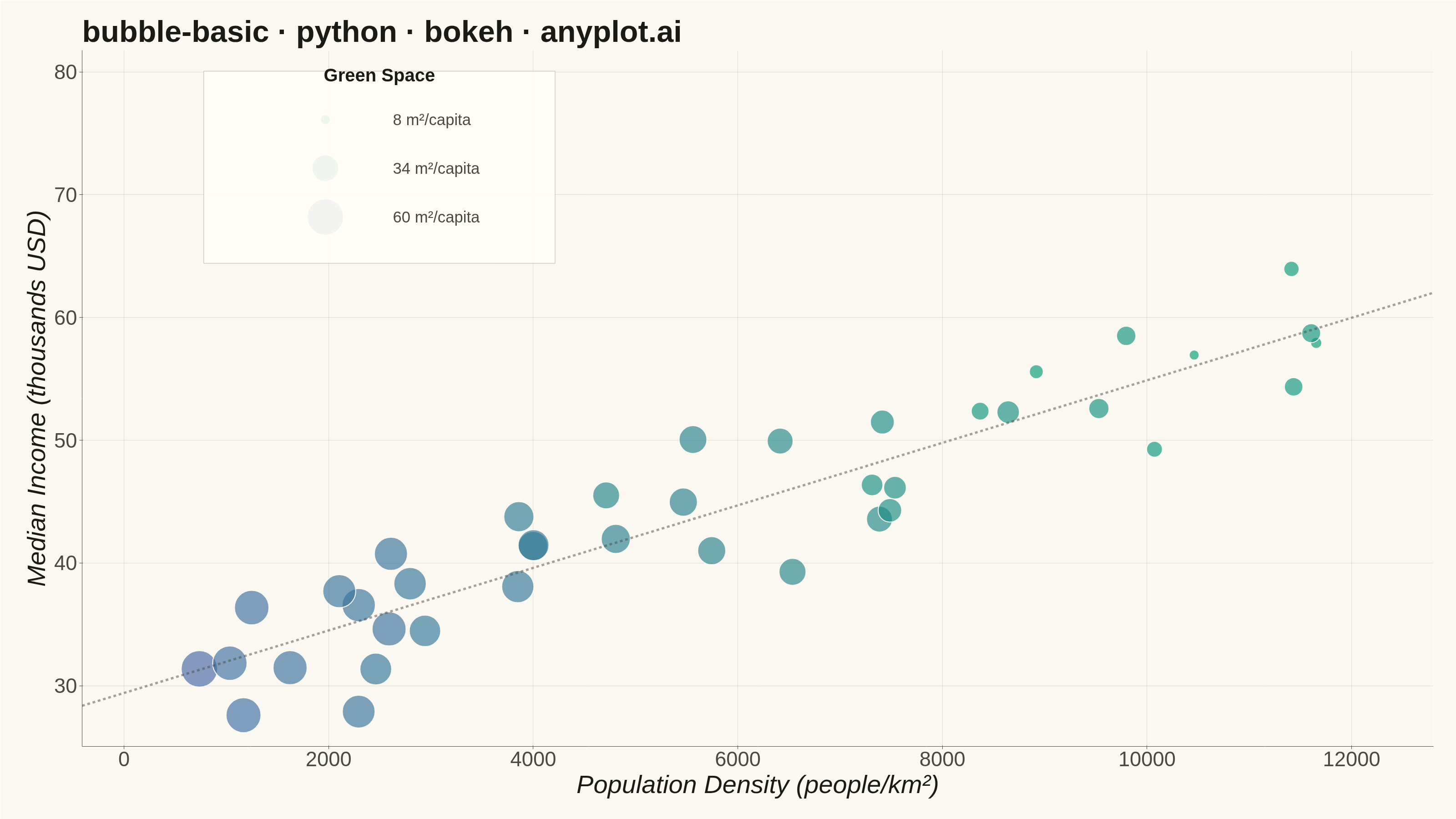
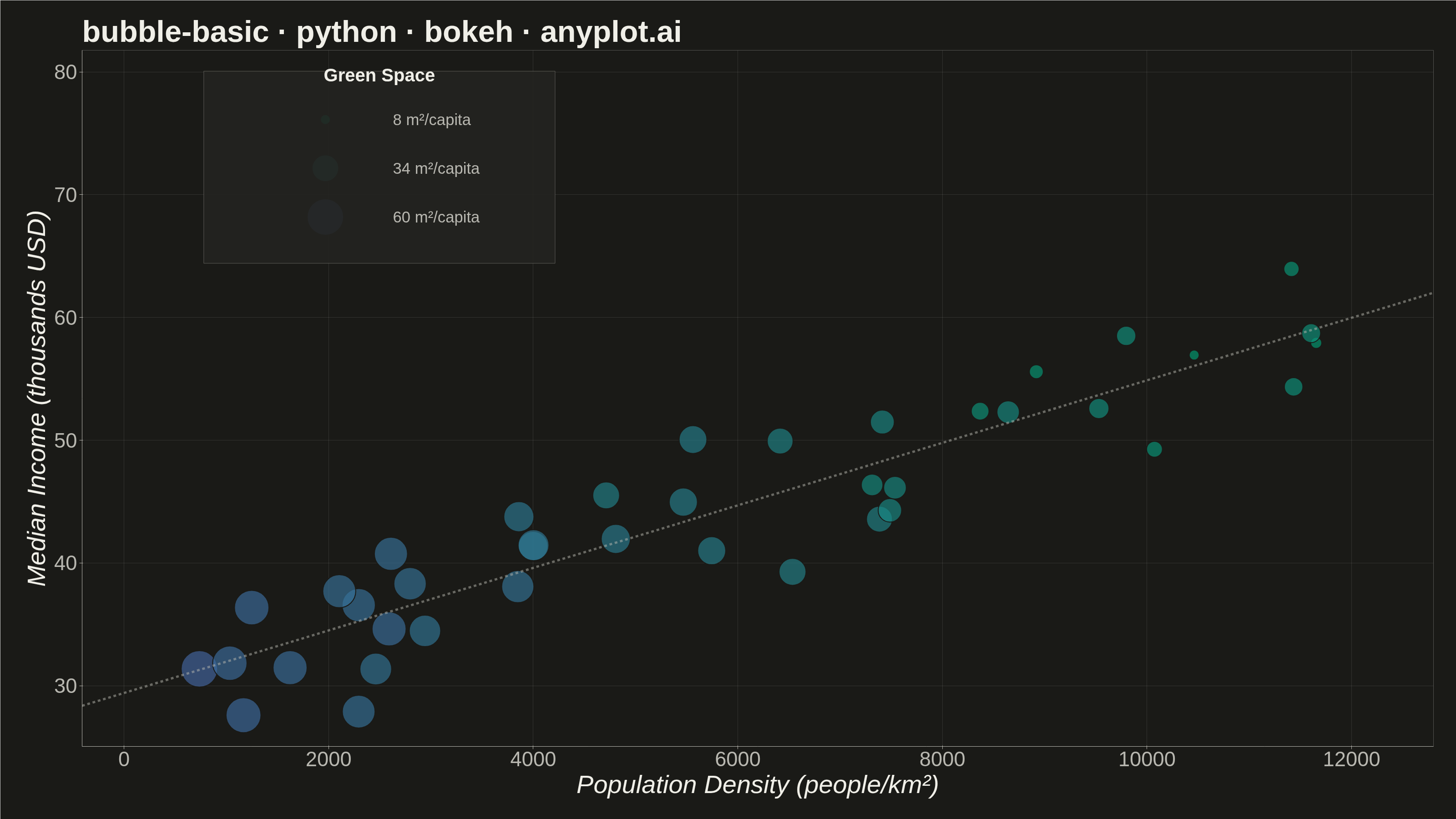
A bubble chart extending scatter plots by adding a third dimension through bubble size. Each point's position shows two variables (x, y) while the bubble size represents a third quantitative variable. This visualization is excellent for understanding relationships between three numerical variables simultaneously, revealing patterns that would be hidden in traditional 2D scatter plots.
""" anyplot.ai
bubble-basic: Basic Bubble Chart
Library: bokeh 3.9.0 | Python 3.13.13
Quality: 92/100 | Created: 2026-05-28
"""

import base64
import io
import os
import time
from pathlib import Path

import numpy as np
from bokeh.io import output_file, save
from bokeh.models import BoxAnnotation, ColumnDataSource, HoverTool, Label, LinearColorMapper, Range1d
from bokeh.plotting import figure
from bokeh.transform import transform
from PIL import Image
from selenium import webdriver
from selenium.webdriver.chrome.options import Options


# Theme tokens
THEME = os.getenv("ANYPLOT_THEME", "light")
PAGE_BG = "#FAF8F1" if THEME == "light" else "#1A1A17"
ELEVATED_BG = "#FFFDF6" if THEME == "light" else "#242420"
INK = "#1A1A17" if THEME == "light" else "#F0EFE8"
INK_SOFT = "#4A4A44" if THEME == "light" else "#B8B7B0"

# imprint_seq colormap (single-polarity: brand green → blue)
_t = np.linspace(0, 1, 256)
_c0 = np.array([0x00, 0x9E, 0x73])
_c1 = np.array([0x44, 0x67, 0xA3])
ANYPLOT_SEQ256 = ["#{:02X}{:02X}{:02X}".format(*(_c0 + (_c1 - _c0) * t).round().astype(int)) for t in _t]

# Data — City metrics: population density vs median income, bubble = green space per capita
# Green space inversely correlated with density (denser cities have less green space)
np.random.seed(42)
n_cities = 40

population_density = np.random.uniform(500, 12000, n_cities)  # people per km²
median_income = 30 + population_density / 400 + np.random.normal(0, 4, n_cities)  # thousands USD
green_space = 60 - (population_density / 12000) * 50 + np.random.normal(0, 4, n_cities)
green_space = np.clip(green_space, 5, 60)  # m² per capita

# Area-proportional bubble sizes: size² ∝ data value, so size ∝ sqrt(data)
size_min, size_max = 22, 80
green_norm = (green_space - green_space.min()) / (green_space.max() - green_space.min())
bubble_size = np.sqrt(size_min**2 + (size_max**2 - size_min**2) * green_norm)

color_mapper = LinearColorMapper(palette=ANYPLOT_SEQ256, low=green_space.min(), high=green_space.max())

source = ColumnDataSource(
    data={
        "density": population_density,
        "income": median_income,
        "size": bubble_size,
        "green_space": green_space,
        "density_display": np.round(population_density).astype(int),
        "income_display": np.round(median_income, 1),
        "green_display": np.round(green_space, 1),
    }
)

# Symmetric axis ranges — equal padding both sides; extra top space for legend
x_pad = (population_density.max() - population_density.min()) * 0.07
y_pad = (median_income.max() - median_income.min()) * 0.07
x_start = population_density.min() - x_pad * 1.5
x_end = population_density.max() + x_pad * 1.5
y_start = median_income.min() - y_pad
y_end = median_income.max() + y_pad * 7

x_range = x_end - x_start
y_range = y_end - y_start

# Plot
title = "bubble-basic · python · bokeh · anyplot.ai"
p = figure(
    width=3200,
    height=1800,
    title=title,
    x_axis_label="Population Density (people/km²)",
    y_axis_label="Median Income (thousands USD)",
    toolbar_location=None,
    min_border_bottom=160,
    min_border_left=180,
    min_border_top=110,
    min_border_right=50,
)
p.x_range = Range1d(start=x_start, end=x_end)
p.y_range = Range1d(start=y_start, end=y_end)

p.scatter(
    x="density",
    y="income",
    size="size",
    source=source,
    fill_color=transform("green_space", color_mapper),
    fill_alpha=0.65,
    line_color=PAGE_BG,
    line_width=2,
)

# Hover tool
hover = HoverTool(
    tooltips=[
        ("Density", "@density_display{,} people/km²"),
        ("Income", "$@income_display{0.0}k"),
        ("Green Space", "@green_display m²/capita"),
    ],
    mode="mouse",
)
p.add_tools(hover)

# Dashed trend line — guides viewer to the positive density-income correlation
trend_coeffs = np.polyfit(population_density, median_income, 1)
x_trend = np.linspace(x_start, x_end, 100)
y_trend = np.polyval(trend_coeffs, x_trend)
p.line(x=x_trend, y=y_trend, line_color=INK_SOFT, line_dash="dashed", line_width=5, line_alpha=0.5)

# Theme-adaptive chrome
p.background_fill_color = PAGE_BG
p.border_fill_color = PAGE_BG
p.outline_line_color = None
p.outline_line_alpha = 0

p.title.text_font_size = "50pt"
p.title.text_color = INK

p.xaxis.axis_label_text_font_size = "42pt"
p.yaxis.axis_label_text_font_size = "42pt"
p.xaxis.axis_label_text_color = INK
p.yaxis.axis_label_text_color = INK

p.xaxis.major_label_text_font_size = "34pt"
p.yaxis.major_label_text_font_size = "34pt"
p.xaxis.major_label_text_color = INK_SOFT
p.yaxis.major_label_text_color = INK_SOFT

p.xaxis.axis_line_color = INK_SOFT
p.yaxis.axis_line_color = INK_SOFT
p.xaxis.major_tick_line_color = INK_SOFT
p.yaxis.major_tick_line_color = INK_SOFT
p.xaxis.minor_tick_line_color = None
p.yaxis.minor_tick_line_color = None

p.xgrid.grid_line_color = INK
p.ygrid.grid_line_color = INK
p.xgrid.grid_line_alpha = 0.12
p.ygrid.grid_line_alpha = 0.12

# Size legend — anchored above the main data cluster (top region is empty due to correlation)
legend_cx = x_start + x_range * 0.22
legend_top = y_end - y_range * 0.04
y_step = y_range * 0.07

ref_green = [green_space.min(), (green_space.min() + green_space.max()) / 2, green_space.max()]
ref_norm = [(v - green_space.min()) / (green_space.max() - green_space.min()) for v in ref_green]
ref_sizes = [np.sqrt(size_min**2 + (size_max**2 - size_min**2) * n) for n in ref_norm]
ref_labels = [f"{v:.0f} m²/capita" for v in ref_green]

legend_box = BoxAnnotation(
    left=legend_cx - x_range * 0.13,
    right=legend_cx + x_range * 0.13,
    top=legend_top + y_range * 0.01,
    bottom=legend_top - y_step * 3.8,
    fill_color=ELEVATED_BG,
    fill_alpha=0.9,
    line_color=INK_SOFT,
    line_alpha=0.4,
)
p.add_layout(legend_box)

p.add_layout(
    Label(
        x=legend_cx,
        y=legend_top - y_range * 0.01,
        text="Green Space",
        text_font_size="30pt",
        text_font_style="bold",
        text_color=INK,
        text_align="center",
    )
)

for i, (sz, lbl, gv) in enumerate(zip(ref_sizes, ref_labels, ref_green, strict=True)):
    ly = legend_top - y_step * (i + 0.85)
    ref_src = ColumnDataSource(data={"x": [legend_cx - x_range * 0.04], "y": [ly], "size": [sz], "green_space": [gv]})
    p.scatter(
        x="x",
        y="y",
        size="size",
        source=ref_src,
        fill_color=transform("green_space", color_mapper),
        fill_alpha=0.65,
        line_color=PAGE_BG,
        line_width=2,
    )
    p.add_layout(
        Label(
            x=legend_cx + x_range * 0.01,
            y=ly,
            text=lbl,
            text_font_size="26pt",
            text_baseline="middle",
            text_color=INK_SOFT,
        )
    )

# Save HTML
output_file(f"plot-{THEME}.html")
save(p)

# Save PNG via headless Chrome — use captureBeyondViewport so browser chrome
# overhead (~139px) doesn't truncate the canvas height
W, H = 3200, 1800
opts = Options()
for arg in (
    "--headless=new",
    "--no-sandbox",
    "--disable-dev-shm-usage",
    "--disable-gpu",
    f"--window-size={W},{H}",
    "--hide-scrollbars",
):
    opts.add_argument(arg)
driver = webdriver.Chrome(options=opts)
driver.set_window_size(W, H)
driver.get(f"file://{Path(f'plot-{THEME}.html').resolve()}")
time.sleep(3)
screenshot = driver.execute_cdp_cmd("Page.captureScreenshot", {"format": "png", "captureBeyondViewport": True})
driver.quit()
Image.open(io.BytesIO(base64.b64decode(screenshot["data"]))).save(f"plot-{THEME}.png")
Runnable source as JSON, for any HTTP client: https://api.anyplot.ai/specs/bubble-basic/bokeh/code. Any spec id and library id listed in llms-full.txt fit the same URL shape; every URL below is complete and callable.
{
  "spec_id": "bubble-basic",
  "language": "python",
  "library": "bokeh",
  "page": "https://anyplot.ai/bubble-basic/python/bokeh",
  "hub": "https://anyplot.ai/bubble-basic",
  "code_json": "https://api.anyplot.ai/specs/bubble-basic/bokeh/code",
  "spec_json": "https://api.anyplot.ai/specs/bubble-basic",
  "render_light_png": "https://storage.googleapis.com/anyplot-images/plots/bubble-basic/python/bokeh/plot-light.png",
  "render_dark_png": "https://storage.googleapis.com/anyplot-images/plots/bubble-basic/python/bokeh/plot-dark.png",
  "interactive_light_html": "https://storage.googleapis.com/anyplot-images/plots/bubble-basic/python/bokeh/plot-light.html",
  "interactive_dark_html": "https://storage.googleapis.com/anyplot-images/plots/bubble-basic/python/bokeh/plot-dark.html",
  "quality_score": 92.0,
  "license": "MIT",
  "guide": "https://anyplot.ai/llms.txt"
}
Part of Basic Bubble Chart on anyplot.ai.