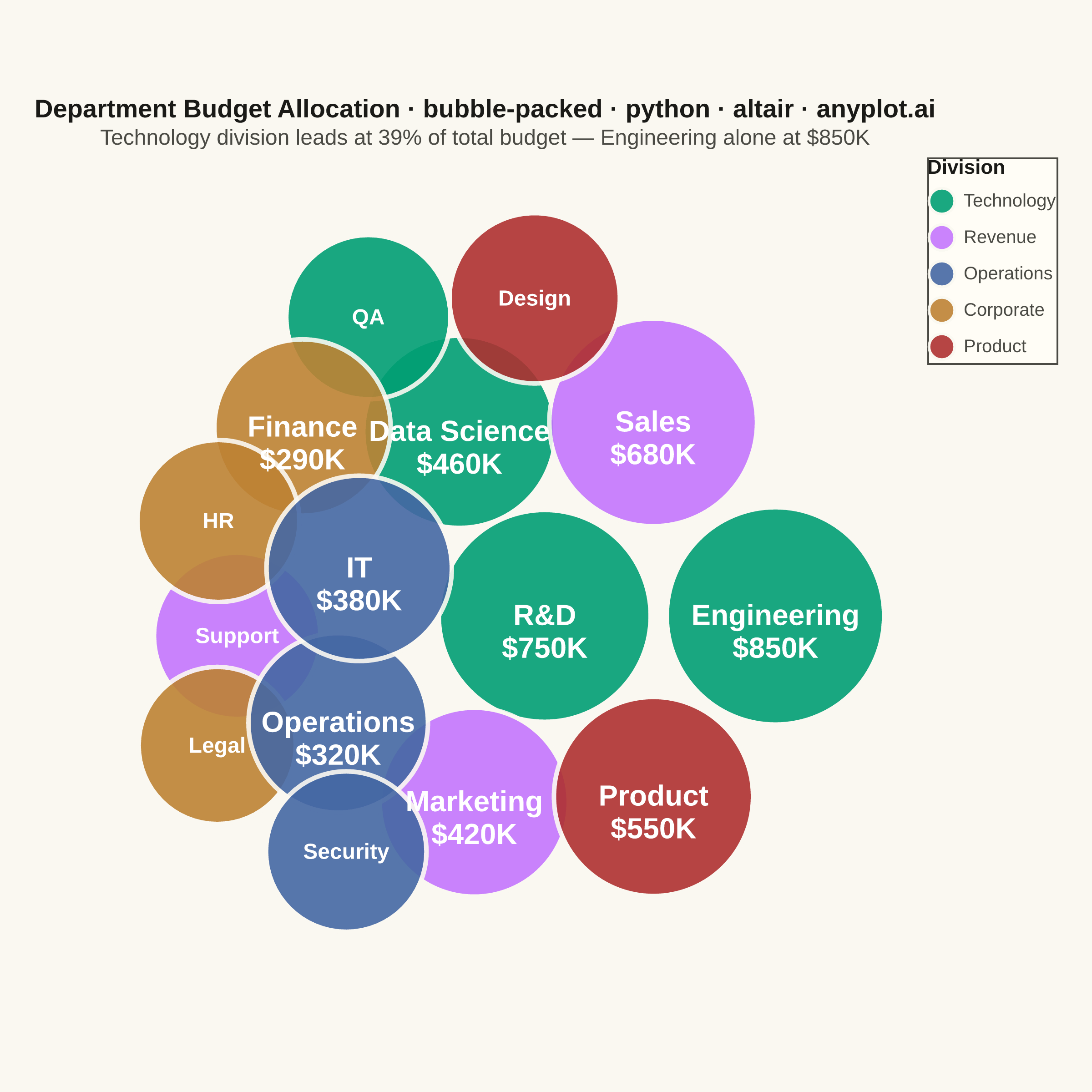
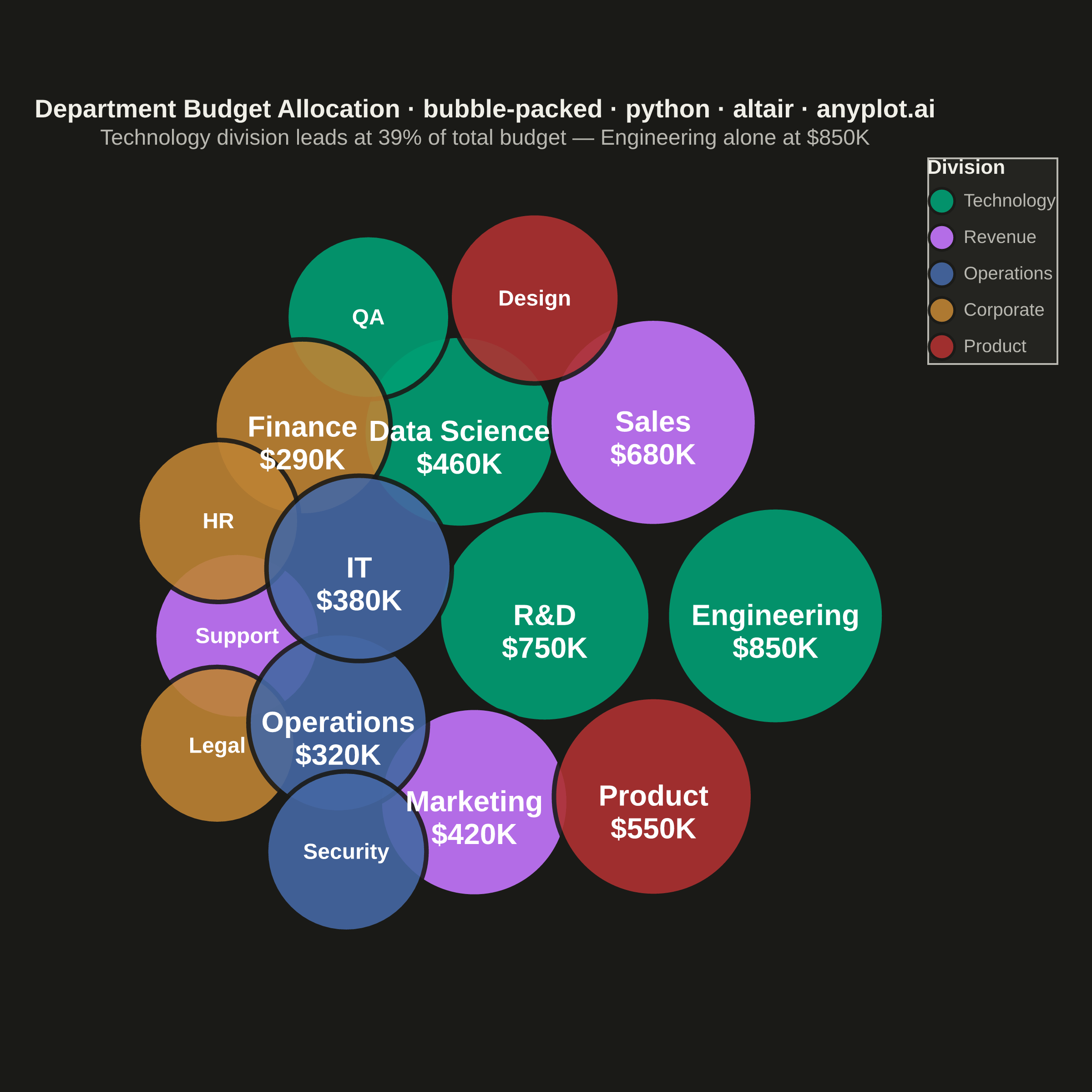
A packed bubble chart displays data as circles where size represents value, and circles are packed together without overlap using physics simulation. Unlike scatter or traditional bubble charts, position has no meaning - only size and optional grouping matter. This visualization efficiently uses space for comparing values across many categories.
""" anyplot.ai
bubble-packed: Basic Packed Bubble Chart
Library: altair 6.1.0 | Python 3.13.13
Quality: 91/100 | Updated: 2026-05-29
"""

import os

import altair as alt
import circlify
import numpy as np
import pandas as pd
from PIL import Image


# Theme tokens (see prompts/default-style-guide.md "Theme-adaptive Chrome")
THEME = os.getenv("ANYPLOT_THEME", "light")
PAGE_BG = "#FAF8F1" if THEME == "light" else "#1A1A17"
ELEVATED_BG = "#FFFDF6" if THEME == "light" else "#242420"
INK = "#1A1A17" if THEME == "light" else "#F0EFE8"
INK_SOFT = "#4A4A44" if THEME == "light" else "#B8B7B0"

# Imprint palette — 8 hues, canonical order (hybrid-v3 sort)
IMPRINT_PALETTE = ["#009E73", "#C475FD", "#4467A3", "#BD8233", "#AE3030", "#2ABCCD", "#954477", "#99B314"]

np.random.seed(42)

# Data — department budget allocation by division ($K)
labels = [
    "Engineering",
    "R&D",
    "Data Science",
    "QA",
    "Marketing",
    "Sales",
    "Support",
    "Finance",
    "HR",
    "Legal",
    "Operations",
    "IT",
    "Security",
    "Design",
    "Product",
]
values = [850, 750, 460, 195, 420, 680, 210, 290, 180, 150, 320, 380, 170, 240, 550]
groups = ["Technology"] * 4 + ["Revenue"] * 3 + ["Corporate"] * 3 + ["Operations"] * 3 + ["Product"] * 2
n = len(labels)

# Circle packing layout via circlify (returns circles in ascending value order)
circles = circlify.circlify(values, show_enclosure=False)
idx_asc = np.argsort(values)
scale = 300

x_coords = np.zeros(n)
y_coords = np.zeros(n)
radii = np.zeros(n)
for ci, oi in zip(circles, idx_asc, strict=True):
    x_coords[oi] = ci.x * scale
    y_coords[oi] = ci.y * scale
    radii[oi] = ci.r * scale

group_order = ["Technology", "Revenue", "Operations", "Corporate", "Product"]
group_colors = IMPRINT_PALETTE[:5]

df = pd.DataFrame(
    {
        "label": labels,
        "value": values,
        "group": groups,
        "x": x_coords,
        "y": y_coords,
        "radius": radii,
        "budget": [f"${v}K" for v in values],
    }
)

# Interactive legend selection — click a division to highlight it
selection = alt.selection_point(fields=["group"], bind="legend")

r_min, r_max = radii.min(), radii.max()
radius_threshold = r_min + (r_max - r_min) * 0.25

circles_layer = (
    alt.Chart(df)
    .mark_circle(stroke=PAGE_BG, strokeWidth=2.5)
    .encode(
        x=alt.X("x:Q", axis=None, scale=alt.Scale(padding=r_max * 0.6)),
        y=alt.Y("y:Q", axis=None, scale=alt.Scale(padding=r_max * 0.6)),
        size=alt.Size("radius:Q", scale=alt.Scale(range=[r_min**2 * 1.6, r_max**2 * 1.6]), legend=None),
        color=alt.Color(
            "group:N",
            scale=alt.Scale(domain=group_order, range=group_colors),
            legend=alt.Legend(
                title="Division",
                titleFontSize=11,
                titleFontWeight="bold",
                labelFontSize=10,
                symbolSize=200,
                orient="right",
            ),
        ),
        opacity=alt.condition(selection, alt.value(0.9), alt.value(0.15)),
        tooltip=[
            alt.Tooltip("label:N", title="Department"),
            alt.Tooltip("budget:N", title="Budget"),
            alt.Tooltip("group:N", title="Division"),
        ],
    )
    .add_params(selection)
)

# Labels for large bubbles: two-line department name + budget
df_large = df[df["radius"] >= radius_threshold].copy()
df_large["display_text"] = df_large["label"] + "\n" + df_large["budget"]

large_labels = (
    alt.Chart(df_large)
    .mark_text(fontWeight="bold", fontSize=16, lineBreak="\n")
    .encode(
        x="x:Q",
        y="y:Q",
        text="display_text:N",
        color=alt.value("#FFFFFF"),
        opacity=alt.condition(selection, alt.value(1.0), alt.value(0.1)),
    )
)

# Labels for smaller bubbles: department name only
df_small = df[df["radius"] < radius_threshold].copy()

small_labels = (
    alt.Chart(df_small)
    .mark_text(fontWeight="bold", fontSize=12)
    .encode(
        x="x:Q",
        y="y:Q",
        text="label:N",
        color=alt.value("#FFFFFF"),
        opacity=alt.condition(selection, alt.value(1.0), alt.value(0.1)),
    )
)

# Title with length-scaled font size (67-char baseline → 16px default)
title_str = "Department Budget Allocation · bubble-packed · python · altair · anyplot.ai"
n_chars = len(title_str)
title_fs = max(11, round(16 * 67 / n_chars)) if n_chars > 67 else 16
subtitle_fs = max(8, round(title_fs * 0.85))

chart = (
    alt.layer(circles_layer, large_labels, small_labels)
    .properties(
        width=450,
        height=460,
        background=PAGE_BG,
        padding={"left": 10, "right": 10, "top": 10, "bottom": 10},
        title=alt.Title(
            title_str,
            subtitle="Technology division leads at 39% of total budget — Engineering alone at $850K",
            fontSize=title_fs,
            subtitleFontSize=subtitle_fs,
            subtitleColor=INK_SOFT,
            fontWeight="bold",
            anchor="middle",
            color=INK,
        ),
    )
    .configure_view(strokeWidth=0, fill=PAGE_BG)
    .configure_legend(fillColor=ELEVATED_BG, strokeColor=INK_SOFT, labelColor=INK_SOFT, titleColor=INK)
)

chart.save(f"plot-{THEME}.png", scale_factor=4.0)

# Pad to exact 2400×2400 square canvas (Step 0 contract)
TW, TH = 2400, 2400
_img = Image.open(f"plot-{THEME}.png").convert("RGB")
_w, _h = _img.size
if _w > TW or _h > TH:
    raise SystemExit(
        f"altair vl-convert produced {_w}×{_h}, exceeds target {TW}×{TH}. "
        f"Shrink chart .properties(width=, height=) values and re-render."
    )
if _w < TW or _h < TH:
    _canvas = Image.new("RGB", (TW, TH), PAGE_BG)
    _canvas.paste(_img, ((TW - _w) // 2, (TH - _h) // 2))
    _canvas.save(f"plot-{THEME}.png")

chart.save(f"plot-{THEME}.html")
Runnable source as JSON, for any HTTP client: https://api.anyplot.ai/specs/bubble-packed/altair/code. Any spec id and library id listed in llms-full.txt fit the same URL shape; every URL below is complete and callable.
{
  "spec_id": "bubble-packed",
  "language": "python",
  "library": "altair",
  "page": "https://anyplot.ai/bubble-packed/python/altair",
  "hub": "https://anyplot.ai/bubble-packed",
  "code_json": "https://api.anyplot.ai/specs/bubble-packed/altair/code",
  "spec_json": "https://api.anyplot.ai/specs/bubble-packed",
  "render_light_png": "https://storage.googleapis.com/anyplot-images/plots/bubble-packed/python/altair/plot-light.png",
  "render_dark_png": "https://storage.googleapis.com/anyplot-images/plots/bubble-packed/python/altair/plot-dark.png",
  "interactive_light_html": "https://storage.googleapis.com/anyplot-images/plots/bubble-packed/python/altair/plot-light.html",
  "interactive_dark_html": "https://storage.googleapis.com/anyplot-images/plots/bubble-packed/python/altair/plot-dark.html",
  "quality_score": 91.0,
  "license": "MIT",
  "guide": "https://anyplot.ai/llms.txt"
}
Part of Basic Packed Bubble Chart on anyplot.ai.