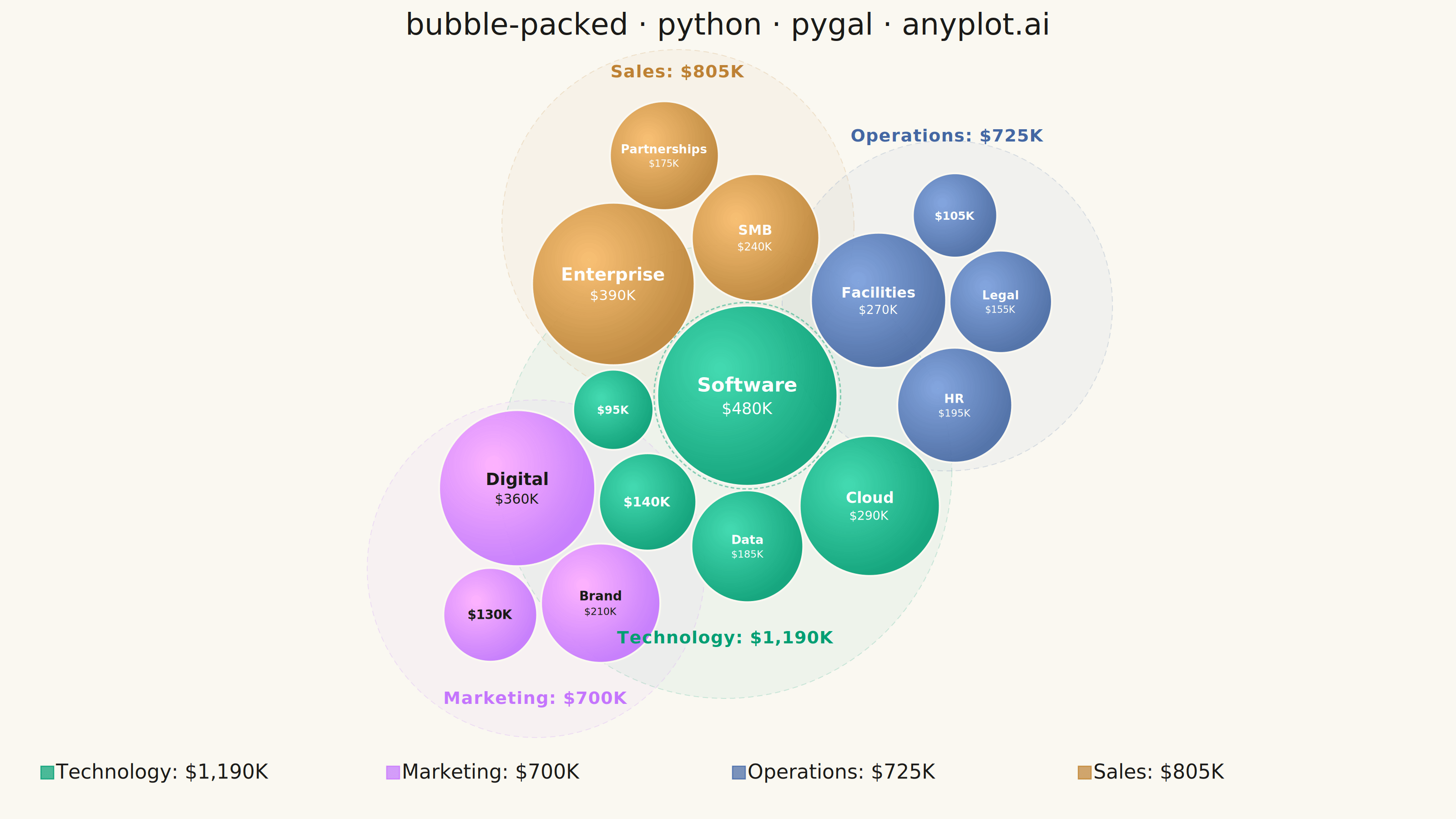
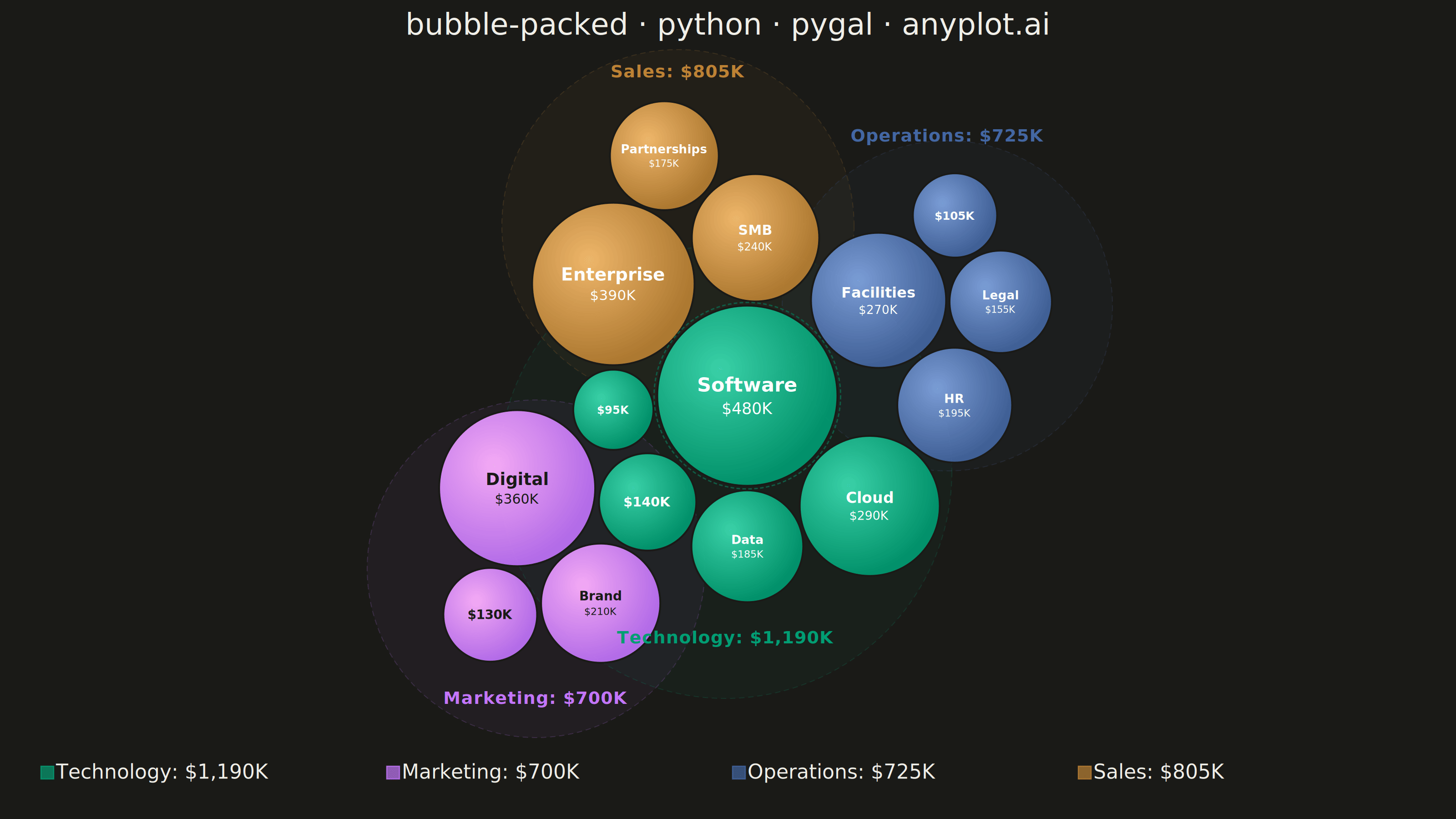
A packed bubble chart displays data as circles where size represents value, and circles are packed together without overlap using physics simulation. Unlike scatter or traditional bubble charts, position has no meaning - only size and optional grouping matter. This visualization efficiently uses space for comparing values across many categories.
""" anyplot.ai
bubble-packed: Basic Packed Bubble Chart
Library: pygal 3.1.0 | Python 3.13.13
Quality: 91/100 | Updated: 2026-05-29
"""

import math
import os
import sys


# Prevent self-import: script file 'pygal.py' would shadow the 'pygal' package
_self_dir = os.path.abspath(os.path.dirname(__file__))
sys.path = [p for p in sys.path if os.path.abspath(p or ".") != _self_dir]
del _self_dir

import pygal
from pygal.etree import etree
from pygal.style import Style


# Theme tokens — Imprint palette + theme-adaptive chrome
THEME = os.getenv("ANYPLOT_THEME", "light")
PAGE_BG = "#FAF8F1" if THEME == "light" else "#1A1A17"
ELEVATED_BG = "#FFFDF6" if THEME == "light" else "#242420"
INK = "#1A1A17" if THEME == "light" else "#F0EFE8"
INK_SOFT = "#4A4A44" if THEME == "light" else "#B8B7B0"
INK_MUTED = "#6B6A63" if THEME == "light" else "#A8A79F"

# Imprint categorical palette — positions 1–4 mapped to the four groups
IMPRINT_PALETTE = ("#009E73", "#C475FD", "#4467A3", "#BD8233", "#AE3030", "#2ABCCD", "#954477", "#99B314")
GROUP_COLORS = {
    "Technology": "#009E73",  # brand green — position 1
    "Marketing": "#C475FD",  # lavender — position 2
    "Operations": "#4467A3",  # blue — position 3
    "Sales": "#BD8233",  # ochre — position 4
}
# In-bubble text: fixed per group fill (bubble fill is theme-independent)
GROUP_TEXT_COLOR = {
    "Technology": "white",
    "Marketing": "#1A1A17",  # lavender is too light for white text
    "Operations": "white",
    "Sales": "white",
}
GROUP_NAMES = ["Technology", "Marketing", "Operations", "Sales"]

WIDTH = 3200
HEIGHT = 1800
PADDING = 10  # gap between packed circles in pixels
FONT_FAMILY = "'Trebuchet MS', 'Lucida Grande', sans-serif"

# Department budget allocation ($K) — varied group sizes to show chart flexibility
data = [
    {"label": "Software Dev", "value": 480, "group": "Technology"},
    {"label": "Cloud Infra", "value": 290, "group": "Technology"},
    {"label": "Data Analytics", "value": 185, "group": "Technology"},
    {"label": "Cybersecurity", "value": 140, "group": "Technology"},
    {"label": "AI Research", "value": 95, "group": "Technology"},
    {"label": "Digital Marketing", "value": 360, "group": "Marketing"},
    {"label": "Brand & Creative", "value": 210, "group": "Marketing"},
    {"label": "Events", "value": 130, "group": "Marketing"},
    {"label": "Facilities", "value": 270, "group": "Operations"},
    {"label": "HR & Recruiting", "value": 195, "group": "Operations"},
    {"label": "Legal", "value": 155, "group": "Operations"},
    {"label": "Admin", "value": 105, "group": "Operations"},
    {"label": "Enterprise", "value": 390, "group": "Sales"},
    {"label": "SMB", "value": 240, "group": "Sales"},
    {"label": "Partnerships", "value": 175, "group": "Sales"},
]

# Compute group totals for legend labels and sort order
group_totals = {}
for item in data:
    group_totals[item["group"]] = group_totals.get(item["group"], 0) + item["value"]

# Scale values to radii (sqrt ensures area-based visual perception)
max_val = max(item["value"] for item in data)
max_radius = min(WIDTH, HEIGHT) * 0.11  # 198 px for 1800 px height

circles = []
for item in data:
    r = math.sqrt(item["value"] / max_val) * max_radius
    circles.append({"r": r, "item": item, "x": 0.0, "y": 0.0})

# Sort: largest-total group first, then descending radius within each group
sorted_groups = sorted(GROUP_NAMES, key=lambda g: -group_totals[g])
group_order = {g: i for i, g in enumerate(sorted_groups)}
circles.sort(key=lambda c: (group_order[c["item"]["group"]], -c["r"]))

cx, cy = WIDTH / 2, HEIGHT / 2
circles[0]["x"] = cx
circles[0]["y"] = cy
placed = [circles[0]]

# Greedy packing with group-affinity clustering
for circle in circles[1:]:
    best_pos = None
    best_score = float("inf")
    same_group = [p for p in placed if p["item"]["group"] == circle["item"]["group"]]

    for existing in placed:
        for angle_deg in range(0, 360, 6):
            angle = math.radians(angle_deg)
            dist = existing["r"] + circle["r"] + PADDING
            nx = existing["x"] + math.cos(angle) * dist
            ny = existing["y"] + math.sin(angle) * dist

            valid = True
            for other in placed:
                ddx = nx - other["x"]
                ddy = ny - other["y"]
                min_gap = circle["r"] + other["r"] + PADDING * 0.5
                if math.sqrt(ddx * ddx + ddy * ddy) < min_gap:
                    valid = False
                    break

            if valid:
                d_center = math.sqrt((nx - cx) ** 2 + (ny - cy) ** 2)
                if same_group:
                    d_group = sum(math.sqrt((nx - p["x"]) ** 2 + (ny - p["y"]) ** 2) for p in same_group) / len(
                        same_group
                    )
                    score = d_center * 0.3 + d_group * 0.7
                else:
                    score = d_center

                if score < best_score:
                    best_score = score
                    best_pos = (nx, ny)

    if best_pos:
        circle["x"], circle["y"] = best_pos
    else:
        circle["x"] = cx
        circle["y"] = max(c["y"] + c["r"] for c in placed) + circle["r"] + PADDING

    placed.append(circle)

# Recenter using area-weighted centroid to fill the chart's content zone
avail_top = 140  # below title area
avail_bottom = HEIGHT - 200  # above legend area
target_cy = (avail_top + avail_bottom) / 2
target_cx = WIDTH / 2

total_area = sum(c["r"] ** 2 for c in placed)
weighted_cx = sum(c["x"] * c["r"] ** 2 for c in placed) / total_area
weighted_cy = sum(c["y"] * c["r"] ** 2 for c in placed) / total_area
dx = target_cx - weighted_cx
dy = target_cy - weighted_cy

for c in placed:
    c["x"] += dx
    c["y"] += dy

# Gather per-group centroid and extent data for label and boundary placement
group_info = {}
for c in placed:
    g = c["item"]["group"]
    if g not in group_info:
        group_info[g] = {"xs": [], "ys": [], "rs": []}
    group_info[g]["xs"].append(c["x"])
    group_info[g]["ys"].append(c["y"])
    group_info[g]["rs"].append(c["r"])

packed = [(c["x"], c["y"], c["r"], c["item"]) for c in placed]

# Title length check for font scaling (no shrink needed for 43-char title)
title_str = "bubble-packed · python · pygal · anyplot.ai"
n_chars = len(title_str)
title_fs = round(66 * 67 / n_chars) if n_chars > 67 else 66

custom_style = Style(
    background=PAGE_BG,
    plot_background=PAGE_BG,
    foreground=INK,
    foreground_strong=INK,
    foreground_subtle=INK_MUTED,
    colors=IMPRINT_PALETTE,
    font_family=FONT_FAMILY,
    title_font_size=title_fs,
    label_font_size=56,
    major_label_font_size=44,
    legend_font_size=44,
    value_font_size=36,
    stroke_width=2.5,
)

chart = pygal.Pie(
    width=WIDTH,
    height=HEIGHT,
    style=custom_style,
    title=title_str,
    show_legend=True,
    legend_at_bottom=True,
    legend_at_bottom_columns=4,
    legend_box_size=28,
    inner_radius=0,
    margin=80,
    no_data_text="",
    tooltip_fancy_mode=True,
    pretty_print=True,
    truncate_legend=-1,
)

for group in GROUP_NAMES:
    chart.add(f"{group}: ${group_totals[group]:,}K", [])


def add_packed_bubbles(root):
    def _text(parent, x, y, label, size, color, bold=False):
        t = etree.SubElement(parent, "text")
        t.set("x", f"{x:.0f}")
        t.set("y", f"{y:.0f}")
        t.set("text-anchor", "middle")
        t.set("dominant-baseline", "middle")
        t.set("fill", color)
        t.set("font-size", f"{size}")
        t.set("font-family", FONT_FAMILY)
        if bold:
            t.set("font-weight", "bold")
        t.text = label

    # Radial gradients for polished 3D bubble appearance
    defs = etree.SubElement(root, "defs")
    for gname, color in GROUP_COLORS.items():
        grad = etree.SubElement(defs, "radialGradient")
        grad.set("id", f"grad-{gname.lower()}")
        grad.set("cx", "35%")
        grad.set("cy", "35%")
        grad.set("r", "65%")
        rgb = [int(color[i : i + 2], 16) for i in (1, 3, 5)]
        light = [min(255, c + 60) for c in rgb]
        stop1 = etree.SubElement(grad, "stop")
        stop1.set("offset", "0%")
        stop1.set("stop-color", f"#{light[0]:02x}{light[1]:02x}{light[2]:02x}")
        stop1.set("stop-opacity", "0.95")
        stop2 = etree.SubElement(grad, "stop")
        stop2.set("offset", "100%")
        stop2.set("stop-color", color)
        stop2.set("stop-opacity", "0.90")

    g = etree.SubElement(root, "g")
    g.set("class", "packed-bubbles")

    overall_cy = sum(c[1] for c in packed) / len(packed)

    # Subtle dashed boundary circles to visually group related items
    for gname, gdata in group_info.items():
        gcx = sum(gdata["xs"]) / len(gdata["xs"])
        gcy = sum(gdata["ys"]) / len(gdata["ys"])
        extent = max(
            math.sqrt((x - gcx) ** 2 + (y - gcy) ** 2) + r
            for x, y, r in zip(gdata["xs"], gdata["ys"], gdata["rs"], strict=True)
        )
        bg_circ = etree.SubElement(g, "circle")
        bg_circ.set("cx", f"{gcx:.0f}")
        bg_circ.set("cy", f"{gcy:.0f}")
        bg_circ.set("r", f"{extent + 18:.0f}")
        bg_circ.set("fill", GROUP_COLORS[gname])
        bg_circ.set("fill-opacity", "0.05")
        bg_circ.set("stroke", GROUP_COLORS[gname])
        bg_circ.set("stroke-opacity", "0.18")
        bg_circ.set("stroke-width", "2")
        bg_circ.set("stroke-dasharray", "12,8")

    # Data circles with gradient fills and SVG tooltips
    for x, y, r, item in packed:
        grad_id = f"grad-{item['group'].lower()}"
        circ = etree.SubElement(g, "circle")
        circ.set("cx", f"{x:.1f}")
        circ.set("cy", f"{y:.1f}")
        circ.set("r", f"{r:.1f}")
        circ.set("fill", f"url(#{grad_id})")
        circ.set("stroke", PAGE_BG)  # theme-adaptive gap between adjacent bubbles
        circ.set("stroke-width", "4")
        tooltip = etree.SubElement(circ, "title")
        tooltip.text = f"{item['label']}: ${item['value']}K ({item['group']})"

    # Highlight ring on the largest bubble for visual hierarchy
    top = max(packed, key=lambda c: c[2])
    ring = etree.SubElement(g, "circle")
    ring.set("cx", f"{top[0]:.1f}")
    ring.set("cy", f"{top[1]:.1f}")
    ring.set("r", f"{top[2] + 7:.1f}")
    ring.set("fill", "none")
    ring.set("stroke", GROUP_COLORS[top[3]["group"]])
    ring.set("stroke-width", "3")
    ring.set("stroke-opacity", "0.45")
    ring.set("stroke-dasharray", "8,5")

    # Circle labels: first-word name + value for larger bubbles, value-only for smaller
    for x, y, r, item in packed:
        text_color = GROUP_TEXT_COLOR[item["group"]]
        if r > 110:
            fs = max(int(r * 0.22), 26)
            name = item["label"].split()[0]
            _text(g, x, y - fs * 0.55, name, fs, text_color, bold=True)
            _text(g, x, y + fs * 0.65, f"${item['value']}K", int(fs * 0.82), text_color)
        else:
            fs = max(int(r * 0.28), 24)
            _text(g, x, y, f"${item['value']}K", fs, text_color, bold=True)

    # Group labels: placed above or below each cluster with generous clearance
    for gname, gdata in group_info.items():
        gcx = sum(gdata["xs"]) / len(gdata["xs"])
        gcy = sum(gdata["ys"]) / len(gdata["ys"])

        if gcy < overall_cy:
            label_y = min(y - r for y, r in zip(gdata["ys"], gdata["rs"], strict=True)) - 70
            label_y = max(label_y, avail_top + 30)
        else:
            label_y = max(y + r for y, r in zip(gdata["ys"], gdata["rs"], strict=True)) + 90
            label_y = min(label_y, avail_bottom - 30)

        lbl = etree.SubElement(g, "text")
        lbl.set("x", f"{gcx:.0f}")
        lbl.set("y", f"{label_y:.0f}")
        lbl.set("text-anchor", "middle")
        lbl.set("fill", GROUP_COLORS[gname])
        lbl.set("font-size", "38")
        lbl.set("font-family", FONT_FAMILY)
        lbl.set("font-weight", "bold")
        lbl.set("letter-spacing", "1.5")
        lbl.text = f"{gname}: ${group_totals[gname]:,}K"

    return root


chart.add_xml_filter(add_packed_bubbles)

chart.render_to_png(f"plot-{THEME}.png")
with open(f"plot-{THEME}.html", "wb") as f:
    f.write(chart.render())
Runnable source as JSON, for any HTTP client: https://api.anyplot.ai/specs/bubble-packed/pygal/code. Any spec id and library id listed in llms-full.txt fit the same URL shape; every URL below is complete and callable.
{
  "spec_id": "bubble-packed",
  "language": "python",
  "library": "pygal",
  "page": "https://anyplot.ai/bubble-packed/python/pygal",
  "hub": "https://anyplot.ai/bubble-packed",
  "code_json": "https://api.anyplot.ai/specs/bubble-packed/pygal/code",
  "spec_json": "https://api.anyplot.ai/specs/bubble-packed",
  "render_light_png": "https://storage.googleapis.com/anyplot-images/plots/bubble-packed/python/pygal/plot-light.png",
  "render_dark_png": "https://storage.googleapis.com/anyplot-images/plots/bubble-packed/python/pygal/plot-dark.png",
  "interactive_light_html": "https://storage.googleapis.com/anyplot-images/plots/bubble-packed/python/pygal/plot-light.html",
  "interactive_dark_html": "https://storage.googleapis.com/anyplot-images/plots/bubble-packed/python/pygal/plot-dark.html",
  "quality_score": 91.0,
  "license": "MIT",
  "guide": "https://anyplot.ai/llms.txt"
}
Part of Basic Packed Bubble Chart on anyplot.ai.