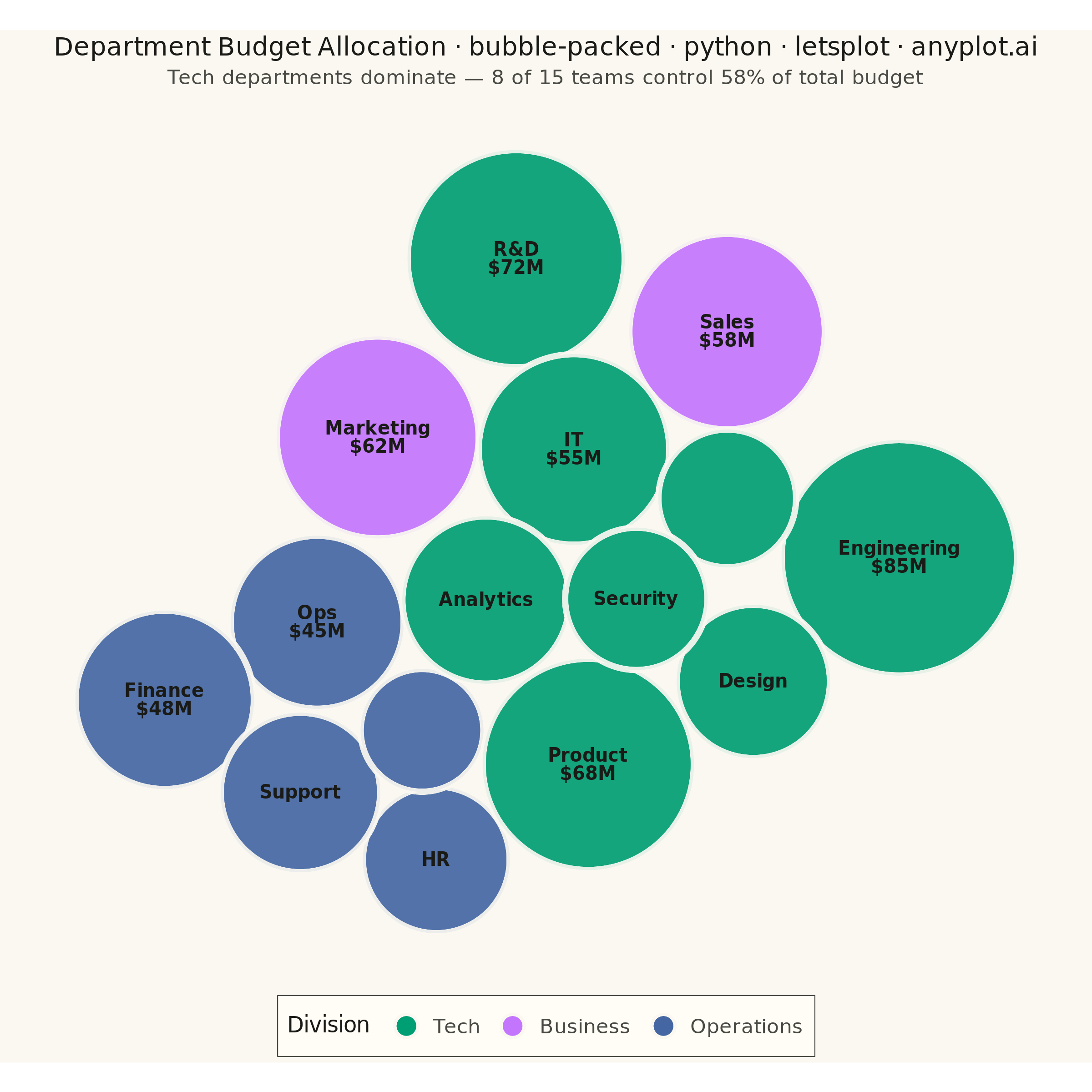
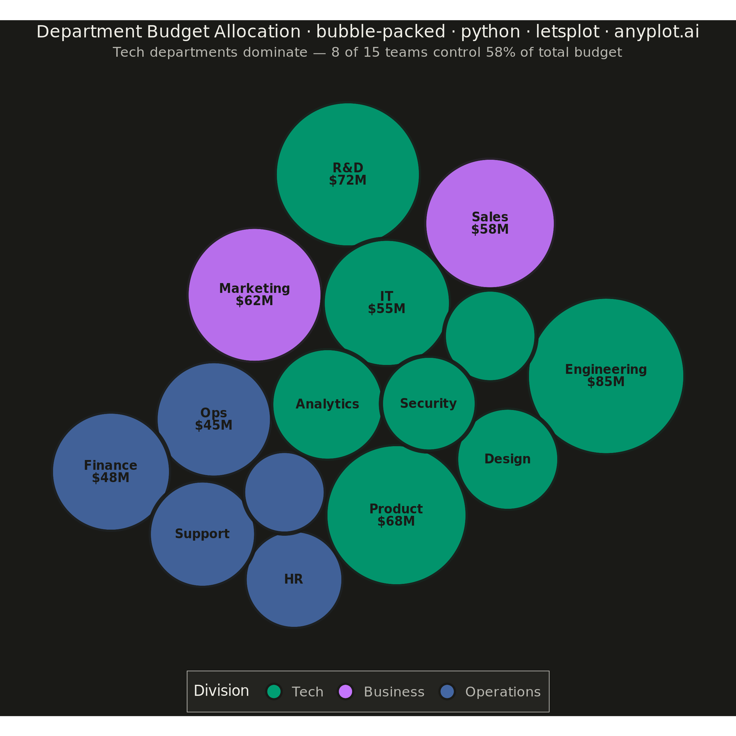
A packed bubble chart displays data as circles where size represents value, and circles are packed together without overlap using physics simulation. Unlike scatter or traditional bubble charts, position has no meaning - only size and optional grouping matter. This visualization efficiently uses space for comparing values across many categories.
""" anyplot.ai
bubble-packed: Basic Packed Bubble Chart
Library: letsplot 4.10.1 | Python 3.13.13
Quality: 93/100 | Updated: 2026-06-16
"""

import os

import numpy as np
import pandas as pd
from lets_plot import (
    LetsPlot,
    aes,
    coord_fixed,
    element_rect,
    element_text,
    geom_point,
    geom_text,
    ggplot,
    ggsave,
    ggsize,
    guide_legend,
    guides,
    labs,
    layer_tooltips,
    scale_fill_manual,
    scale_size_identity,
    theme,
    theme_void,
    xlim,
    ylim,
)


LetsPlot.setup_html()

# Theme-adaptive chrome (see prompts/default-style-guide.md "Theme-adaptive Chrome")
THEME = os.getenv("ANYPLOT_THEME", "light")
PAGE_BG = "#FAF8F1" if THEME == "light" else "#1A1A17"
ELEVATED_BG = "#FFFDF6" if THEME == "light" else "#242420"
INK = "#1A1A17" if THEME == "light" else "#F0EFE8"
INK_SOFT = "#4A4A44" if THEME == "light" else "#B8B7B0"

# Data - department budget allocation ($M)
categories = [
    "Engineering",
    "Marketing",
    "Sales",
    "Operations",
    "HR",
    "Finance",
    "R&D",
    "Customer Support",
    "Legal",
    "IT",
    "Product",
    "Design",
    "Analytics",
    "QA",
    "Security",
]
values = np.array([85, 62, 58, 45, 32, 48, 72, 38, 22, 55, 68, 35, 42, 28, 30])
divisions = [
    "Tech",
    "Business",
    "Business",
    "Operations",
    "Operations",
    "Operations",
    "Tech",
    "Operations",
    "Operations",
    "Tech",
    "Tech",
    "Tech",
    "Tech",
    "Tech",
    "Tech",
]

# Circle packing with group-based spatial clustering
n = len(values)
radii = np.sqrt(values / np.pi) * 3.5
div_names = ["Tech", "Business", "Operations"]
div_angles = {g: i * 2 * np.pi / len(div_names) for i, g in enumerate(div_names)}

np.random.seed(42)
x = np.zeros(n, dtype=float)
y = np.zeros(n, dtype=float)
for i in range(n):
    angle = div_angles[divisions[i]] + np.random.uniform(-0.4, 0.4)
    r_init = np.random.uniform(3, 20)
    x[i] = r_init * np.cos(angle)
    y[i] = r_init * np.sin(angle)

# Force-directed packing: gravity, group attraction, and collision resolution
for step in range(1700):
    if step < 1200:
        x *= 0.995
        y *= 0.995
        for g in div_names:
            mask = np.array([divisions[i] == g for i in range(n)])
            if mask.sum() > 1:
                cx, cy = x[mask].mean(), y[mask].mean()
                x[mask] += (cx - x[mask]) * 0.025
                y[mask] += (cy - y[mask]) * 0.025

    settled = True
    for i in range(n):
        for j in range(i + 1, n):
            dx = x[j] - x[i]
            dy = y[j] - y[i]
            dist = np.sqrt(dx * dx + dy * dy)
            spacing = 1.0 if divisions[i] != divisions[j] else 0.25
            min_dist = radii[i] + radii[j] + spacing
            if dist < min_dist and dist > 0:
                settled = False
                overlap = (min_dist - dist) / 2
                ux, uy = dx / dist, dy / dist
                x[i] -= ux * overlap
                y[i] -= uy * overlap
                x[j] += ux * overlap
                y[j] += uy * overlap

    if step >= 1200 and settled:
        break

x -= x.mean()
y -= y.mean()

# Build DataFrame with diameter in data units for geom_point size_unit='x'
abbrev = {"Customer Support": "Support", "Operations": "Ops"}
df = pd.DataFrame(
    {
        "x": x,
        "y": y,
        "division": divisions,
        "label": categories,
        "budget": [f"${v}M" for v in values],
        "diameter": radii * 2,
        "display_label": [
            (f"{abbrev.get(c, c)}\n${v}M" if v >= 45 else (abbrev.get(c, c) if v >= 30 else ""))
            for c, v in zip(categories, values, strict=True)
        ],
    }
)

# Axis limits ensuring all circles are fully visible (tight padding = good canvas fill)
x_lo = min(x[i] - radii[i] for i in range(n))
x_hi = max(x[i] + radii[i] for i in range(n))
y_lo = min(y[i] - radii[i] for i in range(n))
y_hi = max(y[i] + radii[i] for i in range(n))
pad = (x_hi - x_lo) * 0.02

# Imprint palette - canonical order, Tech (dominant story) leads as brand green
palette = {"Tech": "#009E73", "Business": "#C475FD", "Operations": "#4467A3"}

# Title scaled off the 67-char baseline (see prompts/plot-generator.md)
title = "Department Budget Allocation · bubble-packed · python · letsplot · anyplot.ai"
title_size = max(11, round(16 * 67 / len(title))) if len(title) > 67 else 16

plot = (
    ggplot(df)
    + geom_point(
        aes(x="x", y="y", fill="division", size="diameter"),
        shape=21,
        color=PAGE_BG,
        stroke=1.5,
        alpha=0.92,
        size_unit="x",
        tooltips=(layer_tooltips().title("@label").line("Budget|@budget").line("Division|@division")),
    )
    + scale_size_identity(guide="none")
    # Dark in-bubble text reads well across green/lavender/blue fills (white fails on the lighter hues)
    + geom_text(aes(x="x", y="y", label="display_label"), size=5, color="#1A1A17", fontface="bold")
    + scale_fill_manual(values=palette, breaks=["Tech", "Business", "Operations"])
    + guides(fill=guide_legend(nrow=1))
    + coord_fixed()
    + xlim(x_lo - pad, x_hi + pad)
    + ylim(y_lo - pad, y_hi + pad)
    + labs(
        title=title, subtitle="Tech departments dominate — 8 of 15 teams control 58% of total budget", fill="Division"
    )
    + theme_void()
    + theme(
        plot_background=element_rect(fill=PAGE_BG, color=PAGE_BG),
        plot_title=element_text(size=title_size, color=INK, hjust=0.5),
        plot_subtitle=element_text(size=11, color=INK_SOFT, hjust=0.5),
        legend_position="bottom",
        legend_title=element_text(size=12, color=INK),
        legend_text=element_text(size=11, color=INK_SOFT),
        legend_background=element_rect(fill=ELEVATED_BG, color=INK_SOFT, size=0.5),
    )
    + ggsize(600, 600)
)

# Save (square: ggsize 600 x scale 4 = 2400 x 2400 px)
ggsave(plot, f"plot-{THEME}.png", path=".", scale=4)
ggsave(plot, f"plot-{THEME}.html", path=".")
Runnable source as JSON, for any HTTP client: https://api.anyplot.ai/specs/bubble-packed/letsplot/code. Any spec id and library id listed in llms-full.txt fit the same URL shape; every URL below is complete and callable.
{
  "spec_id": "bubble-packed",
  "language": "python",
  "library": "letsplot",
  "page": "https://anyplot.ai/bubble-packed/python/letsplot",
  "hub": "https://anyplot.ai/bubble-packed",
  "code_json": "https://api.anyplot.ai/specs/bubble-packed/letsplot/code",
  "spec_json": "https://api.anyplot.ai/specs/bubble-packed",
  "render_light_png": "https://storage.googleapis.com/anyplot-images/plots/bubble-packed/python/letsplot/plot-light.png",
  "render_dark_png": "https://storage.googleapis.com/anyplot-images/plots/bubble-packed/python/letsplot/plot-dark.png",
  "interactive_light_html": "https://storage.googleapis.com/anyplot-images/plots/bubble-packed/python/letsplot/plot-light.html",
  "interactive_dark_html": "https://storage.googleapis.com/anyplot-images/plots/bubble-packed/python/letsplot/plot-dark.html",
  "quality_score": 93.0,
  "license": "MIT",
  "guide": "https://anyplot.ai/llms.txt"
}
Part of Basic Packed Bubble Chart on anyplot.ai.