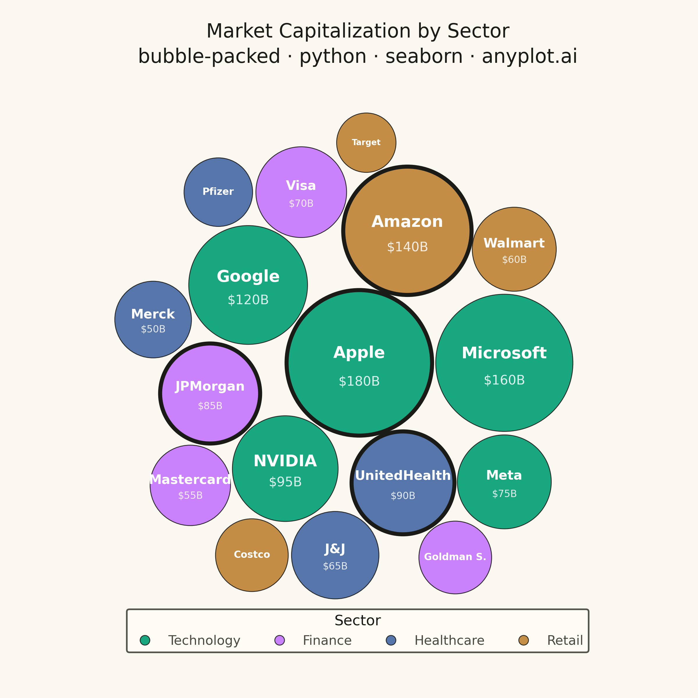
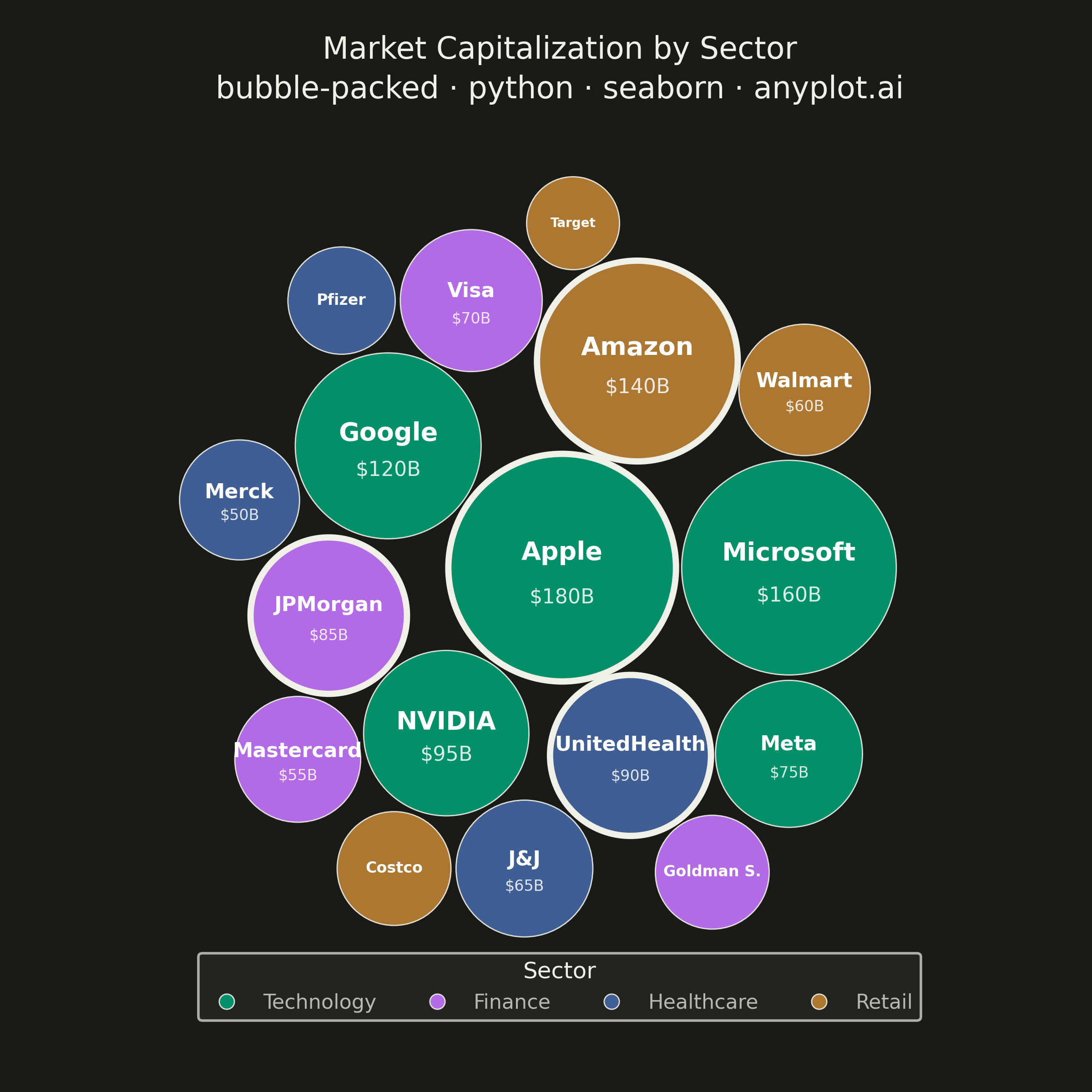
A packed bubble chart displays data as circles where size represents value, and circles are packed together without overlap using physics simulation. Unlike scatter or traditional bubble charts, position has no meaning - only size and optional grouping matter. This visualization efficiently uses space for comparing values across many categories.
""" anyplot.ai
bubble-packed: Basic Packed Bubble Chart
Library: seaborn 0.13.2 | Python 3.13.13
Quality: 87/100 | Updated: 2026-05-30
"""

import os

import matplotlib.pyplot as plt
import numpy as np
import pandas as pd
import seaborn as sns


THEME = os.getenv("ANYPLOT_THEME", "light")

PAGE_BG = "#FAF8F1" if THEME == "light" else "#1A1A17"
ELEVATED_BG = "#FFFDF6" if THEME == "light" else "#242420"
INK = "#1A1A17" if THEME == "light" else "#F0EFE8"
INK_SOFT = "#4A4A44" if THEME == "light" else "#B8B7B0"
INK_MUTED = "#6B6A63" if THEME == "light" else "#A8A79F"

# Imprint palette — canonical order, first series always #009E73
IMPRINT_PALETTE = ["#009E73", "#C475FD", "#4467A3", "#BD8233", "#AE3030", "#2ABCCD", "#954477", "#99B314"]

# Data — company market cap by sector (billions USD)
sectors = {
    "Technology": [("Apple", 180), ("Microsoft", 160), ("Google", 120), ("NVIDIA", 95), ("Meta", 75)],
    "Finance": [("JPMorgan", 85), ("Visa", 70), ("Mastercard", 55), ("Goldman Sachs", 45)],
    "Healthcare": [("UnitedHealth", 90), ("J&J", 65), ("Merck", 50), ("Pfizer", 40)],
    "Retail": [("Amazon", 140), ("Walmart", 60), ("Costco", 45), ("Target", 30)],
}

records = []
for sector, companies in sectors.items():
    for name, value in companies:
        records.append({"name": name, "value": value, "sector": sector, "radius": np.sqrt(value) * 4})

df = pd.DataFrame(records).sort_values("radius", ascending=False).reset_index(drop=True)

# Circle packing — greedy closest-to-center placement without overlap
placed_x, placed_y, placed_r = [], [], []

for _, row in df.iterrows():
    r = row["radius"]

    if not placed_x:
        placed_x.append(0.0)
        placed_y.append(0.0)
        placed_r.append(r)
        continue

    best_pos, best_dist = None, float("inf")
    px_arr = np.array(placed_x)
    py_arr = np.array(placed_y)
    pr_arr = np.array(placed_r)

    for i in range(len(placed_x)):
        for angle in np.linspace(0, 2 * np.pi, 72, endpoint=False):
            gap = placed_r[i] + r + 2
            tx = placed_x[i] + gap * np.cos(angle)
            ty = placed_y[i] + gap * np.sin(angle)

            dists = np.sqrt((px_arr - tx) ** 2 + (py_arr - ty) ** 2)
            if np.all(dists >= pr_arr + r + 1):
                cdist = np.sqrt(tx**2 + ty**2)
                if cdist < best_dist:
                    best_dist = cdist
                    best_pos = (tx, ty)

    bx, by = best_pos if best_pos else (0.0, 0.0)
    placed_x.append(bx)
    placed_y.append(by)
    placed_r.append(r)

df["x"] = placed_x
df["y"] = placed_y

# Recenter into positive coordinate space with padding
pad = 20
df["x"] = df["x"] - (df["x"] - df["radius"]).min() + pad
df["y"] = df["y"] - (df["y"] - df["radius"]).min() + pad
plot_w = (df["x"] + df["radius"]).max() + pad
plot_h = (df["y"] + df["radius"]).max() + pad
max_dim = max(plot_w, plot_h)

# Sector color mapping — Imprint palette positions 1–4
sector_order = list(sectors.keys())
sector_colors = dict(zip(sector_order, IMPRINT_PALETTE[:4], strict=True))

# Apply seaborn theme with adaptive chrome tokens
sns.set_theme(
    style="white",
    rc={
        "figure.facecolor": PAGE_BG,
        "axes.facecolor": PAGE_BG,
        "text.color": INK,
        "axes.labelcolor": INK,
        "legend.facecolor": ELEVATED_BG,
        "legend.edgecolor": INK_SOFT,
    },
)

# Square canvas — packed bubble charts are symmetric, no preferred horizontal axis
fig, ax = plt.subplots(figsize=(6, 6), dpi=400)
fig.patch.set_facecolor(PAGE_BG)
ax.set_facecolor(PAGE_BG)

ax.set_xlim(0, max_dim)
ax.set_ylim(0, max_dim)
ax.set_aspect("equal")

# Convert data-unit radii to scatter marker sizes (points²) for pixel-accurate circles
fig.canvas.draw()
px_per_unit = ax.transData.transform((1, 0))[0] - ax.transData.transform((0, 0))[0]
pts_per_unit = px_per_unit * 72 / fig.dpi
df["marker_size"] = (df["radius"] * 2 * pts_per_unit) ** 2

# Categorical ordering for consistent palette mapping
df["sector"] = pd.Categorical(df["sector"], categories=sector_order, ordered=True)

# Draw bubbles with seaborn scatterplot
sns.scatterplot(
    data=df,
    x="x",
    y="y",
    hue="sector",
    size="marker_size",
    sizes=(df["marker_size"].min(), df["marker_size"].max()),
    hue_order=sector_order,
    palette=sector_colors,
    alpha=0.90,
    edgecolor=INK,
    linewidth=0.5,
    legend=True,
    ax=ax,
)

# Accent the largest bubble per sector with a thicker edge ring to highlight the dominant story
sector_top_idx = df.groupby("sector")["value"].idxmax()
accent = df.loc[sector_top_idx]
ax.scatter(accent["x"], accent["y"], s=accent["marker_size"], facecolor="none", edgecolor=INK, linewidth=2.5, zorder=3)

# Labels inside bubbles — font sizes scaled for 2400×2400 canvas (dpi=400)
for _, row in df.iterrows():
    r = row["radius"]
    name = row["name"]
    value = row["value"]

    if r > 38:
        fs_name, max_chars, show_val = 10, 12, True
    elif r > 28:
        fs_name, max_chars, show_val = 8, 12, True
    elif r > 22:
        fs_name, max_chars, show_val = 6, 10, False
    else:
        fs_name, max_chars, show_val = 5, 8, False

    display_name = name if len(name) <= max_chars else name[: max_chars - 1] + "."

    if show_val:
        y_off = r * 0.13
        ax.text(
            row["x"],
            row["y"] + y_off,
            display_name,
            ha="center",
            va="center",
            fontsize=fs_name,
            fontweight="bold",
            color="white",
        )
        ax.text(
            row["x"],
            row["y"] - y_off * 2,
            f"${value}B",
            ha="center",
            va="center",
            fontsize=fs_name - 2,
            color="white",
            alpha=0.85,
        )
    else:
        ax.text(
            row["x"],
            row["y"],
            display_name,
            ha="center",
            va="center",
            fontsize=fs_name,
            fontweight="bold",
            color="white",
        )

ax.axis("off")

# Title
ax.set_title(
    "Market Capitalization by Sector\nbubble-packed · python · seaborn · anyplot.ai",
    fontsize=12,
    fontweight="medium",
    pad=14,
    color=INK,
    linespacing=1.4,
)

# Filter seaborn-managed legend to hue (sector) entries, then reposition with sns.move_legend
leg_auto = ax.get_legend()
all_handles = leg_auto.legend_handles
all_labels = [t.get_text() for t in leg_auto.get_texts()]
sector_handles = [h for h, lbl in zip(all_handles, all_labels, strict=False) if lbl in sector_order]
sector_labels = [lbl for lbl in all_labels if lbl in sector_order]
leg_auto.remove()
ax.legend(sector_handles, sector_labels)
sns.move_legend(
    ax,
    "lower center",
    bbox_to_anchor=(0.5, -0.06),
    ncol=4,
    title="Sector",
    title_fontsize=9,
    fontsize=8,
    framealpha=0.95,
)
leg = ax.get_legend()
leg.get_frame().set_facecolor(ELEVATED_BG)
leg.get_frame().set_edgecolor(INK_SOFT)
leg.get_title().set_color(INK)
for text in leg.get_texts():
    text.set_color(INK_SOFT)

# Reserve vertical margins for title (top) and legend (bottom)
fig.subplots_adjust(top=0.88, bottom=0.10)

# bbox_inches must stay default (None) — see prompts/library/seaborn.md "Canvas"
plt.savefig(f"plot-{THEME}.png", dpi=400, facecolor=PAGE_BG)
Runnable source as JSON, for any HTTP client: https://api.anyplot.ai/specs/bubble-packed/seaborn/code. Any spec id and library id listed in llms-full.txt fit the same URL shape; every URL below is complete and callable.
{
  "spec_id": "bubble-packed",
  "language": "python",
  "library": "seaborn",
  "page": "https://anyplot.ai/bubble-packed/python/seaborn",
  "hub": "https://anyplot.ai/bubble-packed",
  "code_json": "https://api.anyplot.ai/specs/bubble-packed/seaborn/code",
  "spec_json": "https://api.anyplot.ai/specs/bubble-packed",
  "render_light_png": "https://storage.googleapis.com/anyplot-images/plots/bubble-packed/python/seaborn/plot-light.png",
  "render_dark_png": "https://storage.googleapis.com/anyplot-images/plots/bubble-packed/python/seaborn/plot-dark.png",
  "quality_score": 87.0,
  "license": "MIT",
  "guide": "https://anyplot.ai/llms.txt"
}
Part of Basic Packed Bubble Chart on anyplot.ai.