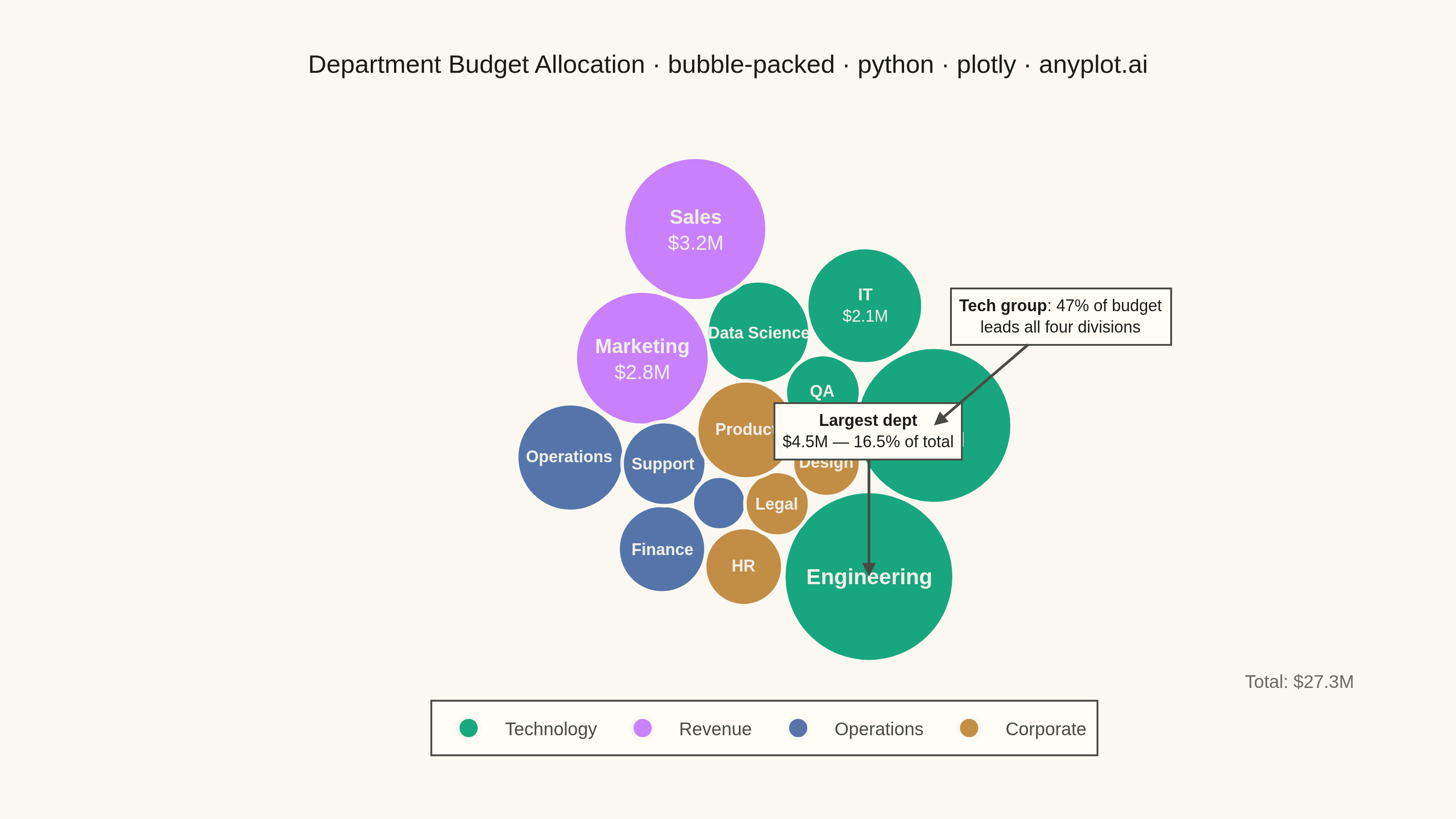
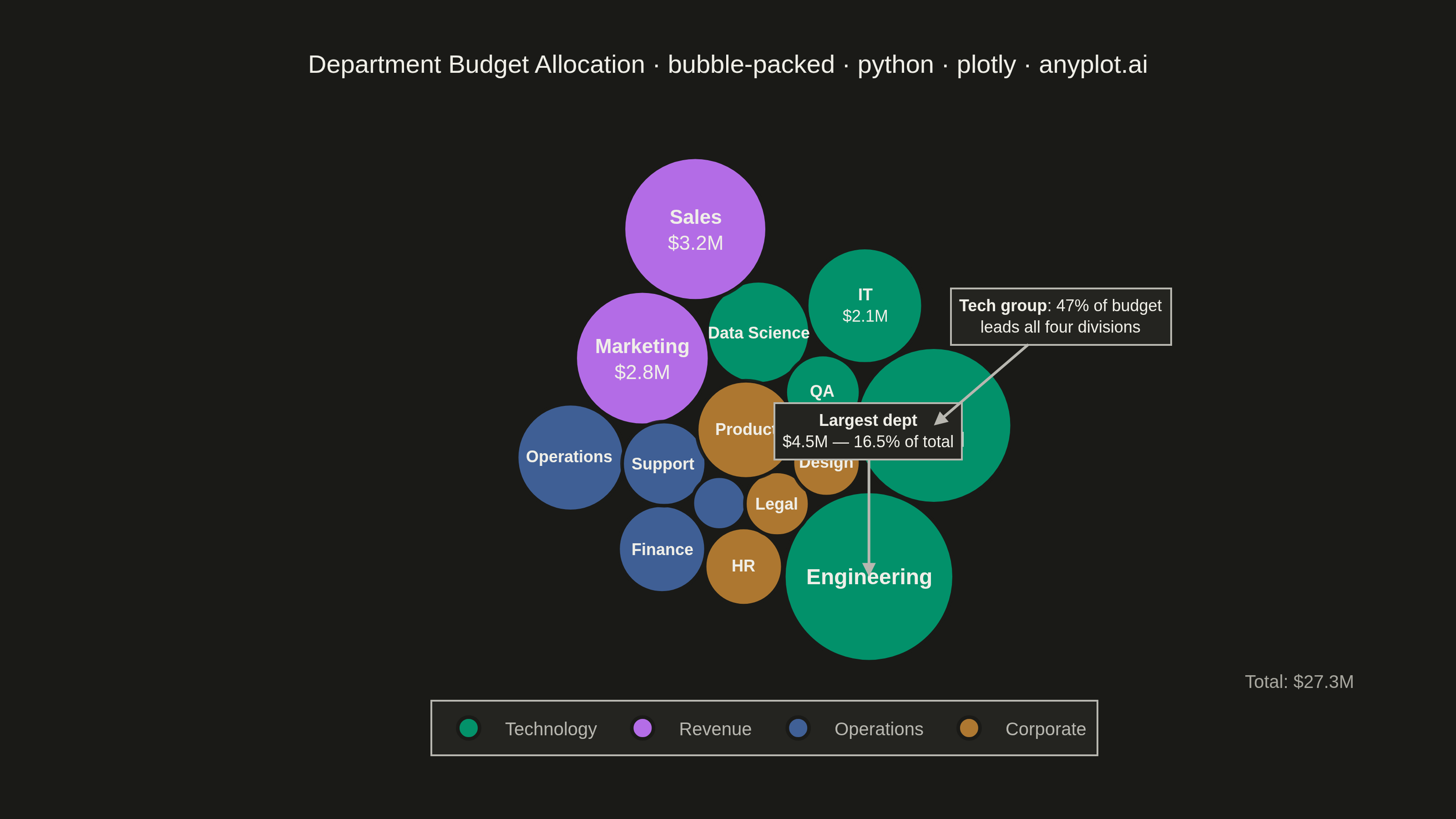
A packed bubble chart displays data as circles where size represents value, and circles are packed together without overlap using physics simulation. Unlike scatter or traditional bubble charts, position has no meaning - only size and optional grouping matter. This visualization efficiently uses space for comparing values across many categories.
""" anyplot.ai
bubble-packed: Basic Packed Bubble Chart
Library: plotly 6.7.0 | Python 3.13.13
Quality: 88/100 | Updated: 2026-05-29
"""

import os

import numpy as np
import plotly.graph_objects as go


THEME = os.getenv("ANYPLOT_THEME", "light")

# Theme-adaptive chrome tokens
PAGE_BG = "#FAF8F1" if THEME == "light" else "#1A1A17"
ELEVATED_BG = "#FFFDF6" if THEME == "light" else "#242420"
INK = "#1A1A17" if THEME == "light" else "#F0EFE8"
INK_SOFT = "#4A4A44" if THEME == "light" else "#B8B7B0"
INK_MUTED = "#6B6A63" if THEME == "light" else "#A8A79F"

# Imprint palette — canonical order; first series always #009E73
GROUP_NAMES = ["Technology", "Revenue", "Operations", "Corporate"]
IMPRINT_4 = ["#009E73", "#C475FD", "#4467A3", "#BD8233"]
GROUP_COLORS = dict(zip(GROUP_NAMES, IMPRINT_4, strict=True))

# Data — department budgets with functional groupings
departments = [
    ("Engineering", 4500000, "Technology"),
    ("R&D", 3800000, "Technology"),
    ("IT", 2100000, "Technology"),
    ("Data Science", 1650000, "Technology"),
    ("QA", 880000, "Technology"),
    ("Sales", 3200000, "Revenue"),
    ("Marketing", 2800000, "Revenue"),
    ("Operations", 1800000, "Operations"),
    ("Finance", 1200000, "Operations"),
    ("Support", 1100000, "Operations"),
    ("Admin", 450000, "Operations"),
    ("HR", 950000, "Corporate"),
    ("Legal", 650000, "Corporate"),
    ("Product", 1500000, "Corporate"),
    ("Design", 720000, "Corporate"),
]

labels = [d[0] for d in departments]
values = np.array([d[1] for d in departments])
groups = [d[2] for d in departments]
n = len(labels)

# Scale radii by area (sqrt) for accurate visual perception
radii = np.sqrt(values / values.max()) * 110

# Circle packing via force simulation
np.random.seed(42)
angles = np.linspace(0, 2 * np.pi, n, endpoint=False)
x_pos = np.cos(angles) * 150 + np.random.randn(n) * 30
y_pos = np.sin(angles) * 150 + np.random.randn(n) * 30

for _ in range(600):
    for i in range(n):
        fx, fy = -x_pos[i] * 0.01, -y_pos[i] * 0.01
        for j in range(n):
            if i != j:
                dx = x_pos[i] - x_pos[j]
                dy = y_pos[i] - y_pos[j]
                dist = np.sqrt(dx**2 + dy**2) + 0.1
                min_dist = radii[i] + radii[j] + 4
                if dist < min_dist:
                    force = (min_dist - dist) * 0.3
                    fx += (dx / dist) * force
                    fy += (dy / dist) * force
        x_pos[i] += fx
        y_pos[i] += fy

# Unweighted mean centering for symmetric empty-space distribution
x_pos -= np.mean(x_pos)
y_pos -= np.mean(y_pos)

# Format values for display
formatted = [f"${v / 1e6:.1f}M" if v >= 1e6 else f"${v / 1e3:.0f}K" for v in values]
shares = [f"{v / values.sum() * 100:.1f}" for v in values]
total = f"${values.sum() / 1e6:.1f}M"

# Tight axis ranges with padding
pad = 15
x_lo = (x_pos - radii).min() - pad
x_hi = (x_pos + radii).max() + pad
y_lo = (y_pos - radii).min() - pad
y_hi = (y_pos + radii).max() + pad

# Canvas: width=800, height=450, scale=4 → 3200×1800 output (landscape hard target)
fig_w, fig_h = 800, 450
m_l, m_r, m_t, m_b = 80, 40, 80, 80
plot_w, plot_h = fig_w - m_l - m_r, fig_h - m_t - m_b

# Convert data-coordinate radii to plotly pixel diameters (scaleanchor constrains min axis)
px_per_unit = min(plot_w / (x_hi - x_lo), plot_h / (y_hi - y_lo))
marker_diameters = 2 * radii * px_per_unit

# Luminance-based text contrast for annotations inside bubbles
text_colors = []
for g in groups:
    c = GROUP_COLORS[g]
    lum = 0.299 * int(c[1:3], 16) + 0.587 * int(c[3:5], 16) + 0.114 * int(c[5:7], 16)
    # Near-white / near-black constants contrast against bubble fills in both themes
    text_colors.append("#F0EFE8" if lum < 160 else "#1A1A17")

# Build figure — one trace per group for idiomatic Plotly legend
fig = go.Figure()

for group_name in GROUP_NAMES:
    color = GROUP_COLORS[group_name]
    idx = np.array([i for i in range(n) if groups[i] == group_name])
    fig.add_trace(
        go.Scatter(
            x=x_pos[idx],
            y=y_pos[idx],
            mode="markers",
            name=group_name,
            marker={
                "size": list(marker_diameters[idx]),
                "sizemode": "diameter",
                "color": color,
                "opacity": 0.9,
                "line": {"color": PAGE_BG, "width": 2},
            },
            text=[labels[i] for i in idx],
            customdata=[[formatted[i], shares[i]] for i in idx],
            hovertemplate="<b>%{text}</b> (%{fullData.name})<br>Budget: %{customdata[0]}<br>Share: %{customdata[1]}%<extra></extra>",
        )
    )

# Text labels inside bubbles — proportional to marker diameter
for i in range(n):
    d = marker_diameters[i]
    font_size = max(9, min(12, int(d * 0.15)))
    label_text = (
        f"<b>{labels[i]}</b><br>{formatted[i]}"
        if d > 60 and len(labels[i]) <= 9
        else f"<b>{labels[i]}</b>"
        if d > 30
        else ""
    )
    fig.add_annotation(
        x=x_pos[i],
        y=y_pos[i],
        text=label_text,
        showarrow=False,
        font={"size": font_size, "color": text_colors[i], "family": "Arial"},
    )

# Title font size scaled for length: round(16 × 67 / len(title))
title_text = "Department Budget Allocation · bubble-packed · python · plotly · anyplot.ai"
title_fontsize = round(16 * 67 / len(title_text))

fig.update_layout(
    autosize=False,
    title={"text": title_text, "font": {"size": title_fontsize, "color": INK}, "x": 0.5, "xanchor": "center"},
    xaxis={"showgrid": False, "zeroline": False, "showticklabels": False, "title": "", "range": [x_lo, x_hi]},
    yaxis={
        "showgrid": False,
        "zeroline": False,
        "showticklabels": False,
        "title": "",
        "scaleanchor": "x",
        "scaleratio": 1,
        "range": [y_lo, y_hi],
    },
    template="plotly_white",
    legend={
        "font": {"size": 10, "family": "Arial", "color": INK_SOFT},
        "bgcolor": ELEVATED_BG,
        "bordercolor": INK_SOFT,
        "borderwidth": 1,
        "orientation": "h",
        "yanchor": "top",
        "y": -0.05,
        "xanchor": "center",
        "x": 0.5,
        "itemsizing": "constant",
    },
    margin={"l": m_l, "r": m_r, "t": m_t, "b": m_b},
    paper_bgcolor=PAGE_BG,
    plot_bgcolor=PAGE_BG,
)

# Total budget note (bottom-right, within bottom margin)
fig.add_annotation(
    text=f"Total: {total}",
    xref="paper",
    yref="paper",
    x=0.98,
    y=-0.04,
    xanchor="right",
    showarrow=False,
    font={"size": 10, "color": INK_MUTED, "family": "Arial"},
)

# Storytelling callouts — guide viewer to key budget insight
eng_idx = labels.index("Engineering")
rd_idx = labels.index("R&D")
tech_total = sum(v for _, v, g in departments if g == "Technology")
tech_share = tech_total / values.sum() * 100

fig.add_annotation(
    x=x_pos[eng_idx],
    y=y_pos[eng_idx],
    text=f"<b>Largest dept</b><br>${values[eng_idx] / 1e6:.1f}M — {values[eng_idx] / values.sum() * 100:.1f}% of total",
    showarrow=True,
    arrowhead=2,
    arrowwidth=1.5,
    arrowcolor=INK_SOFT,
    axref="pixel",
    ayref="pixel",
    ax=0,
    ay=-80,
    font={"size": 9, "color": INK, "family": "Arial"},
    bgcolor=ELEVATED_BG,
    bordercolor=INK_SOFT,
    borderwidth=1,
    borderpad=4,
    align="center",
)
fig.add_annotation(
    x=x_pos[rd_idx],
    y=y_pos[rd_idx],
    text=f"<b>Tech group</b>: {tech_share:.0f}% of budget<br>leads all four divisions",
    showarrow=True,
    arrowhead=2,
    arrowwidth=1.5,
    arrowcolor=INK_SOFT,
    axref="pixel",
    ayref="pixel",
    ax=70,
    ay=-60,
    font={"size": 9, "color": INK, "family": "Arial"},
    bgcolor=ELEVATED_BG,
    bordercolor=INK_SOFT,
    borderwidth=1,
    borderpad=4,
    align="center",
)

# Save — landscape 3200×1800 (width=800, height=450, scale=4)
fig.write_image(f"plot-{THEME}.png", width=fig_w, height=fig_h, scale=4)
fig.write_html(f"plot-{THEME}.html", include_plotlyjs="cdn", full_html=True)
Runnable source as JSON, for any HTTP client: https://api.anyplot.ai/specs/bubble-packed/plotly/code. Any spec id and library id listed in llms-full.txt fit the same URL shape; every URL below is complete and callable.
{
  "spec_id": "bubble-packed",
  "language": "python",
  "library": "plotly",
  "page": "https://anyplot.ai/bubble-packed/python/plotly",
  "hub": "https://anyplot.ai/bubble-packed",
  "code_json": "https://api.anyplot.ai/specs/bubble-packed/plotly/code",
  "spec_json": "https://api.anyplot.ai/specs/bubble-packed",
  "render_light_png": "https://storage.googleapis.com/anyplot-images/plots/bubble-packed/python/plotly/plot-light.png",
  "render_dark_png": "https://storage.googleapis.com/anyplot-images/plots/bubble-packed/python/plotly/plot-dark.png",
  "interactive_light_html": "https://storage.googleapis.com/anyplot-images/plots/bubble-packed/python/plotly/plot-light.html",
  "interactive_dark_html": "https://storage.googleapis.com/anyplot-images/plots/bubble-packed/python/plotly/plot-dark.html",
  "quality_score": 88.0,
  "license": "MIT",
  "guide": "https://anyplot.ai/llms.txt"
}
Part of Basic Packed Bubble Chart on anyplot.ai.