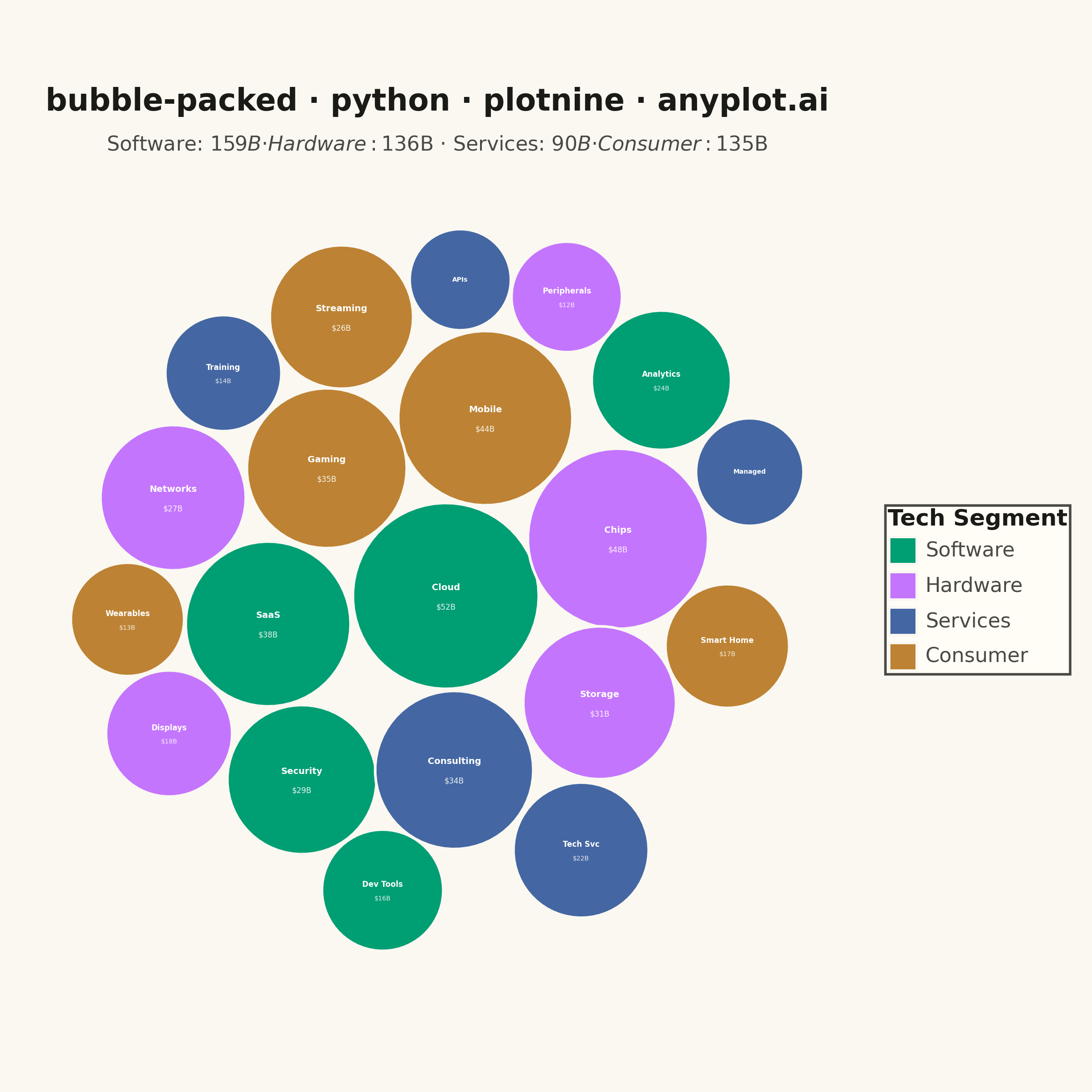
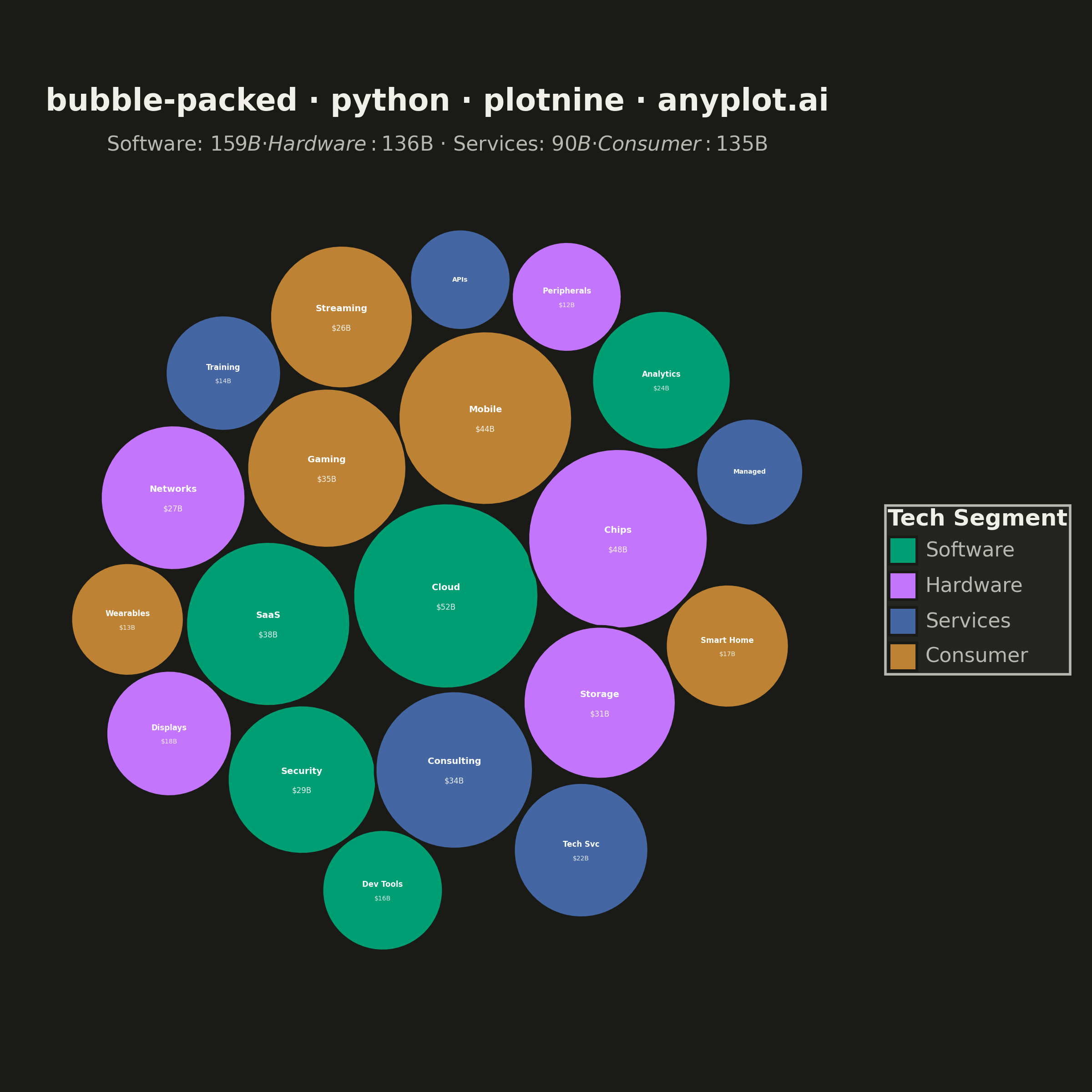
A packed bubble chart displays data as circles where size represents value, and circles are packed together without overlap using physics simulation. Unlike scatter or traditional bubble charts, position has no meaning - only size and optional grouping matter. This visualization efficiently uses space for comparing values across many categories.
""" anyplot.ai
bubble-packed: Basic Packed Bubble Chart
Library: plotnine 0.15.4 | Python 3.13.13
Quality: 90/100 | Updated: 2026-05-29
"""

import os
import sys


# Remove the script's own directory from sys.path so the installed plotnine package is found
_here = os.path.dirname(os.path.abspath(__file__))
if _here in sys.path:
    sys.path.remove(_here)

import numpy as np
import pandas as pd
from plotnine import (
    aes,
    coord_fixed,
    element_rect,
    element_text,
    geom_polygon,
    geom_text,
    ggplot,
    labs,
    scale_fill_manual,
    theme,
    theme_void,
)


# Theme tokens
THEME = os.getenv("ANYPLOT_THEME", "light")
PAGE_BG = "#FAF8F1" if THEME == "light" else "#1A1A17"
ELEVATED_BG = "#FFFDF6" if THEME == "light" else "#242420"
INK = "#1A1A17" if THEME == "light" else "#F0EFE8"
INK_SOFT = "#4A4A44" if THEME == "light" else "#B8B7B0"

# Imprint palette — positions 1-4 for four tech segments
IMPRINT_PALETTE = ["#009E73", "#C475FD", "#4467A3", "#BD8233"]

# Data — global tech industry revenue by segment (billions USD, 2024 est.)
market_data = {
    "label": [
        "Cloud",
        "SaaS",
        "Security",
        "Analytics",
        "Dev Tools",
        "Chips",
        "Storage",
        "Networks",
        "Displays",
        "Peripherals",
        "Consulting",
        "Tech Svc",
        "Training",
        "Managed",
        "APIs",
        "Mobile",
        "Gaming",
        "Streaming",
        "Smart Home",
        "Wearables",
    ],
    "value": [52, 38, 29, 24, 16, 48, 31, 27, 18, 12, 34, 22, 14, 11, 9, 44, 35, 26, 17, 13],
    "group": [
        "Software",
        "Software",
        "Software",
        "Software",
        "Software",
        "Hardware",
        "Hardware",
        "Hardware",
        "Hardware",
        "Hardware",
        "Services",
        "Services",
        "Services",
        "Services",
        "Services",
        "Consumer",
        "Consumer",
        "Consumer",
        "Consumer",
        "Consumer",
    ],
}

df = pd.DataFrame(market_data)

# Scale values to radii (area-based for accurate visual perception)
max_radius = 1.0
min_radius = 0.22
df["radius"] = min_radius + (max_radius - min_radius) * np.sqrt(df["value"] / df["value"].max())

# Circle packing — greedy placement with vectorized collision detection
n = len(df)
radii = df["radius"].values
idx = np.argsort(-radii)
sorted_radii = radii[idx]
gap = 0.03

x_pos = np.zeros(n)
y_pos = np.zeros(n)
angles_sweep = np.linspace(0, 2 * np.pi, 72, endpoint=False)

for i in range(1, n):
    best_dist = float("inf")
    best_x, best_y = 0.0, 0.0
    target_r = sorted_radii[i]

    for ref in range(i):
        place_r = sorted_radii[ref] + target_r + gap
        cx = x_pos[ref] + place_r * np.cos(angles_sweep)
        cy = y_pos[ref] + place_r * np.sin(angles_sweep)

        dx_c = cx[:, np.newaxis] - x_pos[:i][np.newaxis, :]
        dy_c = cy[:, np.newaxis] - y_pos[:i][np.newaxis, :]
        dists_c = np.hypot(dx_c, dy_c)
        valid = np.all(dists_c >= target_r + sorted_radii[:i] + gap, axis=1)

        center_dists = cx**2 + cy**2
        valid_dists = np.where(valid, center_dists, float("inf"))
        best_k = np.argmin(valid_dists)
        if valid_dists[best_k] < best_dist:
            best_dist = valid_dists[best_k]
            best_x, best_y = cx[best_k], cy[best_k]

    x_pos[i] = best_x
    y_pos[i] = best_y

# Force simulation to tighten packing (vectorized with numpy)
tri = np.triu(np.ones((n, n), dtype=bool), k=1)
min_dists = sorted_radii[:, np.newaxis] + sorted_radii[np.newaxis, :] + gap

for _ in range(2000):
    x_pos *= 0.997
    y_pos *= 0.997

    dx = x_pos[:, np.newaxis] - x_pos[np.newaxis, :]
    dy = y_pos[:, np.newaxis] - y_pos[np.newaxis, :]
    dists = np.hypot(dx, dy)

    overlap = tri & (dists < min_dists) & (dists > 1e-3)
    if overlap.any():
        safe_dists = np.where(dists > 1e-3, dists, 1.0)
        push = ((min_dists - dists) / (2 * safe_dists)) * overlap
        corr_x = push * dx
        corr_y = push * dy
        x_pos += corr_x.sum(axis=1) - corr_x.sum(axis=0)
        y_pos += corr_y.sum(axis=1) - corr_y.sum(axis=0)

# Restore original order
x_final = np.zeros(n)
y_final = np.zeros(n)
for i, orig_idx in enumerate(idx):
    x_final[orig_idx] = x_pos[i]
    y_final[orig_idx] = y_pos[i]

df["x"] = x_final
df["y"] = y_final

# Build circle polygons for geom_polygon
circle_dfs = []
angles = np.linspace(0, 2 * np.pi, 64)
for i, row in df.iterrows():
    cx = row["x"] + row["radius"] * np.cos(angles)
    cy = row["y"] + row["radius"] * np.sin(angles)
    circle_dfs.append(pd.DataFrame({"x": cx, "y": cy, "label": row["label"], "group": row["group"], "circle_id": i}))
circles_df = pd.concat(circle_dfs, ignore_index=True)
circles_df["group"] = pd.Categorical(circles_df["group"], categories=["Software", "Hardware", "Services", "Consumer"])

# Labels — name and revenue value per bubble
labels_df = df.copy()
labels_df["value_label"] = labels_df["value"].apply(lambda v: f"${v}B")

# Group colors using Imprint palette (canonical positions 1-4)
group_colors = {
    "Software": IMPRINT_PALETTE[0],  # #009E73 brand green
    "Hardware": IMPRINT_PALETTE[1],  # #C475FD lavender
    "Services": IMPRINT_PALETTE[2],  # #4467A3 blue
    "Consumer": IMPRINT_PALETTE[3],  # #BD8233 ochre
}

# Group totals for subtitle
group_order = ["Software", "Hardware", "Services", "Consumer"]
group_totals = df.groupby("group")["value"].sum()
subtitle_text = " · ".join(f"{g}: ${group_totals[g]}B" for g in group_order)

# Tight viewport bounds for optimal canvas utilization
pad = 0.12
x_lo = (df["x"] - df["radius"]).min() - pad
x_hi = (df["x"] + df["radius"]).max() + pad
y_lo = (df["y"] - df["radius"]).min() - pad
y_hi = (df["y"] + df["radius"]).max() + pad
half_span = max(x_hi - x_lo, y_hi - y_lo) / 2
cx_mid = (x_lo + x_hi) / 2
cy_mid = (y_lo + y_hi) / 2

# Title with auto-scaled fontsize (67-char baseline)
title = "bubble-packed · python · plotnine · anyplot.ai"
title_fontsize = max(8, round(12 * 67 / len(title))) if len(title) > 67 else 12

# Plot — layered grammar of graphics composition
plot = (
    ggplot()
    # Layer 1: Circle fills with theme-adaptive borders for group separation
    + geom_polygon(data=circles_df, mapping=aes(x="x", y="y", fill="group", group="circle_id"), color=PAGE_BG, size=0.6)
    # Layer 2: Name labels — large bubbles (value ≥ 26)
    + geom_text(
        data=labels_df[labels_df["value"] >= 26],
        mapping=aes(x="x", y="y", label="label"),
        size=3.5,
        color="white",
        fontweight="bold",
        nudge_y=0.09,
    )
    # Layer 3: Name labels — medium bubbles (12 ≤ value < 26)
    + geom_text(
        data=labels_df[(labels_df["value"] >= 12) & (labels_df["value"] < 26)],
        mapping=aes(x="x", y="y", label="label"),
        size=3.0,
        color="white",
        fontweight="bold",
        nudge_y=0.06,
    )
    # Layer 4: Name labels — small bubbles (value < 12)
    + geom_text(
        data=labels_df[labels_df["value"] < 12],
        mapping=aes(x="x", y="y", label="label"),
        size=2.5,
        color="white",
        fontweight="bold",
    )
    # Layer 5: Revenue value labels — large bubbles
    + geom_text(
        data=labels_df[labels_df["value"] >= 26],
        mapping=aes(x="x", y="y", label="value_label"),
        size=3.0,
        color="white",
        alpha=0.9,
        nudge_y=-0.12,
    )
    # Layer 6: Revenue value labels — medium bubbles
    + geom_text(
        data=labels_df[(labels_df["value"] >= 12) & (labels_df["value"] < 26)],
        mapping=aes(x="x", y="y", label="value_label"),
        size=2.5,
        color="white",
        alpha=0.85,
        nudge_y=-0.09,
    )
    + scale_fill_manual(values=group_colors, name="Tech Segment")
    + coord_fixed(xlim=(cx_mid - half_span, cx_mid + half_span), ylim=(cy_mid - half_span, cy_mid + half_span))
    + labs(title=title, subtitle=subtitle_text)
    + theme_void()
    + theme(
        figure_size=(6, 6),
        plot_title=element_text(size=title_fontsize, ha="center", weight="bold", color=INK, margin={"b": 4}),
        plot_subtitle=element_text(size=8, ha="center", color=INK_SOFT, margin={"t": 3, "b": 8}),
        legend_title=element_text(size=9, weight="bold", color=INK),
        legend_text=element_text(size=8, color=INK_SOFT),
        legend_position="right",
        legend_direction="vertical",
        legend_background=element_rect(fill=ELEVATED_BG, color=INK_SOFT),
        legend_key=element_rect(fill=ELEVATED_BG, color="none"),
        legend_key_size=12,
        plot_background=element_rect(fill=PAGE_BG, color="none"),
        plot_margin=0.02,
    )
)

# Save
plot.save(f"plot-{THEME}.png", dpi=400, width=6, height=6, units="in", verbose=False)
Runnable source as JSON, for any HTTP client: https://api.anyplot.ai/specs/bubble-packed/plotnine/code. Any spec id and library id listed in llms-full.txt fit the same URL shape; every URL below is complete and callable.
{
  "spec_id": "bubble-packed",
  "language": "python",
  "library": "plotnine",
  "page": "https://anyplot.ai/bubble-packed/python/plotnine",
  "hub": "https://anyplot.ai/bubble-packed",
  "code_json": "https://api.anyplot.ai/specs/bubble-packed/plotnine/code",
  "spec_json": "https://api.anyplot.ai/specs/bubble-packed",
  "render_light_png": "https://storage.googleapis.com/anyplot-images/plots/bubble-packed/python/plotnine/plot-light.png",
  "render_dark_png": "https://storage.googleapis.com/anyplot-images/plots/bubble-packed/python/plotnine/plot-dark.png",
  "quality_score": 90.0,
  "license": "MIT",
  "guide": "https://anyplot.ai/llms.txt"
}
Part of Basic Packed Bubble Chart on anyplot.ai.