The same plot in 14 other libraries — JavaScript: Chart.js, D3.js, Apache ECharts, MUI X Charts; Python: Altair, Bokeh, lets-plot, Matplotlib, Plotly, plotnine, Pygal, Seaborn; R: ggplot2; Julia: Makie.jl. Compare all 15 side by side: Cartogram with Area Distortion by Data Value in Python, R, Julia and JavaScript.
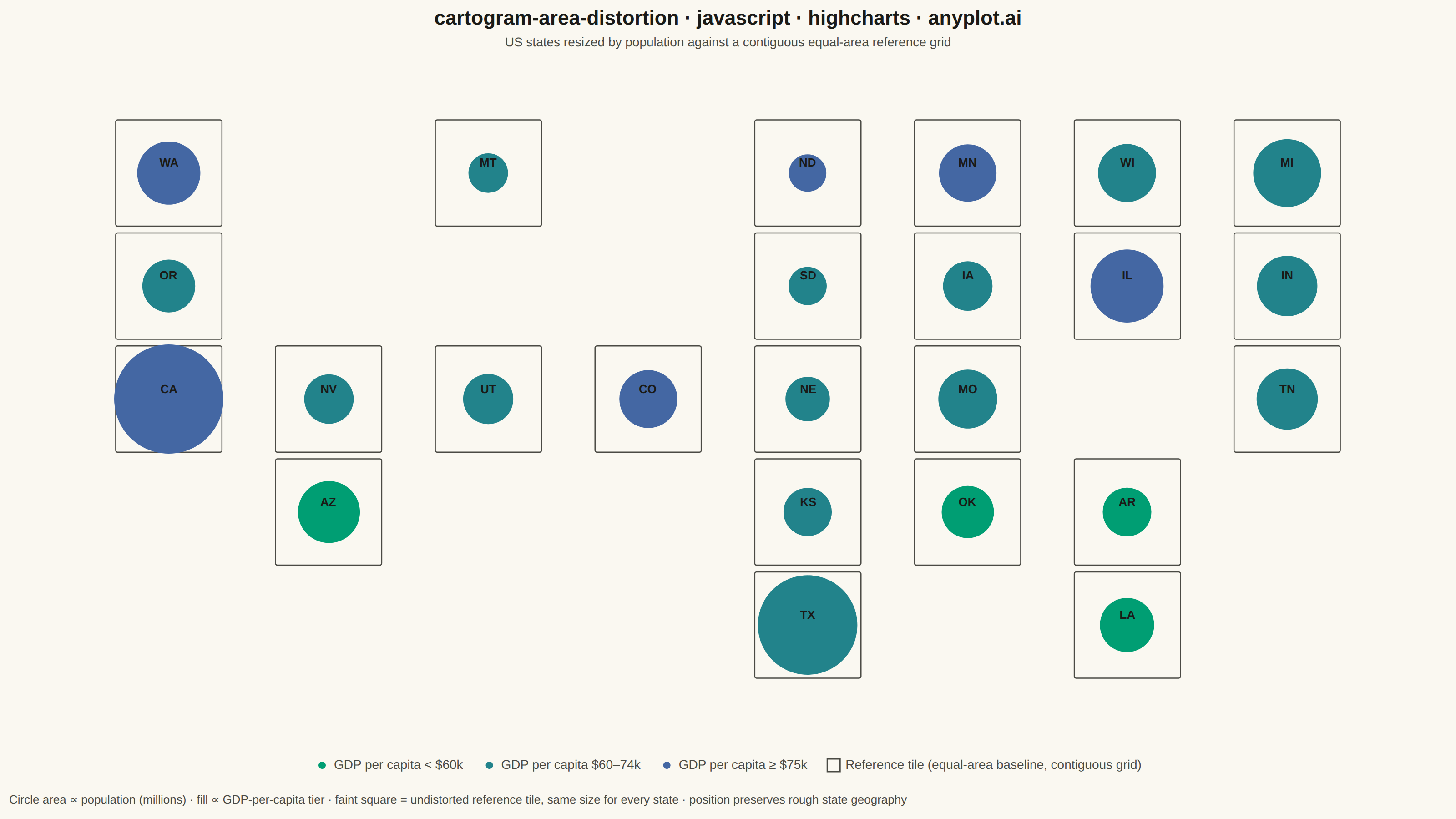
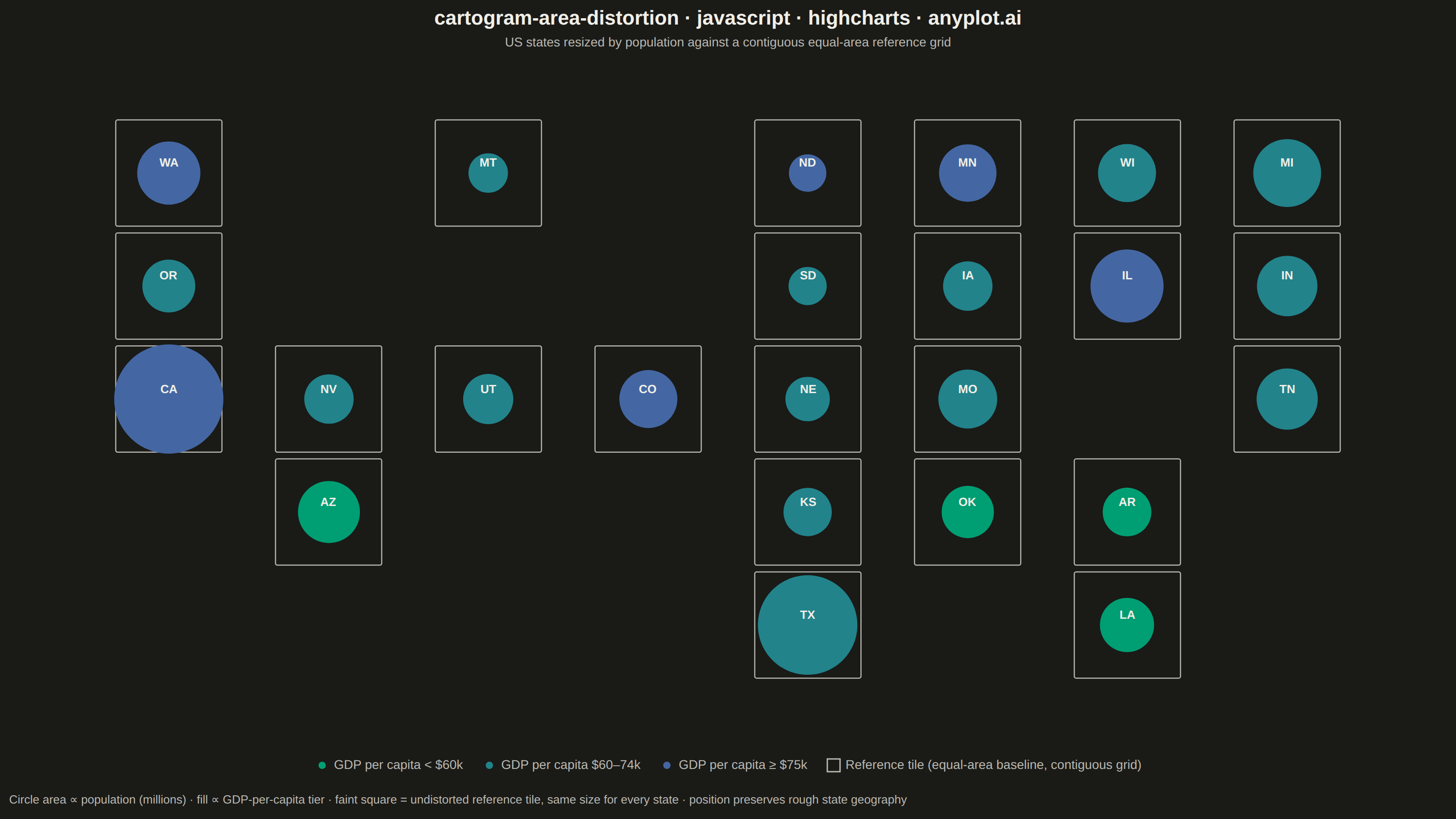
A cartogram distorts geographic regions so that their area becomes proportional to a data variable (e.g., population, GDP, election votes) rather than physical land area. This solves the classic problem of large but sparsely populated areas dominating standard maps, making it easier to compare values across regions at a glance. Contiguous cartograms preserve adjacency and rough shape of regions while rescaling them, famously used in election coverage worldwide.
// anyplot.ai
// cartogram-area-distortion: Cartogram with Area Distortion by Data Value
// Library: highcharts 12.6.0 | JavaScript 22.23.2
// Quality: 88/100 | Created: 2026-08-20

const t = window.ANYPLOT_TOKENS;

// --- Data (in-memory, deterministic) ----------------------------------------
// US states on an approximate tile grid (col = west→east, row = north→south).
// Every state occupies a fixed-size, contiguous reference tile (edges touch
// its grid neighbors); the circle drawn inside each tile has area ∝ population,
// so its size relative to the tile is the area distortion. Fill encodes a
// GDP-per-capita tier. population in millions (2023 est.), gdpPerCapita in
// thousand USD.
const states = [
  { name: "WA", col: 0, row: 0, population: 7.9, gdpPerCapita: 87 },
  { name: "OR", col: 0, row: 1, population: 4.2, gdpPerCapita: 71 },
  { name: "CA", col: 0, row: 2, population: 39.0, gdpPerCapita: 91 },
  { name: "NV", col: 1, row: 2, population: 3.2, gdpPerCapita: 66 },
  { name: "MT", col: 2, row: 0, population: 1.1, gdpPerCapita: 62 },
  { name: "UT", col: 2, row: 2, population: 3.4, gdpPerCapita: 70 },
  { name: "AZ", col: 1, row: 3, population: 7.4, gdpPerCapita: 55 },
  { name: "CO", col: 3, row: 2, population: 5.9, gdpPerCapita: 75 },
  { name: "ND", col: 4, row: 0, population: 0.8, gdpPerCapita: 78 },
  { name: "SD", col: 4, row: 1, population: 0.9, gdpPerCapita: 68 },
  { name: "NE", col: 4, row: 2, population: 2.0, gdpPerCapita: 72 },
  { name: "KS", col: 4, row: 3, population: 2.9, gdpPerCapita: 65 },
  { name: "TX", col: 4, row: 4, population: 30.5, gdpPerCapita: 74 },
  { name: "MN", col: 5, row: 0, population: 5.7, gdpPerCapita: 77 },
  { name: "IA", col: 5, row: 1, population: 3.2, gdpPerCapita: 65 },
  { name: "MO", col: 5, row: 2, population: 6.2, gdpPerCapita: 60 },
  { name: "OK", col: 5, row: 3, population: 4.0, gdpPerCapita: 58 },
  { name: "WI", col: 6, row: 0, population: 5.9, gdpPerCapita: 65 },
  { name: "IL", col: 6, row: 1, population: 12.6, gdpPerCapita: 79 },
  { name: "AR", col: 6, row: 3, population: 3.0, gdpPerCapita: 50 },
  { name: "LA", col: 6, row: 4, population: 4.6, gdpPerCapita: 58 },
  { name: "MI", col: 7, row: 0, population: 10.0, gdpPerCapita: 60 },
  { name: "IN", col: 7, row: 1, population: 6.8, gdpPerCapita: 63 },
  { name: "TN", col: 7, row: 2, population: 7.1, gdpPerCapita: 60 },
];

const maxPopulation = Math.max(...states.map((s) => s.population));
const MIN_RADIUS = 14;
const MAX_RADIUS = 60;

// Area ∝ value → radius ∝ sqrt(value), the defining cartogram encoding.
function radiusFor(population) {
  return MIN_RADIUS + (MAX_RADIUS - MIN_RADIUS) * Math.sqrt(population / maxPopulation);
}

function toPoint(s) {
  return {
    name: s.name,
    x: s.col,
    y: s.row,
    marker: { radius: radiusFor(s.population) },
    custom: { population: s.population, gdpPerCapita: s.gdpPerCapita },
  };
}

// The core bundle has no colorAxis module, so the GDP-per-capita tiers are
// rendered as three ordinary series — each gets its own imprint_seq-derived
// color and a native legend entry, without needing a continuous color axis.
function lerpHex(hexA, hexB, frac) {
  const a = [1, 3, 5].map((i) => parseInt(hexA.slice(i, i + 2), 16));
  const b = [1, 3, 5].map((i) => parseInt(hexB.slice(i, i + 2), 16));
  const mixed = a.map((c, i) => Math.round(c + (b[i] - c) * frac));
  return "#" + mixed.map((c) => c.toString(16).padStart(2, "0")).join("");
}

const tiers = [
  { key: "low", name: "GDP per capita < $60k", test: (g) => g < 60, color: t.seq[0] },
  { key: "mid", name: "GDP per capita $60–74k", test: (g) => g >= 60 && g < 75, color: lerpHex(t.seq[0], t.seq[1], 0.5) },
  { key: "high", name: "GDP per capita ≥ $75k", test: (g) => g >= 75, color: t.seq[1] },
];

const series = tiers.map((tier) => ({
  name: tier.name,
  color: tier.color,
  data: states.filter((s) => tier.test(s.gdpPerCapita)).map(toPoint),
}));

// Reference tile: same fixed footprint for every state, so its edges line up
// contiguously (touching neighbors) with the grid unit — the "undistorted"
// baseline the population-scaled circle is measured against. Legend entry
// only; the tiles themselves are drawn via the SVG renderer (below).
series.push({
  name: "Reference tile (equal-area baseline, contiguous grid)",
  color: t.inkSoft,
  marker: { symbol: "square", radius: 7, fillColor: "transparent", lineColor: t.inkSoft, lineWidth: 1.5 },
  enableMouseTracking: false,
  showInLegend: true,
  data: [],
});

// Draws one fixed-size square per state, aligned to the grid so adjacent
// tiles' edges touch — a contiguous baseline grid the distorted circles sit
// against, making the area distortion legible (spec requires a reference for
// comparison). Re-run on every render/resize since pixel positions depend on
// the current axis-to-pixel mapping.
function drawReferenceTiles(chart) {
  if (chart._tileGroup) chart._tileGroup.destroy();
  const group = chart.renderer.g("reference-tiles").attr({ zIndex: 1 }).add();
  chart._tileGroup = group;

  const xa = chart.xAxis[0];
  const ya = chart.yAxis[0];
  const unitW = Math.abs(xa.toPixels(1) - xa.toPixels(0));
  const unitH = Math.abs(ya.toPixels(1) - ya.toPixels(0));
  const tile = Math.min(unitW, unitH) * 0.94;
  const half = tile / 2;

  states.forEach((s) => {
    const cx = xa.toPixels(s.col);
    const cy = ya.toPixels(s.row);
    chart.renderer
      .rect(cx - half, cy - half, tile, tile, 2)
      .attr({ fill: "transparent", stroke: t.inkSoft, "stroke-width": 1.25, zIndex: 1 })
      .add(group);
  });
}

// --- Chart -------------------------------------------------------------------
Highcharts.chart("container", {
  chart: {
    type: "scatter",
    backgroundColor: "transparent",
    animation: false,
    style: { fontFamily: "inherit" },
    events: { render: function () { drawReferenceTiles(this); } },
  },
  credits: { enabled: false },
  title: {
    text: "cartogram-area-distortion · javascript · highcharts · anyplot.ai",
    style: { color: t.ink, fontSize: "22px", fontWeight: "600" },
  },
  subtitle: {
    text: "US states resized by population against a contiguous equal-area reference grid",
    style: { color: t.inkSoft, fontSize: "14px" },
  },
  caption: {
    text: "Circle area ∝ population (millions) · fill ∝ GDP-per-capita tier · faint square = undistorted reference tile, same size for every state · position preserves rough state geography",
    style: { color: t.inkMuted || t.inkSoft, fontSize: "13px" },
  },
  xAxis: {
    min: -1,
    max: 8,
    visible: false,
  },
  yAxis: {
    min: -1,
    max: 5,
    reversed: true,
    title: { text: null },
    visible: false,
  },
  legend: {
    enabled: true,
    itemStyle: { color: t.inkSoft, fontSize: "14px" },
    itemHoverStyle: { color: t.ink },
  },
  plotOptions: {
    series: { animation: false },
    scatter: {
      marker: { symbol: "circle" },
      dataLabels: {
        enabled: true,
        format: "{point.name}",
        style: {
          color: t.ink,
          fontSize: "13px",
          fontWeight: "600",
          textOutline: "none",
        },
      },
    },
  },
  tooltip: {
    pointFormat:
      "Population: {point.custom.population}M<br/>GDP per capita: ${point.custom.gdpPerCapita}k",
  },
  series,
});
Runnable source as JSON, for any HTTP client: https://api.anyplot.ai/specs/cartogram-area-distortion/highcharts/code. Any spec id and library id listed in llms-full.txt fit the same URL shape; every URL below is complete and callable.
{
  "spec_id": "cartogram-area-distortion",
  "language": "javascript",
  "library": "highcharts",
  "page": "https://anyplot.ai/cartogram-area-distortion/javascript/highcharts",
  "hub": "https://anyplot.ai/cartogram-area-distortion",
  "code_json": "https://api.anyplot.ai/specs/cartogram-area-distortion/highcharts/code",
  "spec_json": "https://api.anyplot.ai/specs/cartogram-area-distortion",
  "render_light_png": "https://storage.googleapis.com/anyplot-images/plots/cartogram-area-distortion/javascript/highcharts/plot-light.png",
  "render_dark_png": "https://storage.googleapis.com/anyplot-images/plots/cartogram-area-distortion/javascript/highcharts/plot-dark.png",
  "interactive_light_html": "https://storage.googleapis.com/anyplot-images/plots/cartogram-area-distortion/javascript/highcharts/plot-light.html",
  "interactive_dark_html": "https://storage.googleapis.com/anyplot-images/plots/cartogram-area-distortion/javascript/highcharts/plot-dark.html",
  "quality_score": 88.0,
  "license": "MIT",
  "guide": "https://anyplot.ai/llms.txt"
}
Part of Cartogram with Area Distortion by Data Value on anyplot.ai.