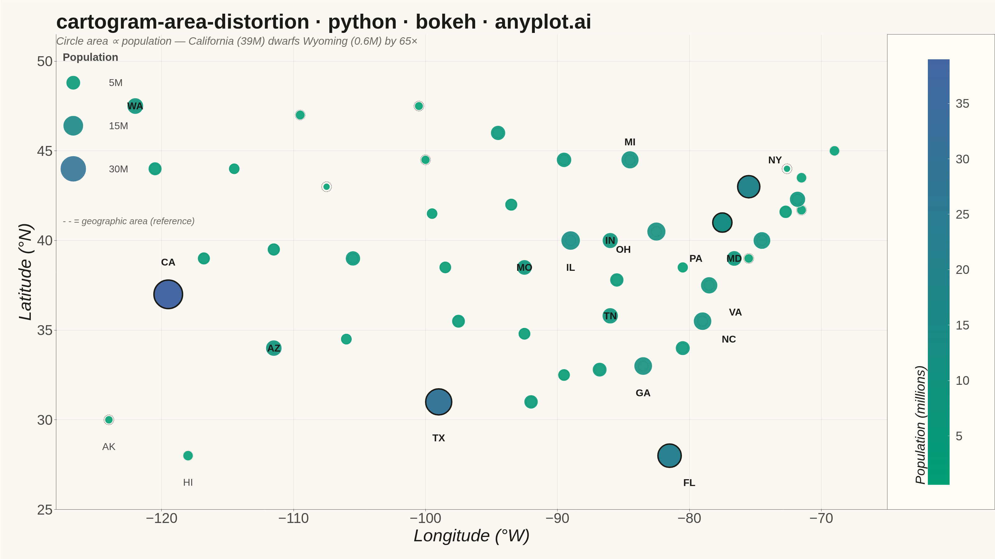
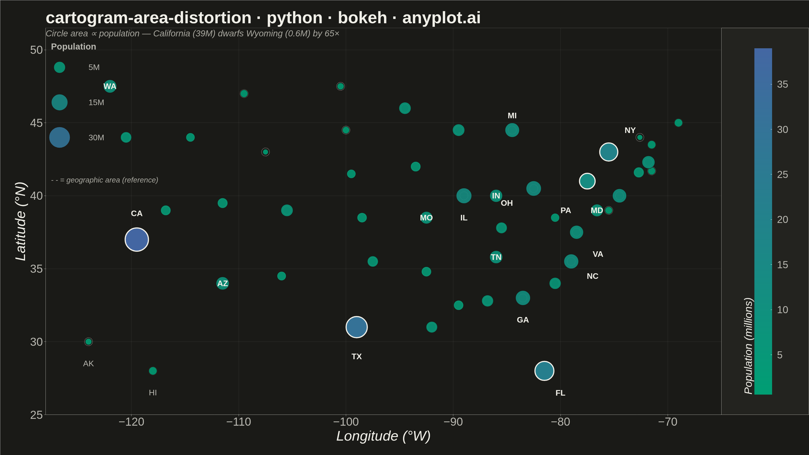
A cartogram distorts geographic regions so that their area becomes proportional to a data variable (e.g., population, GDP, election votes) rather than physical land area. This solves the classic problem of large but sparsely populated areas dominating standard maps, making it easier to compare values across regions at a glance. Contiguous cartograms preserve adjacency and rough shape of regions while rescaling them, famously used in election coverage worldwide.
""" anyplot.ai
cartogram-area-distortion: Cartogram with Area Distortion by Data Value
Library: bokeh 3.9.1 | Python 3.13.13
Quality: 88/100 | Updated: 2026-06-08
"""

import os
import sys
import time
from pathlib import Path


# Prevent this script (bokeh.py) from shadowing the installed bokeh package when
# Python adds its own directory to sys.path[0] on direct invocation.
sys.path = [p for p in sys.path if os.path.abspath(p or os.getcwd()) != os.path.dirname(os.path.abspath(__file__))]

import numpy as np
from bokeh.io import output_file, save
from bokeh.models import BasicTicker, ColorBar, ColumnDataSource, Label, LinearColorMapper, Range1d
from bokeh.plotting import figure
from bokeh.transform import transform
from selenium import webdriver
from selenium.webdriver.chrome.options import Options


# Theme tokens — Imprint palette, theme-adaptive chrome
THEME = os.getenv("ANYPLOT_THEME", "light")
PAGE_BG = "#FAF8F1" if THEME == "light" else "#1A1A17"
ELEVATED_BG = "#FFFDF6" if THEME == "light" else "#242420"
INK = "#1A1A17" if THEME == "light" else "#F0EFE8"
INK_SOFT = "#4A4A44" if THEME == "light" else "#B8B7B0"
INK_MUTED = "#6B6A63" if THEME == "light" else "#A8A79F"

# Imprint sequential colormap: brand green (#009E73) → blue (#4467A3), 256 stops
_c0 = np.array([0x00, 0x9E, 0x73])
_c1 = np.array([0x44, 0x67, 0xA3])
IMPRINT_SEQ256 = [
    "#{:02X}{:02X}{:02X}".format(*np.round(_c0 + (_c1 - _c0) * (t / 255.0)).astype(int)) for t in range(256)
]

# Data — US states: (longitude, latitude, population in millions)
states = {
    "WA": (-122.0, 47.5, 7.7),
    "OR": (-120.5, 44.0, 4.2),
    "CA": (-119.5, 37.0, 39.0),
    "NV": (-116.8, 39.0, 3.2),
    "ID": (-114.5, 44.0, 2.0),
    "MT": (-109.5, 47.0, 1.1),
    "WY": (-107.5, 43.0, 0.6),
    "UT": (-111.5, 39.5, 3.4),
    "CO": (-105.5, 39.0, 5.8),
    "AZ": (-111.5, 34.0, 7.4),
    "NM": (-106.0, 34.5, 2.1),
    "ND": (-100.5, 47.5, 0.8),
    "SD": (-100.0, 44.5, 0.9),
    "NE": (-99.5, 41.5, 2.0),
    "KS": (-98.5, 38.5, 2.9),
    "OK": (-97.5, 35.5, 4.0),
    "TX": (-99.0, 31.0, 30.5),
    "MN": (-94.5, 46.0, 5.7),
    "IA": (-93.5, 42.0, 3.2),
    "MO": (-92.5, 38.5, 6.2),
    "AR": (-92.5, 34.8, 3.0),
    "LA": (-92.0, 31.0, 4.6),
    "WI": (-89.5, 44.5, 5.9),
    "IL": (-89.0, 40.0, 12.6),
    "MI": (-84.5, 44.5, 10.0),
    "IN": (-86.0, 40.0, 6.8),
    "OH": (-82.5, 40.5, 11.8),
    "KY": (-85.5, 37.8, 4.5),
    "TN": (-86.0, 35.8, 7.1),
    "MS": (-89.5, 32.5, 2.9),
    "AL": (-86.8, 32.8, 5.1),
    "GA": (-83.5, 33.0, 11.0),
    "FL": (-81.5, 28.0, 22.6),
    "SC": (-80.5, 34.0, 5.3),
    "NC": (-79.0, 35.5, 10.7),
    "VA": (-78.5, 37.5, 8.6),
    "WV": (-80.5, 38.5, 1.8),
    "PA": (-77.5, 41.0, 13.0),
    "NY": (-75.5, 43.0, 19.7),
    "NJ": (-74.5, 40.0, 9.3),
    "DE": (-75.5, 39.0, 1.0),
    "MD": (-76.6, 39.0, 6.2),
    "CT": (-72.7, 41.6, 3.6),
    "RI": (-71.5, 41.7, 1.1),
    "MA": (-71.8, 42.3, 7.0),
    "VT": (-72.6, 44.0, 0.6),
    "NH": (-71.5, 43.5, 1.4),
    "ME": (-69.0, 45.0, 1.4),
    "AK": (-124.0, 30.0, 0.7),
    "HI": (-118.0, 28.0, 1.4),
}

names = list(states.keys())
lons = [states[s][0] for s in names]
lats = [states[s][1] for s in names]
populations = [states[s][2] for s in names]

# Circle area proportional to population; raised min_size so small states remain visible
min_pop, max_pop = min(populations), max(populations)
min_size, max_size = 22, 92
sizes = [min_size + (max_size - min_size) * np.sqrt((p - min_pop) / (max_pop - min_pop)) for p in populations]
ref_outline_size = 32  # uniform reference circles — geographic footprint baseline

source = ColumnDataSource(
    data={
        "lon": lons,
        "lat": lats,
        "population": populations,
        "size": sizes,
        "ref_size": [ref_outline_size] * len(names),
        "name": names,
        "pop_label": [f"{p:.1f}M" for p in populations],
    }
)

color_mapper = LinearColorMapper(palette=IMPRINT_SEQ256, low=min_pop, high=max_pop)

# Title fontsize scaled by character count (floor 34pt)
title_str = "cartogram-area-distortion · python · bokeh · anyplot.ai"
title_fontsize = max(34, round(50 * (67 / len(title_str) if len(title_str) > 67 else 1.0)))

# Figure — 3200×1800 landscape; toolbar_location=None prevents extra height in PNG
p = figure(
    width=3200,
    height=1800,
    title=title_str,
    x_axis_label="Longitude (°W)",
    y_axis_label="Latitude (°N)",
    x_range=Range1d(-128, -65),
    y_range=Range1d(25, 51.5),
    toolbar_location=None,
    tools="hover",
    tooltips=[("State", "@name"), ("Population", "@pop_label")],
    min_border_bottom=160,
    min_border_left=180,
    min_border_top=110,
    min_border_right=80,
)

# Reference circles: uniform size shows geographic footprint for comparison
# Increased alpha (0.7) from previous (0.45) for a clear comparison baseline
p.scatter(
    x="lon",
    y="lat",
    size="ref_size",
    source=source,
    fill_color=None,
    line_color=INK_SOFT,
    line_width=2.0,
    line_dash="dashed",
    line_alpha=0.7,
)

# Cartogram circles: area scaled by population, Imprint sequential colormap
p.scatter(
    x="lon",
    y="lat",
    size="size",
    source=source,
    fill_color=transform("population", color_mapper),
    fill_alpha=0.9,
    line_color=PAGE_BG,
    line_width=1.5,
)

# Focal emphasis: bold stroke on the 5 most populous states (CA, TX, FL, NY, PA)
top5_states = {"CA", "TX", "FL", "NY", "PA"}
top5_idx = [i for i, n in enumerate(names) if n in top5_states]
top5_source = ColumnDataSource(
    data={
        "lon": [lons[i] for i in top5_idx],
        "lat": [lats[i] for i in top5_idx],
        "population": [populations[i] for i in top5_idx],
        "size": [sizes[i] for i in top5_idx],
        "name": [names[i] for i in top5_idx],
        "pop_label": [f"{populations[i]:.1f}M" for i in top5_idx],
    }
)
p.scatter(
    x="lon",
    y="lat",
    size="size",
    source=top5_source,
    fill_color=transform("population", color_mapper),
    fill_alpha=0.9,
    line_color=INK,
    line_width=4.5,
)

# State abbreviation labels for states with population > 6M
label_offsets = {
    "CA": (0, 1.8),
    "TX": (0, -2.0),
    "FL": (1.5, -1.5),
    "NY": (2.0, 1.5),
    "PA": (-2.0, -2.0),
    "IL": (0, -1.5),
    "OH": (-2.5, -1.0),
    "MI": (0, 1.0),
    "GA": (0, -1.5),
    "NC": (2.0, -1.0),
    "VA": (2.0, -1.5),
}
skip_labels = {"NJ", "MA"}  # too crowded in the Northeast
for i, name in enumerate(names):
    if populations[i] > 6.0 and name not in skip_labels:
        dx, dy = label_offsets.get(name, (0, 0))
        p.add_layout(
            Label(
                x=lons[i] + dx,
                y=lats[i] + dy,
                text=name,
                text_font_size="24pt",
                text_align="center",
                text_baseline="middle",
                text_color=INK,
                text_font_style="bold",
            )
        )

# Size legend — upper-left corner
size_legend_x = -127.5
size_legend_y = 48.8
p.add_layout(
    Label(
        x=size_legend_x,
        y=size_legend_y + 1.1,
        text="Population",
        text_font_size="26pt",
        text_color=INK_SOFT,
        text_font_style="bold",
    )
)
for j, lp in enumerate([5.0, 15.0, 30.0]):
    ls = min_size + (max_size - min_size) * np.sqrt((lp - min_pop) / (max_pop - min_pop))
    ly = size_legend_y - j * 2.4
    fill_hex = IMPRINT_SEQ256[min(255, int((lp - min_pop) / (max_pop - min_pop) * 255))]
    p.scatter(
        x=[size_legend_x + 0.8],
        y=[ly],
        size=ls,
        fill_color=fill_hex,
        fill_alpha=0.9,
        line_color=PAGE_BG,
        line_width=1.5,
    )
    p.add_layout(
        Label(
            x=size_legend_x + 3.5,
            y=ly,
            text=f"{lp:.0f}M",
            text_font_size="24pt",
            text_color=INK_SOFT,
            text_baseline="middle",
        )
    )

# Reference outline annotation
p.add_layout(
    Label(
        x=-127.5,
        y=40.8,
        text="- - = geographic area (reference)",
        text_font_size="22pt",
        text_color=INK_MUTED,
        text_font_style="italic",
    )
)

# AK and HI inset labels
for abbr in ("AK", "HI"):
    p.add_layout(
        Label(
            x=states[abbr][0],
            y=states[abbr][1] - 1.8,
            text=abbr,
            text_font_size="24pt",
            text_align="center",
            text_color=INK_SOFT,
        )
    )

# Subtitle — storytelling annotation preserved from previous version
p.add_layout(
    Label(
        x=-128.0,
        y=50.8,
        text="Circle area ∝ population — California (39M) dwarfs Wyoming (0.6M) by 65×",
        text_font_size="26pt",
        text_color=INK_MUTED,
        text_font_style="italic",
    )
)

# Color bar — enlarged tick labels and title for 3200×1800 legibility
color_bar = ColorBar(
    color_mapper=color_mapper,
    ticker=BasicTicker(desired_num_ticks=6),
    label_standoff=20,
    major_label_text_font_size="30pt",
    major_label_text_color=INK_SOFT,
    title="Population (millions)",
    title_text_font_size="32pt",
    title_text_color=INK,
    width=70,
    padding=80,
    margin=40,
    background_fill_color=ELEVATED_BG,
    border_line_color=INK_SOFT,
)
p.add_layout(color_bar, "right")

# Typography
p.title.text_font_size = f"{title_fontsize}pt"
p.title.text_color = INK
p.title.text_font_style = "bold"
p.xaxis.axis_label_text_font_size = "42pt"
p.yaxis.axis_label_text_font_size = "42pt"
p.xaxis.major_label_text_font_size = "34pt"
p.yaxis.major_label_text_font_size = "34pt"
p.xaxis.axis_label_text_color = INK
p.yaxis.axis_label_text_color = INK
p.xaxis.major_label_text_color = INK_SOFT
p.yaxis.major_label_text_color = INK_SOFT
p.xaxis.axis_line_color = INK_SOFT
p.yaxis.axis_line_color = INK_SOFT
p.xaxis.major_tick_line_color = INK_SOFT
p.yaxis.major_tick_line_color = INK_SOFT
p.xaxis.minor_tick_line_color = None
p.yaxis.minor_tick_line_color = None

# Background and borders
p.background_fill_color = PAGE_BG
p.border_fill_color = PAGE_BG
p.outline_line_color = None

# Grid — subtle
p.xgrid.grid_line_color = INK
p.ygrid.grid_line_color = INK
p.xgrid.grid_line_alpha = 0.12
p.ygrid.grid_line_alpha = 0.12

# Save interactive HTML then screenshot to PNG via headless Chrome
output_file(f"plot-{THEME}.html")
save(p)

W, H = 3200, 1800
opts = Options()
for arg in (
    "--headless=new",
    "--no-sandbox",
    "--disable-dev-shm-usage",
    "--disable-gpu",
    f"--window-size={W},{H}",
    "--hide-scrollbars",
):
    opts.add_argument(arg)
driver = webdriver.Chrome(options=opts)
driver.set_window_size(W, H)

# Chrome headless has ~139 px of browser chrome overhead; resize so the
# viewport (window.innerHeight) is exactly H, not H minus that overhead.
vh = driver.execute_script("return window.innerHeight")
if vh != H:
    driver.set_window_size(W, H + (H - vh))

driver.get(f"file://{Path(f'plot-{THEME}.html').resolve()}")
time.sleep(3)
driver.save_screenshot(f"plot-{THEME}.png")
driver.quit()
Runnable source as JSON, for any HTTP client: https://api.anyplot.ai/specs/cartogram-area-distortion/bokeh/code. Any spec id and library id listed in llms-full.txt fit the same URL shape; every URL below is complete and callable.
{
  "spec_id": "cartogram-area-distortion",
  "language": "python",
  "library": "bokeh",
  "page": "https://anyplot.ai/cartogram-area-distortion/python/bokeh",
  "hub": "https://anyplot.ai/cartogram-area-distortion",
  "code_json": "https://api.anyplot.ai/specs/cartogram-area-distortion/bokeh/code",
  "spec_json": "https://api.anyplot.ai/specs/cartogram-area-distortion",
  "render_light_png": "https://storage.googleapis.com/anyplot-images/plots/cartogram-area-distortion/python/bokeh/plot-light.png",
  "render_dark_png": "https://storage.googleapis.com/anyplot-images/plots/cartogram-area-distortion/python/bokeh/plot-dark.png",
  "interactive_light_html": "https://storage.googleapis.com/anyplot-images/plots/cartogram-area-distortion/python/bokeh/plot-light.html",
  "interactive_dark_html": "https://storage.googleapis.com/anyplot-images/plots/cartogram-area-distortion/python/bokeh/plot-dark.html",
  "quality_score": 88.0,
  "license": "MIT",
  "guide": "https://anyplot.ai/llms.txt"
}
Part of Cartogram with Area Distortion by Data Value on anyplot.ai.