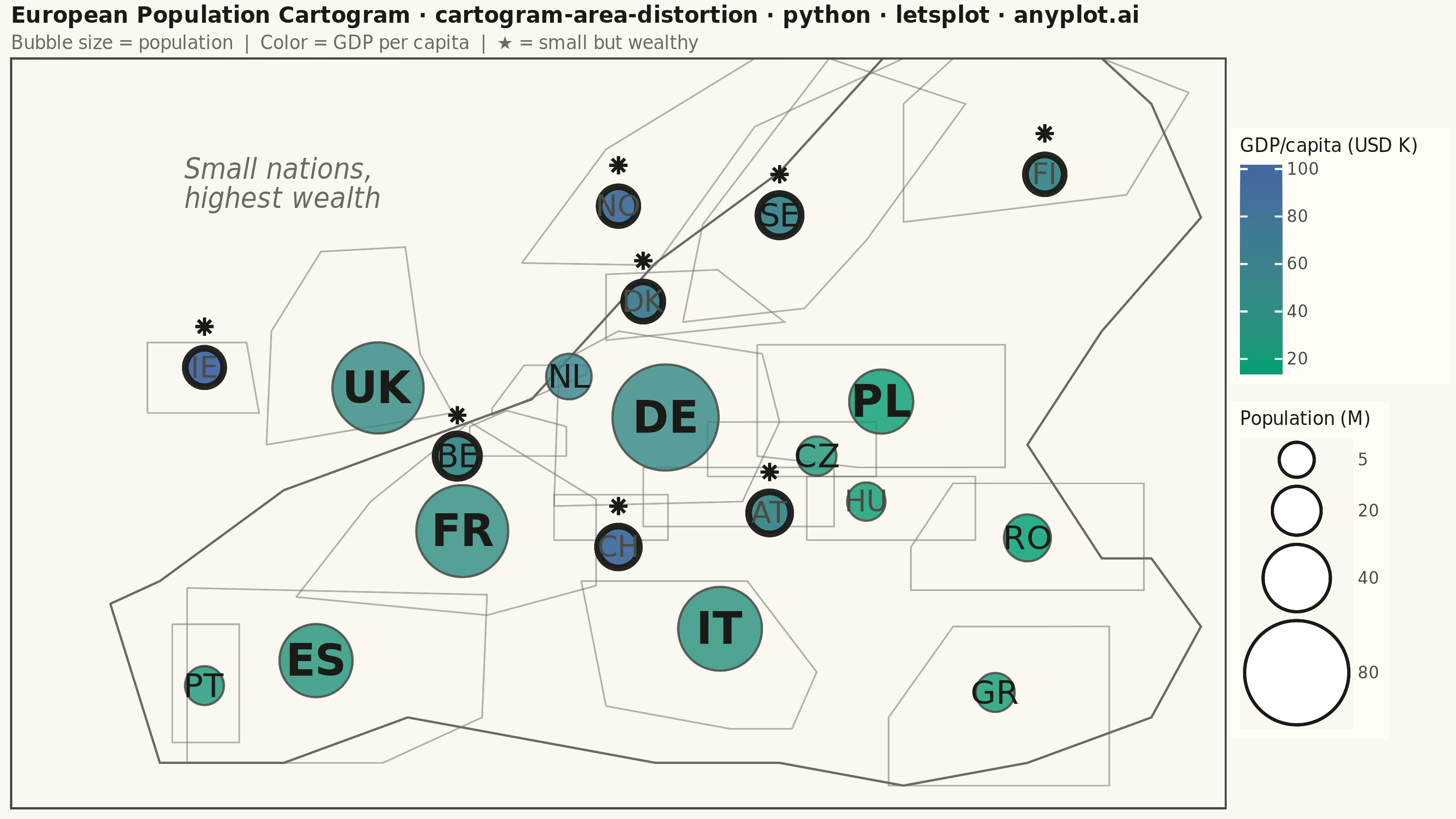
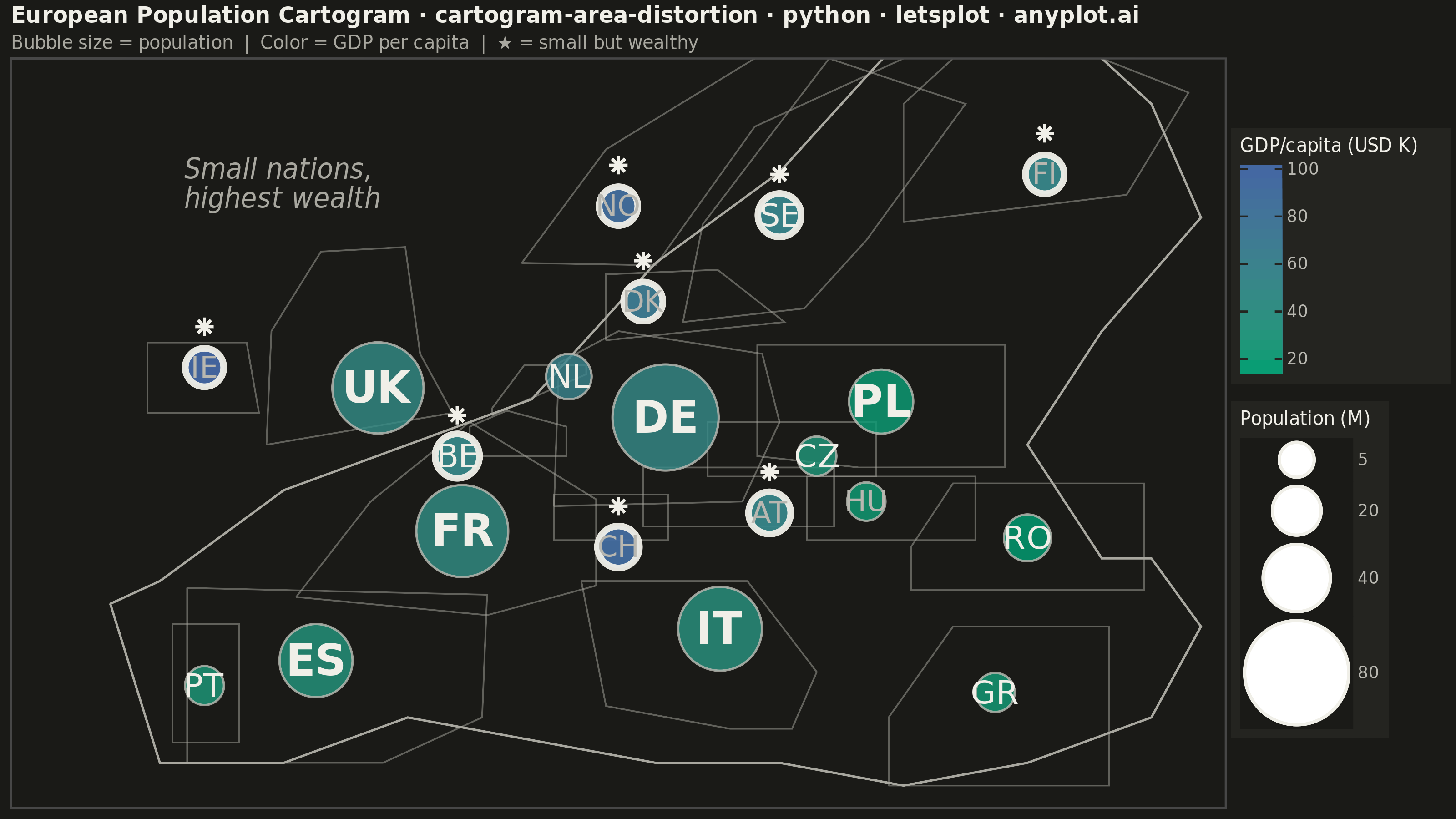
A cartogram distorts geographic regions so that their area becomes proportional to a data variable (e.g., population, GDP, election votes) rather than physical land area. This solves the classic problem of large but sparsely populated areas dominating standard maps, making it easier to compare values across regions at a glance. Contiguous cartograms preserve adjacency and rough shape of regions while rescaling them, famously used in election coverage worldwide.
""" anyplot.ai
cartogram-area-distortion: Cartogram with Area Distortion by Data Value
Library: letsplot 4.10.1 | Python 3.13.13
Quality: 84/100 | Updated: 2026-06-08
"""

import os

import pandas as pd
from lets_plot import (
    LetsPlot,
    aes,
    coord_cartesian,
    element_blank,
    element_rect,
    element_text,
    geom_path,
    geom_point,
    geom_polygon,
    geom_text,
    ggplot,
    ggsize,
    labs,
    layer_tooltips,
    scale_fill_gradient,
    scale_size,
    theme,
    theme_minimal,
)
from lets_plot.export import ggsave


LetsPlot.setup_html()

# Theme tokens — Imprint palette, theme-adaptive chrome
THEME = os.getenv("ANYPLOT_THEME", "light")
PAGE_BG = "#FAF8F1" if THEME == "light" else "#1A1A17"
ELEVATED_BG = "#FFFDF6" if THEME == "light" else "#242420"
INK = "#1A1A17" if THEME == "light" else "#F0EFE8"
INK_SOFT = "#4A4A44" if THEME == "light" else "#B8B7B0"
INK_MUTED = "#6B6A63" if THEME == "light" else "#A8A79F"

# Imprint sequential colormap: brand green (#009E73) → blue (#4467A3)
CMAP_LOW = "#009E73"
CMAP_HIGH = "#4467A3"

# Data: 20 European countries — population (millions) and GDP per capita (thousands USD)
# NL/BE positions spread further apart to reduce label crowding in Central Europe
countries_data = {
    "country": [
        "Germany",
        "France",
        "United Kingdom",
        "Italy",
        "Spain",
        "Poland",
        "Netherlands",
        "Belgium",
        "Sweden",
        "Austria",
        "Switzerland",
        "Norway",
        "Denmark",
        "Finland",
        "Ireland",
        "Portugal",
        "Czech Republic",
        "Greece",
        "Hungary",
        "Romania",
    ],
    "population": [
        83.2,
        67.8,
        67.0,
        59.0,
        47.4,
        37.7,
        17.5,
        11.6,
        10.4,
        9.1,
        8.8,
        5.4,
        5.9,
        5.5,
        5.1,
        10.3,
        10.8,
        10.4,
        9.7,
        19.0,
    ],
    "gdp_per_capita": [
        48.7,
        42.3,
        46.1,
        34.5,
        30.1,
        17.8,
        57.0,
        51.2,
        55.7,
        53.3,
        92.4,
        89.2,
        67.8,
        53.2,
        100.2,
        24.5,
        27.0,
        20.2,
        18.8,
        15.1,
    ],
    # Adjusted centroids: NL moved east, BE moved west/south for visual separation
    "lon": [
        10.4,
        2.2,
        -1.2,
        12.6,
        -3.7,
        19.1,
        6.5,
        2.0,
        15.0,
        14.6,
        8.5,
        8.5,
        9.5,
        25.7,
        -8.2,
        -8.2,
        16.5,
        23.7,
        18.5,
        25.0,
    ],
    "lat": [
        51.2,
        46.2,
        52.5,
        41.9,
        40.5,
        51.9,
        53.0,
        49.5,
        60.1,
        47.0,
        45.5,
        60.5,
        56.3,
        61.9,
        53.4,
        39.4,
        49.5,
        39.1,
        47.5,
        45.9,
    ],
    "abbr": [
        "DE",
        "FR",
        "UK",
        "IT",
        "ES",
        "PL",
        "NL",
        "BE",
        "SE",
        "AT",
        "CH",
        "NO",
        "DK",
        "FI",
        "IE",
        "PT",
        "CZ",
        "GR",
        "HU",
        "RO",
    ],
}
df = pd.DataFrame(countries_data)
df["highlight"] = (df["population"] < 15) & (df["gdp_per_capita"] > 50)

# Stars shifted +1.8° north so they sit above country abbreviation labels
df_stars = df[df["highlight"]].copy()
df_stars["lat"] = df_stars["lat"] + 1.8

# Simplified European coastline polygon for outer geographic boundary
europe_outline = pd.DataFrame(
    {
        "lon": [-12, -10, -5, 0, 5, 10, 15, 20, 25, 30, 32, 30, 28, 25, 28, 32, 30, 25, 20, 15, 10, 5, 0, -5, -10, -12],
        "lat": [43, 36, 36, 38, 37, 36, 36, 35, 36, 38, 42, 45, 45, 50, 55, 60, 65, 70, 68, 62, 58, 52, 50, 48, 44, 43],
        "group": ["outline"] * 26,
    }
)

# Simplified individual country border outlines — closed polygons (last pt = first pt)
# These show each country's approximate geographic footprint alongside its bubble
_borders = {
    "DE": [(5.9, 47.3), (13.5, 47.5), (15.0, 51.0), (14.3, 54.0), (8.5, 55.0), (6.1, 53.6), (5.9, 47.3)],
    "FR": [(-4.5, 43.3), (3.2, 42.5), (7.6, 43.8), (7.6, 47.6), (2.5, 51.0), (-1.5, 47.5), (-4.5, 43.3)],
    "GB": [(-5.7, 50.0), (1.8, 51.4), (0.5, 54.0), (-0.1, 58.7), (-3.5, 58.5), (-5.5, 55.0), (-5.7, 50.0)],
    "IT": [(7.0, 44.0), (13.7, 44.0), (16.5, 40.0), (15.5, 37.5), (13.0, 37.5), (8.0, 38.5), (7.0, 44.0)],
    "ES": [(-8.9, 43.7), (3.2, 43.4), (3.0, 38.0), (-1.0, 36.0), (-8.9, 36.0), (-8.9, 43.7)],
    "PL": [(14.1, 54.4), (24.1, 54.4), (24.1, 49.0), (18.2, 49.0), (14.1, 49.5), (14.1, 54.4)],
    "NL": [(3.4, 51.3), (7.2, 53.1), (7.2, 53.5), (4.7, 53.5), (3.4, 51.6), (3.4, 51.3)],
    "BE": [(2.5, 49.5), (6.4, 49.5), (6.4, 50.8), (4.0, 51.5), (2.5, 50.8), (2.5, 49.5)],
    "SE": [(11.1, 55.4), (16.0, 56.0), (18.5, 59.0), (22.5, 65.0), (17.0, 67.0), (11.9, 59.7), (11.1, 55.4)],
    "AT": [(9.5, 46.4), (17.2, 46.4), (17.2, 49.0), (9.5, 49.0), (9.5, 46.4)],
    "CH": [(5.9, 45.8), (10.5, 45.8), (10.5, 47.8), (5.9, 47.8), (5.9, 45.8)],
    "NO": [(4.6, 58.0), (10.0, 57.9), (14.0, 64.0), (20.0, 67.0), (14.0, 67.0), (8.0, 63.0), (4.6, 58.0)],
    "DK": [(8.0, 54.6), (15.2, 55.4), (12.5, 57.7), (8.0, 57.5), (8.0, 54.6)],
    "FI": [(20.0, 59.8), (29.0, 61.0), (31.5, 65.5), (28.0, 67.0), (22.0, 67.0), (20.0, 65.0), (20.0, 59.8)],
    "IE": [(-10.5, 51.4), (-6.0, 51.4), (-6.5, 54.5), (-10.5, 54.5), (-10.5, 51.4)],
    "PT": [(-9.5, 36.9), (-6.8, 36.9), (-6.8, 42.1), (-9.5, 42.1), (-9.5, 36.9)],
    "CZ": [(12.1, 48.6), (18.9, 48.6), (18.9, 51.0), (12.1, 51.0), (12.1, 48.6)],
    "GR": [(19.4, 35.0), (28.3, 35.0), (28.3, 42.0), (22.0, 42.0), (19.4, 38.0), (19.4, 35.0)],
    "HU": [(16.1, 45.8), (22.9, 45.8), (22.9, 48.6), (16.1, 48.6), (16.1, 45.8)],
    "RO": [(20.3, 43.6), (29.7, 43.6), (29.7, 48.3), (22.0, 48.3), (20.3, 45.5), (20.3, 43.6)],
}
border_rows = []
for abbr, pts in _borders.items():
    for lon_v, lat_v in pts:
        border_rows.append({"group": abbr, "lon": lon_v, "lat": lat_v})
country_borders = pd.DataFrame(border_rows)

# Title with fontsize scaled for total character count (default 16px, floor 11px)
title = "European Population Cartogram · cartogram-area-distortion · python · letsplot · anyplot.ai"
n = len(title)
title_size = max(11, round(16 * 67 / n))

plot = (
    ggplot()
    # Faint European coastline for outer geographic context
    + geom_polygon(
        aes(x="lon", y="lat", group="group"), data=europe_outline, fill=PAGE_BG, color=INK_MUTED, size=0.5, alpha=0.4
    )
    # Individual country border outlines — makes area distortion legible vs actual footprints
    + geom_path(aes(x="lon", y="lat", group="group"), data=country_borders, color=INK_MUTED, size=0.35, alpha=0.5)
    # Non-highlighted countries: bubble area ∝ population, fill color = GDP per capita
    + geom_point(
        aes(x="lon", y="lat", size="population", fill="gdp_per_capita"),
        data=df[~df["highlight"]],
        shape=21,
        color=INK_SOFT,
        stroke=0.5,
        alpha=0.82,
        tooltips=layer_tooltips()
        .title("@country")
        .line("Population|@population M")
        .line("GDP/capita|$@gdp_per_capita K"),
    )
    # Highlighted small-but-wealthy nations — bold border for storytelling emphasis
    + geom_point(
        aes(x="lon", y="lat", size="population", fill="gdp_per_capita"),
        data=df[df["highlight"]],
        shape=21,
        color=INK,
        stroke=1.6,
        alpha=0.95,
        tooltips=layer_tooltips()
        .title("@country")
        .line("Population|@population M")
        .line("GDP/capita|$@gdp_per_capita K"),
    )
    # Stars nudged +1.8° north so they sit above abbreviation labels, not on top of them
    + geom_point(aes(x="lon", y="lat"), data=df_stars, shape=8, size=3.0, color=INK)
    + scale_size(range=[8, 26], name="Population (M)", breaks=[5, 20, 40, 80])
    + scale_fill_gradient(low=CMAP_LOW, high=CMAP_HIGH, name="GDP/capita (USD K)")
    # Three-tier label hierarchy: large bold, medium, small — all inside bubbles
    + geom_text(
        aes(x="lon", y="lat", label="abbr"), data=df[df["population"] > 30], size=12, color=INK, fontface="bold"
    )
    + geom_text(
        aes(x="lon", y="lat", label="abbr"),
        data=df[(df["population"] > 10) & (df["population"] <= 30)],
        size=9,
        color=INK,
    )
    + geom_text(aes(x="lon", y="lat", label="abbr"), data=df[df["population"] <= 10], size=8, color=INK_SOFT)
    # Annotation near Atlantic/Nordic highlighted cluster (IE/NO/DK area)
    + geom_text(
        aes(x="x", y="y"),
        data=pd.DataFrame({"x": [-9.0], "y": [61.5]}),
        label="Small nations,\nhighest wealth",
        size=8,
        color=INK_MUTED,
        fontface="italic",
        hjust=0,
    )
    + labs(title=title, subtitle="Bubble size = population  |  Color = GDP per capita  |  ★ = small but wealthy")
    + coord_cartesian(xlim=[-16, 33], ylim=[34, 67])
    + ggsize(800, 450)
    + theme_minimal()
    + theme(
        plot_title=element_text(size=title_size, face="bold", color=INK),
        plot_subtitle=element_text(size=10, color=INK_MUTED),
        legend_title=element_text(size=10, color=INK),
        legend_text=element_text(size=9, color=INK_SOFT),
        legend_background=element_rect(fill=ELEVATED_BG, color=INK_SOFT),
        axis_title=element_blank(),
        axis_text=element_blank(),
        axis_ticks=element_blank(),
        panel_grid=element_blank(),
        plot_background=element_rect(fill=PAGE_BG, color=PAGE_BG),
        panel_background=element_rect(fill=PAGE_BG),
    )
)

# Save PNG (3200×1800 px via scale=4) and interactive HTML
ggsave(plot, f"plot-{THEME}.png", path=".", scale=4)
ggsave(plot, f"plot-{THEME}.html", path=".")
Runnable source as JSON, for any HTTP client: https://api.anyplot.ai/specs/cartogram-area-distortion/letsplot/code. Any spec id and library id listed in llms-full.txt fit the same URL shape; every URL below is complete and callable.
{
  "spec_id": "cartogram-area-distortion",
  "language": "python",
  "library": "letsplot",
  "page": "https://anyplot.ai/cartogram-area-distortion/python/letsplot",
  "hub": "https://anyplot.ai/cartogram-area-distortion",
  "code_json": "https://api.anyplot.ai/specs/cartogram-area-distortion/letsplot/code",
  "spec_json": "https://api.anyplot.ai/specs/cartogram-area-distortion",
  "render_light_png": "https://storage.googleapis.com/anyplot-images/plots/cartogram-area-distortion/python/letsplot/plot-light.png",
  "render_dark_png": "https://storage.googleapis.com/anyplot-images/plots/cartogram-area-distortion/python/letsplot/plot-dark.png",
  "interactive_light_html": "https://storage.googleapis.com/anyplot-images/plots/cartogram-area-distortion/python/letsplot/plot-light.html",
  "interactive_dark_html": "https://storage.googleapis.com/anyplot-images/plots/cartogram-area-distortion/python/letsplot/plot-dark.html",
  "quality_score": 84.0,
  "license": "MIT",
  "guide": "https://anyplot.ai/llms.txt"
}
Part of Cartogram with Area Distortion by Data Value on anyplot.ai.