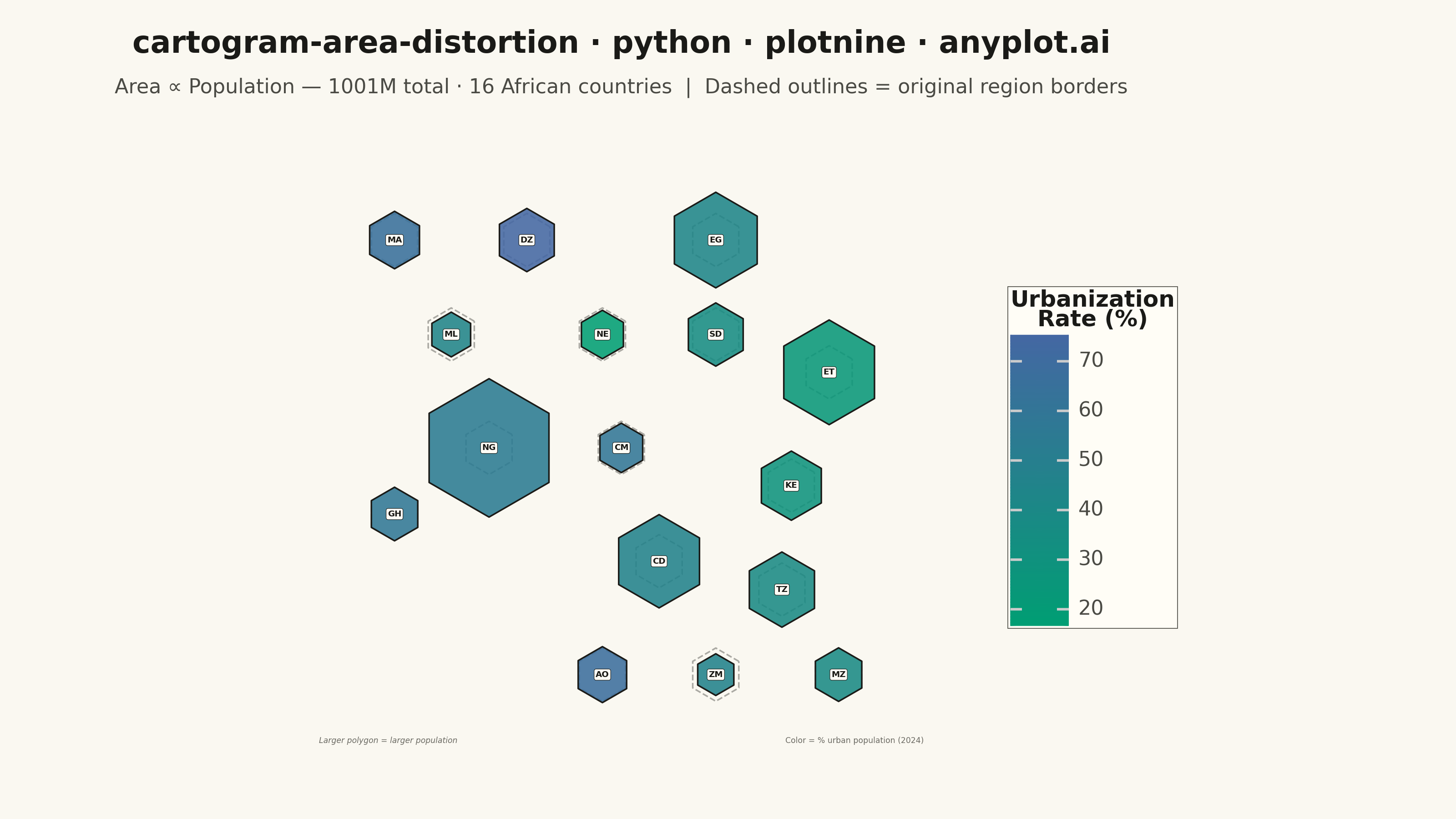
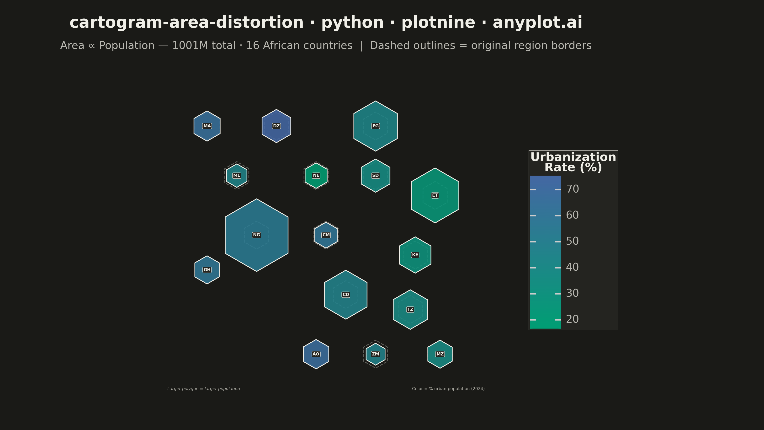
A cartogram distorts geographic regions so that their area becomes proportional to a data variable (e.g., population, GDP, election votes) rather than physical land area. This solves the classic problem of large but sparsely populated areas dominating standard maps, making it easier to compare values across regions at a glance. Contiguous cartograms preserve adjacency and rough shape of regions while rescaling them, famously used in election coverage worldwide.
""" anyplot.ai
cartogram-area-distortion: Cartogram with Area Distortion by Data Value
Library: plotnine 0.15.5 | Python 3.13.13
Quality: 82/100 | Updated: 2026-06-08
"""

import os
import sys


# Work around naming conflict between this file (plotnine.py) and the plotnine package
_script_dir = os.path.dirname(os.path.abspath(__file__))
for _p in (_script_dir, "", "."):
    if _p in sys.path:
        sys.path.remove(_p)

import numpy as np
import pandas as pd
from plotnine import (
    aes,
    annotate,
    coord_fixed,
    element_blank,
    element_rect,
    element_text,
    geom_label,
    geom_path,
    geom_polygon,
    ggplot,
    guide_colorbar,
    labs,
    scale_fill_gradient,
    theme,
)


THEME = os.getenv("ANYPLOT_THEME", "light")
PAGE_BG = "#FAF8F1" if THEME == "light" else "#1A1A17"
ELEVATED_BG = "#FFFDF6" if THEME == "light" else "#242420"
INK = "#1A1A17" if THEME == "light" else "#F0EFE8"
INK_SOFT = "#4A4A44" if THEME == "light" else "#B8B7B0"
INK_MUTED = "#6B6A63" if THEME == "light" else "#A8A79F"

# African countries: (name, abbrev, centroid_x, centroid_y, population_M, urbanization_pct)
# Schematic grid positions preserving rough geographic adjacency; area ∝ population
COUNTRIES = [
    ("Morocco", "MA", -3.0, 10.0, 38.0, 65),
    ("Algeria", "DZ", 4.0, 10.0, 46.0, 75),
    ("Egypt", "EG", 14.0, 10.0, 105.0, 43),
    ("Mali", "ML", 0.0, 5.0, 23.0, 44),
    ("Niger", "NE", 8.0, 5.0, 27.0, 17),
    ("Sudan", "SD", 14.0, 5.0, 46.0, 36),
    ("Ethiopia", "ET", 20.0, 3.0, 126.0, 24),
    ("Nigeria", "NG", 2.0, -1.0, 220.0, 54),
    ("Ghana", "GH", -3.0, -4.5, 33.0, 58),
    ("Cameroon", "CM", 9.0, -1.0, 28.0, 59),
    ("Kenya", "KE", 18.0, -3.0, 55.0, 29),
    ("DR Congo", "CD", 11.0, -7.0, 100.0, 46),
    ("Tanzania", "TZ", 17.5, -8.5, 65.0, 38),
    ("Angola", "AO", 8.0, -13.0, 36.0, 68),
    ("Zambia", "ZM", 14.0, -13.0, 20.0, 46),
    ("Mozambique", "MZ", 20.5, -13.0, 33.0, 38),
]

populations = [c[4] for c in COUNTRIES]
median_pop = float(np.median(populations))
total_pop = sum(populations)
BASE_R = 1.6  # base hexagon radius in data units


def hex_poly(cx, cy, r, rotation=np.pi / 6):
    """Return closed hexagon vertices as list of (x, y)."""
    angles = np.linspace(0, 2 * np.pi, 6, endpoint=False) + rotation
    xs = cx + r * np.cos(angles)
    ys = cy + r * np.sin(angles)
    return list(zip(np.append(xs, xs[0]), np.append(ys, ys[0]), strict=False))


# Reference outlines — fixed size for all countries (shows original territory extent)
ref_rows = []
for name, _abbrev, cx, cy, _pop, _urb in COUNTRIES:
    for i, (x, y) in enumerate(hex_poly(cx, cy, BASE_R * 0.88)):
        ref_rows.append({"country": name, "x": x, "y": y, "order": i})
df_ref = pd.DataFrame(ref_rows)

# Cartogram polygons: radius scales with sqrt(population / median_population)
poly_rows, cent_rows = [], []
for name, abbrev, cx, cy, pop, urb in COUNTRIES:
    r = min(BASE_R * np.sqrt(pop / median_pop), BASE_R * 2.65)
    for i, (x, y) in enumerate(hex_poly(cx, cy, r)):
        poly_rows.append({"country": name, "x": x, "y": y, "order": i, "urb": urb, "pop": pop})
    cent_rows.append({"country": name, "abbrev": abbrev, "x": cx, "y": cy, "urb": urb, "pop": pop})

df_poly = pd.DataFrame(poly_rows)
df_cent = pd.DataFrame(cent_rows)

total_str = f"{total_pop:.0f}M total · {len(COUNTRIES)} African countries"

plot = (
    ggplot()
    # Dashed reference outlines — original territory borders
    + geom_path(df_ref, aes(x="x", y="y", group="country"), color=INK_SOFT, size=0.35, linetype="dashed", alpha=0.45)
    # Cartogram polygons filled by urbanization rate (Imprint sequential: green=rural → blue=urban)
    + geom_polygon(df_poly, aes(x="x", y="y", group="country", fill="urb"), color=INK, size=0.35, alpha=0.88)
    # Imprint sequential colormap — single-polarity continuous data
    + scale_fill_gradient(low="#009E73", high="#4467A3", name="Urbanization\nRate (%)", guide=guide_colorbar(nbin=100))
    # Country abbreviation labels
    + geom_label(
        df_cent,
        aes(x="x", y="y", label="abbrev"),
        color=INK,
        fill=ELEVATED_BG,
        size=3.3,
        fontweight="bold",
        label_padding=0.18,
        label_size=0.2,
    )
    + coord_fixed(ratio=1.0, xlim=(-7.5, 25.5), ylim=(-17.5, 14.5))
    + labs(
        title="cartogram-area-distortion · python · plotnine · anyplot.ai",
        subtitle=f"Area ∝ Population — {total_str}  |  Dashed outlines = original region borders",
    )
    + annotate(
        "text",
        x=-7.0,
        y=-16.5,
        label="Larger polygon = larger population",
        size=3.1,
        color=INK_MUTED,
        fontstyle="italic",
        ha="left",
    )
    + annotate(
        "text", x=25.0, y=-16.5, label="Color = % urban population (2024)", size=3.1, color=INK_MUTED, ha="right"
    )
    + theme(
        figure_size=(8, 4.5),
        plot_background=element_rect(fill=PAGE_BG, color=PAGE_BG),
        panel_background=element_rect(fill=PAGE_BG),
        plot_title=element_text(size=12, ha="center", weight="bold", color=INK, margin={"b": 4}),
        plot_subtitle=element_text(size=8, ha="center", color=INK_SOFT, margin={"b": 6}),
        legend_title=element_text(size=9, weight="bold", color=INK),
        legend_text=element_text(size=8, color=INK_SOFT),
        legend_position="right",
        legend_background=element_rect(fill=ELEVATED_BG, color=INK_SOFT, size=0.3),
        axis_text=element_blank(),
        axis_title=element_blank(),
        axis_ticks=element_blank(),
        panel_grid_major=element_blank(),
        panel_grid_minor=element_blank(),
        panel_border=element_blank(),
        plot_margin=0.02,
    )
)

plot.save(f"plot-{THEME}.png", dpi=400, width=8, height=4.5, units="in", verbose=False)
Runnable source as JSON, for any HTTP client: https://api.anyplot.ai/specs/cartogram-area-distortion/plotnine/code. Any spec id and library id listed in llms-full.txt fit the same URL shape; every URL below is complete and callable.
{
  "spec_id": "cartogram-area-distortion",
  "language": "python",
  "library": "plotnine",
  "page": "https://anyplot.ai/cartogram-area-distortion/python/plotnine",
  "hub": "https://anyplot.ai/cartogram-area-distortion",
  "code_json": "https://api.anyplot.ai/specs/cartogram-area-distortion/plotnine/code",
  "spec_json": "https://api.anyplot.ai/specs/cartogram-area-distortion",
  "render_light_png": "https://storage.googleapis.com/anyplot-images/plots/cartogram-area-distortion/python/plotnine/plot-light.png",
  "render_dark_png": "https://storage.googleapis.com/anyplot-images/plots/cartogram-area-distortion/python/plotnine/plot-dark.png",
  "quality_score": 82.0,
  "license": "MIT",
  "guide": "https://anyplot.ai/llms.txt"
}
Part of Cartogram with Area Distortion by Data Value on anyplot.ai.