The same plot in 14 other libraries — JavaScript: Chart.js, D3.js, Apache ECharts, Highcharts; Python: Altair, Bokeh, lets-plot, Matplotlib, Plotly, plotnine, Pygal, Seaborn; R: ggplot2; Julia: Makie.jl. Compare all 15 side by side: Cartogram with Area Distortion by Data Value in Python, R, Julia and JavaScript.
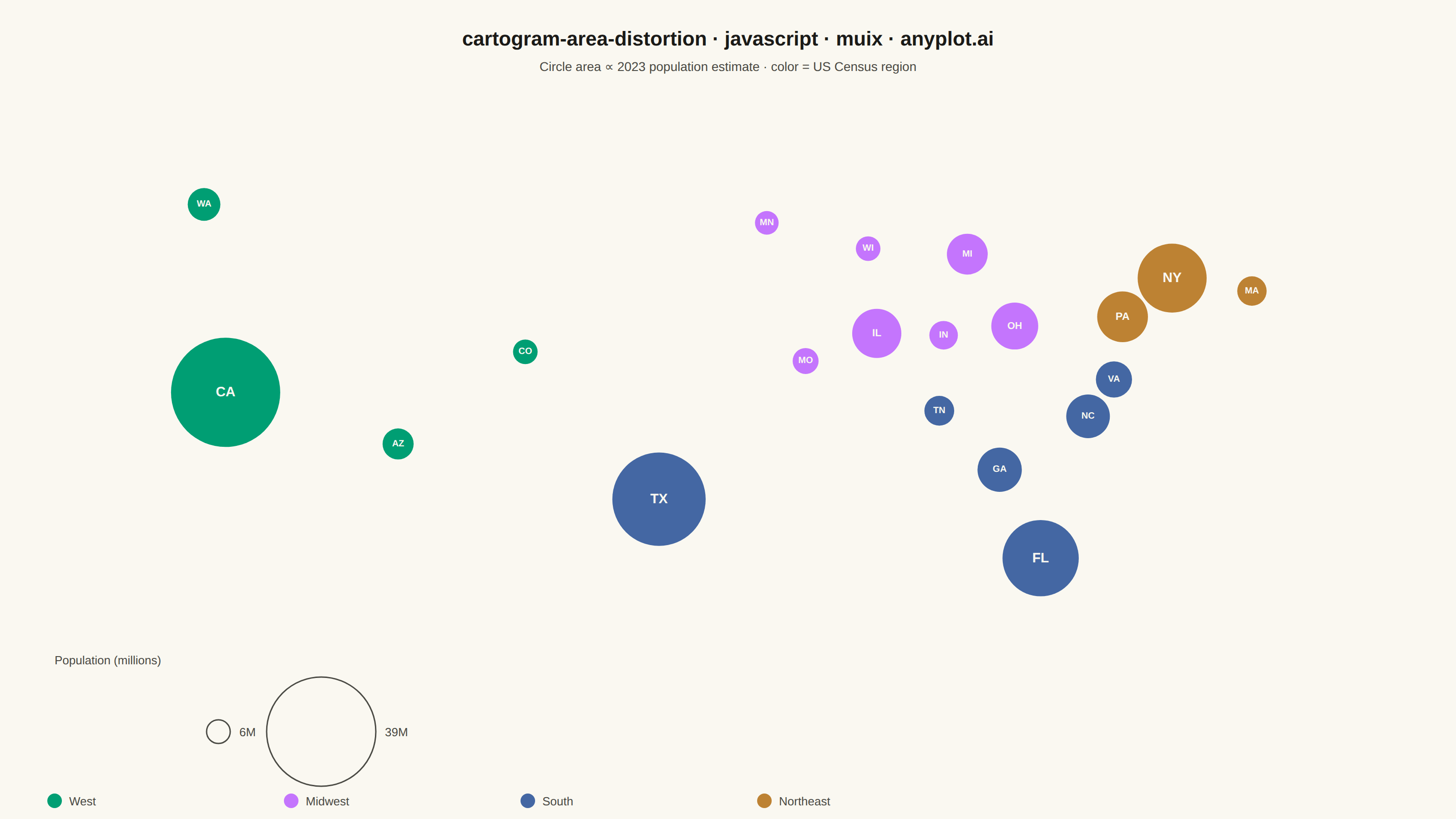
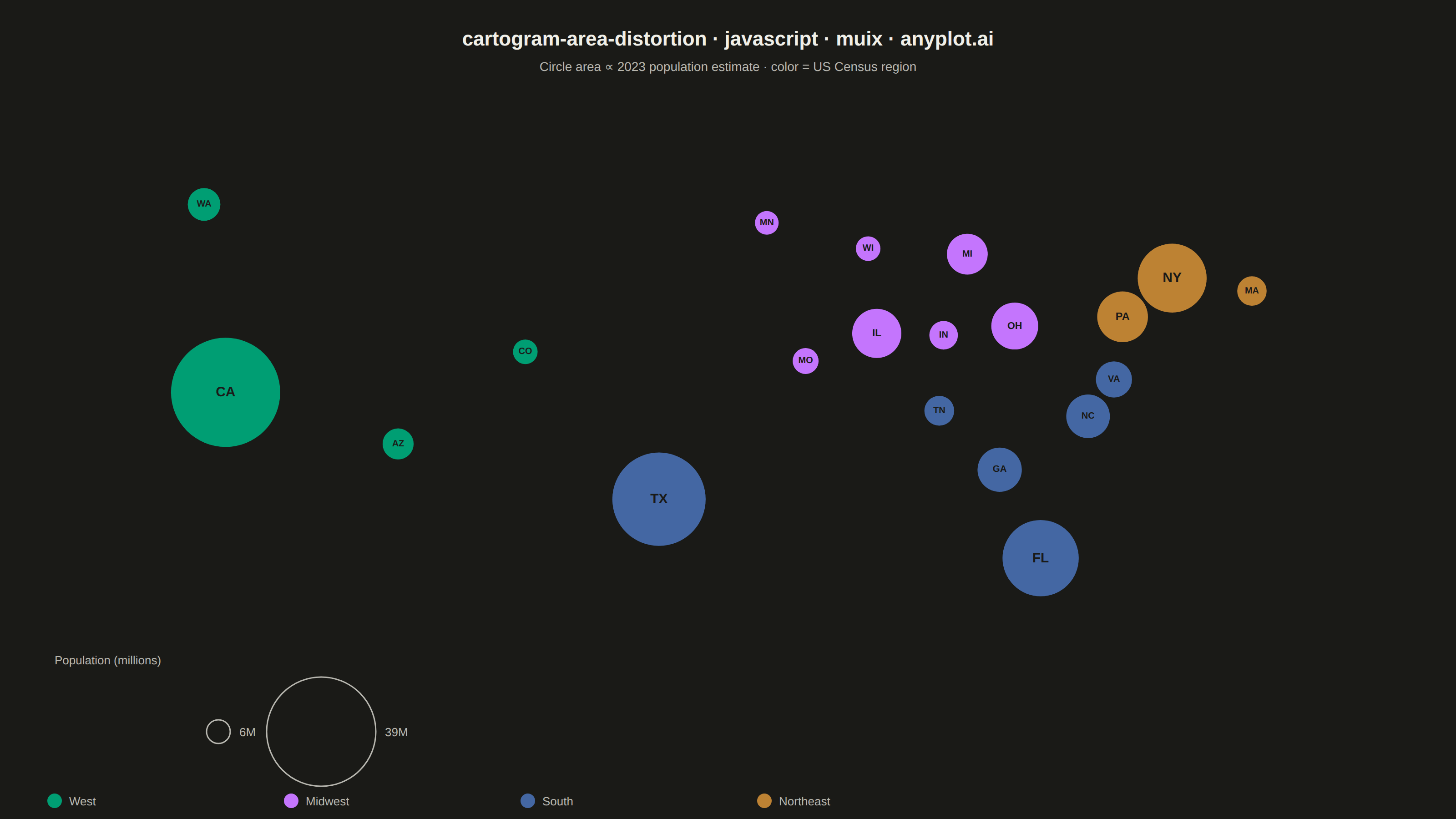
A cartogram distorts geographic regions so that their area becomes proportional to a data variable (e.g., population, GDP, election votes) rather than physical land area. This solves the classic problem of large but sparsely populated areas dominating standard maps, making it easier to compare values across regions at a glance. Contiguous cartograms preserve adjacency and rough shape of regions while rescaling them, famously used in election coverage worldwide.
// anyplot.ai
// cartogram-area-distortion: Cartogram with Area Distortion by Data Value
// Library: muix 7.29.1 | JavaScript 22.23.2
// Quality: 86/100 | Created: 2026-08-20
import { ScatterChart } from "@mui/x-charts/ScatterChart";
import { useXScale, useYScale } from "@mui/x-charts/hooks";

const t = window.ANYPLOT_TOKENS;

// --- Data: 2023 US Census population estimates (millions), plotted at each
// state's approximate geographic centroid (longitude/latitude). The community
// @mui/x-charts surface has no polygon/map primitive to distort real state
// boundaries, so this follows the Dorling-cartogram convention instead: a
// circle's area (not the true land shape) carries the data value, while
// positions preserve each state's relative geography and neighbors. ---------
const REGIONS = ["West", "Midwest", "South", "Northeast"];

const states = [
  { name: "California", abbr: "CA", lon: -119.4, lat: 36.8, population: 38.9, region: "West" },
  { name: "Texas", abbr: "TX", lon: -99.3, lat: 31.0, population: 30.5, region: "South" },
  { name: "Florida", abbr: "FL", lon: -81.6, lat: 27.8, population: 22.6, region: "South" },
  { name: "New York", abbr: "NY", lon: -75.5, lat: 43.0, population: 19.6, region: "Northeast" },
  { name: "Pennsylvania", abbr: "PA", lon: -77.8, lat: 40.9, population: 13.0, region: "Northeast" },
  { name: "Illinois", abbr: "IL", lon: -89.2, lat: 40.0, population: 12.5, region: "Midwest" },
  { name: "Ohio", abbr: "OH", lon: -82.8, lat: 40.4, population: 11.8, region: "Midwest" },
  { name: "Georgia", abbr: "GA", lon: -83.5, lat: 32.6, population: 11.0, region: "South" },
  { name: "North Carolina", abbr: "NC", lon: -79.4, lat: 35.5, population: 10.8, region: "South" },
  { name: "Michigan", abbr: "MI", lon: -85.0, lat: 44.3, population: 10.0, region: "Midwest" },
  { name: "Virginia", abbr: "VA", lon: -78.2, lat: 37.5, population: 8.7, region: "South" },
  { name: "Washington", abbr: "WA", lon: -120.4, lat: 47.0, population: 7.8, region: "West" },
  { name: "Arizona", abbr: "AZ", lon: -111.4, lat: 34.0, population: 7.4, region: "West" },
  { name: "Tennessee", abbr: "TN", lon: -86.3, lat: 35.8, population: 7.1, region: "South" },
  { name: "Massachusetts", abbr: "MA", lon: -71.8, lat: 42.3, population: 7.0, region: "Northeast" },
  { name: "Indiana", abbr: "IN", lon: -86.1, lat: 39.9, population: 6.8, region: "Midwest" },
  { name: "Missouri", abbr: "MO", lon: -92.5, lat: 38.5, population: 6.2, region: "Midwest" },
  { name: "Wisconsin", abbr: "WI", lon: -89.6, lat: 44.6, population: 5.9, region: "Midwest" },
  { name: "Colorado", abbr: "CO", lon: -105.5, lat: 39.0, population: 5.9, region: "West" },
  { name: "Minnesota", abbr: "MN", lon: -94.3, lat: 46.0, population: 5.7, region: "Midwest" },
];

// --- Radius scale: circle area (πr²), not radius, is proportional to
// population — the defining rule of an area-distortion cartogram. -----------
const MIN_RADIUS = 13;
const MAX_RADIUS = 60;
const populations = states.map((s) => s.population);
const minPop = Math.min(...populations);
const maxPop = Math.max(...populations);
const sqrtMin = Math.sqrt(minPop);
const sqrtMax = Math.sqrt(maxPop);
const radiusFor = (population) =>
  MIN_RADIUS + ((MAX_RADIUS - MIN_RADIUS) * (Math.sqrt(population) - sqrtMin)) / (sqrtMax - sqrtMin);

// Secondary encoding: US Census region, from the Imprint categorical palette.
const regionColor = (region) => t.palette[REGIONS.indexOf(region)];

// --- Geographic domain, padded so even the largest circles stay in frame ---
const lons = states.map((s) => s.lon);
const lats = states.map((s) => s.lat);
const lonRange = Math.max(...lons) - Math.min(...lons);
const latRange = Math.max(...lats) - Math.min(...lats);
const xDomain = [Math.min(...lons) - lonRange * 0.16, Math.max(...lons) + lonRange * 0.16];
const yDomain = [Math.min(...lats) - latRange * 0.3, Math.max(...lats) + latRange * 0.3];

// One series per state (MUI X community scatter sizes markers per-series, not
// per-point) — largest population first, so smaller circles draw on top and
// stay visible instead of being covered by their bigger neighbors.
const series = [...states]
  .sort((a, b) => b.population - a.population)
  .map((s) => ({
    id: s.abbr,
    label: `${s.name} (${s.region})`,
    data: [{ x: s.lon, y: s.lat, id: s.abbr }],
    markerSize: radiusFor(s.population),
    color: regionColor(s.region),
    valueFormatter: () => `${s.name}: ${s.population.toFixed(1)}M residents`,
  }));

const title = "cartogram-area-distortion · javascript · muix · anyplot.ai";
const titleFontSize = Math.max(16, Math.round(22 * Math.min(1, 67 / title.length)));

// State abbreviations, positioned in data space via the chart's own scales.
function StateLabels() {
  const xScale = useXScale();
  const yScale = useYScale();
  return (
    <g>
      {states.map((s) => {
        const r = radiusFor(s.population);
        const fontSize = Math.max(10, Math.min(15, r * 0.42));
        return (
          <text
            key={s.abbr}
            x={xScale(s.lon)}
            y={yScale(s.lat)}
            textAnchor="middle"
            dominantBaseline="central"
            fontSize={fontSize}
            fontWeight={600}
            fill={t.pageBg}
          >
            {s.abbr}
          </text>
        );
      })}
    </g>
  );
}

// --- Chart (default-exported component — the harness mounts it) -----------
export default function Chart() {
  const { width, height } = window.ANYPLOT_SIZE;
  const sizeLegendCy = height - 96;
  const colorLegendY = height - 20;
  const minR = radiusFor(minPop);
  const maxR = radiusFor(maxPop);
  const maxCx = 240 + minR + 40 + maxR;

  return (
    <ScatterChart
      width={width}
      height={height}
      series={series}
      margin={{ top: 108, right: 40, bottom: 170, left: 40 }}
      xAxis={[
        {
          scaleType: "linear",
          min: xDomain[0],
          max: xDomain[1],
          disableLine: true,
          disableTicks: true,
          valueFormatter: () => "",
        },
      ]}
      yAxis={[
        {
          scaleType: "linear",
          min: yDomain[0],
          max: yDomain[1],
          disableLine: true,
          disableTicks: true,
          valueFormatter: () => "",
        },
      ]}
      legend={{ hidden: true }}
      skipAnimation
    >
      <StateLabels />
      <text x={width / 2} y={50} textAnchor="middle" fontSize={titleFontSize} fontWeight={600} fill={t.ink}>
        {title}
      </text>
      <text x={width / 2} y={78} textAnchor="middle" fontSize={14} fill={t.inkSoft}>
        Circle area ∝ 2023 population estimate · color = US Census region
      </text>

      {/* Size legend: two reference circles anchor the area-to-population scale */}
      <text x={60} y={sizeLegendCy - MAX_RADIUS - 14} fontSize={13} fill={t.inkSoft}>
        Population (millions)
      </text>
      <circle cx={240} cy={sizeLegendCy} r={minR} fill="none" stroke={t.inkSoft} strokeWidth={1.5} />
      <text x={240 + minR + 10} y={sizeLegendCy + 5} fontSize={13} fill={t.inkSoft}>
        {Math.round(minPop)}M
      </text>
      <circle cx={maxCx} cy={sizeLegendCy} r={maxR} fill="none" stroke={t.inkSoft} strokeWidth={1.5} />
      <text x={maxCx + maxR + 10} y={sizeLegendCy + 5} fontSize={13} fill={t.inkSoft}>
        {Math.round(maxPop)}M
      </text>

      {/* Color legend: one swatch per US Census region */}
      {REGIONS.map((region, i) => (
        <g key={region}>
          <circle cx={60 + i * 260} cy={colorLegendY} r={8} fill={t.palette[i]} />
          <text x={60 + i * 260 + 16} y={colorLegendY + 5} fontSize={13} fill={t.inkSoft}>
            {region}
          </text>
        </g>
      ))}
    </ScatterChart>
  );
}
Runnable source as JSON, for any HTTP client: https://api.anyplot.ai/specs/cartogram-area-distortion/muix/code. Any spec id and library id listed in llms-full.txt fit the same URL shape; every URL below is complete and callable.
{
  "spec_id": "cartogram-area-distortion",
  "language": "javascript",
  "library": "muix",
  "page": "https://anyplot.ai/cartogram-area-distortion/javascript/muix",
  "hub": "https://anyplot.ai/cartogram-area-distortion",
  "code_json": "https://api.anyplot.ai/specs/cartogram-area-distortion/muix/code",
  "spec_json": "https://api.anyplot.ai/specs/cartogram-area-distortion",
  "render_light_png": "https://storage.googleapis.com/anyplot-images/plots/cartogram-area-distortion/javascript/muix/plot-light.png",
  "render_dark_png": "https://storage.googleapis.com/anyplot-images/plots/cartogram-area-distortion/javascript/muix/plot-dark.png",
  "interactive_light_html": "https://storage.googleapis.com/anyplot-images/plots/cartogram-area-distortion/javascript/muix/plot-light.html",
  "interactive_dark_html": "https://storage.googleapis.com/anyplot-images/plots/cartogram-area-distortion/javascript/muix/plot-dark.html",
  "quality_score": 86.0,
  "license": "MIT",
  "guide": "https://anyplot.ai/llms.txt"
}
Part of Cartogram with Area Distortion by Data Value on anyplot.ai.