The same plot in 14 other libraries — Python: Altair, Bokeh, lets-plot, Matplotlib, Plotly, plotnine, Pygal, Seaborn; Julia: Makie.jl; JavaScript: Chart.js, D3.js, Apache ECharts, Highcharts, MUI X Charts. Compare all 15 side by side: Cartogram with Area Distortion by Data Value in Python, R, Julia and JavaScript.
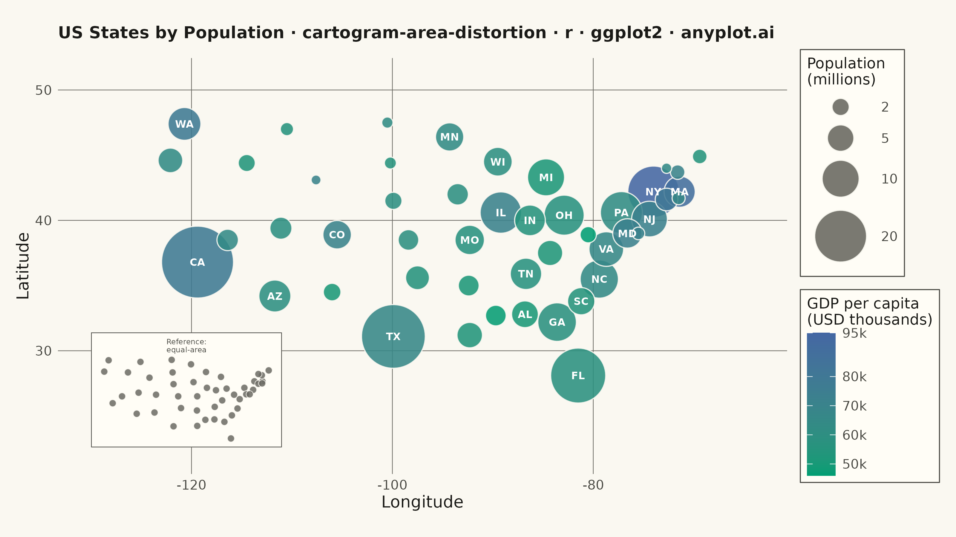
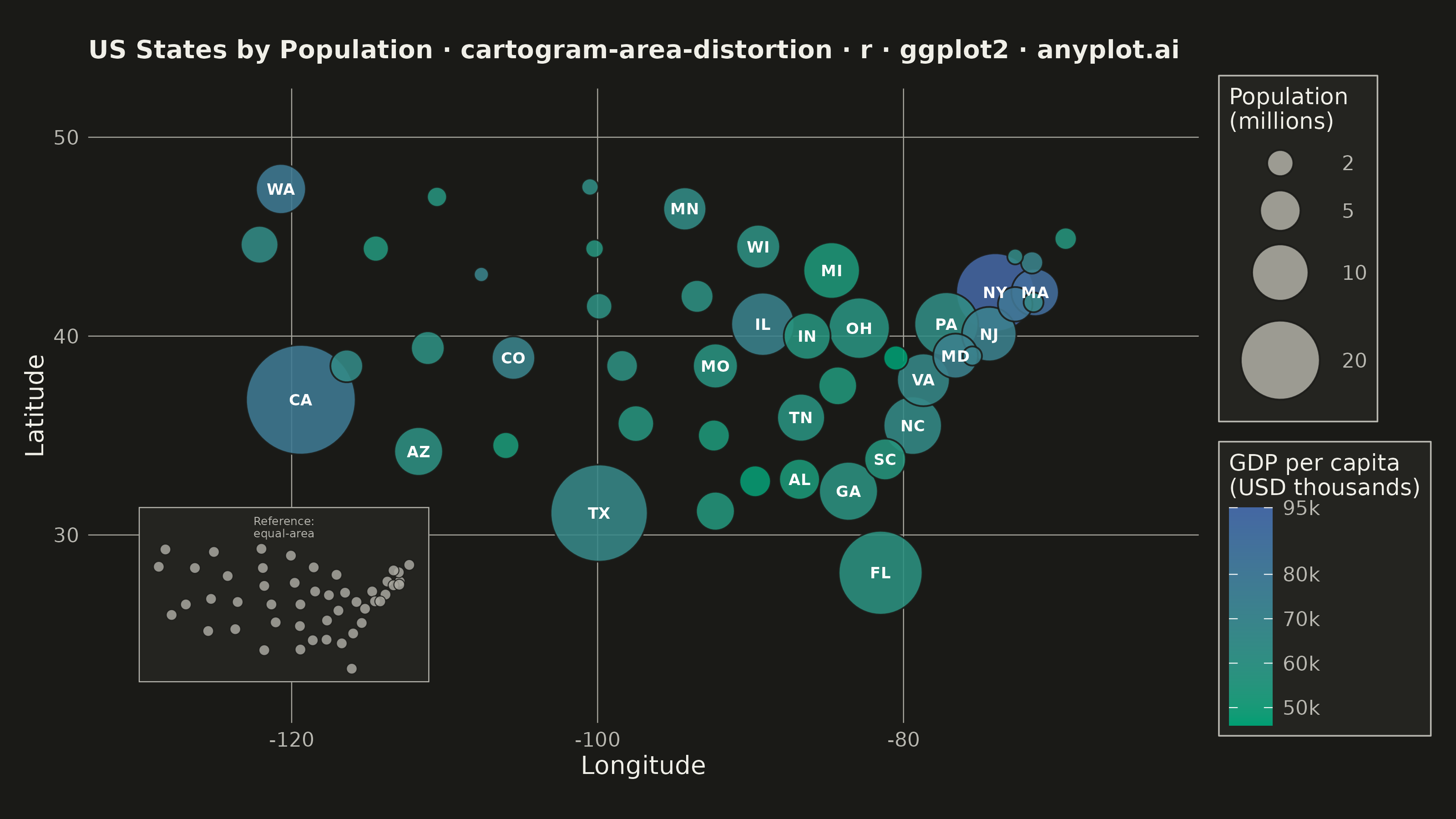
A cartogram distorts geographic regions so that their area becomes proportional to a data variable (e.g., population, GDP, election votes) rather than physical land area. This solves the classic problem of large but sparsely populated areas dominating standard maps, making it easier to compare values across regions at a glance. Contiguous cartograms preserve adjacency and rough shape of regions while rescaling them, famously used in election coverage worldwide.
#' anyplot.ai
#' cartogram-area-distortion: Cartogram with Area Distortion by Data Value
#' Library: ggplot2 3.5.1 | R 4.4.1
#' Quality: 82/100 | Created: 2026-06-08

library(ggplot2)
library(dplyr)
library(scales)
library(ragg)

set.seed(42)

# Theme tokens (Imprint palette)
THEME       <- Sys.getenv("ANYPLOT_THEME", "light")
PAGE_BG     <- if (THEME == "light") "#FAF8F1" else "#1A1A17"
ELEVATED_BG <- if (THEME == "light") "#FFFDF6" else "#242420"
INK         <- if (THEME == "light") "#1A1A17" else "#F0EFE8"
INK_SOFT    <- if (THEME == "light") "#4A4A44" else "#B8B7B0"
INK_MUTED   <- if (THEME == "light") "#6B6A63" else "#A8A79F"

# Imprint sequential colormap: brand green -> blue
SEQ_LOW  <- "#009E73"  # Imprint position 1
SEQ_HIGH <- "#4467A3"  # Imprint position 3

# 48 contiguous US states — approximate centroids + 2023 population (millions)
# and approximate GDP per capita in USD thousands (~2022)
states <- tibble::tibble(
  abbr = c(
    "CA", "TX", "FL", "NY", "PA", "IL", "OH", "GA", "NC", "MI",
    "NJ", "VA", "WA", "AZ", "TN", "MA", "IN", "MO", "MD", "WI",
    "CO", "MN", "SC", "AL", "LA", "KY", "OR", "OK", "CT", "UT",
    "IA", "NV", "AR", "MS", "KS", "NM", "NE", "ID", "WV", "ME",
    "NH", "MT", "RI", "DE", "SD", "ND", "VT", "WY"
  ),
  lon = c(
    -119.4,  -99.9,  -81.5,  -74.0,  -77.2,  -89.2,  -82.9,  -83.6,  -79.4,  -84.7,
     -74.4,  -78.7, -120.7, -111.7,  -86.7,  -71.4,  -86.3,  -92.3,  -76.6,  -89.5,
    -105.5,  -94.3,  -81.2,  -86.8,  -92.3,  -84.3, -122.1,  -97.5,  -72.7, -111.1,
     -93.5, -116.4,  -92.4,  -89.7,  -98.4, -106.0,  -99.9, -114.5,  -80.5,  -69.4,
     -71.6, -110.5,  -71.5,  -75.5, -100.2, -100.5,  -72.7, -107.6
  ),
  lat = c(
    36.8, 31.1, 28.1, 42.2, 40.6, 40.6, 40.4, 32.2, 35.5, 43.3,
    40.1, 37.8, 47.4, 34.2, 35.9, 42.2, 40.0, 38.5, 39.0, 44.5,
    38.9, 46.4, 33.8, 32.8, 31.2, 37.5, 44.6, 35.6, 41.6, 39.4,
    42.0, 38.5, 35.0, 32.7, 38.5, 34.5, 41.5, 44.4, 38.9, 44.9,
    43.7, 47.0, 41.7, 39.0, 44.4, 47.5, 44.0, 43.1
  ),
  population = c(
    39.0, 30.5, 22.6, 19.6, 12.96, 12.6, 11.8, 10.9, 10.7, 10.0,
     9.3,  8.7,  7.8,  7.4,  7.1,  7.0,  6.8,  6.2,  6.2,  5.9,
     5.8,  5.7,  5.3,  5.1,  4.6,  4.5,  4.3,  4.0,  3.6,  3.4,
     3.2,  3.2,  3.0,  2.96, 2.94,  2.1,  2.0,  1.96, 1.78, 1.40,
     1.39, 1.12, 1.10, 1.02, 0.91, 0.78, 0.65, 0.58
  ),
  gdp_pc = c(
    78, 67, 58, 95, 62, 71, 57, 58, 64, 52,
    72, 66, 78, 60, 57, 89, 56, 57, 72, 60,
    70, 63, 55, 51, 54, 53, 63, 56, 80, 60,
    60, 64, 52, 47, 59, 51, 60, 54, 46, 55,
    70, 56, 67, 71, 56, 62, 64, 70
  )
)

# Label ~24 most populous states (population >= 5M) for better geographic coverage
labeled_states <- states %>% filter(population >= 5)

# Title with length-aware font scaling (baseline 67 chars at 12pt)
plot_title <- paste0(
  "US States by Population · cartogram-area-distortion",
  " · r · ggplot2 · anyplot.ai"
)
title_size <- max(8L, round(12 * 67 / nchar(plot_title)))

# Reference inset — equal-area dots at geographic centroids (no population distortion)
# Provides visual comparison: all states equal size vs. cartogram where size = population
ref_map_plot <- ggplot(states, aes(x = lon, y = lat)) +
  geom_point(
    fill = INK_MUTED, color = PAGE_BG,
    shape = 21, size = 1.8, stroke = 0.3, alpha = 0.85
  ) +
  coord_fixed(ratio = 1.3) +
  labs(title = "Reference:\nequal-area") +
  theme_void(base_size = 5) +
  theme(
    plot.background  = element_rect(fill = ELEVATED_BG, color = INK_SOFT, linewidth = 0.4),
    panel.background = element_rect(fill = ELEVATED_BG, color = NA),
    plot.title       = element_text(color = INK_SOFT, size = 4.5, hjust = 0.5,
                                    margin = margin(t = 2, b = 1)),
    plot.margin      = margin(2, 3, 3, 3, "pt")
  )
ref_grob <- ggplotGrob(ref_map_plot)

# Dorling-style cartogram: circles at geographic centroids, area proportional to population
# annotation_custom placed first so data circles render on top of the inset
p <- ggplot(states, aes(x = lon, y = lat)) +
  annotation_custom(
    grob = ref_grob,
    xmin = -130, xmax = -111, ymin = 22, ymax = 32
  ) +
  geom_point(
    aes(size = population, fill = gdp_pc),
    shape  = 21,
    color  = PAGE_BG,
    stroke = 0.5,
    alpha  = 0.88
  ) +
  geom_text(
    data     = labeled_states,
    aes(label = abbr),
    color    = "white",
    size     = 2.2,
    fontface = "bold"
  ) +
  scale_size_area(
    name     = "Population\n(millions)",
    max_size = 20,
    breaks   = c(2, 5, 10, 20, 40),
    labels   = c("2", "5", "10", "20", "40")
  ) +
  scale_fill_gradient(
    name   = "GDP per capita\n(USD thousands)",
    low    = SEQ_LOW,
    high   = SEQ_HIGH,
    breaks = c(50, 60, 70, 80, 95),
    labels = scales::label_number(suffix = "k")
  ) +
  guides(
    size = guide_legend(
      override.aes = list(fill = INK_MUTED, color = PAGE_BG, alpha = 0.9)
    )
  ) +
  coord_fixed(ratio = 1.3, xlim = c(-130, -64), ylim = c(22, 51)) +
  labs(
    title = plot_title,
    x     = "Longitude",
    y     = "Latitude"
  ) +
  theme_minimal(base_size = 8) +
  theme(
    plot.background   = element_rect(fill = PAGE_BG,    color = PAGE_BG),
    panel.background  = element_rect(fill = PAGE_BG,    color = NA),
    panel.border      = element_blank(),
    panel.grid.major  = element_line(color = INK_MUTED, linewidth = 0.2),
    panel.grid.minor  = element_blank(),
    axis.title        = element_text(color = INK,       size = 10),
    axis.text         = element_text(color = INK_SOFT,  size = 8),
    plot.title        = element_text(color = INK,       size = title_size,
                                     face = "bold",
                                     margin = margin(b = 10)),
    legend.background = element_rect(fill  = ELEVATED_BG, color = INK_SOFT,
                                     linewidth = 0.3),
    legend.text       = element_text(color = INK_SOFT,  size = 8),
    legend.title      = element_text(color = INK,       size = 9),
    legend.key        = element_rect(fill = NA, color = NA),
    legend.position   = "right",
    plot.margin       = margin(t = 10, r = 10, b = 10, l = 10, unit = "pt")
  )

# Save
ggsave(
  filename = sprintf("plot-%s.png", THEME),
  plot     = p,
  device   = ragg::agg_png,
  width    = 8,
  height   = 4.5,
  units    = "in",
  dpi      = 400
)
Runnable source as JSON, for any HTTP client: https://api.anyplot.ai/specs/cartogram-area-distortion/ggplot2/code. Any spec id and library id listed in llms-full.txt fit the same URL shape; every URL below is complete and callable.
{
  "spec_id": "cartogram-area-distortion",
  "language": "r",
  "library": "ggplot2",
  "page": "https://anyplot.ai/cartogram-area-distortion/r/ggplot2",
  "hub": "https://anyplot.ai/cartogram-area-distortion",
  "code_json": "https://api.anyplot.ai/specs/cartogram-area-distortion/ggplot2/code",
  "spec_json": "https://api.anyplot.ai/specs/cartogram-area-distortion",
  "render_light_png": "https://storage.googleapis.com/anyplot-images/plots/cartogram-area-distortion/r/ggplot2/plot-light.png",
  "render_dark_png": "https://storage.googleapis.com/anyplot-images/plots/cartogram-area-distortion/r/ggplot2/plot-dark.png",
  "quality_score": 82.0,
  "license": "MIT",
  "guide": "https://anyplot.ai/llms.txt"
}
Part of Cartogram with Area Distortion by Data Value on anyplot.ai.