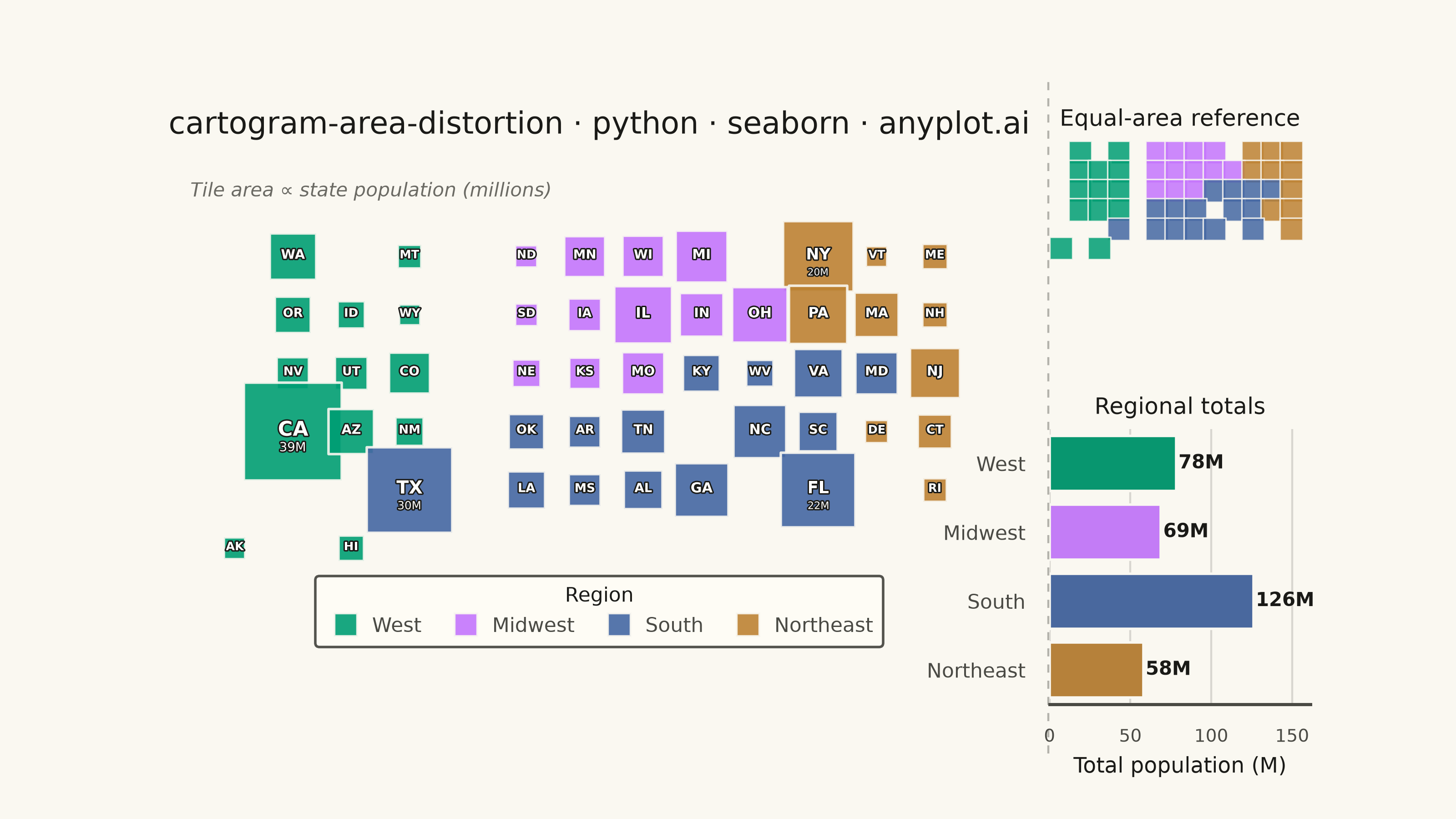
A cartogram distorts geographic regions so that their area becomes proportional to a data variable (e.g., population, GDP, election votes) rather than physical land area. This solves the classic problem of large but sparsely populated areas dominating standard maps, making it easier to compare values across regions at a glance. Contiguous cartograms preserve adjacency and rough shape of regions while rescaling them, famously used in election coverage worldwide.
""" anyplot.ai
cartogram-area-distortion: Cartogram with Area Distortion by Data Value
Library: seaborn 0.13.2 | Python 3.13.13
Quality: 93/100 | Updated: 2026-06-16
"""

import os

import matplotlib.patheffects as pe
import matplotlib.pyplot as plt
import numpy as np
import pandas as pd
import seaborn as sns


# Theme tokens (see prompts/default-style-guide.md "Theme-adaptive Chrome")
THEME = os.getenv("ANYPLOT_THEME", "light")
PAGE_BG = "#FAF8F1" if THEME == "light" else "#1A1A17"
ELEVATED_BG = "#FFFDF6" if THEME == "light" else "#242420"
INK = "#1A1A17" if THEME == "light" else "#F0EFE8"
INK_SOFT = "#4A4A44" if THEME == "light" else "#B8B7B0"
INK_MUTED = "#6B6A63" if THEME == "light" else "#A8A79F"

# Imprint palette — canonical order, regions take positions 1..4
IMPRINT_PALETTE = ["#009E73", "#C475FD", "#4467A3", "#BD8233"]

# Data: US states with population (millions) on an approximate tile grid
np.random.seed(42)

states_data = {
    # state: (row, col, population_millions, region)
    "WA": (0, 1, 7.7, "West"),
    "MT": (0, 3, 1.1, "West"),
    "ND": (0, 5, 0.8, "Midwest"),
    "MN": (0, 6, 5.7, "Midwest"),
    "WI": (0, 7, 5.9, "Midwest"),
    "MI": (0, 8, 10.0, "Midwest"),
    "NY": (0, 10, 19.5, "Northeast"),
    "VT": (0, 11, 0.6, "Northeast"),
    "ME": (0, 12, 1.4, "Northeast"),
    "OR": (1, 1, 4.2, "West"),
    "ID": (1, 2, 1.9, "West"),
    "WY": (1, 3, 0.6, "West"),
    "SD": (1, 5, 0.9, "Midwest"),
    "IA": (1, 6, 3.2, "Midwest"),
    "IL": (1, 7, 12.6, "Midwest"),
    "IN": (1, 8, 6.8, "Midwest"),
    "OH": (1, 9, 11.8, "Midwest"),
    "PA": (1, 10, 13.0, "Northeast"),
    "MA": (1, 11, 7.0, "Northeast"),
    "NH": (1, 12, 1.4, "Northeast"),
    "NV": (2, 1, 3.1, "West"),
    "UT": (2, 2, 3.3, "West"),
    "CO": (2, 3, 5.8, "West"),
    "NE": (2, 5, 2.0, "Midwest"),
    "KS": (2, 6, 2.9, "Midwest"),
    "MO": (2, 7, 6.2, "Midwest"),
    "KY": (2, 8, 4.5, "South"),
    "WV": (2, 9, 1.8, "South"),
    "VA": (2, 10, 8.6, "South"),
    "MD": (2, 11, 6.2, "South"),
    "NJ": (2, 12, 9.3, "Northeast"),
    "CA": (3, 1, 39.0, "West"),
    "AZ": (3, 2, 7.3, "West"),
    "NM": (3, 3, 2.1, "West"),
    "OK": (3, 5, 4.0, "South"),
    "AR": (3, 6, 3.0, "South"),
    "TN": (3, 7, 7.0, "South"),
    "NC": (3, 9, 10.6, "South"),
    "SC": (3, 10, 5.2, "South"),
    "DE": (3, 11, 1.0, "Northeast"),
    "CT": (3, 12, 3.6, "Northeast"),
    "TX": (4, 3, 29.5, "South"),
    "LA": (4, 5, 4.6, "South"),
    "MS": (4, 6, 3.0, "South"),
    "AL": (4, 7, 5.0, "South"),
    "GA": (4, 8, 10.8, "South"),
    "FL": (4, 10, 22.2, "South"),
    "RI": (4, 12, 1.1, "Northeast"),
    "AK": (5, 0, 0.7, "West"),
    "HI": (5, 2, 1.4, "West"),
}

rows = []
for state, (r, c, pop, region) in states_data.items():
    rows.append({"state": state, "row": r, "col": c, "population": pop, "region": region})
df = pd.DataFrame(rows)

# Region ordering and Imprint color mapping
region_order = ["West", "Midwest", "South", "Northeast"]
region_palette = dict(zip(region_order, IMPRINT_PALETTE, strict=True))

# Marker area range — wide enough to read area ∝ population, floored so small tiles stay legible
size_min = 70
size_max = 1500

# Theme — seaborn drives the chrome via rc tokens
sns.set_theme(
    style="white",
    rc={
        "figure.facecolor": PAGE_BG,
        "axes.facecolor": PAGE_BG,
        "axes.edgecolor": INK_SOFT,
        "axes.labelcolor": INK,
        "text.color": INK,
        "xtick.color": INK_SOFT,
        "ytick.color": INK_SOFT,
        "grid.color": INK,
        "grid.alpha": 0.15,
        "font.family": "sans-serif",
    },
)

# Plot — 8 × 4.5 in @ dpi 400 → 3200 × 1800 px (hard canvas contract)
fig = plt.figure(figsize=(8, 4.5), dpi=400, facecolor=PAGE_BG)
gs = fig.add_gridspec(
    2, 2, width_ratios=[3.2, 1], height_ratios=[1, 1], wspace=0.06, hspace=0.32, bottom=0.14, top=0.92
)
ax_main = fig.add_subplot(gs[:, 0])
ax_ref = fig.add_subplot(gs[0, 1])
ax_bar = fig.add_subplot(gs[1, 1])
for ax in (ax_main, ax_ref, ax_bar):
    ax.set_facecolor(PAGE_BG)

# Main cartogram — square tiles sized by population, colored by region
sns.scatterplot(
    data=df,
    x="col",
    y="row",
    size="population",
    sizes=(size_min, size_max),
    hue="region",
    hue_order=region_order,
    palette=region_palette,
    style="region",
    style_order=region_order,
    markers=dict.fromkeys(region_order, "s"),
    alpha=0.9,
    edgecolor=PAGE_BG,
    linewidth=1.0,
    ax=ax_main,
)

# Keep only the region (hue) handles for a compact horizontal legend
handles, labels = ax_main.get_legend_handles_labels()
region_handles, region_labels = [], []
for handle, lbl in zip(handles, labels, strict=False):
    if lbl in region_order:
        handle.set_markersize(9)
        handle.set_markeredgecolor(PAGE_BG)
        handle.set_markeredgewidth(0.8)
        region_handles.append(handle)
        region_labels.append(lbl)

ax_main.get_legend().remove()
legend = ax_main.legend(
    handles=region_handles,
    labels=region_labels,
    loc="lower center",
    fontsize=8,
    title="Region",
    title_fontsize=8,
    framealpha=0.95,
    facecolor=ELEVATED_BG,
    edgecolor=INK_SOFT,
    ncol=4,
    bbox_to_anchor=(0.5, -0.13),
    borderpad=0.5,
    columnspacing=1.2,
    handletextpad=0.3,
)
legend.get_title().set_color(INK)
for txt in legend.get_texts():
    txt.set_color(INK_SOFT)

# State abbreviations — white fill with dark stroke stays legible on any tile color
label_stroke = [pe.withStroke(linewidth=1.1, foreground="#1A1A17")]
pop_max = df["population"].max()
for _, row in df.iterrows():
    pop_frac = row["population"] / pop_max
    fontsize = 4.5 + pop_frac * 3.5
    ax_main.text(
        row["col"],
        row["row"] - 0.02,
        row["state"],
        ha="center",
        va="center",
        fontsize=fontsize,
        fontweight="bold",
        color="white",
        path_effects=label_stroke,
        zorder=5,
    )
    # Population callout for the very largest states only
    if row["population"] >= 18.0:
        ax_main.text(
            row["col"],
            row["row"] + 0.28,
            f"{row['population']:.0f}M",
            ha="center",
            va="center",
            fontsize=fontsize * 0.62,
            color="white",
            path_effects=label_stroke,
            zorder=5,
        )

# Style main axes — geographic tile grid, no axes chrome
ax_main.invert_yaxis()
ax_main.set_aspect("equal")
ax_main.set_xlim(-0.9, 13.4)
ax_main.set_ylim(5.9, -1.5)
ax_main.set_xlabel("")
ax_main.set_ylabel("")
ax_main.set_xticks([])
ax_main.set_yticks([])
sns.despine(ax=ax_main, left=True, bottom=True)

ax_main.set_title(
    "cartogram-area-distortion · python · seaborn · anyplot.ai", fontsize=12, fontweight="medium", color=INK, pad=14
)

ax_main.text(
    0.01,
    0.97,
    "Tile area ∝ state population (millions)",
    ha="left",
    va="top",
    fontsize=7.5,
    color=INK_MUTED,
    fontstyle="italic",
    transform=ax_main.transAxes,
)

# Reference inset — equal-area tile map, no labels so the size contrast reads cleanly
sns.scatterplot(
    data=df,
    x="col",
    y="row",
    hue="region",
    hue_order=region_order,
    palette=region_palette,
    style="region",
    style_order=region_order,
    markers=dict.fromkeys(region_order, "s"),
    s=80,
    alpha=0.85,
    edgecolor=PAGE_BG,
    linewidth=0.6,
    legend=False,
    ax=ax_ref,
)

ax_ref.invert_yaxis()
ax_ref.set_aspect("equal")
ax_ref.set_xlim(-0.6, 13.0)
ax_ref.set_ylim(5.9, -0.6)
ax_ref.set_xlabel("")
ax_ref.set_ylabel("")
ax_ref.set_xticks([])
ax_ref.set_yticks([])
sns.despine(ax=ax_ref, left=True, bottom=True)
ax_ref.set_title("Equal-area reference", fontsize=9, fontweight="medium", color=INK, pad=6)

# Subtle divider between the main cartogram and the side panels
fig.add_artist(
    plt.Line2D(
        [0.72, 0.72],
        [0.08, 0.9],
        transform=fig.transFigure,
        color=INK_SOFT,
        linewidth=0.8,
        linestyle=(0, (4, 4)),
        alpha=0.4,
    )
)

# Regional totals — seaborn barplot with statistical aggregation
region_totals = df.groupby("region", observed=True)["population"].sum().reset_index()
region_totals.columns = ["region", "total_pop"]
region_totals = region_totals.set_index("region").reindex(region_order).reset_index()
region_totals["total_pop"] = region_totals["total_pop"].round(1)

sns.barplot(
    data=region_totals,
    x="total_pop",
    y="region",
    hue="region",
    hue_order=region_order,
    order=region_order,
    palette=region_palette,
    edgecolor=PAGE_BG,
    linewidth=1.0,
    legend=False,
    ax=ax_bar,
    saturation=0.9,
)

for i, rrow in region_totals.iterrows():
    ax_bar.text(
        rrow["total_pop"] + 1.5,
        i,
        f"{rrow['total_pop']:.0f}M",
        ha="left",
        va="center",
        fontsize=7.5,
        fontweight="bold",
        color=INK,
    )

ax_bar.set_xlabel("Total population (M)", fontsize=8.5, color=INK)
ax_bar.set_ylabel("")
ax_bar.set_title("Regional totals", fontsize=9, fontweight="medium", color=INK, pad=6)
ax_bar.tick_params(axis="y", labelsize=8, colors=INK_SOFT)
ax_bar.tick_params(axis="x", labelsize=7, colors=INK_SOFT)
ax_bar.set_xlim(0, region_totals["total_pop"].max() * 1.28)
sns.despine(ax=ax_bar, left=True)
ax_bar.yaxis.grid(False)
ax_bar.xaxis.grid(True, alpha=0.15, linewidth=0.8)

# Save — bbox_inches stays default (None) to keep the exact 3200×1800 canvas
plt.savefig(f"plot-{THEME}.png", dpi=400, facecolor=PAGE_BG)
Runnable source as JSON, for any HTTP client: https://api.anyplot.ai/specs/cartogram-area-distortion/seaborn/code. Any spec id and library id listed in llms-full.txt fit the same URL shape; every URL below is complete and callable.
{
  "spec_id": "cartogram-area-distortion",
  "language": "python",
  "library": "seaborn",
  "page": "https://anyplot.ai/cartogram-area-distortion/python/seaborn",
  "hub": "https://anyplot.ai/cartogram-area-distortion",
  "code_json": "https://api.anyplot.ai/specs/cartogram-area-distortion/seaborn/code",
  "spec_json": "https://api.anyplot.ai/specs/cartogram-area-distortion",
  "render_light_png": "https://storage.googleapis.com/anyplot-images/plots/cartogram-area-distortion/python/seaborn/plot-light.png",
  "render_dark_png": "https://storage.googleapis.com/anyplot-images/plots/cartogram-area-distortion/python/seaborn/plot-dark.png",
  "quality_score": 93.0,
  "license": "MIT",
  "guide": "https://anyplot.ai/llms.txt"
}
Part of Cartogram with Area Distortion by Data Value on anyplot.ai.