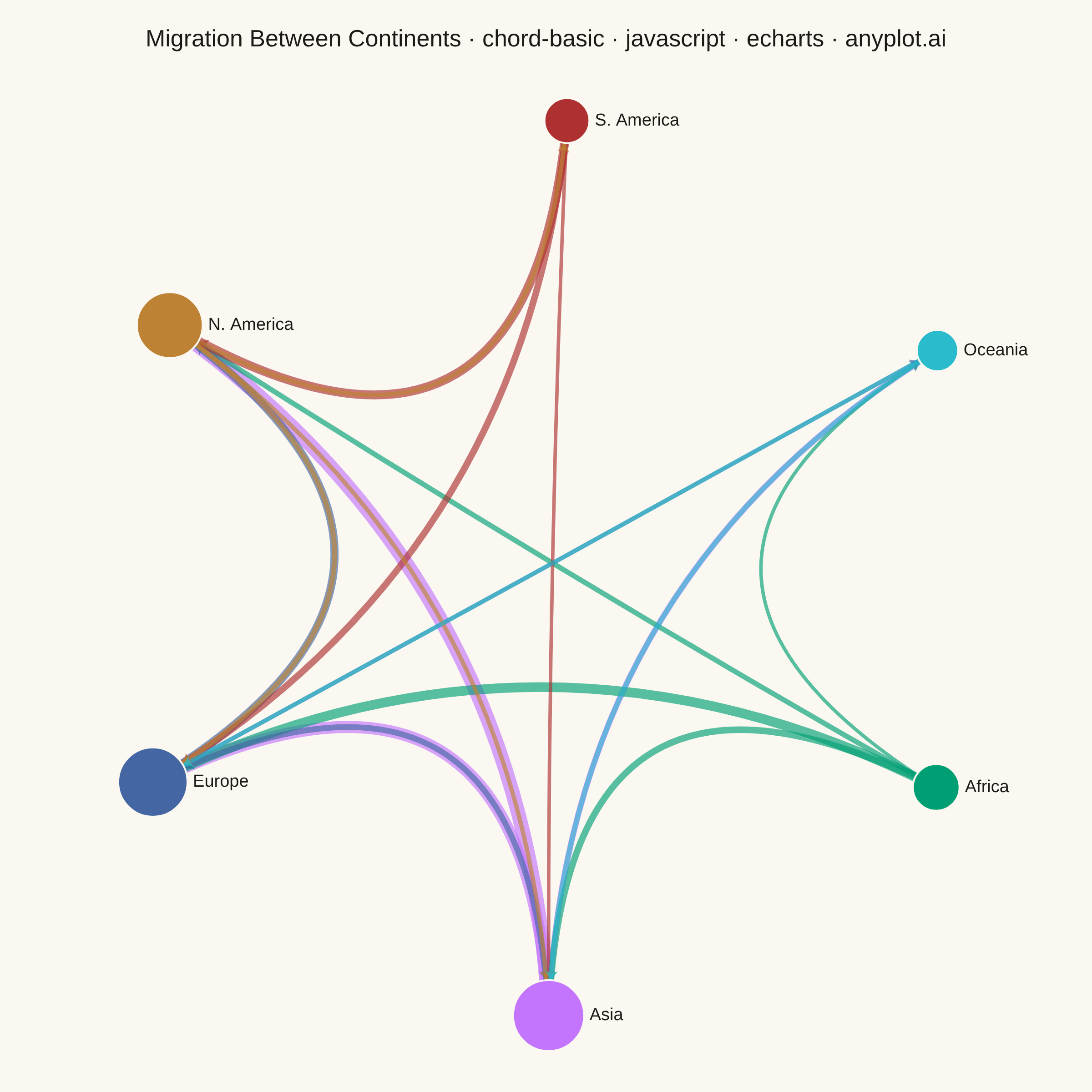
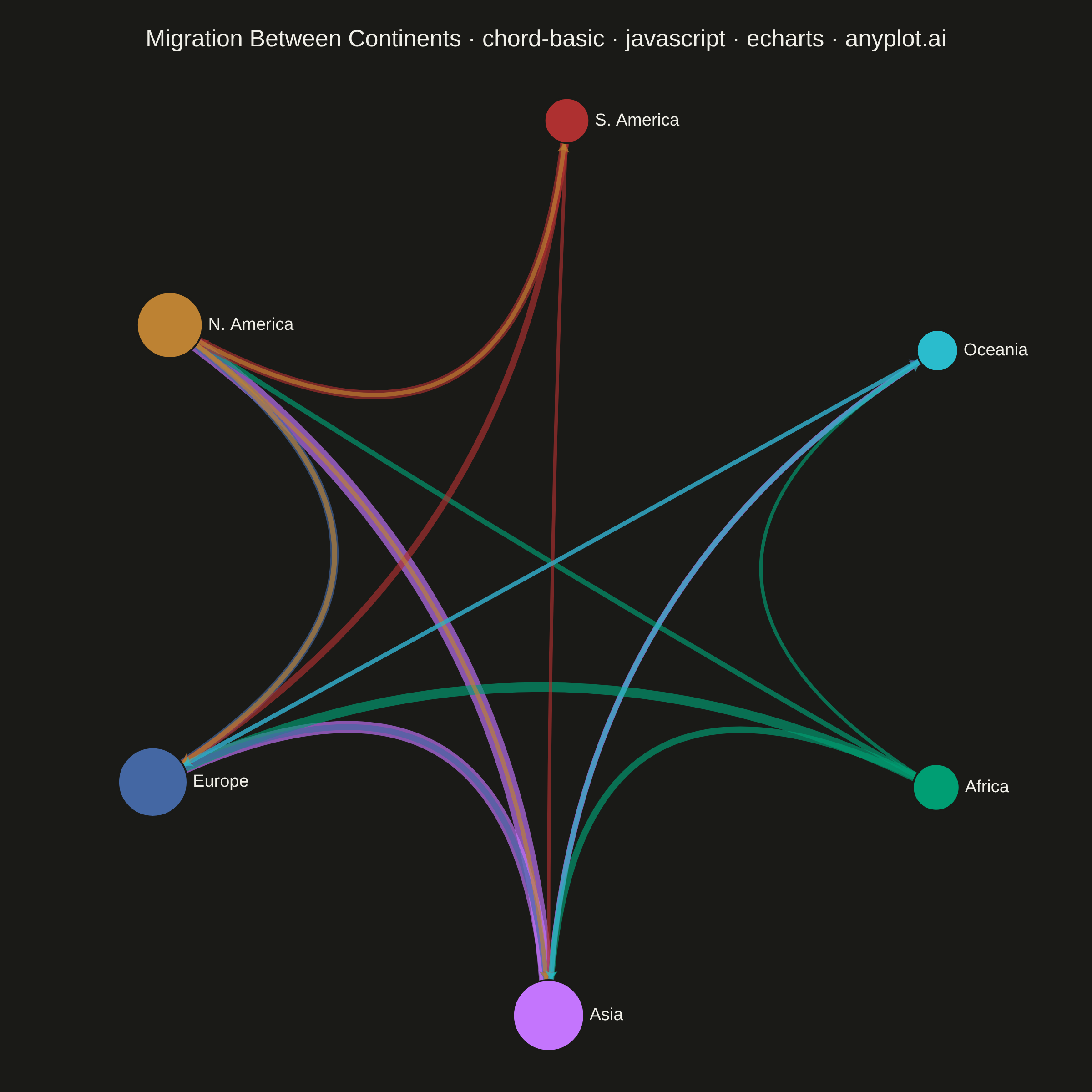
A chord diagram displays relationships or flows between entities arranged around a circle's perimeter. Arcs (chords) connect related entities, with chord width proportional to the flow magnitude. This visualization excels at revealing the overall structure of connections and identifying the strongest relationships within a system.
// anyplot.ai
// chord-basic: Basic Chord Diagram
// Library: echarts 5.5.1 | JavaScript 22.22.3
// Quality: 86/100 | Created: 2026-06-17
//# anyplot-orientation: square

const t = window.ANYPLOT_TOKENS;

// Data — annual migration flows between continents (millions of people).
// ECharts has no native chord type; a circular `graph` series is the idiomatic
// equivalent — entities sit on a ring, arcs (chords) carry the flow magnitude.
const continents = [
  "Africa",        // brand green — always first
  "Asia",
  "Europe",
  "N. America",
  "S. America",
  "Oceania",
];

// Each entity gets a distinct Imprint color (canonical order 1→6).
const nodeColor = {
  "Africa": t.palette[0],
  "Asia": t.palette[1],
  "Europe": t.palette[2],
  "N. America": t.palette[3],
  "S. America": t.palette[4],
  "Oceania": t.palette[5],
};

// Directed flows (source → target, value in millions). Bidirectional pairs are
// listed separately so both directions render as their own chord.
const flows = [
  { source: "Asia", target: "Europe", value: 12 },
  { source: "Asia", target: "N. America", value: 15 },
  { source: "Asia", target: "Oceania", value: 4 },
  { source: "Africa", target: "Europe", value: 9 },
  { source: "Africa", target: "Asia", value: 5 },
  { source: "Africa", target: "N. America", value: 3 },
  { source: "Africa", target: "Oceania", value: 1 },
  { source: "Europe", target: "N. America", value: 7 },
  { source: "Europe", target: "Asia", value: 4 },
  { source: "Europe", target: "Oceania", value: 2 },
  { source: "S. America", target: "N. America", value: 8 },
  { source: "S. America", target: "Europe", value: 5 },
  { source: "S. America", target: "Asia", value: 1 },
  { source: "N. America", target: "Europe", value: 3 },
  { source: "N. America", target: "Asia", value: 2 },
  { source: "N. America", target: "S. America", value: 2 },
  { source: "Oceania", target: "Europe", value: 2 },
  { source: "Oceania", target: "Asia", value: 3 },
];

// Node size encodes total throughput (in + out flow).
const throughput = Object.fromEntries(continents.map((c) => [c, 0]));
for (const f of flows) {
  throughput[f.source] += f.value;
  throughput[f.target] += f.value;
}
const maxThroughput = Math.max(...Object.values(throughput));
const sizeFor = (c) => 34 + (throughput[c] / maxThroughput) * 44;

const nodes = continents.map((c) => ({
  name: c,
  symbolSize: sizeFor(c),
  itemStyle: { color: nodeColor[c], borderColor: t.pageBg, borderWidth: 2 },
}));

// Chord width is proportional to flow magnitude; color follows the source node.
const links = flows.map((f) => ({
  source: f.source,
  target: f.target,
  value: f.value,
  lineStyle: {
    // Minimum width + opacity floor keep low-volume flows (1–2M) legible.
    width: 3 + f.value * 0.85,
    curveness: 0.3,
    color: nodeColor[f.source],
    opacity: 0.65,
  },
}));

// Init
const chart = echarts.init(document.getElementById("container"));

// Option
chart.setOption({
  animation: false,
  color: t.palette,
  backgroundColor: "transparent",
  title: {
    text: "Migration Between Continents · chord-basic · javascript · echarts · anyplot.ai",
    left: "center",
    top: 26,
    textStyle: { color: t.ink, fontSize: 26, fontWeight: 500 },
  },
  tooltip: {
    trigger: "item",
    formatter: (p) =>
      p.dataType === "edge"
        ? `${p.data.source} → ${p.data.target}<br/>${p.data.value}M people`
        : `${p.name}<br/>${throughput[p.name]}M total flow`,
  },
  series: [{
    type: "graph",
    layout: "circular",
    circular: { rotateLabel: false },
    data: nodes,
    links: links,
    roam: false,
    // Reserve a title band at the top and shrink the ring slightly so the
    // topmost node clears the title text (VQ-02 crowding fix).
    top: "12%",
    bottom: "6%",
    center: ["50%", "54%"],
    edgeSymbol: ["none", "arrow"],
    edgeSymbolSize: 10,
    label: {
      show: true,
      position: "right",
      color: t.ink,
      fontSize: 19,
      fontWeight: 500,
    },
    lineStyle: { opacity: 0.65 },
    emphasis: {
      focus: "adjacency",
      lineStyle: { opacity: 0.9 },
      label: { fontSize: 21 },
    },
  }],
});

window.addEventListener("resize", () => chart.resize());
chart.on("finished", () => { window.__anyplotReady = true; });
Runnable source as JSON, for any HTTP client: https://api.anyplot.ai/specs/chord-basic/echarts/code. Any spec id and library id listed in llms-full.txt fit the same URL shape; every URL below is complete and callable.
{
  "spec_id": "chord-basic",
  "language": "javascript",
  "library": "echarts",
  "page": "https://anyplot.ai/chord-basic/javascript/echarts",
  "hub": "https://anyplot.ai/chord-basic",
  "code_json": "https://api.anyplot.ai/specs/chord-basic/echarts/code",
  "spec_json": "https://api.anyplot.ai/specs/chord-basic",
  "render_light_png": "https://storage.googleapis.com/anyplot-images/plots/chord-basic/javascript/echarts/plot-light.png",
  "render_dark_png": "https://storage.googleapis.com/anyplot-images/plots/chord-basic/javascript/echarts/plot-dark.png",
  "interactive_light_html": "https://storage.googleapis.com/anyplot-images/plots/chord-basic/javascript/echarts/plot-light.html",
  "interactive_dark_html": "https://storage.googleapis.com/anyplot-images/plots/chord-basic/javascript/echarts/plot-dark.html",
  "quality_score": 86.0,
  "license": "MIT",
  "guide": "https://anyplot.ai/llms.txt"
}
Part of Basic Chord Diagram on anyplot.ai.