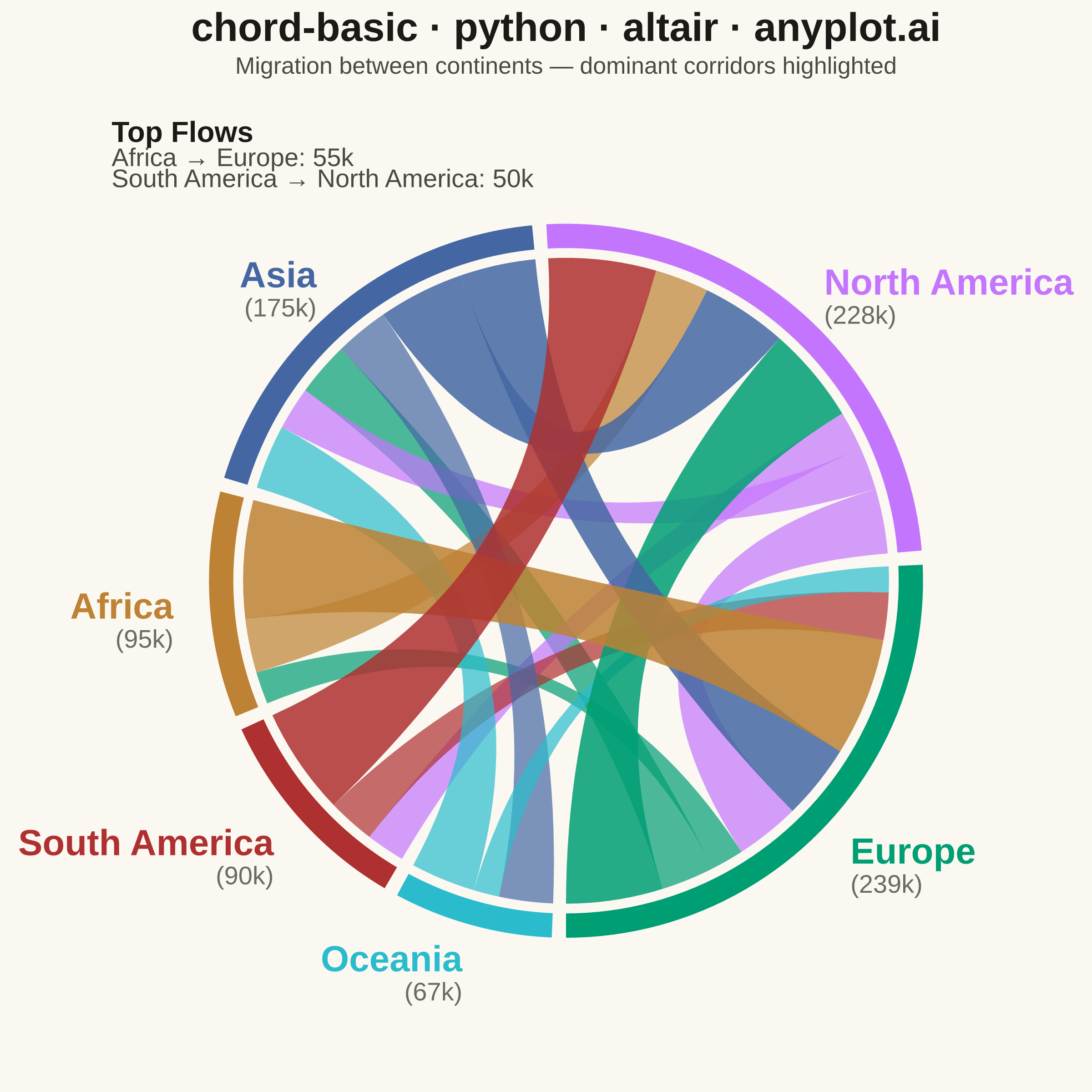
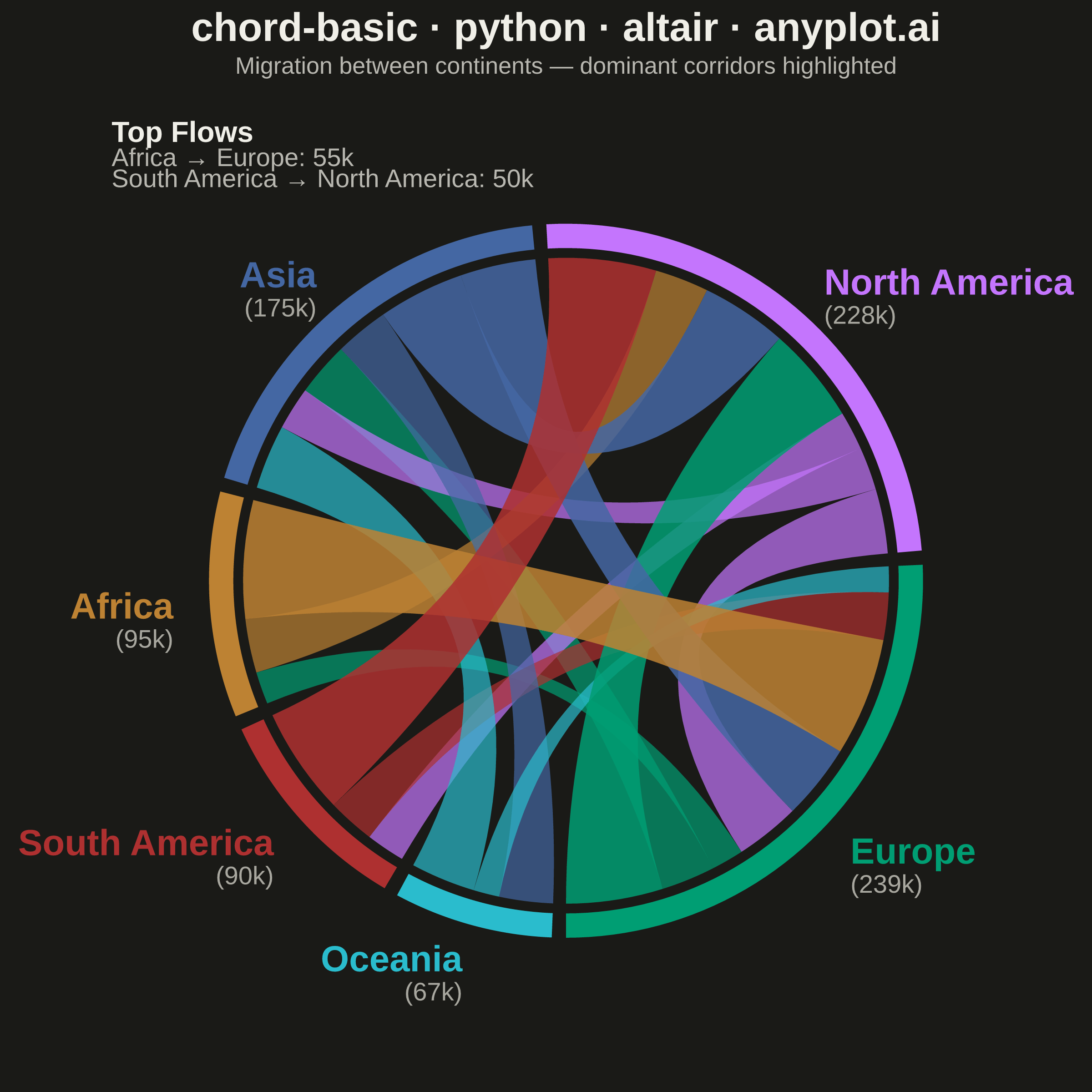
A chord diagram displays relationships or flows between entities arranged around a circle's perimeter. Arcs (chords) connect related entities, with chord width proportional to the flow magnitude. This visualization excels at revealing the overall structure of connections and identifying the strongest relationships within a system.
""" anyplot.ai
chord-basic: Basic Chord Diagram
Library: altair 6.2.1 | Python 3.13.13
Quality: 90/100 | Updated: 2026-06-17
"""

import os

import altair as alt
import numpy as np
import pandas as pd
from PIL import Image


# Theme-adaptive chrome (Imprint palette tokens)
THEME = os.getenv("ANYPLOT_THEME", "light")
PAGE_BG = "#FAF8F1" if THEME == "light" else "#1A1A17"
ELEVATED_BG = "#FFFDF6" if THEME == "light" else "#242420"
INK = "#1A1A17" if THEME == "light" else "#F0EFE8"
INK_SOFT = "#4A4A44" if THEME == "light" else "#B8B7B0"
INK_MUTED = "#6B6A63" if THEME == "light" else "#A8A79F"

# Data - Migration flows between continents (thousands of people, bidirectional)
flows_data = [
    {"source": "Europe", "target": "North America", "value": 45},
    {"source": "North America", "target": "Europe", "value": 30},
    {"source": "Europe", "target": "Asia", "value": 25},
    {"source": "Asia", "target": "Europe", "value": 35},
    {"source": "Asia", "target": "North America", "value": 40},
    {"source": "North America", "target": "Asia", "value": 20},
    {"source": "Africa", "target": "Europe", "value": 55},
    {"source": "Europe", "target": "Africa", "value": 15},
    {"source": "Africa", "target": "North America", "value": 25},
    {"source": "South America", "target": "North America", "value": 50},
    {"source": "North America", "target": "South America", "value": 18},
    {"source": "South America", "target": "Europe", "value": 22},
    {"source": "Oceania", "target": "Asia", "value": 30},
    {"source": "Asia", "target": "Oceania", "value": 25},
    {"source": "Oceania", "target": "Europe", "value": 12},
]

df = pd.DataFrame(flows_data)

# Internal layout domain (square). Mapped to a small Altair view + padded to 2400x2400.
W, H = 1200, 1200
CX, CY = W / 2, H / 2 + 20
R_OUTER, R_INNER, R_CHORD = 440, 410, 398

# Entity ordering and Imprint palette (canonical order 1->6, colorblind-safe)
entities = ["Europe", "North America", "Asia", "Africa", "South America", "Oceania"]
colors = ["#009E73", "#C475FD", "#4467A3", "#BD8233", "#AE3030", "#2ABCCD"]
color_scale = alt.Scale(domain=entities, range=colors)

# Compute entity totals and angular positions
entity_totals = {e: df[df["source"] == e]["value"].sum() + df[df["target"] == e]["value"].sum() for e in entities}
total_flow = sum(entity_totals.values())
gap = 0.04
available_angle = 2 * np.pi - gap * len(entities)

entity_arcs = {}
angle = -np.pi / 2
for e in entities:
    arc_len = (entity_totals[e] / total_flow) * available_angle
    entity_arcs[e] = (angle, angle + arc_len, arc_len)
    angle += arc_len + gap

# Build outer arc polygons
arcs_rows = []
for e in entities:
    start, end, _ = entity_arcs[e]
    angles = np.linspace(start, end, 50)
    xs = np.concatenate([CX + R_OUTER * np.cos(angles), CX + R_INNER * np.cos(angles[::-1])])
    ys = np.concatenate([CY + R_OUTER * np.sin(angles), CY + R_INNER * np.sin(angles[::-1])])
    for i, (x, y) in enumerate(zip(xs, ys, strict=True)):
        arcs_rows.append({"entity": e, "x": x, "y": y, "order": i})

arcs_df = pd.DataFrame(arcs_rows)

# Track chord offsets within each entity arc
source_off = {}
target_off = {}
for e in entities:
    start, _, arc_len = entity_arcs[e]
    frac = df[df["source"] == e]["value"].sum() / entity_totals[e] if entity_totals[e] > 0 else 0.5
    source_off[e] = start
    target_off[e] = start + frac * arc_len

# Visual hierarchy: top 30% of flows are "major"
value_threshold = df["value"].quantile(0.7)

# Build chord polygons with quadratic bezier curves
N_BEZ = 35
chords_rows = []
center = np.array([CX, CY])

for _, row in df.iterrows():
    src, tgt, val = row["source"], row["target"], row["value"]
    _, _, s_len = entity_arcs[src]
    _, _, t_len = entity_arcs[tgt]

    sw = (val / entity_totals[src]) * s_len
    tw = (val / entity_totals[tgt]) * t_len
    sa = source_off[src]
    source_off[src] += sw
    ta = target_off[tgt]
    target_off[tgt] += tw

    t_param = np.linspace(0, 1, N_BEZ)
    angles_s = np.linspace(sa, sa + sw, 10)
    angles_t = np.linspace(ta, ta + tw, 10)

    arc_s = np.column_stack([CX + R_CHORD * np.cos(angles_s), CY + R_CHORD * np.sin(angles_s)])
    arc_t = np.column_stack([CX + R_CHORD * np.cos(angles_t), CY + R_CHORD * np.sin(angles_t)])

    t1 = (1 - t_param) ** 2
    t2 = 2 * (1 - t_param) * t_param
    t3 = t_param**2
    p_se = np.array([CX + R_CHORD * np.cos(sa + sw), CY + R_CHORD * np.sin(sa + sw)])
    p_ts = np.array([CX + R_CHORD * np.cos(ta), CY + R_CHORD * np.sin(ta)])
    p_te = np.array([CX + R_CHORD * np.cos(ta + tw), CY + R_CHORD * np.sin(ta + tw)])
    p_ss = np.array([CX + R_CHORD * np.cos(sa), CY + R_CHORD * np.sin(sa)])
    bez_1 = np.outer(t1, p_se) + np.outer(t2, center) + np.outer(t3, p_ts)
    bez_2 = np.outer(t1, p_te) + np.outer(t2, center) + np.outer(t3, p_ss)
    pts = np.vstack([arc_s, bez_1, arc_t, bez_2])

    chord_id = f"{src}->{tgt}"
    is_major = val >= value_threshold
    for i in range(len(pts)):
        chords_rows.append(
            {
                "chord_id": chord_id,
                "source": src,
                "target": tgt,
                "value": int(val),
                "x": pts[i, 0],
                "y": pts[i, 1],
                "order": i,
                "major": is_major,
                "flow_label": f"{src} → {tgt}: {int(val)}k",
            }
        )

chords_df = pd.DataFrame(chords_rows)

# Label positions outside arcs
labels_rows = []
for e in entities:
    start, end, _ = entity_arcs[e]
    mid = (start + end) / 2
    r_label = R_OUTER + 45
    deg = np.degrees(mid) % 360
    labels_rows.append(
        {
            "entity": e,
            "x": CX + r_label * np.cos(mid),
            "y": CY + r_label * np.sin(mid),
            "align": "right" if 90 < deg < 270 else "left",
            "total": f"({entity_totals[e]}k)",
        }
    )

labels_df = pd.DataFrame(labels_rows)

# Shared scales
x_scale = alt.Scale(domain=[0, W])
y_scale = alt.Scale(domain=[0, H])

# Interactive selection: hover over a chord to highlight it
hover = alt.selection_point(fields=["chord_id"], on="pointerover", empty="all")

# Outer arc ring
arcs_layer = (
    alt.Chart(arcs_df)
    .mark_line(filled=True, strokeWidth=0)
    .encode(
        x=alt.X("x:Q", scale=x_scale, axis=None),
        y=alt.Y("y:Q", scale=y_scale, axis=None),
        color=alt.Color("entity:N", scale=color_scale, legend=None),
        detail="entity:N",
        order="order:Q",
    )
)

# Chord encoding with interactive hover highlighting
chord_base_encode = {
    "x": alt.X("x:Q", scale=x_scale, axis=None),
    "y": alt.Y("y:Q", scale=y_scale, axis=None),
    "color": alt.Color("source:N", scale=color_scale, legend=None),
    "detail": "chord_id:N",
    "order": "order:Q",
    "tooltip": [
        alt.Tooltip("source:N", title="From"),
        alt.Tooltip("target:N", title="To"),
        alt.Tooltip("value:Q", title="Flow (thousands)"),
    ],
}

# Major chords (dominant flows) - higher opacity, highlighted on hover
major_chords = (
    alt.Chart(chords_df[chords_df["major"]])
    .mark_line(filled=True, strokeWidth=0)
    .encode(**chord_base_encode, opacity=alt.condition(hover, alt.value(0.85), alt.value(0.6)))
    .add_params(hover)
)

# Minor chords - lower opacity, but kept legible against the surface
minor_chords = (
    alt.Chart(chords_df[~chords_df["major"]])
    .mark_line(filled=True, strokeWidth=0)
    .encode(**chord_base_encode, opacity=alt.condition(hover, alt.value(0.7), alt.value(0.45)))
    .add_params(hover)
)

# Labels split by alignment
label_enc = {
    "x": alt.X("x:Q", scale=x_scale, axis=None),
    "y": alt.Y("y:Q", scale=y_scale, axis=None),
    "text": "entity:N",
    "color": alt.Color("entity:N", scale=color_scale, legend=None),
}

labels_left = (
    alt.Chart(labels_df[labels_df["align"] == "left"])
    .mark_text(fontSize=20, fontWeight="bold", align="left")
    .encode(**label_enc)
)

labels_right = (
    alt.Chart(labels_df[labels_df["align"] == "right"])
    .mark_text(fontSize=20, fontWeight="bold", align="right")
    .encode(**label_enc)
)

# Flow total annotations under entity labels (theme-adaptive tertiary ink)
total_enc = {
    "x": alt.X("x:Q", scale=x_scale, axis=None),
    "y": alt.Y("y:Q", scale=y_scale, axis=None),
    "text": "total:N",
}

totals_left = (
    alt.Chart(labels_df[labels_df["align"] == "left"])
    .mark_text(fontSize=14, align="left", dy=18, color=INK_MUTED)
    .encode(**total_enc)
)

totals_right = (
    alt.Chart(labels_df[labels_df["align"] == "right"])
    .mark_text(fontSize=14, align="right", dy=18, color=INK_MUTED)
    .encode(**total_enc)
)

# Top-flow callout (top-left corner)
top2 = df.nlargest(2, "value")
annot_rows = []
for i, (_, r) in enumerate(top2.iterrows()):
    annot_rows.append({"x": 40, "y": H - 60 - i * 26, "text": f"{r['source']} → {r['target']}: {r['value']}k"})

annot_df = pd.DataFrame(annot_rows)
annot_title = (
    alt.Chart(pd.DataFrame([{"x": 40, "y": H - 28, "text": "Top Flows"}]))
    .mark_text(fontSize=16, fontWeight="bold", align="left", color=INK)
    .encode(x=alt.X("x:Q", scale=x_scale, axis=None), y=alt.Y("y:Q", scale=y_scale, axis=None), text="text:N")
)
center_annot = (
    alt.Chart(annot_df)
    .mark_text(fontSize=14, align="left", color=INK_SOFT)
    .encode(x=alt.X("x:Q", scale=x_scale, axis=None), y=alt.Y("y:Q", scale=y_scale, axis=None), text="text:N")
)

# Direct color-coded labeling replaces a detached legend: each region name is
# printed in its own entity color next to its arc (see labels_left/right above),
# which is the color key — cleaner than a redundant separate legend box.

# Compose all layers
chart = (
    alt.layer(
        minor_chords,
        major_chords,
        arcs_layer,
        labels_left,
        labels_right,
        totals_left,
        totals_right,
        annot_title,
        center_annot,
    )
    .properties(
        width=535,
        height=535,
        padding={"left": 0, "right": 0, "top": 0, "bottom": 0},
        title=alt.Title(
            text="chord-basic · python · altair · anyplot.ai",
            subtitle="Migration between continents — dominant corridors highlighted",
            fontSize=22,
            subtitleFontSize=13,
            color=INK,
            subtitleColor=INK_SOFT,
            anchor="middle",
            offset=16,
        ),
    )
    .configure(background=PAGE_BG, view=alt.ViewConfig(strokeWidth=0, stroke=None, fill=PAGE_BG))
)

# Save PNG (square target 2400x2400), then PAD-only to exact target. Never crop.
chart.save(f"plot-{THEME}.png", scale_factor=4.0)
chart.save(f"plot-{THEME}.html")

TW, TH = 2400, 2400
_img = Image.open(f"plot-{THEME}.png").convert("RGB")
_w, _h = _img.size
if _w > TW or _h > TH:
    raise SystemExit(
        f"altair vl-convert produced {_w}×{_h}, exceeds target {TW}×{TH}. "
        f"Shrink chart .properties(width=, height=) values and re-render."
    )
if _w < TW or _h < TH:
    _canvas = Image.new("RGB", (TW, TH), PAGE_BG)
    _canvas.paste(_img, ((TW - _w) // 2, (TH - _h) // 2))
    _canvas.save(f"plot-{THEME}.png")
Runnable source as JSON, for any HTTP client: https://api.anyplot.ai/specs/chord-basic/altair/code. Any spec id and library id listed in llms-full.txt fit the same URL shape; every URL below is complete and callable.
{
  "spec_id": "chord-basic",
  "language": "python",
  "library": "altair",
  "page": "https://anyplot.ai/chord-basic/python/altair",
  "hub": "https://anyplot.ai/chord-basic",
  "code_json": "https://api.anyplot.ai/specs/chord-basic/altair/code",
  "spec_json": "https://api.anyplot.ai/specs/chord-basic",
  "render_light_png": "https://storage.googleapis.com/anyplot-images/plots/chord-basic/python/altair/plot-light.png",
  "render_dark_png": "https://storage.googleapis.com/anyplot-images/plots/chord-basic/python/altair/plot-dark.png",
  "interactive_light_html": "https://storage.googleapis.com/anyplot-images/plots/chord-basic/python/altair/plot-light.html",
  "interactive_dark_html": "https://storage.googleapis.com/anyplot-images/plots/chord-basic/python/altair/plot-dark.html",
  "quality_score": 90.0,
  "license": "MIT",
  "guide": "https://anyplot.ai/llms.txt"
}
Part of Basic Chord Diagram on anyplot.ai.