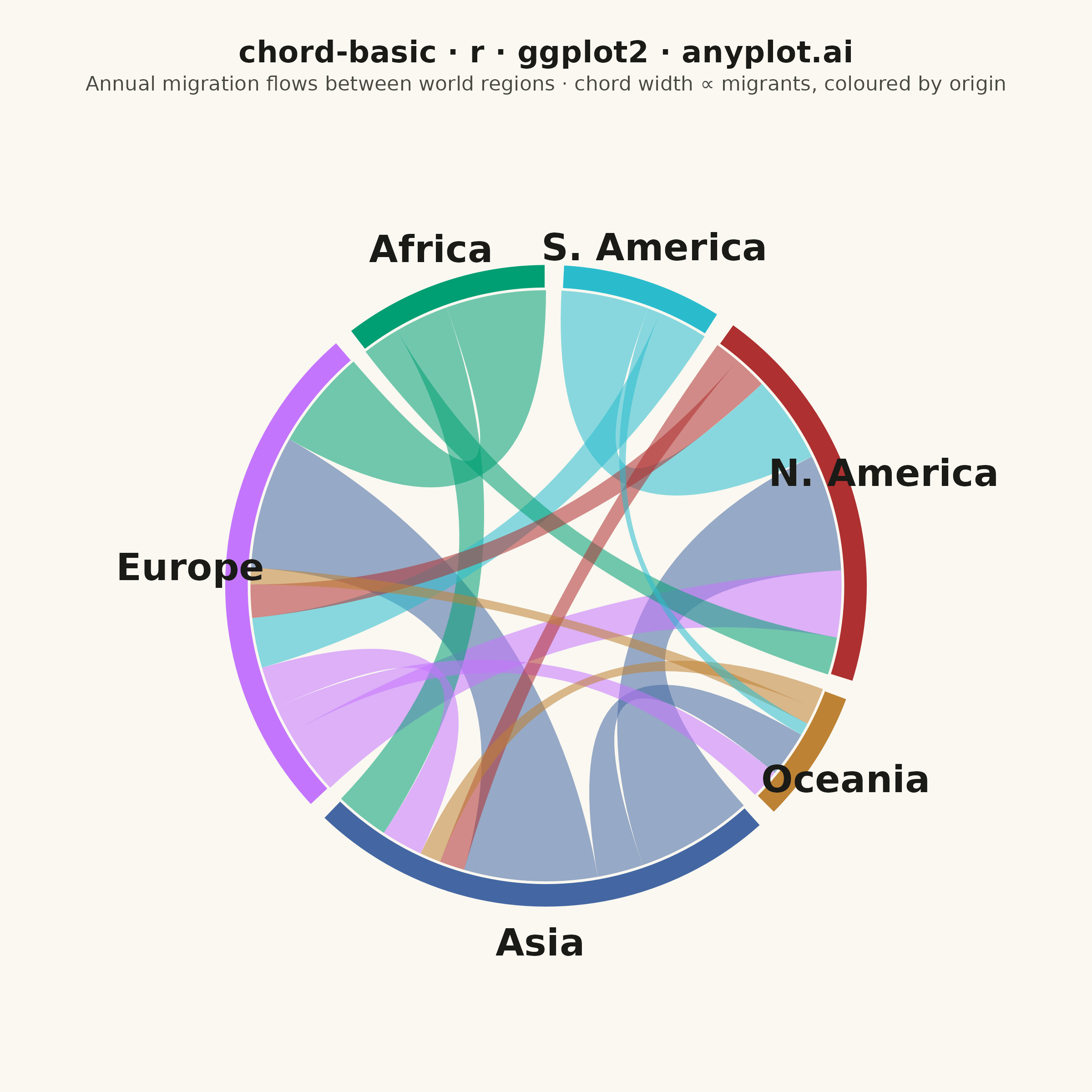
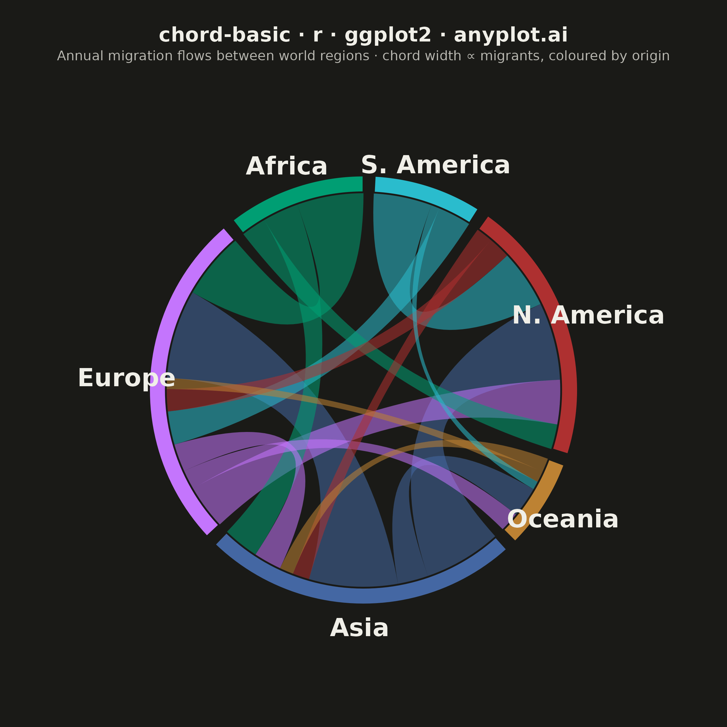
A chord diagram displays relationships or flows between entities arranged around a circle's perimeter. Arcs (chords) connect related entities, with chord width proportional to the flow magnitude. This visualization excels at revealing the overall structure of connections and identifying the strongest relationships within a system.
#' anyplot.ai
#' chord-basic: Basic Chord Diagram
#' Library: ggplot2 3.5.1 | R 4.4.1
#' Quality: 92/100 | Created: 2026-06-17

library(ggplot2)
library(dplyr)
library(tidyr)
library(ragg)

set.seed(42)

# --- Theme tokens -----------------------------------------------------------
THEME       <- Sys.getenv("ANYPLOT_THEME", "light")
PAGE_BG     <- if (THEME == "light") "#FAF8F1" else "#1A1A17"
ELEVATED_BG <- if (THEME == "light") "#FFFDF6" else "#242420"
INK         <- if (THEME == "light") "#1A1A17" else "#F0EFE8"
INK_SOFT    <- if (THEME == "light") "#4A4A44" else "#B8B7B0"

# Imprint palette — one distinct hue per region, first sector brand green
IMPRINT_PALETTE <- c("#009E73", "#C475FD", "#4467A3", "#BD8233",
                     "#AE3030", "#2ABCCD", "#954477", "#99B314")

# --- Data: annual migration flows between world regions (millions) ----------
entities <- c("Africa", "Europe", "Asia", "Oceania", "N. America", "S. America")

flows <- tribble(
  ~source,      ~target,       ~value,
  "Asia",       "Europe",      3.2,
  "Asia",       "N. America",  2.8,
  "Asia",       "Oceania",     1.1,
  "Africa",     "Europe",      2.4,
  "Africa",     "Asia",        1.3,
  "Africa",     "N. America",  0.9,
  "Europe",     "N. America",  1.6,
  "Europe",     "Asia",        1.0,
  "Europe",     "Oceania",     0.7,
  "S. America", "N. America",  2.1,
  "S. America", "Europe",      1.2,
  "N. America", "Europe",      0.8,
  "N. America", "Asia",        0.6,
  "Oceania",    "Asia",        0.5,
  "Oceania",    "Europe",      0.4,
  "S. America", "Oceania",     0.3
)
flows$id <- seq_len(nrow(flows))

# --- Geometry helpers (data prep only — plot stays top-level) ---------------
deg2rad <- function(d) d * pi / 180

pt_on_circle <- function(angle_deg, r) {
  data.frame(x = r * cos(deg2rad(angle_deg)), y = r * sin(deg2rad(angle_deg)))
}

arc_seq <- function(a_from, a_to, r, n = 50) {
  a <- seq(a_from, a_to, length.out = n)
  data.frame(x = r * cos(deg2rad(a)), y = r * sin(deg2rad(a)))
}

# Quadratic bezier with control point pinned at the centre (0, 0) — this is
# what bends each chord toward the middle of the circle.
bezier_to_centre <- function(p0, p1, n = 40) {
  t <- seq(0, 1, length.out = n)
  data.frame(
    x = (1 - t)^2 * p0$x + t^2 * p1$x,
    y = (1 - t)^2 * p0$y + t^2 * p1$y
  )
}

# --- Sector layout: each region gets an arc sized by its total flow ---------
R_IN    <- 1.00   # inner radius — chords attach here
R_OUT   <- 1.085  # outer radius — sector band thickness
R_LAB   <- 1.20   # region labels
GAP_DEG <- 3      # blank gap between adjacent sectors
N       <- length(entities)

sector_total <- sapply(entities, function(e) {
  sum(flows$value[flows$source == e]) + sum(flows$value[flows$target == e])
})
avail <- 360 - N * GAP_DEG

sector_df <- data.frame(entity = entities, sec_total = sector_total)
sector_df$span    <- sector_df$sec_total / sum(sector_total) * avail
sector_df$a_start <- NA_real_
sector_df$a_end   <- NA_real_
cursor <- 90  # start at the top, lay sectors counter-clockwise
for (i in seq_len(N)) {
  sector_df$a_start[i] <- cursor
  sector_df$a_end[i]   <- cursor + sector_df$span[i]
  cursor <- sector_df$a_end[i] + GAP_DEG
}

# --- Flow ends: each flow occupies a slice on its source AND target sector --
ends <- bind_rows(
  transmute(flows, entity = source, flow_id = id, role = "out", value, partner = target),
  transmute(flows, entity = target, flow_id = id, role = "in",  value, partner = source)
)
ends$entity  <- factor(ends$entity, levels = entities)
ends$partner <- factor(ends$partner, levels = entities)
ends <- ends %>%
  arrange(entity, role, partner) %>%
  group_by(entity) %>%
  mutate(cum_end = cumsum(value), cum_start = cum_end - value) %>%
  ungroup() %>%
  left_join(sector_df, by = "entity") %>%
  mutate(
    ang1 = a_start + cum_start / sec_total * span,
    ang2 = a_start + cum_end   / sec_total * span
  )

# --- Build sector band polygons (annulus segments) --------------------------
sector_poly <- do.call(rbind, lapply(seq_len(N), function(i) {
  outer <- arc_seq(sector_df$a_start[i], sector_df$a_end[i], R_OUT)
  inner <- arc_seq(sector_df$a_end[i], sector_df$a_start[i], R_IN)  # reversed
  poly  <- rbind(outer, inner)
  poly$entity <- entities[i]
  poly$group  <- paste0("sector_", i)
  poly
}))

# --- Build chord ribbons: source arc → bezier → target arc → bezier back ----
ribbon_df <- do.call(rbind, lapply(flows$id, function(fid) {
  src <- ends[ends$flow_id == fid & ends$role == "out", ]
  tgt <- ends[ends$flow_id == fid & ends$role == "in", ]
  poly <- rbind(
    arc_seq(src$ang1, src$ang2, R_IN, n = 20),
    bezier_to_centre(pt_on_circle(src$ang2, R_IN), pt_on_circle(tgt$ang1, R_IN)),
    arc_seq(tgt$ang1, tgt$ang2, R_IN, n = 20),
    bezier_to_centre(pt_on_circle(tgt$ang2, R_IN), pt_on_circle(src$ang1, R_IN))
  )
  poly$group      <- paste0("ribbon_", fid)
  poly$src_entity <- as.character(src$entity)
  poly
}))
# Draw widest chords first so thin ones stay visible on top
ribbon_order <- flows$id[order(flows$value, decreasing = TRUE)]
ribbon_df$group <- factor(ribbon_df$group,
                          levels = paste0("ribbon_", ribbon_order))

# --- Region labels at the sector mid-angle ----------------------------------
label_df <- sector_df %>%
  mutate(
    mid = (a_start + a_end) / 2,
    x   = R_LAB * cos(deg2rad(mid)),
    y   = R_LAB * sin(deg2rad(mid))
  )

fill_values <- setNames(IMPRINT_PALETTE[seq_len(N)], entities)

# --- Plot -------------------------------------------------------------------
p <- ggplot() +
  geom_polygon(
    data = ribbon_df,
    aes(x, y, group = group, fill = src_entity),
    alpha = 0.55, color = NA
  ) +
  geom_polygon(
    data = sector_poly,
    aes(x, y, group = group, fill = entity),
    color = PAGE_BG, linewidth = 0.5
  ) +
  geom_text(
    data = label_df,
    aes(x, y, label = entity),
    color = INK, size = 5.2, fontface = "bold"
  ) +
  scale_fill_manual(values = fill_values, guide = "none") +
  coord_fixed(xlim = c(-1.62, 1.62), ylim = c(-1.62, 1.62), expand = FALSE) +
  labs(
    title    = "chord-basic · r · ggplot2 · anyplot.ai",
    subtitle = "Annual migration flows between world regions · chord width ∝ migrants, coloured by origin"
  ) +
  theme_void(base_size = 8) +
  theme(
    plot.background  = element_rect(fill = PAGE_BG, color = PAGE_BG),
    panel.background = element_rect(fill = PAGE_BG, color = NA),
    plot.title       = element_text(color = INK,      size = 12, hjust = 0.5,
                                    face = "bold", margin = margin(t = 6, b = 3)),
    plot.subtitle    = element_text(color = INK_SOFT, size = 8,  hjust = 0.5,
                                    margin = margin(b = 4)),
    plot.margin      = margin(10, 10, 10, 10)
  )

# --- Save -------------------------------------------------------------------
ggsave(
  filename = sprintf("plot-%s.png", THEME),
  plot     = p,
  device   = ragg::agg_png,
  width    = 6,
  height   = 6,
  units    = "in",
  dpi      = 400
)
Runnable source as JSON, for any HTTP client: https://api.anyplot.ai/specs/chord-basic/ggplot2/code. Any spec id and library id listed in llms-full.txt fit the same URL shape; every URL below is complete and callable.
{
  "spec_id": "chord-basic",
  "language": "r",
  "library": "ggplot2",
  "page": "https://anyplot.ai/chord-basic/r/ggplot2",
  "hub": "https://anyplot.ai/chord-basic",
  "code_json": "https://api.anyplot.ai/specs/chord-basic/ggplot2/code",
  "spec_json": "https://api.anyplot.ai/specs/chord-basic",
  "render_light_png": "https://storage.googleapis.com/anyplot-images/plots/chord-basic/r/ggplot2/plot-light.png",
  "render_dark_png": "https://storage.googleapis.com/anyplot-images/plots/chord-basic/r/ggplot2/plot-dark.png",
  "quality_score": 92.0,
  "license": "MIT",
  "guide": "https://anyplot.ai/llms.txt"
}
Part of Basic Chord Diagram on anyplot.ai.