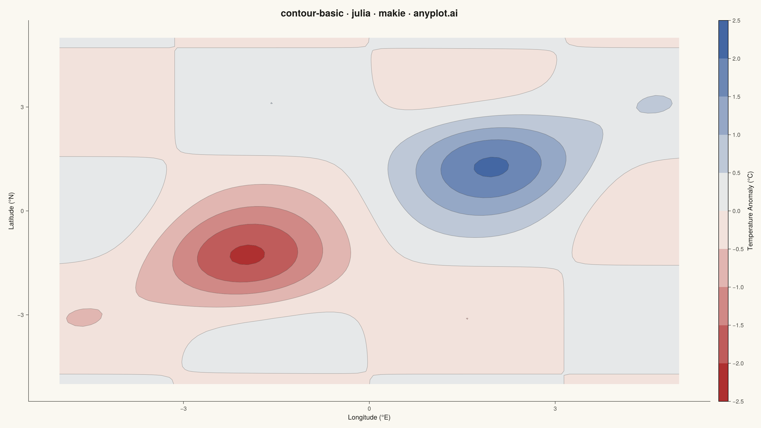
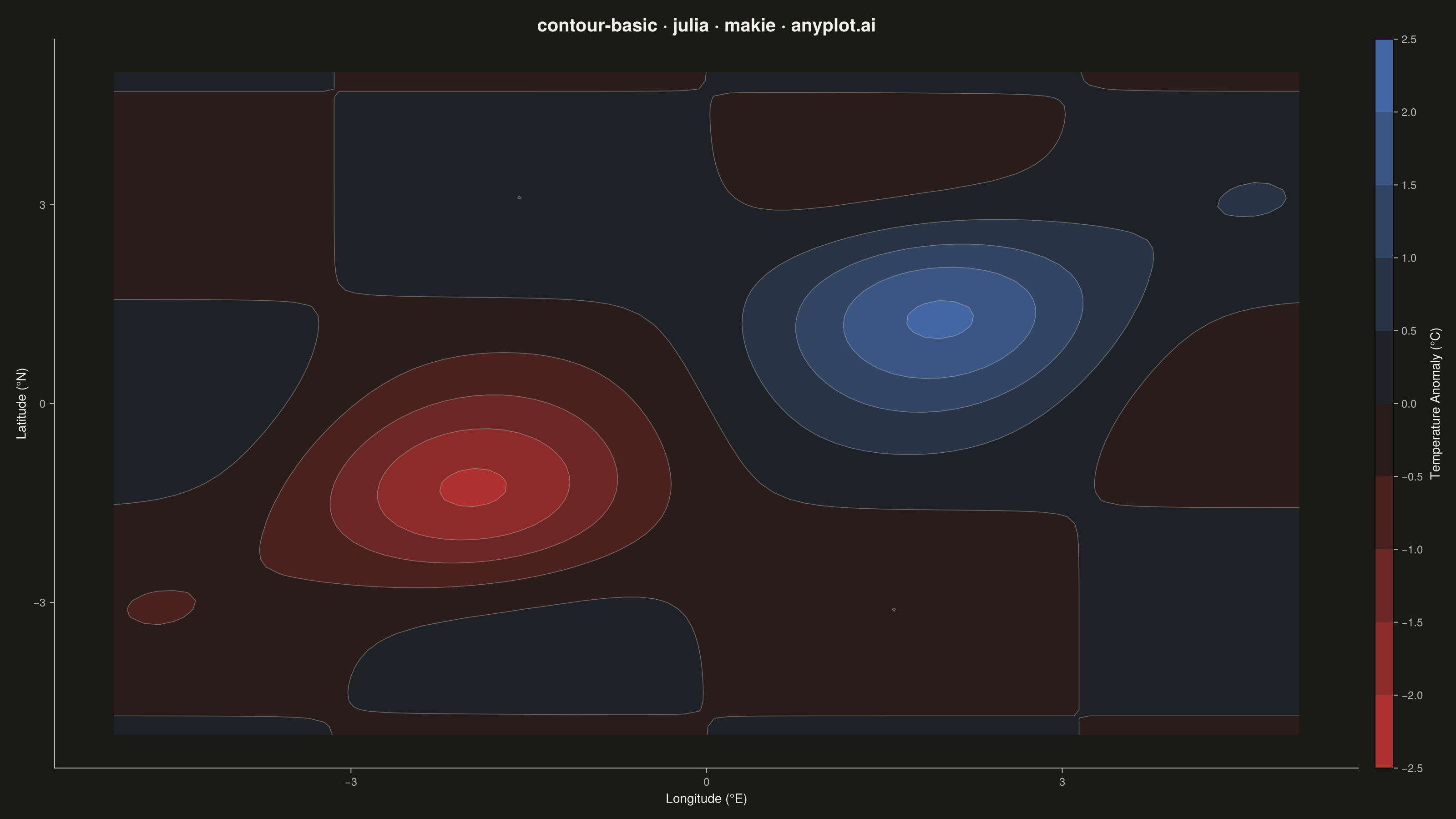
The same plot in 14 other libraries — Python: Altair, Bokeh, lets-plot, Matplotlib, Plotly, plotnine, Pygal, Seaborn; R: ggplot2; JavaScript: Chart.js, D3.js, Apache ECharts, Highcharts, MUI X Charts. Compare all 15 side by side: Basic Contour Plot in Python, R, Julia and JavaScript.
A contour plot displays isolines (level curves) of a 2D scalar field, connecting points of equal value across a surface. It transforms 3D data into an intuitive 2D representation, making it easy to identify regions of high and low values, gradients, and patterns. Contour plots are essential for visualizing continuous surfaces where the relationship between X, Y coordinates and a Z value needs to be understood.
# anyplot.ai
# contour-basic: Basic Contour Plot
# Library: makie 0.21.9 | Julia 1.11.9
# Quality: 89/100 | Created: 2026-06-25

using CairoMakie
using Colors
using ColorSchemes
using Random

Random.seed!(42)

# Theme tokens
const THEME       = get(ENV, "ANYPLOT_THEME", "light")
const PAGE_BG     = THEME == "light" ? colorant"#FAF8F1" : colorant"#1A1A17"
const INK         = THEME == "light" ? colorant"#1A1A17" : colorant"#F0EFE8"
const INK_SOFT    = THEME == "light" ? colorant"#4A4A44" : colorant"#B8B7B0"

# Imprint diverging colormap: warm anomaly (red) ↔ near-neutral ↔ cool anomaly (blue)
const _midpoint   = THEME == "light" ? colorant"#FAF8F1" : colorant"#1A1A17"
const ANYPLOT_DIV = cgrad([colorant"#AE3030", _midpoint, colorant"#4467A3"])

# Data — surface temperature anomaly field (°C relative to 30-year climatology mean)
const xs = LinRange(-5.0, 5.0, 80)
const ys = LinRange(-5.0, 5.0, 80)
const z = [
    2.0 * exp(-0.5 * ((xi - 2.0)^2 + (yi - 1.5)^2)) -
    2.0 * exp(-0.5 * ((xi + 2.0)^2 + (yi + 1.5)^2)) +
    0.5 * sin(xi) * cos(yi)
    for xi in xs, yi in ys
]

const LEVELS = collect(range(-2.5, 2.5, step = 0.5))

# Plot
fig = Figure(
    size            = (1600, 900),
    fontsize        = 14,
    backgroundcolor = PAGE_BG,
)

ax = Axis(
    fig[1, 1];
    title              = "contour-basic · julia · makie · anyplot.ai",
    titlesize          = 20,
    titlecolor         = INK,
    xlabel             = "Longitude (°E)",
    ylabel             = "Latitude (°N)",
    xlabelcolor        = INK,
    ylabelcolor        = INK,
    xlabelsize         = 14,
    ylabelsize         = 14,
    xticklabelcolor    = INK_SOFT,
    yticklabelcolor    = INK_SOFT,
    xticklabelsize     = 12,
    yticklabelsize     = 12,
    xtickcolor         = INK_SOFT,
    ytickcolor         = INK_SOFT,
    backgroundcolor    = PAGE_BG,
    topspinevisible    = false,
    rightspinevisible  = false,
    leftspinecolor     = INK_SOFT,
    bottomspinecolor   = INK_SOFT,
    xgridvisible       = false,
    ygridvisible       = false,
)

# Filled contours
cf = contourf!(ax, xs, ys, z;
    levels   = LEVELS,
    colormap = ANYPLOT_DIV,
)

# Contour lines overlay
contour!(ax, xs, ys, z;
    levels    = LEVELS,
    color     = RGBAf(INK.r, INK.g, INK.b, 0.35f0),
    linewidth = 0.8,
)

# Colorbar
Colorbar(fig[1, 2], cf;
    label          = "Temperature Anomaly (°C)",
    labelcolor     = INK,
    labelsize      = 14,
    tickcolor      = INK_SOFT,
    ticklabelcolor = INK_SOFT,
    ticklabelsize  = 12,
    ticks          = -2.5:0.5:2.5,
    width          = 20,
)

# Save
save("plot-$(THEME).png", fig; px_per_unit = 2)
Runnable source as JSON, for any HTTP client: https://api.anyplot.ai/specs/contour-basic/makie/code. Any spec id and library id listed in llms-full.txt fit the same URL shape; every URL below is complete and callable.
{
  "spec_id": "contour-basic",
  "language": "julia",
  "library": "makie",
  "page": "https://anyplot.ai/contour-basic/julia/makie",
  "hub": "https://anyplot.ai/contour-basic",
  "code_json": "https://api.anyplot.ai/specs/contour-basic/makie/code",
  "spec_json": "https://api.anyplot.ai/specs/contour-basic",
  "render_light_png": "https://storage.googleapis.com/anyplot-images/plots/contour-basic/julia/makie/plot-light.png",
  "render_dark_png": "https://storage.googleapis.com/anyplot-images/plots/contour-basic/julia/makie/plot-dark.png",
  "quality_score": 89.0,
  "license": "MIT",
  "guide": "https://anyplot.ai/llms.txt"
}
Part of Basic Contour Plot on anyplot.ai.