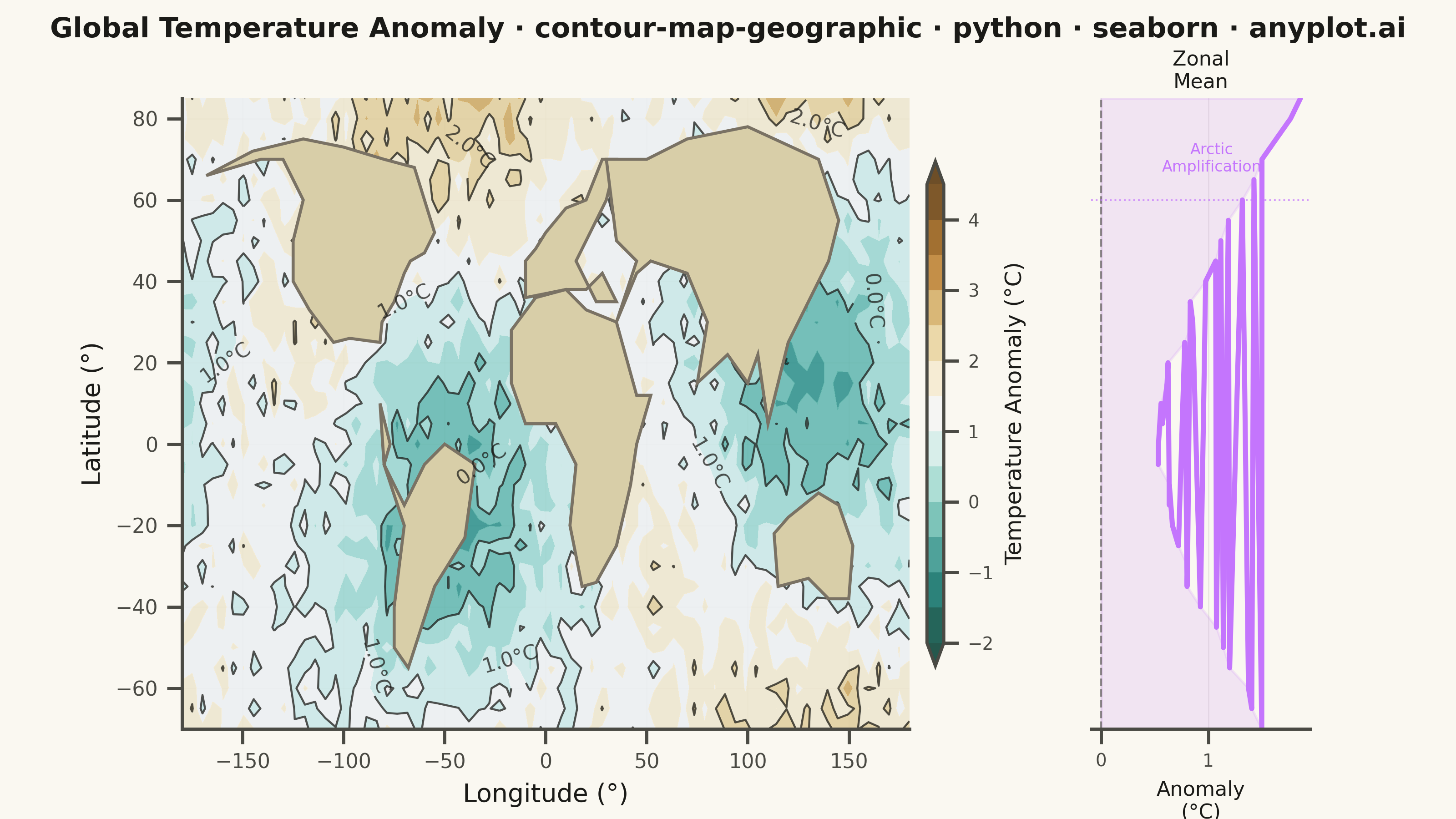
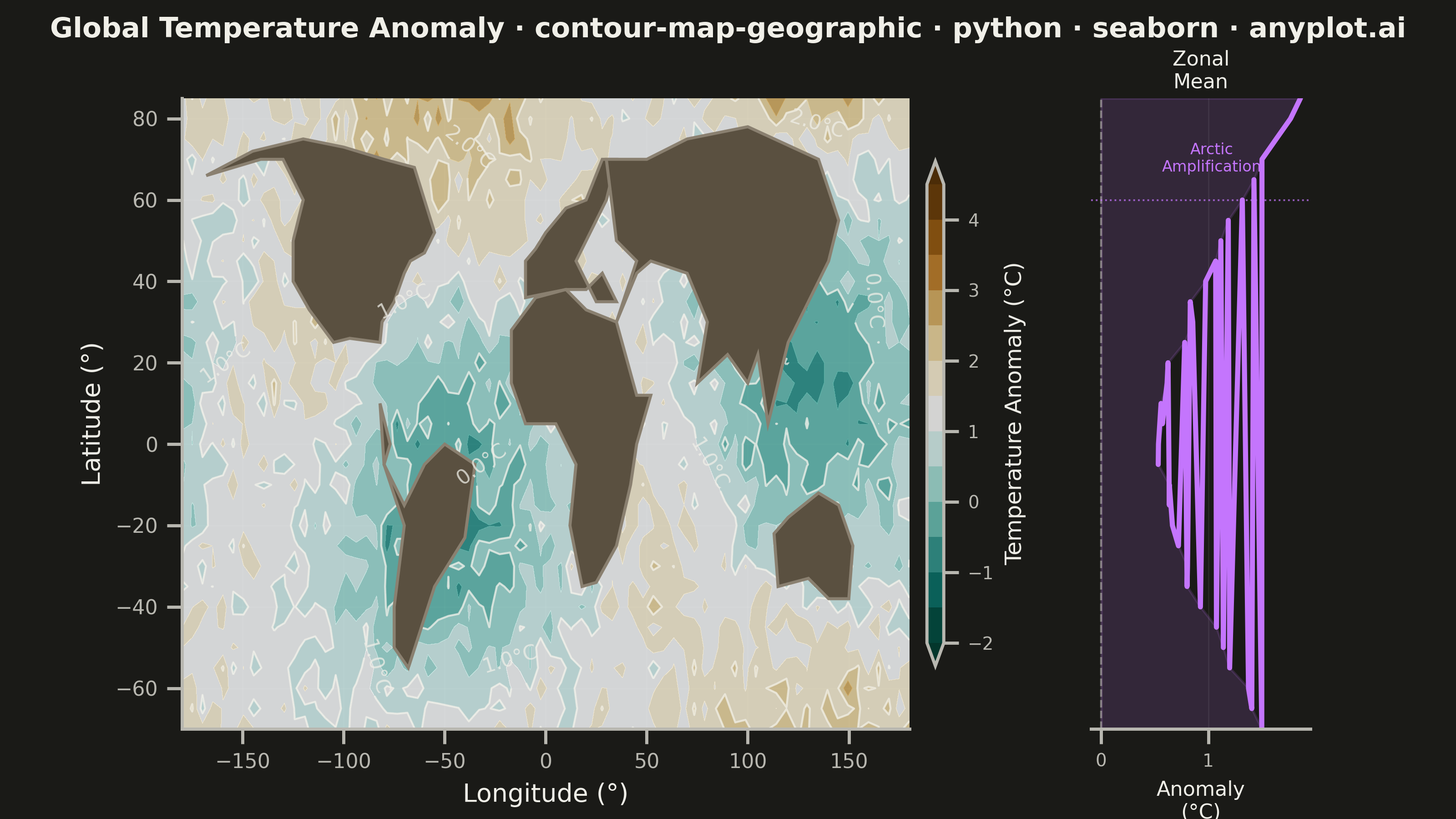
A contour map overlays isolines (lines of equal value) onto a geographic basemap, visualizing continuous spatial data such as elevation, temperature, or atmospheric pressure across real-world coordinates. Unlike basic contour plots that use abstract x/y coordinates, this plot anchors contours to latitude/longitude positions with geographic context like coastlines, borders, or terrain. It combines the precision of isoline visualization with spatial awareness, making it ideal for meteorological, topographic, and environmental applications.
""" anyplot.ai
contour-map-geographic: Contour Lines on Geographic Map
Library: seaborn 0.13.2 | Python 3.13.13
Quality: 83/100 | Updated: 2026-05-20
"""

import os

import matplotlib.pyplot as plt
import numpy as np
import seaborn as sns


# Theme tokens
THEME = os.getenv("ANYPLOT_THEME", "light")
PAGE_BG = "#FAF8F1" if THEME == "light" else "#1A1A17"
ELEVATED_BG = "#FFFDF6" if THEME == "light" else "#242420"
INK = "#1A1A17" if THEME == "light" else "#F0EFE8"
INK_SOFT = "#4A4A44" if THEME == "light" else "#B8B7B0"
OCEAN = "#C4D8EC" if THEME == "light" else "#182633"
LAND = "#D8CEA8" if THEME == "light" else "#5A5040"
COAST = "#7A7264" if THEME == "light" else "#8A8070"
HIGHLIGHT = "#C475FD"  # Okabe-Ito warm orange — highlights Arctic signal

# Simplified world coastline polygons (major continents)
WORLD_COASTLINES = [
    # North America
    [
        (-168, 66),
        (-141, 70),
        (-130, 70),
        (-120, 60),
        (-125, 50),
        (-125, 40),
        (-117, 33),
        (-105, 25),
        (-97, 26),
        (-82, 25),
        (-81, 30),
        (-75, 35),
        (-70, 42),
        (-67, 45),
        (-60, 47),
        (-55, 52),
        (-60, 60),
        (-65, 68),
        (-80, 70),
        (-100, 73),
        (-120, 75),
        (-145, 72),
        (-168, 66),
    ],
    # South America
    [
        (-82, 10),
        (-77, 0),
        (-80, -5),
        (-70, -15),
        (-60, -5),
        (-50, 0),
        (-35, -5),
        (-40, -23),
        (-55, -35),
        (-68, -55),
        (-75, -50),
        (-75, -40),
        (-70, -20),
        (-80, -5),
        (-82, 10),
    ],
    # Europe
    [
        (-10, 36),
        (-10, 45),
        (-5, 48),
        (0, 52),
        (5, 55),
        (10, 58),
        (20, 60),
        (28, 70),
        (35, 70),
        (30, 60),
        (25, 55),
        (20, 50),
        (15, 45),
        (20, 40),
        (25, 35),
        (35, 35),
        (28, 42),
        (20, 38),
        (10, 38),
        (-10, 36),
    ],
    # Africa
    [
        (-17, 15),
        (-17, 28),
        (-5, 36),
        (10, 38),
        (20, 33),
        (35, 30),
        (45, 12),
        (52, 12),
        (45, 0),
        (42, -10),
        (35, -25),
        (25, -34),
        (18, -35),
        (12, -20),
        (15, -5),
        (5, 5),
        (-10, 5),
        (-17, 15),
    ],
    # Asia
    [
        (35, 30),
        (45, 42),
        (52, 45),
        (70, 42),
        (80, 30),
        (75, 15),
        (90, 22),
        (100, 15),
        (105, 22),
        (110, 5),
        (120, 25),
        (130, 35),
        (140, 45),
        (145, 55),
        (135, 70),
        (100, 78),
        (70, 75),
        (50, 70),
        (30, 70),
        (35, 50),
        (45, 45),
        (35, 30),
    ],
    # Australia
    [
        (113, -22),
        (120, -18),
        (135, -12),
        (145, -15),
        (152, -25),
        (150, -38),
        (140, -38),
        (130, -33),
        (115, -35),
        (113, -22),
    ],
]

# Data: Global temperature anomaly grid (simulated climate data)
np.random.seed(42)

lon = np.linspace(-180, 180, 72)
lat = np.linspace(-70, 85, 32)
LON, LAT = np.meshgrid(lon, lat)

# Realistic temperature anomaly: higher anomalies at poles (Arctic amplification)
anomaly_base = 0.5 + 1.5 * (np.abs(LAT) / 90) ** 1.5
anomaly_regional = 0.8 * np.sin(np.radians(LON * 2)) * np.cos(np.radians(LAT * 1.5)) + 0.6 * np.cos(
    np.radians(LON + 60)
) * np.sin(np.radians(LAT * 2))
noise = np.random.randn(32, 72) * 0.3
Z = np.clip(anomaly_base + anomaly_regional + noise, -2.0, 4.5)

# Apply seaborn theme with full theme-adaptive chrome
sns.set_theme(
    style="ticks",
    rc={
        "figure.facecolor": PAGE_BG,
        "axes.facecolor": PAGE_BG,
        "axes.edgecolor": INK_SOFT,
        "axes.labelcolor": INK,
        "text.color": INK,
        "xtick.color": INK_SOFT,
        "ytick.color": INK_SOFT,
        "grid.color": INK,
        "grid.alpha": 0.10,
        "legend.facecolor": ELEVATED_BG,
        "legend.edgecolor": INK_SOFT,
    },
)

# Canvas — landscape 3200×1800 px: main geographic map + zonal mean side panel
fig, (ax_map, ax_zone) = plt.subplots(
    1, 2, figsize=(8, 4.5), dpi=400, gridspec_kw={"width_ratios": [4, 1], "wspace": 0.06}
)
fig.patch.set_facecolor(PAGE_BG)

# --- Geographic contour map ---
ax_map.set_facecolor(OCEAN)
ax_map.set_xlim(-180, 180)
ax_map.set_ylim(-70, 85)

# Filled contours — BrBG_r: warm brown = positive anomaly, teal = negative
levels = np.linspace(-2, 4.5, 14)
contourf_plot = ax_map.contourf(LON, LAT, Z, levels=levels, cmap="BrBG_r", alpha=0.85, extend="both", zorder=1)

# Contour lines at every other level (alpha increased for visibility)
contour_lines = ax_map.contour(LON, LAT, Z, levels=levels[::2], colors=INK, linewidths=0.8, alpha=0.75, zorder=2)
ax_map.clabel(contour_lines, inline=True, fontsize=8, fmt="%.1f°C", colors=INK)

# Coastlines with land fill for geographic context
for coastline in WORLD_COASTLINES:
    if len(coastline) > 2:
        lons = [p[0] for p in coastline]
        lats = [p[1] for p in coastline]
        ax_map.fill(lons, lats, color=LAND, edgecolor=COAST, linewidth=1.2, zorder=3)

# Colorbar
cbar = fig.colorbar(contourf_plot, ax=ax_map, shrink=0.80, pad=0.02, aspect=30)
cbar.set_label("Temperature Anomaly (°C)", fontsize=9, color=INK)
cbar.ax.tick_params(labelsize=7, colors=INK_SOFT)
cbar.outline.set_edgecolor(INK_SOFT)

ax_map.set_xlabel("Longitude (°)", fontsize=10, color=INK)
ax_map.set_ylabel("Latitude (°)", fontsize=10, color=INK)
ax_map.tick_params(axis="both", labelsize=8, colors=INK_SOFT)
ax_map.grid(True, alpha=0.10, linewidth=0.5, color=INK_SOFT, zorder=0)
ax_map.set_axisbelow(True)
ax_map.spines["top"].set_visible(False)
ax_map.spines["right"].set_visible(False)
ax_map.spines["left"].set_color(INK_SOFT)
ax_map.spines["bottom"].set_color(INK_SOFT)

# --- Zonal mean profile — seaborn lineplot shows Arctic amplification signal ---
zonal_mean = Z.mean(axis=1)  # mean anomaly over all longitudes per latitude band

sns.lineplot(x=zonal_mean, y=lat, ax=ax_zone, color=HIGHLIGHT, linewidth=2.0, errorbar=None)
ax_zone.fill_betweenx(lat, 0, zonal_mean, where=(zonal_mean > 0), color=HIGHLIGHT, alpha=0.15)

# Zero reference line
ax_zone.axvline(0, color=INK_SOFT, linewidth=0.8, linestyle="--", alpha=0.6)

# Mark 60°N — boundary of Arctic amplification zone
ax_zone.axhline(60, color=HIGHLIGHT, linewidth=0.7, linestyle=":", alpha=0.7)
ax_zone.text(
    0.55, 0.93, "Arctic\nAmplification", transform=ax_zone.transAxes, fontsize=6, color=HIGHLIGHT, ha="center", va="top"
)

ax_zone.set_ylim(-70, 85)
ax_zone.set_title("Zonal\nMean", fontsize=8, color=INK, pad=4)
ax_zone.set_xlabel("Anomaly\n(°C)", fontsize=8, color=INK)
ax_zone.tick_params(axis="x", labelsize=7, colors=INK_SOFT)
ax_zone.set_yticks([])
ax_zone.grid(True, alpha=0.10, linewidth=0.5, color=INK_SOFT)
ax_zone.set_facecolor(PAGE_BG)
ax_zone.spines["top"].set_visible(False)
ax_zone.spines["right"].set_visible(False)
ax_zone.spines["left"].set_visible(False)
ax_zone.spines["bottom"].set_color(INK_SOFT)

fig.suptitle(
    "Global Temperature Anomaly · contour-map-geographic · python · seaborn · anyplot.ai",
    fontsize=11,
    fontweight="bold",
    x=0.5,
    y=0.98,
    color=INK,
)

plt.tight_layout()
plt.savefig(f"plot-{THEME}.png", dpi=400, facecolor=PAGE_BG)
Runnable source as JSON, for any HTTP client: https://api.anyplot.ai/specs/contour-map-geographic/seaborn/code. Any spec id and library id listed in llms-full.txt fit the same URL shape; every URL below is complete and callable.
{
  "spec_id": "contour-map-geographic",
  "language": "python",
  "library": "seaborn",
  "page": "https://anyplot.ai/contour-map-geographic/python/seaborn",
  "hub": "https://anyplot.ai/contour-map-geographic",
  "code_json": "https://api.anyplot.ai/specs/contour-map-geographic/seaborn/code",
  "spec_json": "https://api.anyplot.ai/specs/contour-map-geographic",
  "render_light_png": "https://storage.googleapis.com/anyplot-images/plots/contour-map-geographic/python/seaborn/plot-light.png",
  "render_dark_png": "https://storage.googleapis.com/anyplot-images/plots/contour-map-geographic/python/seaborn/plot-dark.png",
  "quality_score": 83.0,
  "license": "MIT",
  "guide": "https://anyplot.ai/llms.txt"
}
Part of Contour Lines on Geographic Map on anyplot.ai.